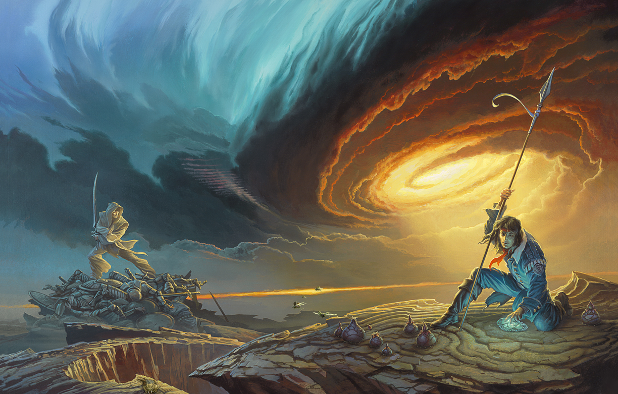
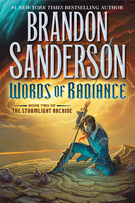
Tor Books is proud to reveal the cover for Brandon Sanderson’s upcoming Words of Radiance, sequel to the New York Times bestselling The Way of Kings! Below the cut, artist Michael Whelan shares his thoughts on the process of designing the cover, including several preliminary sketches for alternate images.
As with any Brandon Sanderson book, there’s just too much content to try to distill such a complex tapestry into one image, alas. Having such a rich world of possibilities is overwhelming: a well delineated but diverse cast of characters, strange yet compellingly natural flora and fauna, multiple story threads weaving from page to page…how does one choose what to present? It seems as if any choice will be wrong, for having to leave something else out that calls to be presented to a potential reader. Nonetheless, a choice must be made.
I was aided in this part by Irene Gallo and the editorial staff at Tor Books. After conferring with Brandon Sanderson they agreed on a short list of key scenes for me to consider. Irene sent me these possible scenes in an email accompanied by copious notes about characters, dress, and other necessary details.
I chewed over these potential scenes, read what I could of the actual text, and let everything simmer in my head while I completed other tasks. But even with the limited scope of the scenes that were selected for me, possibilities abounded in such profusion that I began to feel paralyzed with indecision. All directions looked equally tantalizing.
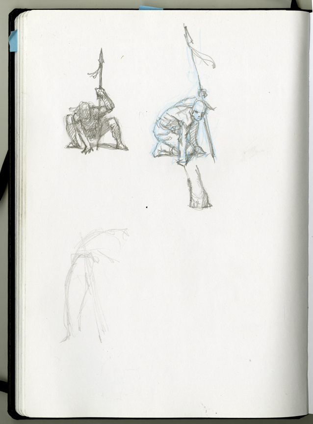
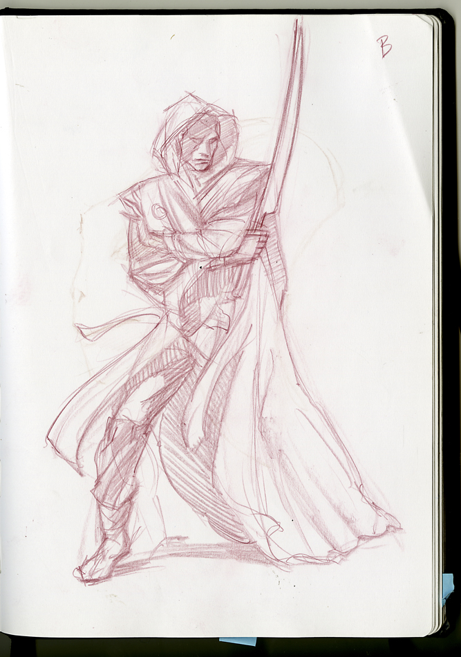
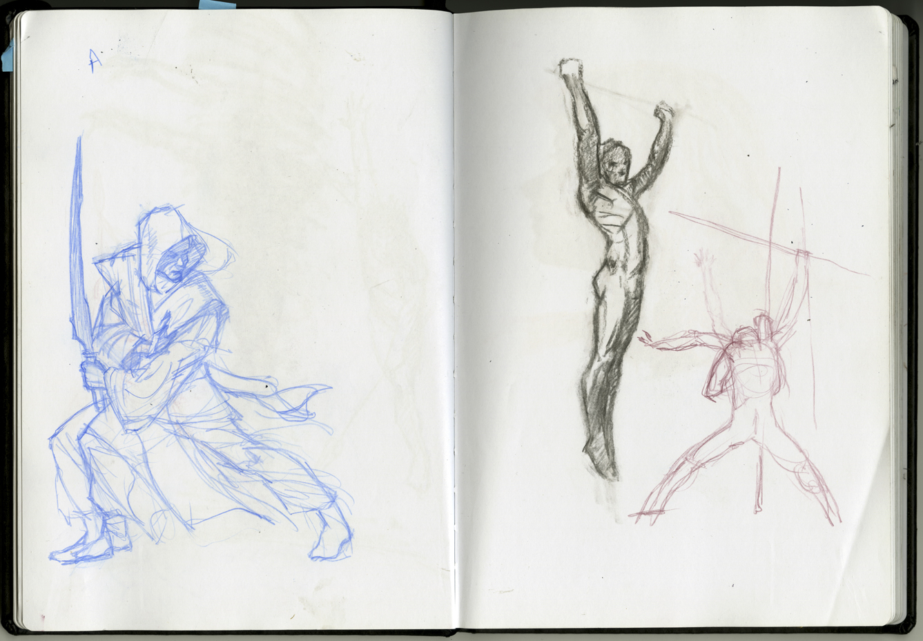
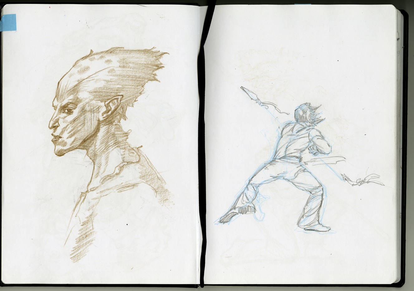
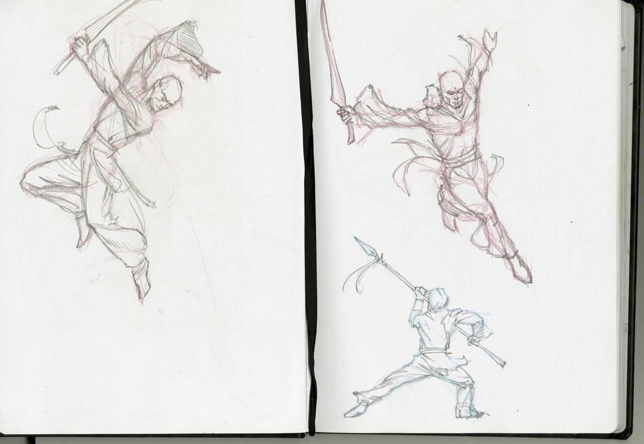
With such a bewildering array of opportunities before me I fell back on a formula that I’ve employed regularly through my career: set out to establish the value relationships of the image first and save the issue of color for the last step before beginning work on the actual painting. Once I get started, ideas start popping up in my head even while I’m doing something else; in such cases I’ll do a sketch on whatever is handy. Many of these quick loose sketches or “thumbnails” are done on sheets of old manuscript paper [from books I was commissioned to do in the pre-digital days]. One can tell I used that stuff because the lines of type on the reverse side almost always show through the image if I choose to scan it for something like a blog post. ;-)
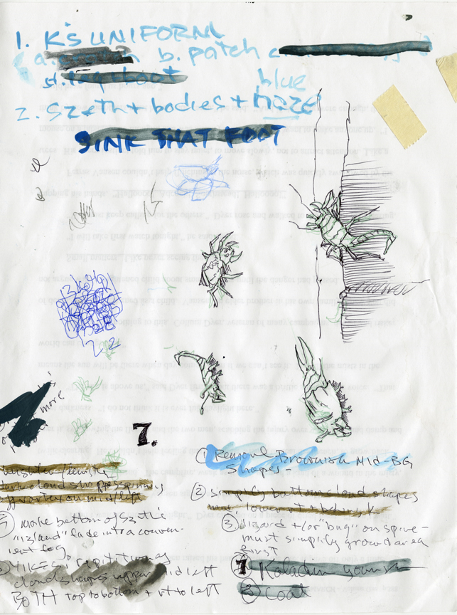
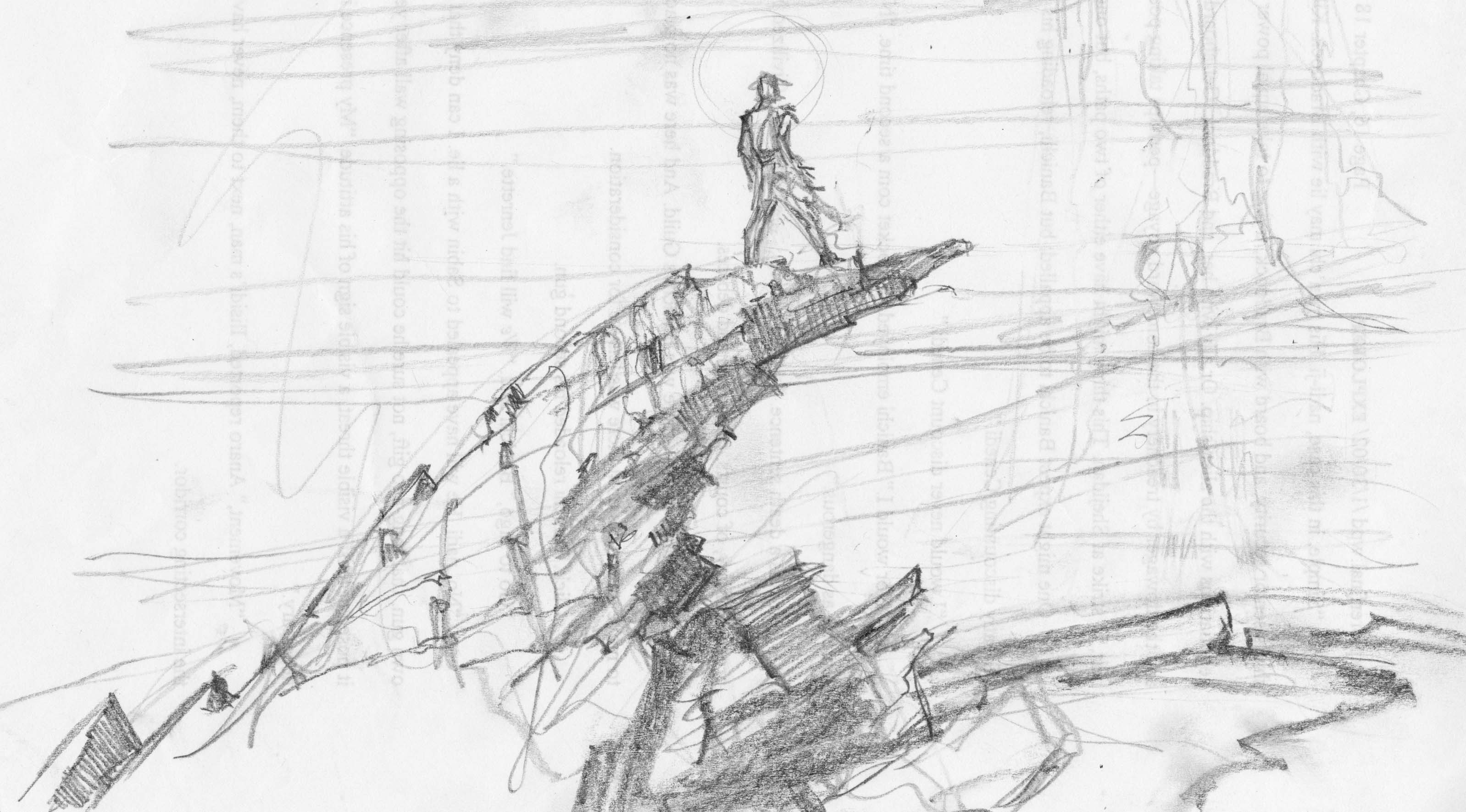
Most of my prelim sketches, however, were done in my studio—in sketchbooks…
…or painted directly on scraps of watercolor board.
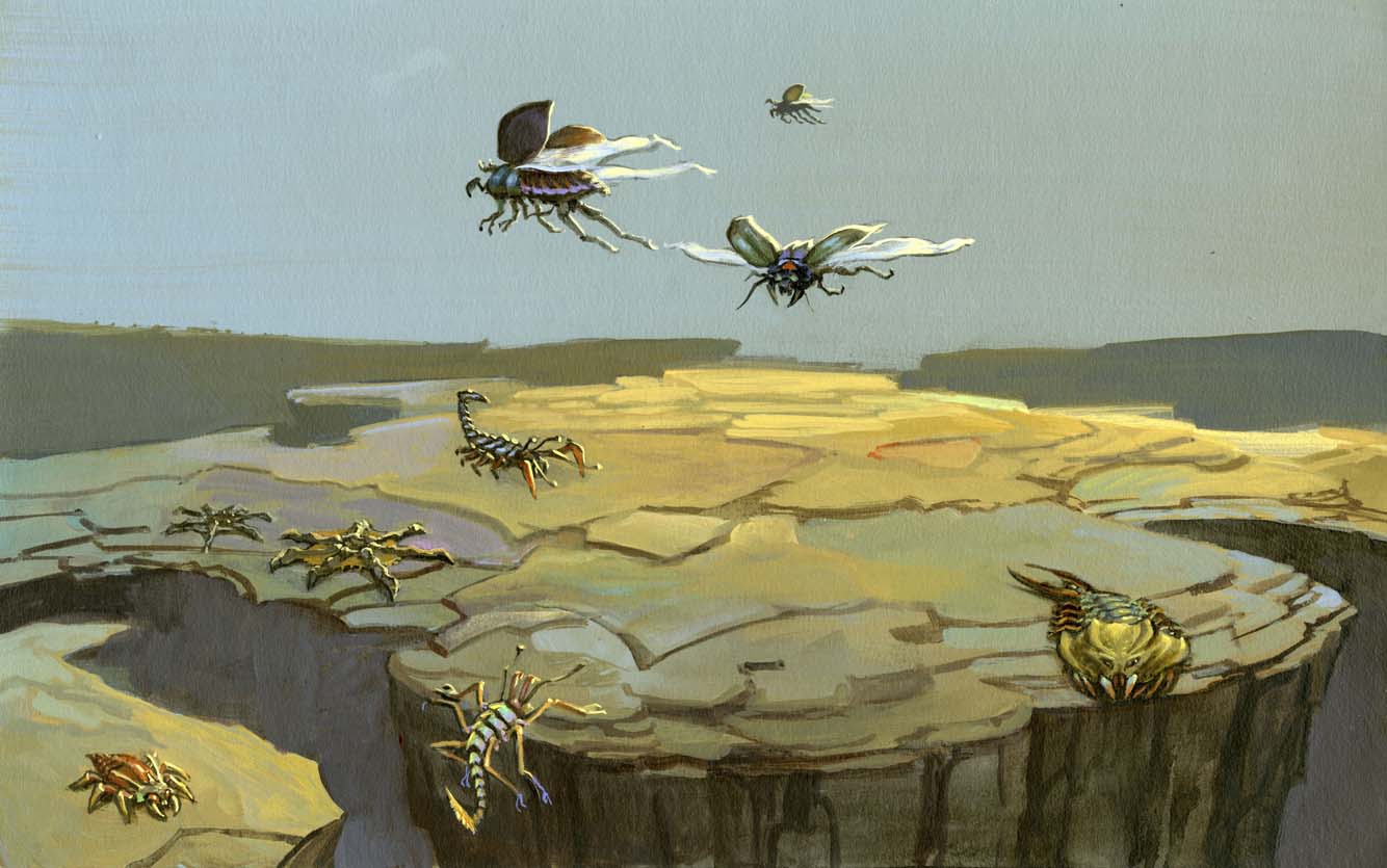
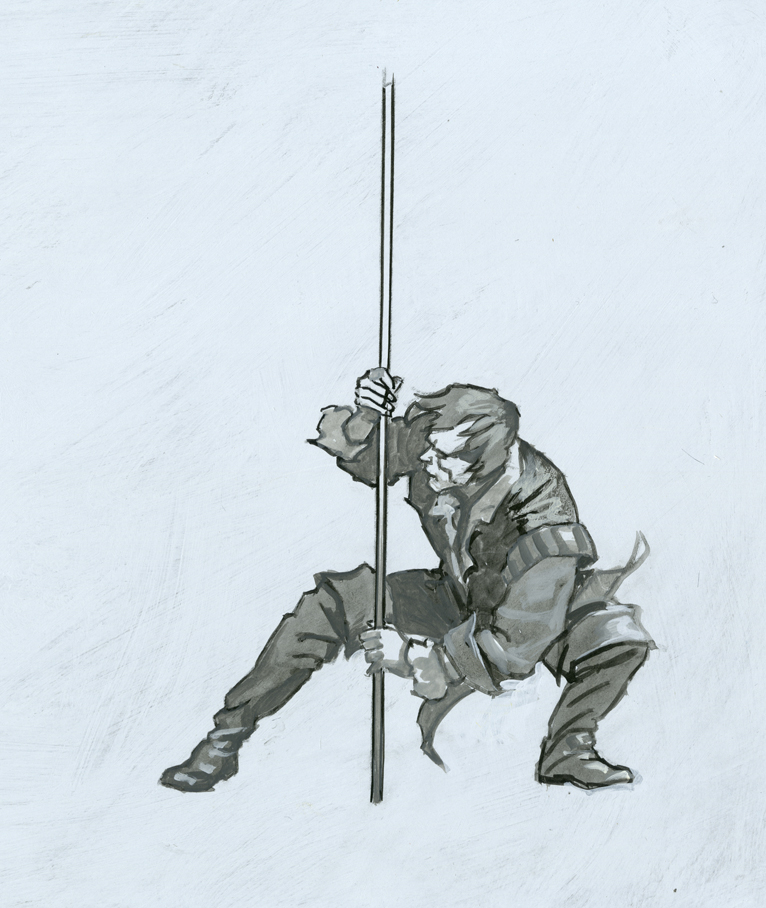
Unfortunately, I wasted some time drawing out some concepts that were based on a mistaken notion of who was where in the picture I was thinking of painting, and so I had to scrap those approaches. Nevertheless, it helped get me into the right mindset for taking things further.
Eventually, things started to gel for me. As I have done on my past several projects, I separated out the background from the foreground and worked on them independently, at least at the beginning. I’m not convinced it is a good way to go ordinarily, but for the Stormlight Archives books I think it’s called for, due to the key importance of the weather in these stories. it seemed appropriate to me to “build the storm first” and construct the scene within it, rather than the other way around.
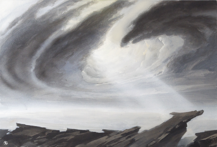
As I felt my way into Roshar territory I alternated between coming up with ideas for light effects/storm systems for the background and doing sketches exploring figure poses. My thought was that I could work both ends of the problem at the same time and after a while an intersecting idea would come to me in which all the elements worked together.
Riffling through my preliminary sketches, I scanned a bunch of the most likely candidates into the computer and tried assembling them via Photoshop. I came up with all sorts of variations, most of which were too crappy to show here. But Irene found one she liked well enough to give me the green light on, and after some discussion we went with this concept. She was kind enough to send me a provisional type layout which was extremely helpful in that it showed me where to alter the composition to make things fit in the open areas.
But before I could start I needed to 1) get a color scheme together and 2) give myself some reference photos to go by as I worked. The color scheme I did in my usual fashion—small and loose— painted on a scrap of canvas at roughly 3 x 5 inches.
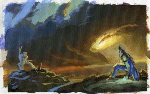
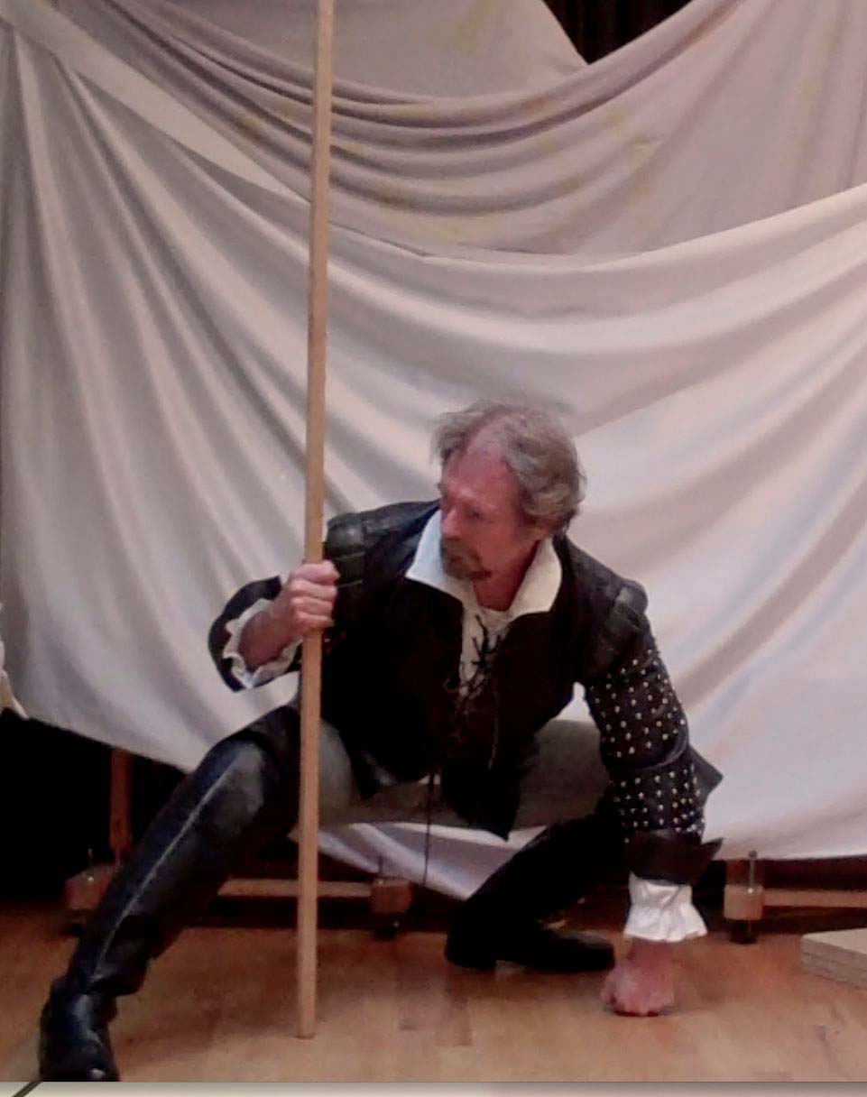
(As I got going on the painting, however, I lost confidence in the tiny color sketch and made a sloppy but larger version, which is visible in the studio photo below.) For the reference photos I posed myself in front of a Flip Video cam on a tripod in my studio. I took several screen snaps off the video and dumped them into my studio laptop. The resolution was low but good enough for my purposes. No one photo was quite right, but between the different shots running in an iPhoto slideshow, I had enough visual info to do the job.
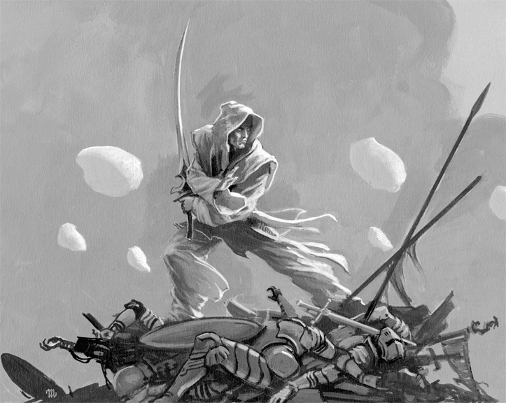
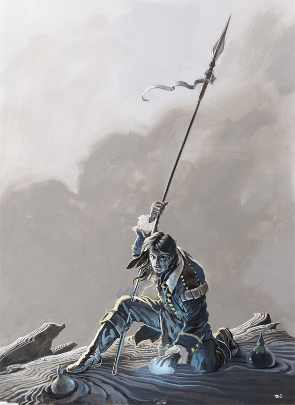
Just to be sure, however, I did a painted study of the two main figures to use as my “models” while I painted.
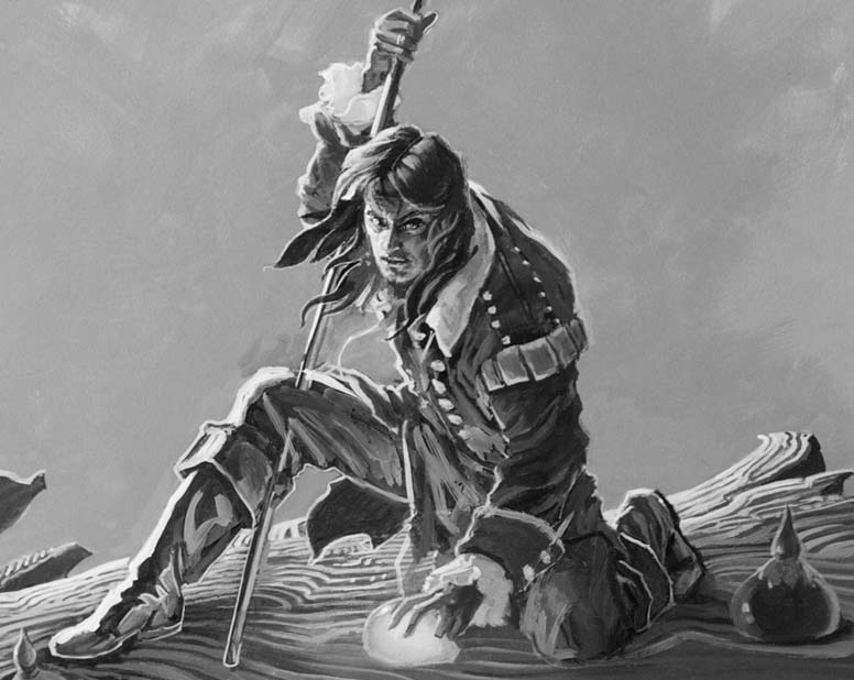
From that point it was just a matter of painting the painting. I used acrylics on a 24×36” Gessobord, going from background to foreground as per my usual practice. My laptop was next to me the whole time, running a slideshow of my reference photos and sketches.
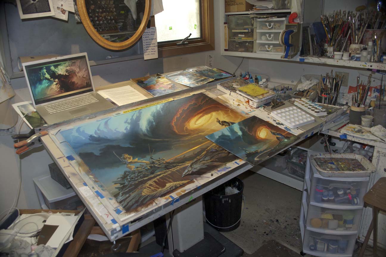
Unlike my painting for The Way of Kings, I went right into it without doing a pastel underdrawing of the cloud structure first. Later I wished that I had not skipped that step, because I changed my mind a few times about the look of the clouds and sky on the left half of the panel—meaning a lot of time spent in overpainting, which I could ill afford as I was already behind deadline. (My summer’s work has been deeply affected by a severe back injury at the beginning of June, which made it almost impossible for me to focus on what I had to do for weeks afterwards.) Fortunately, the folks at Tor granted me an amazing amount of slack as I worked my way through this process, and for that I am extremely grateful.
Thanks to Brandon Sanderson for writing such an inspiring book, and thanks to Tor for allowing me once again be part of what will surely be called the high water mark of fantasy in our time.
