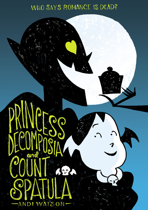
Tor.com is pleased to reveal the cover for Andi Watson’s graphic novel Princess Decomposia and Count Spatula, available February 2015 from First Second Books!
Colleen A.F. Venable, the Senior Designer for First Second, was kind enough to share her thoughts on the cover design process, including tons of early sketches and alternate designs from Andi.
What do you get when you mix giant walking eyeballs, decomposing soldiers, and toothless vampires together? The most adorable story of friendship, romance, and sweets the underworld has ever seen. Princess Decomposia and Count Spatula is a gothic tale in the spirit (pun only half intended) of the best of Austen’s novels.
I knew Andi would be wonderful to work with when it came to the cover just by looking at his art. He’s got such a great natural sense of composition and a knack for iconic appealing character designs. But when I got his first batch of thumbnails I was in awe. Often there’s one or maybe two thumbnails in a first batch that are promising, but on first try I received 34 thumbnails and I swear all of them could have become incredible final covers.
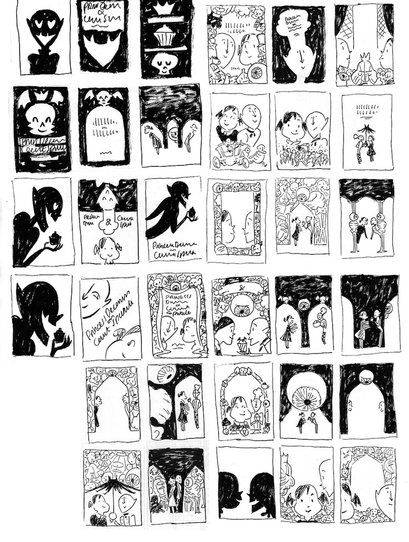
After a lot of staring and debating Calista Brill, the book’s editor, and I narrowed it down to our four favorites.
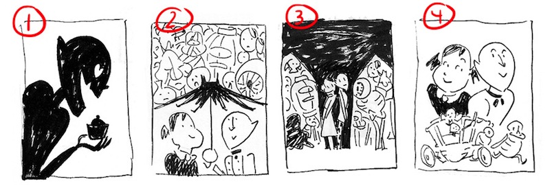
1. So striking and graphic, but it felt like it was missing something without the princess there, connecting with the count
2. This one was a fantastic showcase of all the characters, but didn’t leave much room for a title treatment, and made you wonder how strong that umbrella had to be to hold up all those people
3. Loved this one, but we thought it might be stronger if the characters are a bit sneakier spying on the Princess and Count’s budding relationship. Giant Eyeball! You really need to work on your stealth skills!
4. Such a sweet portrait, but it was too busy with the cart, and we didn’t want to give away the great chase scene at the end that it’s featured in (if you don’t like spoilers pretend I said nothing. Nothing! What cart? I don’t know what you are talking about.)
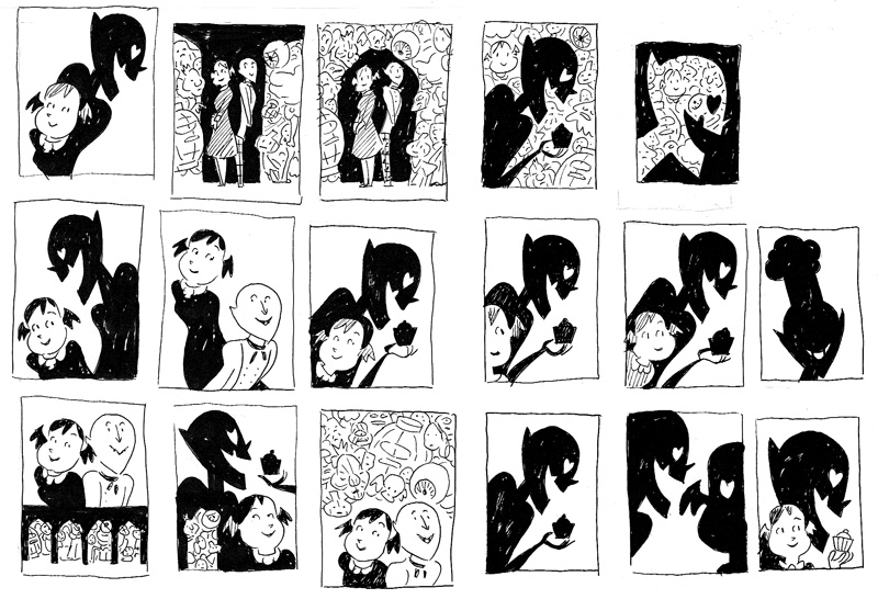
Andi sent another round of thumbnails. Again, it was hard to not love them all.
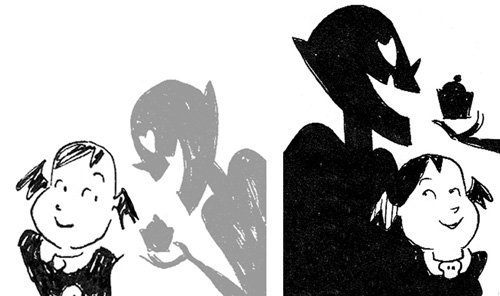
One of the tricky things with this cover was getting all of the aspects the book represented: humor, love, friendship, and the underworld. We also wanted to make sure it didn’t look too young because the Princess is a grown woman and the Count is… well I’m not sure how old… 800 years old, give or take 780. The image on the right felt a better connection between the two, did a great job of representing the tone of the tale, and it didn’t hurt that it that it was also graphically stunning.
We had our cover concept!
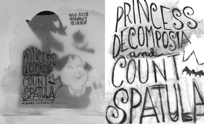
I wanted the text to feel organic with Andi’s art and to add to the great flow of his lines. Tissue paper is my BFF. I drew four or five versions and taped my favorites together to scan. I also included a tagline I wrote just for placement, which wound up making it to the final cover. “Who Says Romance Is Dead?”
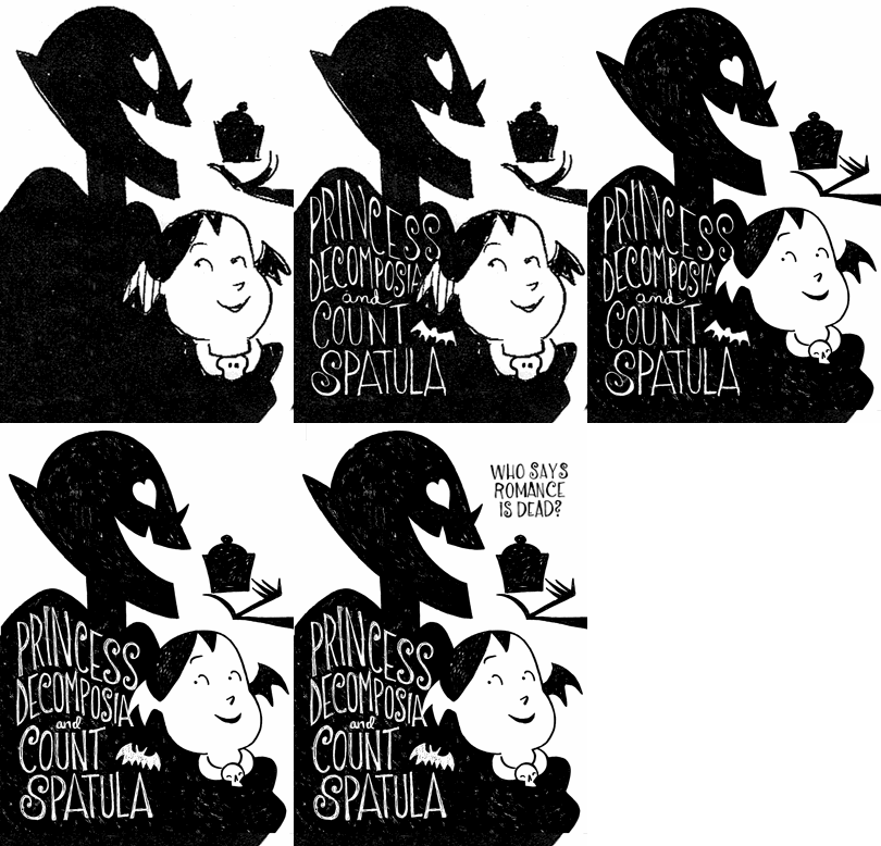
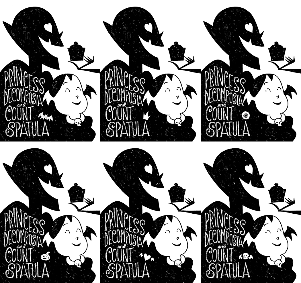
Time for refining! Andi and I worked together. I had him redrew my lettering so everything would be in his hand and we had fun design-geek-outs over tiny details like what should go into the negative space above the “A” in spatula. Animated gifs, do your work!
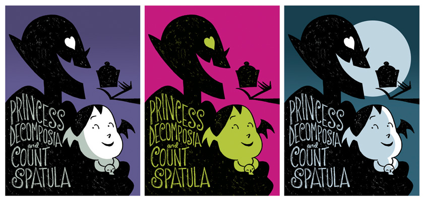
Andi sent a first round of color suggestions. I would buy all three of these books! Loved the green from the second image and the moody night feel of the third. Put the two together, add some texture to the moon and VOILA, you have a pretty incredible cover for an even more charming book.
