Welcome to the third installment of a series exploring the look and feel of fantasy maps. In this series, I argue for the existence of a default fantasy map style, tease out its key elements, and say something about where it came from and where it’s going.
“What Does a Fantasy Map Look Like?” is an attempt to separate a fantasy map’s design language—which is broadly understood but just as broadly ignored—from the territory it describes. I followed that up with “Fantasy Maps Don’t Belong in the Hands of Fantasy Characters,” which argues that because the default fantasy map style is aimed at a modern audience, it would be out of place inside a fantasy story set in a premodern society. Which turns out to have been a controversial thing to say (even if it is, you know, true).
This time I’d like to spend a few moments exploring the origins of the default fantasy map style. We’ve established that fantasy maps don’t much look like real-world maps of the premodern era—that they adopt, to use Stefan Ekman’s phrase yet again, a “pseudomedieval aesthetic”: the maps are modern in function and sensibility, but adopt design cues intended to signify old maps.
We know what this fantasy map style looks like. We’ve established some of its parameters. But where does it come from?
You could point to Tolkien’s map of Middle-earth as the Ur-map, the progenitor map from which the modern fantasy map design is descended, and you might not even be wrong. But Christopher Tolkien, who drew the first map for the first edition of The Lord of the Rings, would have been working within an existing tradition: he was not working in a vacuum, nor was the style of the map invented from whole cloth. What was that existing tradition?
This is a look at some possible influences on and origins of the fantasy map style. I can’t do more than suggest possibilities, because a definitive study of the origins of fantasy maps would be a task worthy of a doctoral dissertation, and I can’t go down that route (no! please! not again!). This is basically an educated guess, based on what I’ve picked up from having stared at, read about, and blogged about maps for more than 16 years.
The Sixteenth-Century Origins of Fantasy Maps
Maybe the fantasy map style came from a map like this:
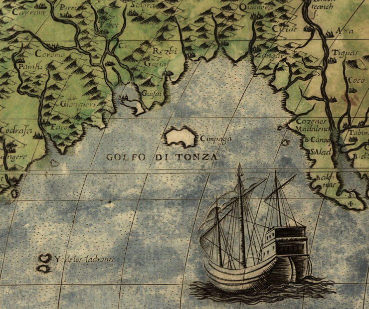
This map has several design elements in common with modern fantasy maps. In its original form it was in black and white (this example is hand-colored, as printed maps often were back then), with land left blank and seas shaded (here with stippling). There is a focus on physical landforms like mountain ranges. The hill signs are oblique, with shading on one side to give a three-dimensional effect. On the other hand, the map is engraved, not hand-drawn, and there is a graticule—a grid of lines showing latitude and longitude—which almost never shows up in fantasy maps.
Even so, the similarities between modern fantasy maps and this map are hard to ignore. But this map isn’t as old as the premodern period that is usually depicted in epic fantasy novels. Don’t get me wrong, this map is plenty old! It’s just that it dates from the 1560s—the early modern period, smack dab in the middle of the Renaissance—not medieval times.
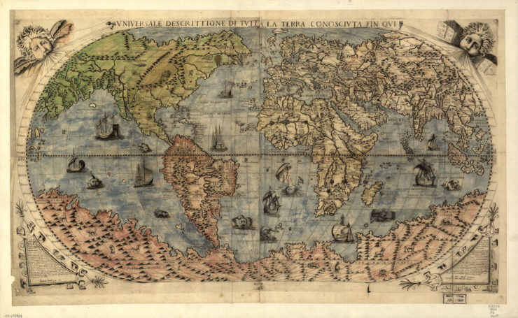
It’s one of Paolo Forlani’s maps of the world, the Universale descrittione di tutta la terra conosciuta fin qui. There are many different variations of this map in existence: Donato Bertelli based a world map on Forlani’s; Forlani based his on Giacomo Gastaldi’s. One version of Forlani’s map is the first known appearance of the name “Canada” on a world map: in other words, it is to Canada what Martin Waldseemüller’s 1507 Universalis Cosmographia is to America. (But I digress.)
You could make an argument that modern fantasy maps have a lot in common with engraved sixteenth-century maps like this one—hand-drawn homages of maps on copperplate, but with “pseudomedieval” flourishes, like labels using an italic or uncial script, to make them seem more ancient. And again, you might not even be wrong.
But that would skip over nearly four hundred years of art, illustration, and mapmaking that took place between Forlani’s time and the emergence of the modern fantasy map. It would also ignore the immediate antecedents of the fantasy map style. It would reduce the fantasy map to a pastiche of the past, when it’s a bit more complicated than that—there is a line between Forlani and the fantasy map, but it’s not a direct line, and there are many interesting stops along the way.
Forlani, like other sixteenth- and seventeenth-century European mapmakers you might have heard of—like Blaeu, Hondius, Magnus, Ortelius, Saxton, and yes, Mercator—operated a century or two before the rise of general, scientific mapping surveys: a century before the Cassini family completed their generations-long survey of France, and two centuries before the start of Britain’s Ordnance Survey. Both projects used triangulation to create maps of far greater accuracy than was possible before. (An online version of the Cassini map can be consulted here; for the early history of the Ordnance Survey, see Map of a Nation, Rachel Hewitt’s 2010 “biography” of the organization.)
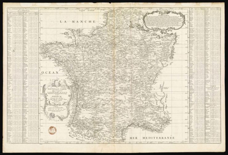
Comprehensive surveys like these were the forebears of the familiar paper maps of our era: quad maps, hiking maps, highway maps, nautical and aviation charts. They marked the dawn of mapmaking that was scientific and systematic, making use of standard surveying equipment that enabled the measuring of accurate distances, standard scales, standard projections, a standard list of symbols, and a standard design language that departed from the conventions of early modern mapmaking. The hill signs familiar to both fantasy maps and early modern cartography were replaced by relief shading and, eventually, by contour lines.
This was a departure from earlier mapmaking efforts, where maps were replete with flourishes and decorations: ornate cartouches, lavish illustrations of exotic peoples and animals in the corners, and, of course, sea monsters. In The Art of Illustrated Maps (HOW Books, 2015), John Roman argues that the split was between what he calls “cartographic” and “chorographic” maps: cartographic maps were technical and accurate, whereas chorographic maps were artistic and expressive, presenting things “as the mind sees it, not as it exists in mathematical terms” (p. 5). A Renaissance-era map, with rhumb lines and gridlines as well as sea monsters, could embody aspects of both traditions.
But that doesn’t mean that modern mapmaking abandoned the chorographic for the strictly cartographic. Maps that were artistic in nature persisted past the rise of scientific mapmaking and into the present day. With civil, military, and nautical navigation needs increasingly met by professional cartographers, a rich tradition of map illustrations—pictorial maps—flourished wherever a map was used for non-navigational purposes: to educate, to propagandize and persuade, to entertain, to sell things. Examples of this tradition can be found throughout the nineteenth and twentieth centuries, and present a colourful, whimsical mirror image of the no-nonsense maps produced by the Ordnance Survey or the U.S. Geological Survey.
The Pictorial Map Tradition
“Pictorial maps,” writes Stephen J. Hornsby in Picturing America: The Golden Age of Pictorial Maps (University of Chicago Press, 2017), “were quite different from these scientific maps. Unlike the federal agencies and publishing houses that produced relatively uniform maps, artists and cartographers created a great variety of pictorial output” (p. 3). In Picturing America (reviewed here), Hornsby examines the intense volume of pictorial maps produced by American map illustrators between the 1920s and 1960s, but the genre originated earlier than that, and persists to this day.
One of the most common examples of map illustrations in the nineteenth century, for example, was the bird’s-eye or panoramic map.
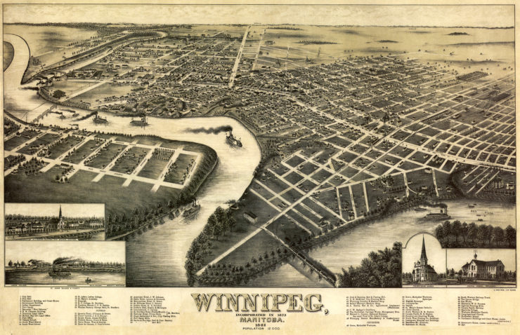
The practice of producing a panoramic view of a city goes back at least as far as Georg Braun and Franz Hogenberg’s Civitates Orbis Terrarum, which appeared in six volumes between 1572 and 1617. But in nineteenth-century Canada and the United States, panoramic maps proliferated, especially, as John R. Hébert and Patrick E. Dempsey write, after the Civil War:
Victorian America’s panoramic maps differ dramatically from the Renaissance city perspectives. The post-Civil War town views are more accurate and are drawn from a higher oblique angle. Small towns as well as major urban centers were portrayed. Panoramic mapping of urban centers was unique to North America in this era. Most panoramic maps were published independently, not as plates in an atlas or in a descriptive geographical book. Preparation and sale of nineteenth-century panoramas were motivated by civic pride and the desire of the city fathers to encourage commercial growth. Many views were prepared for and endorsed by chambers of commerce and other civic organizations and were used as advertisements of a city’s commercial and residential potential.
Bird’s-eye views were everywhere during that period: the Library of Congress has a collection of more than 1,500 bird’s-eye maps; the Amon Carter Museum in Fort Worth has a website dedicated to panoramic views of Texas cities. (But again, I digress.)
Bird’s-eye maps exemplify two things about map illustrations in general. One, map illustrations were by and large a commercial art. The vast bulk of them were produced for advertising and promotional purposes. For bird’s-eye maps, the product was, as Hébert and Dempsey point out, the town or city itself.
And two, they made use of linear perspective, which John Roman says is a hallmark of map illustrations, and crucial to their development as a distinct genre. Without linear perspective, Roman writes, “art would have remained abstract and objective, and illustrated maps would lack the three-dimensional effect that makes such imagery so visually captivating. [ . . . ] Perspective had no effect at all on flat-map cartography, but for the field of illustrated maps, its impact was major” (p. 38).
While the use of perspective is pervasive in map illustrations, we see it most used in promotional maps of cities—the modern-day inheritors of bird’s-eye maps: see, for example, the Melbourne Map—and in paintings of mountain ranges and ski resorts, which are a subgenre unto themselves.
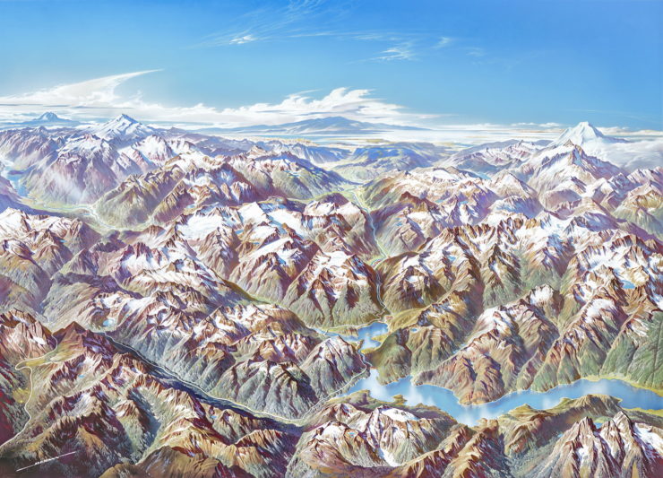
Take, for example, the work of Heinrich C. Berann. He not only collaborated with Marie Tharp and Bruce Heezen to create iconic relief maps of the ocean floor, he also produced panoramic paintings of mountain ranges for National Geographic and, later in his career, for the National Park Service. More recently, James Niehues has painted hundreds of panoramic maps of a very specific subject: ski resorts and recreational areas: if you’ve seen a panorama map of your local ski resort, chances are Niehues was the one who painted it.
Both Berann and Niehues make use of perspective, and they both depict mountain ranges. If their work looks a little bit like a fantasy map to you, you’re not wrong, and you’re not alone: someone once brought a mountain panorama to my attention as a fantasy-style map. The similarity stems from the fact that fantasy maps and mountain panoramas are subsets of the same pictorial map tradition: both feature mountains (three-quarter of the fantasy maps in Ekman’s sample had mountains in them) and both offer an oblique view of their subject.
Most fantasy maps don’t use linear perspective per se—there’s generally no vanishing point, nor a horizon—but they share that oblique view with map illustrations like bird’s-eye maps and mountain panoramas. What’s key in all cases is the feeling of height: the sense of flying over the landscape. As Ricardo Padrón observes in “Mapping Imaginary Worlds,” his chapter in Maps: Finding Our Place in the World (2007), “[t]he places drawn in profile do not allow us to remain aloft, looking down on Middle Earth from that imaginary point of view way on high that maps usually assign to us. They pull us down to earth (to Middle Earth, that is), inviting us to consider the landscape from the perspective of someone traveling through it” (pp. 273-274). Remember, too, the scenes in Peter Jackson’s Lord of the Rings movies where the camera soars not over the terrain of Middle-earth, but the map.
That view from a height makes the imaginary world come alive, but it also makes the map indistinguishable from the territory. As I’ve said before, we tend to treat them as if they’re one and the same.
Buy the Book

Come Tumbling Down
Children’s Book Illustrations
But pictorial maps aren’t the only tradition to influence the modern fantasy map. There’s another we need to consider: children’s book illustrations, which when you think of it are a form of commercial art themselves.
However much modern fantasy is seen as an adult(ish) genre today, its roots in children’s literature cannot be denied. I’ve noted before that Tolkien is a bridge between children’s books and modern fantasy, his work blending the childlike with the epic. (Adam Gopnik called Tolkien’s work “[an] arranged marriage between the Elder Edda and The Wind in the Willows—big Icelandic romance and small-scale, cozy English children’s book.”) And remember, The Lord of the Rings was the sequel to The Hobbit, a children’s book—the implications of that fact are, I think, often overlooked.
Whatever role The Lord of the Rings has played as the inspiration for modern fantasy mapmaking, the reason it had maps is more prosaic and mundane: it had maps because The Hobbit had maps. And The Hobbit had maps—and other illustrations—because it was a children’s book: maps and illustrations had been accompanying children’s books and adventure stories since the 19th century.
Hugh Brogan, in an essay included in Katharine Harmon’s first collection of map art, You Are Here: Personal Geographies and Other Maps of the Imagination (Princeton Architectural Press, 2004), refers to a “well-established”—but relatively recent—tradition of providing maps in children’s books.
The device of a map to excite and assist readers’ fancy seems obvious enough nowadays, but it is a comparatively recent invention. Robinson Crusoe [ . . . ] was sent into the world without a map. It was not until the late nineteenth century that techinques of reproduction grew sufficiently cheap and various to make the great Victorian age of illustration possible, and maps are, after all, only a form of illustration. (p. 150)
We’re familiar with many examples, from Narnia to Neverland, from Treasure Island to the Hundred Acre Wood, from The Wind in the Willows to Swallows and Amazons, and with the illustrators who brought them to life, such as Pauline Baynes, who illustrated the Narnia books and some of Tolkien’s, and E. H. Shepard, who illustrated The Wind in the Willows and Winnie-the-Pooh.

Indeed, Faerie was very much in the air in the early to mid-twentieth century: not just between book covers, but as standalone pictorial maps. In 1917 Bernard Sleigh produced An Anciente Mappe of Fairyland: Newly Discovered and Set Forth, a Narnia-like amalgamation of classical myths, medieval legends and folk tales, and nursery rhymes, all brought together on a five-foot wide print meant to be hung in nurseries. Though much more vibrantly coloured and detailed than any endpaper map could ever be, Sleigh’s map is very much in the same tradition, and breathes the same oxygen, as children’s book illustrations and fantasy maps, with which it shares many design elements.
In contrast, though Jules Verne’s novels were also illustrated, and accompanied by maps, the maps accompanying Jules Verne’s novels adopted the style of the scientific maps of their era: they were neither chorographic nor pictorial. But then Verne wasn’t writing fantasy, nor was he creating a mythic and imagined past. His characters were exploring real places, or places that could have been real: to adopt map illustration techniques would have gone against the mimetic, scientific aesthetic Verne was trying to achieve.
Fantasy Maps: Anachronistic, But Not in the Way You Think
But Verne’s work still had this much in common with Neverland and Narnia: they were adventure stories set in places that needed maps and illustrations. And in the late 19th and early-to-mid-20th centuries, those maps and illustrations were, generally speaking, provided.
This is no longer true, except in rare cases (even rarer in fiction for adults) where the illustrations are included as a deliberate call-back to an earlier style, such as Marie Brennan’s Memoirs of Lady Trent series. Generally speaking, outside of comics and graphic novels, illustrations are not a feature of fiction, genre or otherwise, for adults or otherwise.
Except for the exception, that is: maps. Maps are not the sole province of fantasy novels: they appear in science fiction, in historical fiction, and certainly in works of nonfiction where needed. But the association between fantasy and maps, born from fantasy’s origins in modern children’s stories, makes fantasy maps the most prominent survivor of the tradition.
Map illustrations have also fallen by the wayside. “The pictorial map genre began to wane in the postwar period,” Hornsby writes, “a victim of the increasing use of photography in advertising and the retirement of interwar generation mapmakers” (p. 243). What used to be done with a pictorial map is now done with photography and infographics: with software-generated cartograms, choropleth maps and satellite imagery. Map illustrators do still exist, but they tend to work in very specific niches, like ski resort maps and Where’s Waldo?
And then there are fantasy maps: a very specific niche of map illustration that uses a fraction of the toolkit available to its pictorial map predecessors, but has become, thanks to the ridiculous popularity of movie and television adaptations of epic fantasy series, the most prominent and best-known heir to the pictorial map tradition.
So fantasy maps are anachronistic, but not for the reasons you might think. Not because they adopt a faux-medieval aesthetic, not because they’re emulating old maps, but because they’re almost living fossils: among the last remnants of two distinct, and not quite extinct, artistic traditions that were commonplace a century ago.
They’re a relic of a particular moment in time: the early to mid-twentieth century. Not the sixteenth.
Jonathan Crowe blogs about maps at The Map Room. His nonfiction has appeared in AE, The New York Review of Science Fiction, the Ottawa Citizen and here at Tor.com. His sf fanzine, Ecdysis, was a two-time Aurora Award finalist. He lives in Shawville, Quebec, with his wife, their three cats, and an uncomfortable number of snakes. He’s on Twitter at @mcwetboy.


