As we continue our journey through the alphabet some of you may have noticed a slight itching in the back of your eyes. Maybe you’ve felt hunger pains, not in your belly, but at the midpoint of your head. That’s where your visual cortex is found and that hunger signals the beginning stages of art addiction. Other symptoms include a compulsive need to discover all the names of teachers and friends of a particular well-known artist, exploding bookcases due to the weight of too many art books, and a deep knowledge of auction houses and their scheduled public viewings. Lastly, hives.
Don’t worry, the addiction is relatively benign and plenty of support groups exist. Just remember, it’s a scavenger hunt which has no list and never ends.
Note: Click on images to see them larger and in much higher quality.
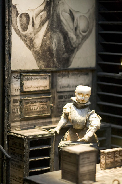
Brothers Quay
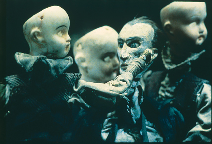
Twitching characters, assembled from a motley of doll parts and defunct machinery, glide across stages that might have been found in a Baroque junk yard. The weird and wonderful world of twin brothers, Stephen and Timothy, spouts from a love of Eastern Europe and all things decaying. Their stop-motion films are truly like witnessing a dream.
![]()
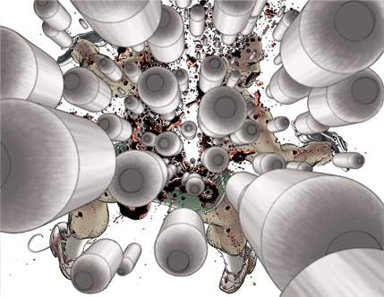
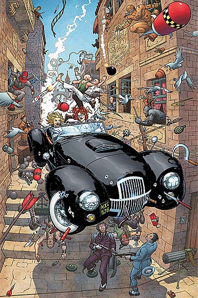
Frank Quitely
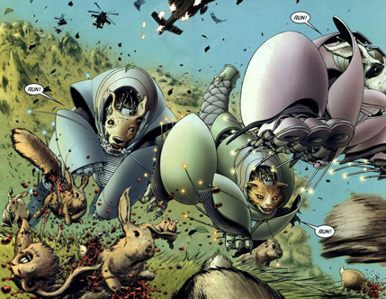
European comic sensibilities blend with Manga-esque action, in the work of Frank Quitely. One of mainstream comic’s most critically acclaimed artists, he’s made an indelible mark on the superhero genre, especially in relation to storytelling and panel layout.
![]()
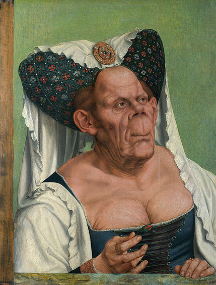
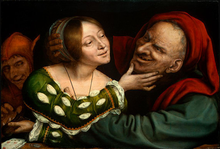
Quentin Matsys
A 15th century Flemish artist who was one of the most prominent painters of Antwerp. His work has the precise rendering of Van Eyck, but with a sometimes playful focus on characterization and expression. His later works became vehicles for his love of the grotesque, especially in contrast to the beautiful.
![]()
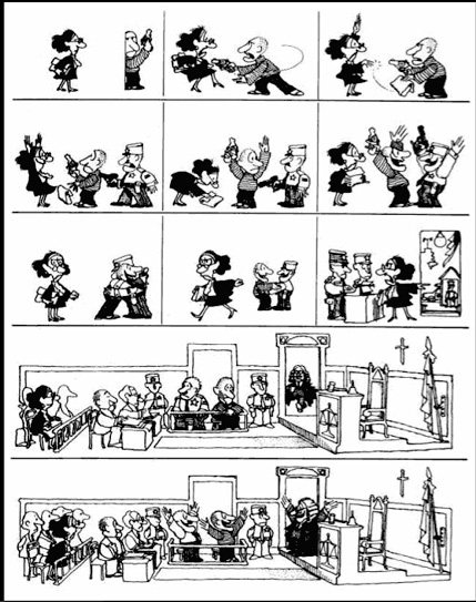
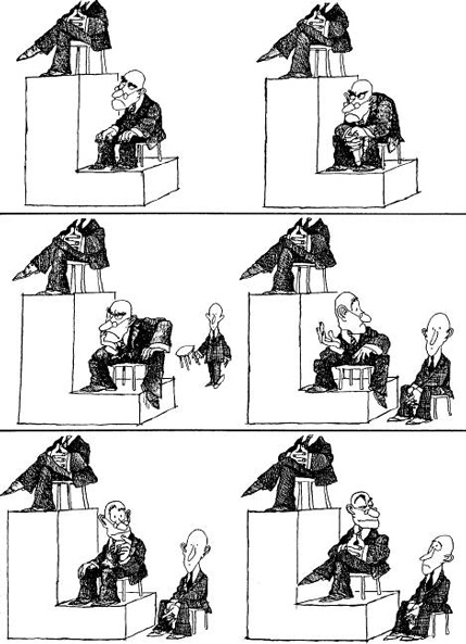
Quino
Quino is the pen name of Argentine cartoonist Joaquin Salvador Lavado. He is the creator of a very popular comic strip called Mafalda as well as a series of political and editorial cartoons. His work is famous for its scathing wit and brilliant observations of social and political follies.
C O L O P H O N
The display face Bordeaux by British type designer David Quay (1987) combines the stark contrast of Romantic-era type with the super-condensed quirkyness of nineteenth-century advertising faces. (Shown: Bordeaux Bold and Bordeaux Script.)
We are Kurt Huggins and Zelda Devon. We live in a pocket-sized apartment in Brooklyn where we collect neat, weird things. Our home is abundant with books, old furniture, mismatching tea cups, and a cat named Cipher. We both illustrate stuff for money so we can continue to invent stories, buy shoelaces, watch puppet shows, and eat sandwiches.





That first Quino cartoon had me in stitches!
A big YES for The Brothers Quay!