

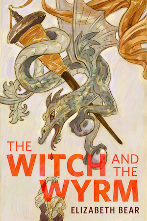


It’s a challenge to distill an entire trilogy, especially one as good as Mistborn, into a single picture. No idea seems to do the content justice, and every sketch can feel like a compromise. I can recall reading the novels and thinking naively how easy it was going to be to come up with a cover. Sanderson, after all, seems to write like a picture maker, with description and language that suggests more than a casual familiarity with the visual arts. He even writes from an artist’s point of view, quite convincingly I might add, in his recent novel The Way of Kings. To a pictorially oriented person like myself, the effect is palpable, each chapter begs to be illustrated. And in Mistborn everything, both alien and ordinary, is brought to life effortlessly, the fantastic envisioned with the precision and clarity of the familiar and the mundane made wonderful as if seen for the first time.
I suppose that’s an essential component to fantasy art as well. My favorite genre artists have always been able to imbue the imaginary with a truth and honesty that seems to defy a subject’s fictional origins. The process often involves visually manipulating or recombining things we can observe in real life so that our creations appear convincing¹. Grounded in actual anatomy, texture, or light, the imaginary can be rendered believable, even real. Although the camera and lens may convey most accurately the illusion of truth when depicting the physical world, it’s only writers and artists who are able to bring form to the fantastic.
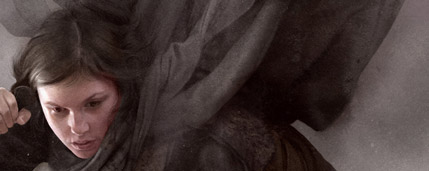
Which brings me back to Mistborn, and the unique world Sanderson has so excellently crafted. It’s a strange setting, with a few fantasy tropes included, but turned completely on their head. This refreshing inversion of some of the genre’s most cherished traditions is by no means limited to the world building alone, with a narrative arc and cast truly worthy of their unique setting. It’s these characters that make the story come alive, and none more so than Vin, the young female protagonist that exists at the center of all three novels. She’s our entry point into the world and the unusual system of magic that defines so many important aspects of the story. Powerful and determined, Vin is a wonderful hero, with a dangerous side that makes her all the more compelling to visualize on a cover. Her facility at committing violence and subsequent struggle to understand her role in an ever more complicated world is what really grabbed me about her. As an illustrator that’s often what I look for, a character or situation with some interesting tension, a conflict I can wrap my head around solidly while concepting.
At one point she is named “beautiful destroyer,” and I think in many ways that is exactly what I was trying to convey when I painted her. I rolled that phrase around in my head a lot while working on this. Although I’ll never be able to make one picture capable of encompassing everything I love about this series, I’m pleased that I was given the opportunity to express a mood and atmosphere that does my vision of the story justice.
In the end I like our simple solution, Vin suspended weightless, rising above the mist.

The Mistborn Trilogy will be available as an ebook on February 1st.
¹If you’re an artist interested in depicting things that don’t exist, do yourself a favor and check out Imaginative Realism, by James Gurney.
Sam Weber is a science fiction/fantasy illustrator based in New York City. Check out his gallery here on Tor.com.
Excellent work. Matches what I see when I read her.
Absolutely brilliant painting, just brilliant.
Wanted to make sure that was clear before I say that the typography just doesn’t look right to me, it seems to intrude on the great art, rather than compliment it.
Wannabe book designer’s rant over.
Wolfbrother Out!
Same here! That is spooky spooky close to how I imagined Vin when I first read the trilogy.
Awesome Cover! Love this, with the type and all.
Great article, great cover. I quite enjoy getting to see new covers for great books in ebook editions.
Great series. When i heard Sanderson was going to be finishing the Wheel of Time series i went and bought the first book in this one to get a feel for what to expect. It has an interesting and well-developed setting, unique and interesting characters who actually grow over the course of the series, intriguing and logically consistent magic, and knock-your-socks-off WOW action.
I’d love to see either an animated or live action (with good special-effects) version of any of his fight scenes. Think about the first time you saw the fights in “The Matrix” – that’s how i felt reading the ones in Mistborn.
P.S. With Sanderson at the helm, WoT has been reinvigorated. He saved it not only from disappearing, but from its own stagnation.
Beautiful picture. Absolutely what I see when I picture Vin.
Would like to see a bit more emphasis on the mists, though. The images that I’ve seen of mist and fog in book covers and fan art, never seem to grasp the qualities described in the books. It would be almost impossible to do Sanderson’s descriptions justice. I always picture something a bit more “solid” and concealing than real mist. I fear this is likely only possible in CGI, but I keep looking and hoping for something that captures this without making it seem too symbolic.
yes, this IS Vin!
amazing image!!!!
looks good!
Very, very nice. I particularly like the mistcloak. I had a hard time picturing that when I read the books. I think this gets it right.
Nice art, though one wonders why Macmillan is even bothering to do this – most of the time when an omnibus edition gets released it’s purpose is to stir up new sales by offering a new edition at a reduced price – in this case the Macmillan-forced price for the trilogy is actually higher than the price for the three books individually.
I really feel sorry for authors who are stuck with such a crappy publisher. I mean, Sanderson is obviously doing ok with his humongous sales – but the struggling midlist guys are going to be strangled by idiocy like this.
Love everything about it except her face. It’s well done, but it clashes with the image I had of her in my head.
Much much nicer than the original edition. I like the youngish face of Vin very much because it fits with the book, she is supposed to be a young teenager when the story starts! Congrats!!!
Amazing work. Captures Vin perfectly. The technique on the lighting is so good, I initially assumed I was looking at a photograph, with mist shopped in in the background. Well done!
One question; what’s with the tentacle-thingies rising out of the mist? It works, stylistically, contrasted against the tendrils of mist and the mistcloak. But I don’t remember Vin ever having to fight tentacle-things in the trilogy. Artistic license, or am I forgetting something? Ruin, maybe?
love it!
I was thinking of buying this so my husband could read it on his Kindle. It cost $10 more than the paperback box set, which we already own. I don’t get it. Guess my husband will have to read the paperbacks. Oh well.
I really hope she dosen’t catch a cold… with all this mist-humidity and barefooting. Let’s not talk about landing from where the hell she falls… again without anything on her feet
Good work depicting the character. Enough work on clothing and details of it, but…
Don’t like it, sorry.
awesome! looks great!
Very nice!
@mlinden: I think there is another mistborn below her in the fog, and that is his cloak.
AMAZING, only complaint is the daggers. How in the heck could you get obsidian to look like that?
Nice work Sam! ACAD representin’!
Very good work, just as I imagine Vin! I really love the cloak, I think this is dead on!

The only thing I imagine in another way are the knives. In the books they always talk about obsidian or glass knives, and I always imagined these to be formed more like a spearhead, the hilt wrappen in leather.
Google Picture Search offered me this:
Still, really great picture, captures the beautiful destroyer theme really well!!
Great cover, Sam! Just as I imagined Vin.
Bzzz™.
Beautiful, dynamic lighting and pose. Authors are always lucky to have a cover like this grace their books, and publishers, to boost their sales.
~Duncan
======================
Professional magazine and book illustrator for HarperCollins, PS Publishing, Pocket Books, ILEX, Fort Ross, Ballistic Publishing, Asimov’s Science Fiction, Moonstone Books, ISFiC Press, and many other publishers and self-publishing authors. See my illustrations at: http://DuncanLong.com/art.html
i really like it, but I like the knives in the first cover better
No matter how many times it’s mentioned that Vin is brunette, I can’t stop my mental image of her from being blond. Weird.
Great cover. That really helps show what the mistcloak is supposed to look like.
Gorgeous, gorgeous cover. Excellent work!
This is one of the best book covers I’ve ever seen. I always appreciate it when a cover shows characters actually doing something, rather than just “posing for the camera.”
This cover is actually good enough to even be used as a poster, in my opinion.
Really great picture, although my first thought was ‘her knives are metal!’ I had always pictured the glass knives as being knapped (like stone arrowheads), but I suppose they could be ground, which would make them look like metal knives. Grinding glass takes a long time, but the glass knives were special ordered and expensive in the books, so I’d accept that they were ground.
I really like this picture, it’s too bad its only the cover of the e-books, it would be nice to have a more solid copy.
I think her face needs to be more feminine and I see her as slightly skinnier, but I love the cloak (:
I really like this cover. Good job! It totally captures the feel of the trilogy
Amazing illustration. I love the detailing on her shirt and sleeves.