


Words of Radiance draws ever nearer! The continuation of Brandon Sanderson’s Stormlight Archive will be here on March 4th, but since we can hardly wait, we’re giving out more preview material. To hold you over while you wait for the release, here’s some interior art from the book.
Enjoy!
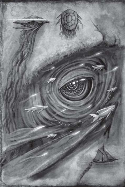
In the first chapter, which you can read here, Shallan dived off the Wind’s Pleasure, the ship carrying her and Jasnah from Kharbranth toward the Shattered Plains, in order to try to get a sketch of the poorly-documented creature called the Santhid. Here is her illustration, in stunning detail.
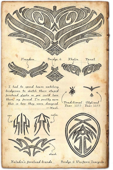
In modern Roshar, slaves are designated by brands on their foreheads. Since Dalinar freed the bridgemen at the end of The Way of Kings, many of whom had been branded slaves, it was necessary to tattoo over their brands to indicate their freedom. This process was documented by a mysterious onlooker called “Nazh.”
Carl Engle-Laird is the editorial assistant for Tor.com, where he acquires and edits original fiction. You can follow him on Twitter here.
First: Wonderful art, both of them.
Second: I’m a little dubious of Kholin & Tanat looking that similar.
The overall lines create a beautiful pattern. Yet they work too neatly at being symmetrical.
Feels more like a great design was created, then the meanings were assigned. In a world where we have seen very few birds, why would freedom look so much like wings?
Digging the glyphs!
Does anyone know where i can buy the US version? (i live in england and have Way of Kings hardback and would rather buy the US version to match it instead of the UK version)
@3 – You may be able to do it through Amazon. I personally have two amazon accounts. My normal US account, and then a UK amazon account with a fake UK address (shame on me). Certain books (such as Malazan) came out in UK months before the US and I had to have them. So I would use my UK account to buy it.
So, you may be able to make a US Amazon account and have it shipped to UK? Not exactly sure, but it’s something to look into.
Or calling a US book store. They may be willing to ship it to you, provided you pay for the shipping.
I emailed Brandon a few months ago to get a picture of Kaladin’s forehead brands. This is perfect. I love the differences between the glyphs in the tatoo and the insignia. Did Isaac design all of the glyphs, or were they schetched out by Brandon?
Oh and the art is awesome. I had always imagined the slave brands as ugly chicken scratch. But seeing them in this tribal style makes me think that they wouldn’t look so bad afterall.
@6
those arent the slave brands.
those glyphs are the forehead tattoos bridge four made to hide their brands. you can read about it in the preview chapters
@7 – If you look at the very bottom left corner, there is a piece labeled “Kaladin’s forehead brands”. Since his tattoo bled back out of his skin, I imagine that the image of his forhead brand is not the tattoo, but rather his slave brand.
The santhid sketch is beautiful. Note the detail in the “eyebrows” and lower “eyelash” things…every pixel of that entire sketch is greatness.
@8
ah sorry youre right :)
i just looks at the upper part
Braid_Tug@1, they’re not symmetrical, only nearly so. The glyphs have a phonetic component that careful Rosharan glyph-readers will pick out, and then they can be stylized in many different ways. It reminds me a bit of Mayan writing, which is phonetic but hugely stylized.
Are all three brands distinct on Kaladin’s forehead, or do they overlap? If distinct, how do they fit?
The brands are distinct, and they appear in the arrangement that they’re drawn here.
*hearts*
I must be getting the scale wrong.
Is terrible to think that the branding irons would have to pretty finely crafted? Though I guess they could let the brands be kinda messy and figure people will get the general idea.
@@@@@11, Thanks again Peter for the information!
Any chance we will be getting a full “alphabet” of the glyphs?
Beyond what is posted on the Coppermind, that is.
Guessing then, these are the stylized form of Kholin & Tanat, which helps in the balanced appearance of them.
@@@@@ 14, have to agree with you. I mentally saw Kaladin’s “Dangerous / Shash” brand as a strike marker across the other brands. Not a full thing. Guess it’s placed just over his nose bridge.
@@@@@#6
@@@@@#7
Kaladin’s brands do include the slave mark..remember his stormlight abilities interefered with the tatto ink staying on his forehead.
I don’t have a reading copy of the book only audio so I’m not positive which is which.
sas nahn…Slave
shash…Dangerous
@@@@@#1 RAFO LOL!!
wow great stuff. this is why I ended up preordering the physical copy of the book rahter than going with the kindle version… I have never been happy with the artwork on my kindle (too small).
Beautiful images. (ever since Tor gave us the chapter with the santhid, I thought it would be a wonderful opportunity to also give us the picture Shallan would be drawing.)
And I really like the way “Team Brandon” chose to present all it’s images – as part of the history, here with a character, who “had to watch” the stupid sketching. – He could be a spy, so I wonder if he will ever enter the story “in person”.
Very nice. This is the reason I have to buy these books in both Kindle format and hardcover. Sigh…
@3, I was in the same position as you.
Using your amazon UK account, login in to amazon DE, then order of there as usual.
Speculation time:
In the text (chapter 2) Kaladin explains about the glyphs: “The smaller ones above,” Kaladin said, “say the date you were freed and the one who freed you.”
This would mean that the Bridgemen were freed on Tanat = 9th month of the year.
I believe this is the very fist direct hint at the acutal date and it fits quite well with the other hints:
Navani’s notes are written on Jeseses = 1174/1/1 and I suppose she would write those sometimes around the 62 days from “now”. Which fits quite well, with the 50 days per month!
Beautiful illustrations, as always. I never cease to be impressed by the attention to detail that Brandon and team put into his works. I’ve never seen so many illustrations actually inside epic fantasy books before, and I absolutely love how all the interior artwork has rational in-world explanations for being there (e.g. Shallan’s sketches are what she’s actually seeing during the story and sketching).
Nazh…is this the same Nazh from the map in the front of Alloy of Law?
I might have to get a bridge four tattoo.
NOT on my forehead though.
@3 as 20 said just use your UK account but on .com instead of .co.uk
That’s what I’m doing. It’s just a shame you can’t get kindle books this way, WE’RE STILL WAITING FOR MITOSIS OVER HERE BRANDON…
@23 – I think you may be onto something here.
I just double checked Alloy of Law and the quote on that map says “My friend, annotated with locations as per your instructions” -Nazh
Notice how “my friend” is used in both. Since this is two different planets…. My guess is that this was drawn for Hoid by someone else that can worldhop.
Edit- or possibly drawn for the 17th shard and not Hoid
Wow, Shallan’s/Ben’s art is STUNNING.
I CANNOT WAIT for this book to come out.
I will start reading on my Nook at midnight (or as soon as I can get it!) on March 4th, then also have ordered the hardcover to keep as part of my collection – since I have planned in advance to love and cherish this series and keep it forever!
Damn those people in Germany whose books were already delivered by a happy mistake!
You know the more I look at these, the more I love the lattice work of the eye and the scale picture of the Santhid to the boat.
Really need to look into buying some of Ben’s work.
@23 and @26. You certainly uncovered another tidbit. With Brandon, nothing is coincidental.
Now I want to know what’s the deal with Nazh.
And the artwork IS beautiful (goes without saying :) )
Wait… Kholin is not symmetrical? Have we even seen a non-symmetrical glyph before?
I’m thrilled to see art being incorporated into this book, since the sketches are so important. I hope there’s a lot more! Can’t wait. Just a few more days.
Will there be a poster of the colored map? The art in the first two books should be enough pages for a calendar.
So did anyone else just check the cover art to make sure the uniform insignia is the same?
I love all of the artwork. I am going to have to get the hardcovers for this series instead of getting audio only like I usually do
Notice how the top part of Bridge 4 resembles their salute? Two arms brought up together, crossed at the wrist. Nice touch!
@30 – Kholin is actually derived from two separate glyphs, khokh and linil. It stands to reason, then, that the two distinct portions of the name would be distinct from one another.
Where is more of the artwork? I’ve searched online through google, tor, 17th Shard, etc. and haven’t found most of it. Specifically, I’ve been looking for Pattern’s image. Any clues?