To celebrate last October’s 30th anniversary of The Hitchhiker’s Guide to the Galaxy, publisher Pan Macmillan commissed a series of striking new covers for the series. Below, Charles from Faceout Books interviews Carl Rush, the art director behind the new design. This post originally appeared on Faceout Books. Visit them for many more great images!
Faceout Books (Charles Brock): I was blown away when I first saw this series. So much fun. I need to track down a set of these. Amazing work by Crush Creative. Thank you Carl for taking time to share your process. Truly inspiring work. How did you become a book designer?
Carl Rush: My background in design started working for the music industry designing record covers. When I set Crush up eleven years ago this was the area I worked in mostly, but after about two years the record companies started to struggle and the days of decent budgets for designers in the music industry was over. I’m sure there are a few jobs still around, but at the time I couldn’t risk sticking to what I knew… It was time to look for other avenues of work. In 2002, I had a lucky break and won a big project for Heineken in Amsterdam. This job lasted for for four years and paid all the bills. Because I had regular work which paid well it meant I could take on some smaller (less well paid) interesting jobs. This took the form of book cover design.
FB: What do you enjoy about your job?
CR: With book cover design it really gives us a chance to think laterally. We work in lots of areas of design but book cover design probably produces our most visually stunning work. For us, book covers are replacement for record cover design.
FB: Who do you see as the audience for this book?
CR: The audience was massive. This is a HUGE book in the U.K. There are Hitchhiker conventions, countless number of fan sites, blogs, TV series, movies! You name it—people are NUTS about these books. Over 15 million copies have been sold!
FB: Were there any constraints from the client?
CR: No—the brief was totally open—do what you like… That made the job a little daunting. Chris Pelling, the designer from Crush who worked on the project was a big fan of the books, so it felt like a great pressure to come up with something stunning.
FB: Were there any steps taken before you started designing?
CR: Chris had read all the books, I had read the first, so it was a case of refreshing ourselves with the stories, work out what some of the key storylines were and get a list together or what was important.
FB: Was there a clear working process that led to the final?
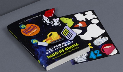
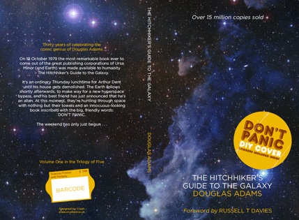
CR: I guess so… We submitted three different routes, one of which was the idea that we produced a cover with no design on the front. Radical, yes! The idea was there there wouldn’t be a design but a sticker on the front would announce: DON’T PANIC – DIY COVER – STICKERS INCLUDED INSIDE. The reader was then encouraged to create their own cover from a set of stickers…
FB: Were there any known influences that led to your solution?
CR: YES. In the series, DON’T PANIC (always upper-case) is a phrase written on the cover of The Hitchhiker’s Guide to the Galaxy. The novel explains that this was partly because the device “looked insanely complicated” to operate, and partly to keep intergalactic travelers from panicking. It is said that despite its many glaring (and occasionally fatal) inaccuracies, The Hitchhiker’s Guide to the Galaxy itself has outsold the Encyclopedia Galactica because it is slightly cheaper, and because it has the words “Don’t Panic” in large, friendly letters on the cover.
FB: Did the project have any unique struggles?
CR: You know what… This was such a dream to work on. What was most important about this job was the faith of the publishers. It was the publishers that made this happen. We always try to push the boundaries of design and will always submit a range of ideas from “safe” to more “radical.” Sadly, publishing companies will often go for the safe option. This is not the decision of the art directors or the designers that commission us, oh no! They ask Crush to come up with ideas because they know they will get the unexpected. The problem seems to come when the sales teams get hold of the designs. If it’s not something they have seen before, or know that a cover style worked last time, they’ll just do that again… Sales are less likely to take a risk on a cover design.
However, the Hitchhikers project was different. The publishing house’s creative director worked hard to get it past sales and then once the cover was approved the marketing department really got behind it.
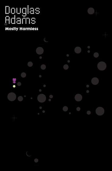
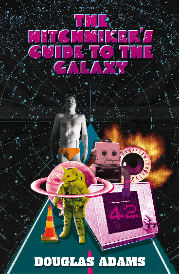
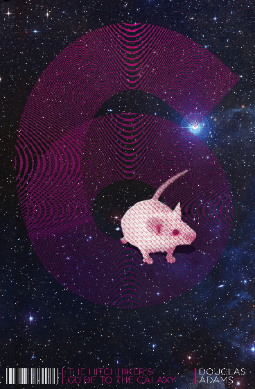
Some of the initial ideas:
The idea that was developed into the final look—blank covers with attached stickers:
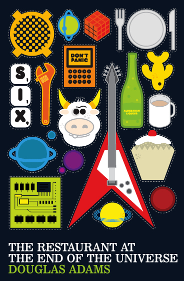
The second stage of that idea:
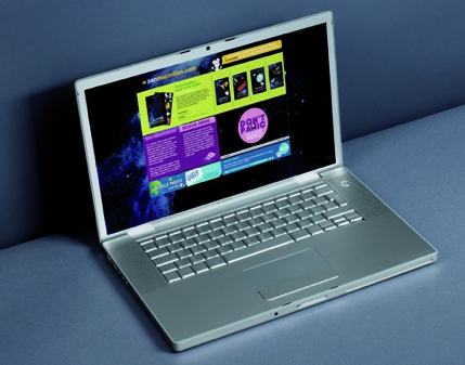
Once the covers were done and approved, the marketing department approached us to create all the digital and print marketing. Firstly we designed the website. We also created an animation (a book trailer).
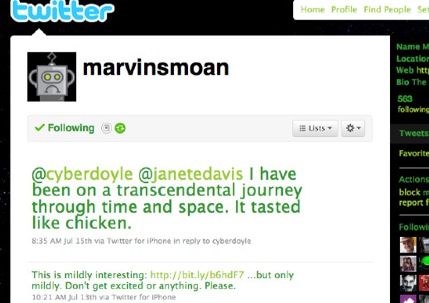
Then they asked us to create an online game of some sort. We thought long and hard about this but realized to build a little flash game—maybe a shoot-em-up or something—might not be the best approach. Would it be fun? Would it be funny? Most importantly Would it sell book? So we brainstormed the idea a little longer and came up with a marketing plan to create a Twitter account for Marvin the paranoid android.
We asked our friends at Modern Toss to write 400 tweets in the style of Marvin (miserable) and then gave those lines to the marketing department to tweet out on the build up to the release of the book.
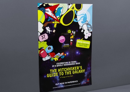
We also created all the printed marketing materials and even an embroidered beach towel.
FB: What is the message behind the design?
CR: The essence of the story. (I hope.)
FB: What would you say makes this an effective design?
CR: The publishers having the courage to go with a new idea.
FB: What’s something unique you learned while working on this project?
CR: Don’t be frightened to submit real ideas. Sometimes they do stick.


