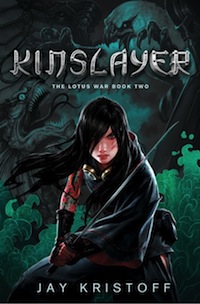
So today, we launch the cover for Kinslayer, part 2 of my Lotus War trilogy. I honestly thought there was no way our illustrator Jason Chan could top his cover for Stormdancer. Almighty Zeus, I was wrong. When Lucas wrote midi-chlorians he wasn’t as wrong as I was… actually, no, who am I kidding? Anyway, after apologizing to Jason for my lack of faith, I asked him along today to talk about the evolution of the cover design, because I’m really only capable of drooling like a 3 year old when I look at this thing. So awaaaaaay he goes.
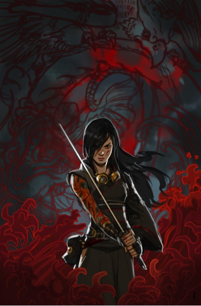
Jason Chan: When we began discussing a cover for Kinslayer, I wanted something that drew from Stormdancer’s cover style. Stormdancer’s cover is very serene in composition, but the color palette suggests that darkness and violence are a large part of the world and story. We used a graphic blood lotus motif as a way of symbolizing an important element in the story without giving anything away. We wanted to continue this type of treatment in the sequel, but change up the elements to tell a different story.
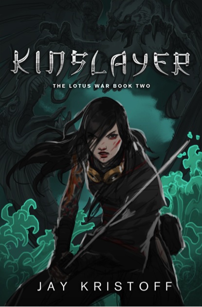
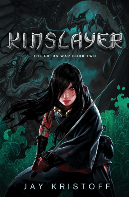
From the start, Jay knew that he wanted to depict Yukiko in a fiercer manner. She would be confident, dangerous, and she should look like she’d just been in a fight. I decided to pose her in a way that was head on, unlike the previous cover. Now she engages the viewer directly, ready for battle. She is obviously more disheveled and a little beaten up from fighting, but the fierceness in her face lets you know that she still has more fight in her.
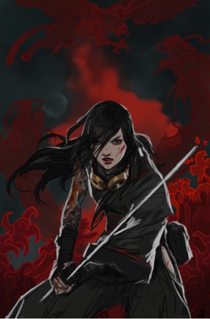
For the background, we wanted to try something different, but stay in the same graphic style. Jay suggested a water motif might fit the story well, so I did a number of sketches using that as the focus. We also introduced a scene of Buruu fighting sea dragons to add some excitement and give viewers a glimpse of some of the incredible creatures they will encounter in the book.
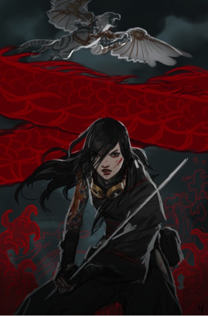
Much of the process of nailing this cover down came from deciding on a color palette. The world is polluted and the water is red or rust colored in the early sketches—unfortunately, this made the cover a little TOO similar to Stormdancer’s, so we tried a number of different color combinations.
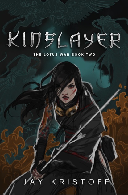
Finally, we settled on a muted sea green/blue color palette with splashes of red in Yuki. Behind her, Buruu and a sea dragon are depicted squaring off almost like two statues. The result, I feel, is a nice evolution on both the cover image and the characters of the previous book.
Jay Kristoff: *wipes drool from chin*
Yes. *nods sagely* What he said.
Here’s the final result:
Jay Kristoff has managed to trick the world into thinking he’s an author. His debut novel, Stormdancer, billed as a dystopian Japanese-inspired steampunk fantasy, will be released Spring 2012 through Thomas Dunne/Tor UK.
Jason Chan is a full-time concept artist with Massive Black Inc., working for clients in the video game and entertainment industries. A number of the notable clients Jason has worked with through Massive Black include Sega, Sony Entertainment, Microsoft, BioWare, Electronic Arts, and many more.


