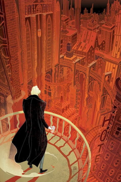
Tor Books will publish Vicious by V. E. Schwab this fall. I was excited when the editor, Miriam Weinberg, asked for Victo Ngai by name. Beyond all of her other great work, Victo has been creating a number of fantastic illustrations for Tor.com stories over the past year (even winning a gold medal at the Society of Illustrators for one) and I was thrilled to see that people were taking notice.
After reading the book Victo came back with a bunch of sketches. Here are just a few….
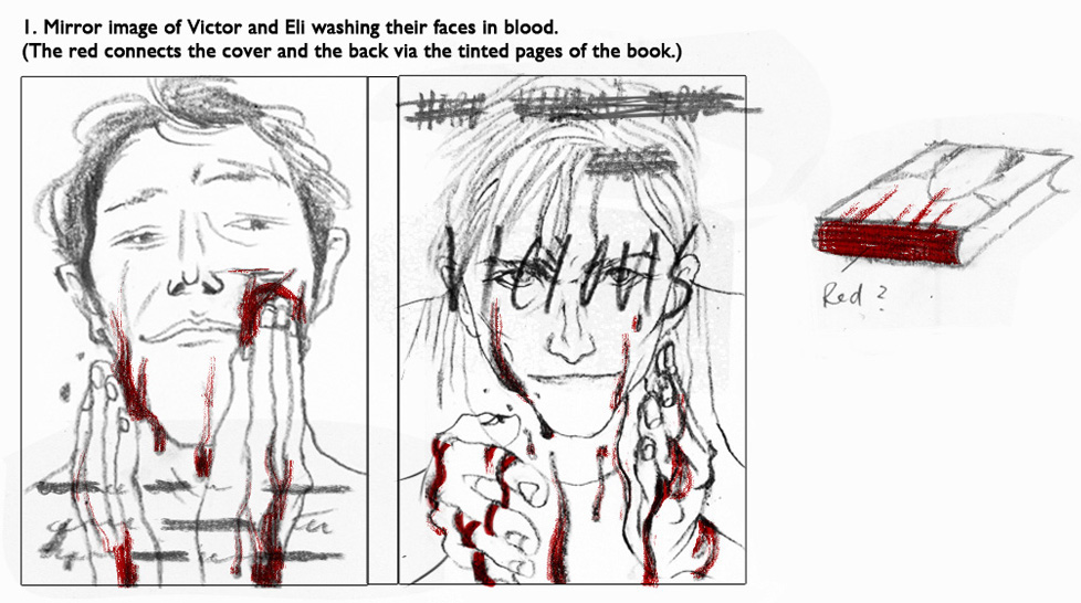
This would have been a really powerful cover and I loved that Victo was thinking about the entire book as an object. I’m afraid, however, that the image would be a bit too brutal for the typical bookstore market. Ultimately the job of the jacket is to entice people to pick up the book and this had the potential to scare off as many readers as it would intrigue.
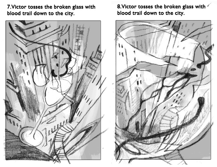
These sketches created some great shapes and patterns but, while they evoke a frozen moment that makes you wonder what happened, I thought they were just a tad too enigmatic.
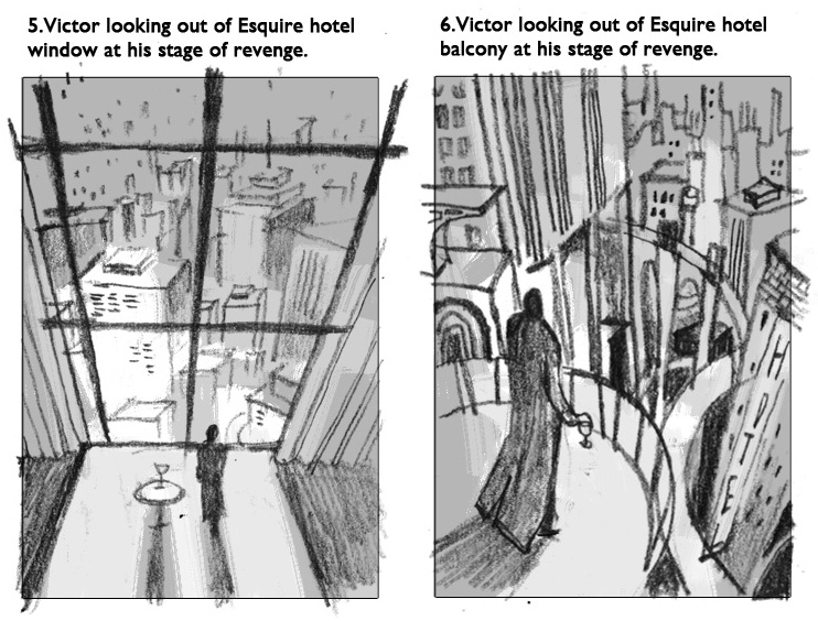
Here we see the family of sketches that we went with. The left side image has that classic “the city is mine!” look while the right side has a slightly more science fictional feel.
Once we chose the sketch and Victo finalized the art. She revealed, “Vicious is my first cover ever. I really enjoyed the project, what could be more fun than getting paid to read and draw? However, I would be lying if I say there wasn’t any pressure, as I am definitely one of those who judge a book by its cover. This story is mesmerizing and I hope my art has done it justice, and makes people want to pick up a copy!”
At this point is was up to Tor Books senior designer Peter Lutjen to add type and create the cover design.

I loved the deco quaility to the left hand side but these placed too much of the cover’s focus on the quote.
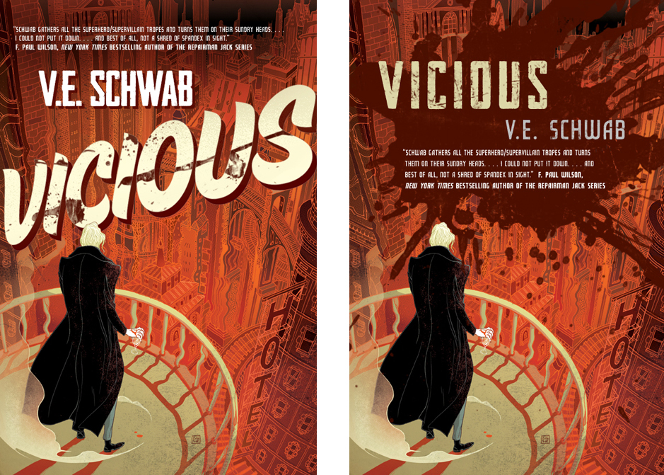
The left side played with the comic book aspect of the story but was just a little less sophisticated than we wanted. On the right….I liked this one quite a bit but it was felt the blood splotch was a bit too gruesome. And it covered up so much of that cool city.
In the end, we kept the type fairly straightforward—elgontaed and slightly curved to mimic the city and keep the cover looking elegant.
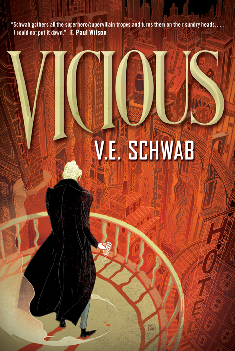
Aparently the work paid off, here is author V. E. Schwab on the cover:
This cover is Vicious.
I mean, obviously, this cover is for Vicious, but some covers are covers and some covers are books, and this cover is a book.
What I mean to say, is that this cover is both a moment from the book, and an embodiment of the book itself.
We see Victor on his hotel balcony, looking out over the city of Merit. His fingers curl loosely around a new glass after crushing one only minutes before, his hand still bloody from the damage. And as he stands there, relishing the absence of bars after a decade in prison, he is consumed by two thoughts:
1. That Eli is somewhere in the city below him.
2. That he will find him.
There’s the sprawling, surreal cityscape and Victor’s wounded hand and the way the world seems to bend around him…And then, there’s the title.
The title announces itself with marquee-style enthusiasm, wonderfully at odds with the tone of word itself. Vicious. A title that sunk nails into my skin about halfway through the first draft and never let go. The clash—played out by the word and its execution—between verve and peril, levity and brutality.
The whole effect, of the titling, and the color palette, is dark and strange and yet strangely gleeful. Vivid. Alive. Which is funny when you consider that it’s a book about death, both the act of dying—or killing—and the act of coming back, and the parts of you that don’t.
But the final touch, the best touch, is the art itself.
This is a book that plays with comic book culture, with the ideas of the hero and the villain. It takes superpowers and strips away the spandex and the capes, until what’s left is gritty and violent and bare. And this cover is a perfect companion to that kind of play. It takes comic book art, and warps it, twists and strips it down to bones and then builds a new body. And a detailed one at that, the intricate cityscape brought to life in heated reds and yellows instead of blues and grays and blacks, Victor a splash of darkness in the foreground, his back to us, his eyes on his prize.
Some covers are covers and some covers are books.
This cover is a book.
This cover is Vicious.
Irene Gallo is the Art Director of Tor Books.


