This post originally ran on April 10, 2014.
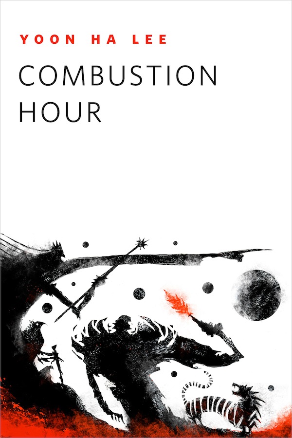
Artist Jeffrey Alan Love has created a fantastic image to accompany Yoon Ha Lee’s short story “Combustion Hour,” available to read for free here on Tor.com. Below, Jeffrey was kind enough to share his process, including sketches and photos of the work at various stages.
“Combustion Hour” by Yoon Ha Lee is a wonderful story, visually rich and emotionally engaging. As I read it I was flooded with images, and also struck with how it seemed tailor-made for me to illustrate. This is the third time I have worked with Irene Gallo for Tor.com, and each time she has matched me with a story that has struck some personal chord within me and made it a joy to work on.
After reading the story a few times I put it away for a few days. I used to start making word lists, and go through a very intensive writing process to begin to find links and connections that I could use visually within the story, bringing disparate elements together conceptually. In the past year that has changed to a much more meditative process in which I have replaced active searching and forced writing with daydreaming, dreams, daily walks with no purpose or destination, and trying to pinpoint or distill my emotional response to the story. In some ways I want people to feel an emotion, or feel that they have been asked a question by my images, and not that I have tried to show them how smart I am. Narrative and emotion have replaced conceptual leaps.
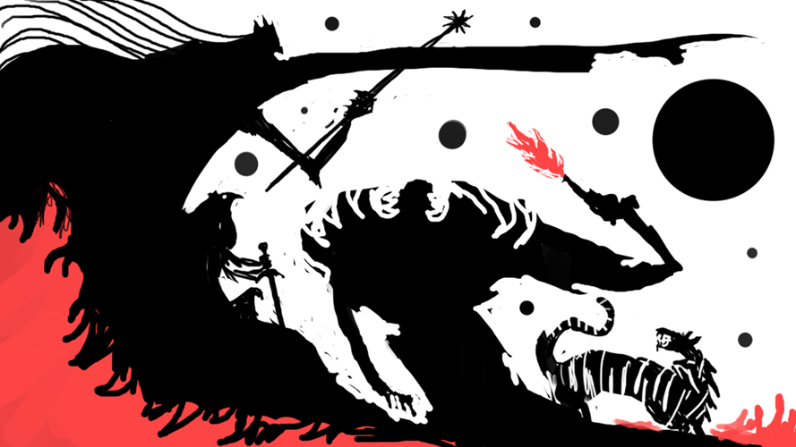
I work digitally for my sketches. I find that if I try to work with pencil at this stage I become too concerned with drawing and linework and lose sight of what is important. The big shapes, the overall statement, the value structure—I focus on value, shape, and edge, and smearing digital pixels around is like playing in mud for me. I’m not attached to it, so I feel comfortable distorting, overpainting, destroying, and experimenting. I usually leave color for a later stage, as like a bad juggler the more balls I throw up into the air the more likely I am to have them all come tumbling down. Value, shapes, and edges are enough trouble for me. Color can wait its turn. For this story it made sense to have only one color, so it was easy to introduce it at this stage.
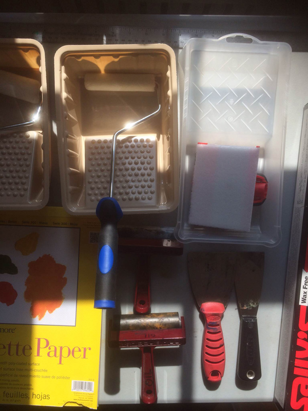
Once a sketch has been picked I prep my studio to make the piece. This time I’m going to use paint rollers, brayers, putty knives, and some sort of pad that I think is used to paint the corners of walls. I use a lot of various techniques in making final illustrations, to keep it fun for me, but to also discover new methods of mark-making through accident and failure. Having a completely resolved sketch allows me to just have fun at this stage, because as long as I keep the same value relationships, design of shapes, and edges, the media/method I use is irrelevant—it can be anything. Acrlic, oil, etching ink, crayons, house paint, collaged paper, photoshop, it all comes down to the same basic picture-making principles.
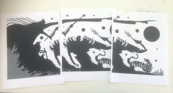
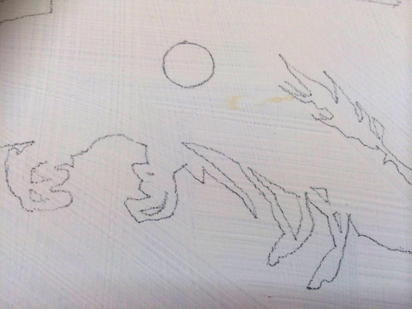
I print out the sketch to final size and then transfer it to a piece of masonite that has been roughly gessoed. I also spilled some coffee on it by accident. Oops.
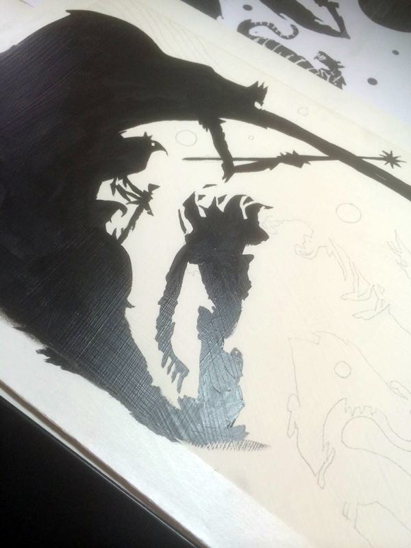
I then fill in the big shapes with a brush and black paint, not really caring about keeping the surface flat, as I want there to be ridges and dribbles that will catch the paint later.
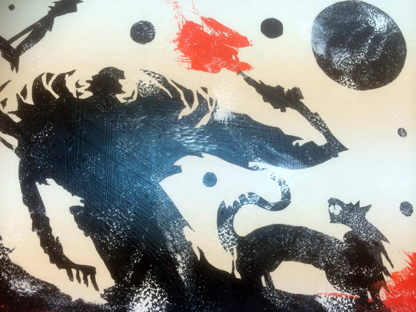
With a paint roller I roll white paint across the surface, letting it catch on the ridges and inconsistencies in the gesso and black paint.
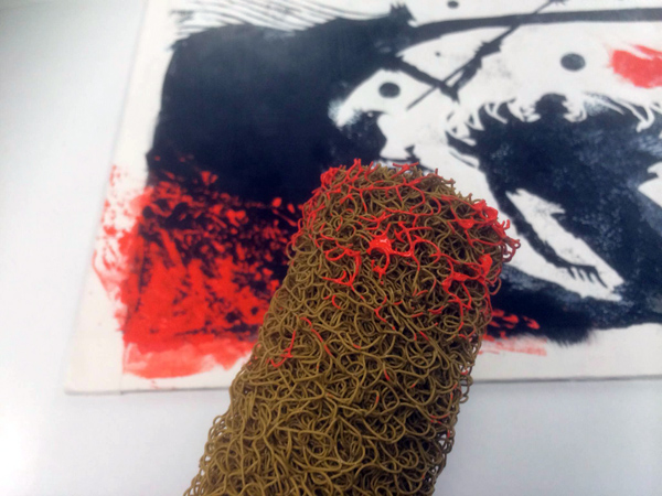
I use a decorative paint roller I found in the clearance bin at the hardware store to roll out the red paint at the bottom. I try not to control what happens at this stage, but just let as many happy accidents (and unhappy ones) happen. Chaos first, and then I can edit it later, keeping what I like, and making use of what I don’t like in a way I’ll explain in a bit.
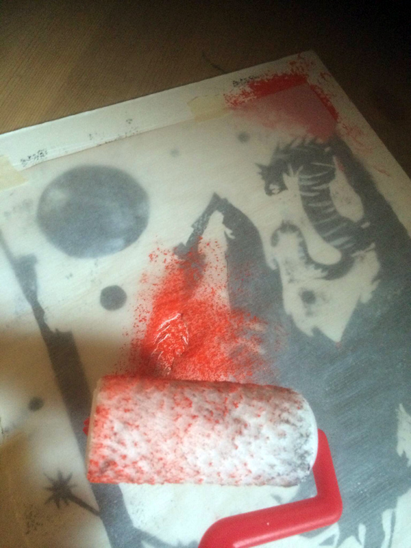
I mask off with tracing paper the piece and cut out the shape of the flame from the gun, and then roll it out to get the shape and mark-making quality I want.
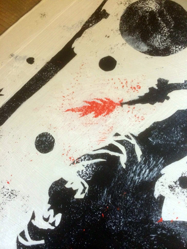
And this is where I stop working traditionally. I photograph the piece, and take it into photoshop. All of those unhappy accidents I will paint over, but first I make them into custom photoshop brushes. This allows me to work digitally but keep the mark-making language consistent in the piece throughout the entire process.
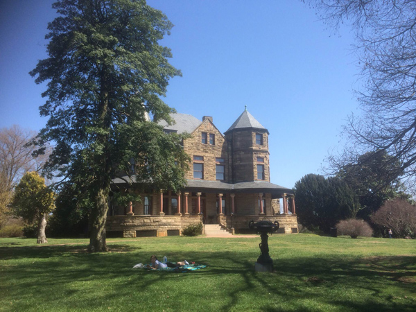
At this stage I take a break for a few days. Since I live in Richmond, Virginia, the cost of living is such that I can take a day off to go read in the park with my girlfriend. I remind myself of this every time I think of moving to New York.
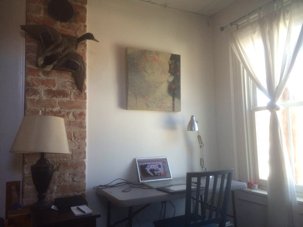
I painted the traditional piece in my studio, which is a few blocks from my home, and finished it in my home studio. My students usually can’t believe I work on a tiny laptop screen and an Intuos 2 tablet that I bought in 2003—more proof that it’s the basic principles of picture-making and your brain that bring success, and not the tools. As mentioned before I create custom brushes from the happy and unhappy accidents, and then go in using a normal round brush to clean up edges and get rid of visual clutter created by the paint rollers. Having a small screen also means that I don’t get caught up in details but am able to keep the visual impact of the entire piece always foremost in my mind. Details are secondary, the overall composition is king.
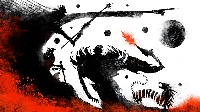
And that’s it. I hope people enjoy the art, but more importantly I hope it gets them to read the story. If so, I’ve done my job.

