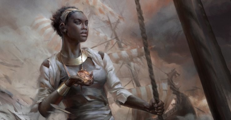
I was excited to be hired to create Tor.com Publishing’s very first fantasy world map, especially since the novella, The Drowning Eyes, that the map illuminates isn’t a traditional fantasy setting of elves and dragons and magic. (Well, it does have magic.) As the book’s editor, Carl Engle-Laird explained, The Drowning Eyes is actually based on an island in a Caribbean style-setting; a geography that we’re not accustomed to seeing in continent-spanning fantasy maps.
My approach when designing a map is to ensure that the style of illustration fits the tone of the world being depicted, as opposed to fitting inside a uniform style. I believe that this helps visually set the table for what the readers might expect from the story, especially since most maps appear before the text.
Carl and I went over concepts as I dug into the story, and how to avoid making the map look too European. Of this process, Carl writes:
A few factors of the Jihiri Islands setting immediately make themselves apparent. Since the setting is an archipelago with smallish islands and a high degree of inter-island mobility, most of the maps would be designed to withstand sea travel.
Even if paper were available, which is pretty unlikely considering the lack of logging on islands with non-replenishable forests, it’s not the most practical material for rainy sea voyages.
We needed a sturdier material to be reflected in the design. We also want to pin down the purpose of this map. Since sailing is so important, compass lines and trade routes are going to matter much more than borders and mountains and rivers, which feature so prominently on maps of worlds more closely modeled on Europe or continental North America.
How did people craft maps before paper? I started researching and found that the answers were widely varied, including such materials as bark, animal skins, and even shells. Carl and I thought that animal skins might be the best visual, so we asked the author Emily Foster if this direction made sense for the story. Animal skin won out.
From there it was time to figure out how this map fit into the world. The novella describes a structure known as the Windspeaker Temple, which houses their society’s library, and which was subsequently burned down. That made it easy to think of the map as an artifact that survived the destruction of the Windspeaker Temple.
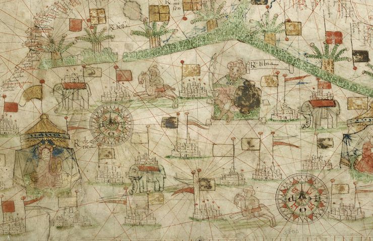
The map also had to be nautical in nature as well. Since it’s a sea traveling culture, the spaces in-between the islands are just as important as the islands. I created a portolan style map, as seen above. A portolan map is one where the compass directions are depicted in the form of radiating lines. The ship’s navigator would place the compass on the chart, and align with one of the lines to determine the right direction to sail in.
For most maps, I get a rough sketch with notes from the author. Many authors already have this kind of sketch ready to send, as it helps them track what is going on in their world while they’re writing the story. Emily supplied me with such a sketch: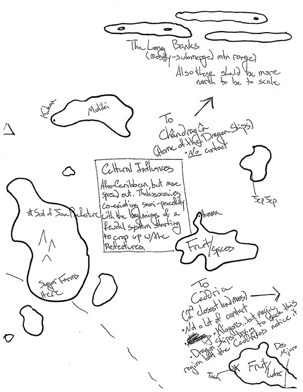
Taking Emily’s sketch, I started with a rough pencil of the world, just trying to get everything in place for accuracy. Getting everything in place is always the first step for me.
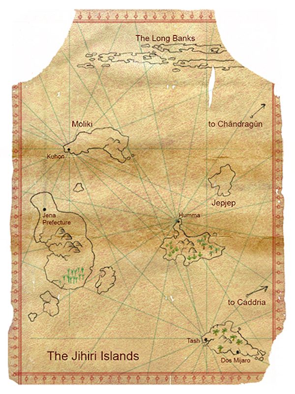
From there, I’ll start refining, starting with the most important elements: lands, locations, features, and names. I’ll also start adding in extra details, such as creatures or ships. The map will often go back and forth from me to the editor and author several times, and there can be a lot of tweaking and corrections and additions that come up during this period. (In this case, I got everything in the right place, with correct names, the first time.)
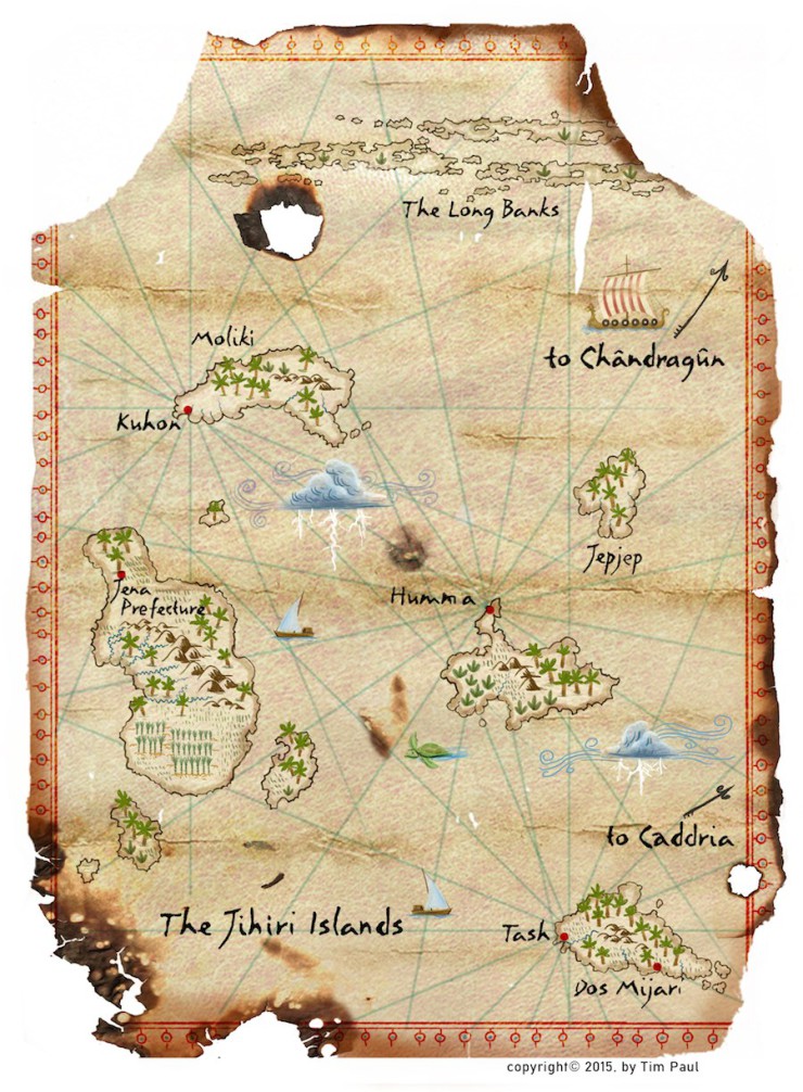
Once I get the final go ahead from the editor and author, I’ll make the final version of the map. I added the burned areas at this stage, having saved them for the end to ensure that I wouldn’t cover up any important information while the map was still in draft form. Another feature I added were crease marks to help give it the look that it had been rolled up and reused constantly. I often do maps in color, then convert to grayscale and input tweaks to that version. This allows for a color version to be shown online, but the more detailed grayscale version is what will appear in the book itself.
I’m very happy with this map, and hope that it gives readers a sense of what kind of exciting world to expect in The Drowning Eyes!
But wait, there’s more! Head over to Macmillan Audio, where audiobook narrator Robin Miles will guide you around the map of the Jihiri Islands as she reads excerpts from the book.
Check out more of Tim Paul’s work here.


