I’ve spent the last two years studying the typography and design of science fiction movies for Typeset in the Future, available in all good bookstores now from the lovely folks at Abrams. My studies have given me huge respect for the worlds these films create—their feats of visual storytelling are nothing short of amazing, creating cinematic visions of imagined worlds for which every detail must be realized on screen.
I was intrigued, therefore, when Tor.com invited me to apply the same approach to classic science fiction novels. These books, I’ve come to realize, have an even greater challenge to overcome when visualizing their future. A novel has just a single wraparound opportunity to picture its imagined world. Done well, a great sci-fi cover can seed an entire universe of visuals in a reader’s imagination, giving the brain’s internal SFX department all the material it needs to extrapolate during reading. Let’s take a look, then, at the design and typography of five classic cover designs—and how they bring their imagined worlds to life.
The Left Hand of Darkness by Ursula K. Le Guin (Penguin Classics, 2016)
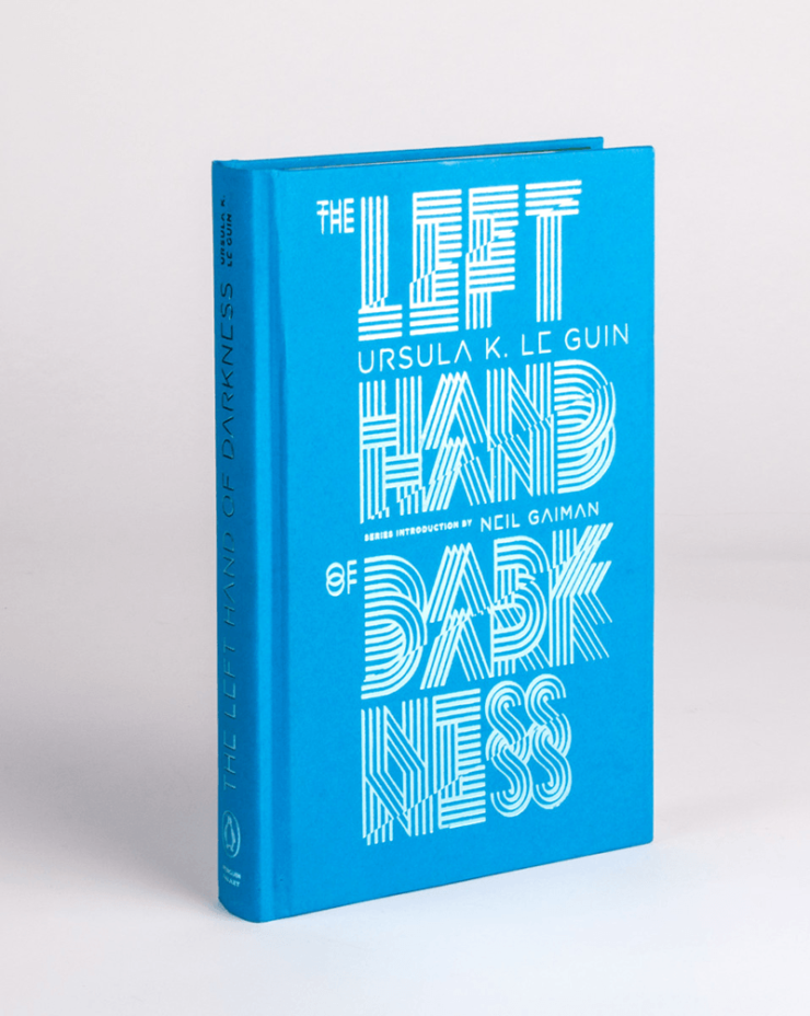
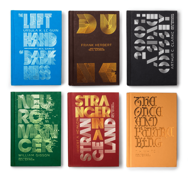
Ursula K. Le Guin’s landmark (and Hugo- and Nebula-winning) The Left Hand of Darkness deals with sexual ambiguity, exile, and the need for cultural understanding on a barren, ice-bound world where survival itself is a daily challenge. Alex Trochut’s cover for Penguin’s 2016 edition heads my list because of its intriguing minimalist treatment, relying solely on typography to conjure the mood of this hugely influential sci-fi novel.
In Trochut’s treatment, the title’s words are duplicated, sliced, and transparent, conjuring the shifting gender identity of the planet’s androgynous population in an ice-blue frosted hue. The title is not immediately readable from a casual glance—it forces you to look again, to reconsider your interpretation. It’s a brave move for a cover in any genre—making a book hard to identify across a crowded bookstore is not usually a publisher’s first choice. Nonetheless, the treatment suits the ambiguity of Gethen perfectly, alienating the reader while at the same time drawing their intrigue.
Squeezed between the shifting titles are the names of Le Guin and series introducer Neil Gaiman, both of which are sliced to remove essential elements—the bars of the “A” and “E”—to make them feel more alien to readers. This is a recurring trope in sci-fi typography, in which designers selectively extract lines and elements from individual glyphs to move them away from their humanist, hand-written origins. It’s an intriguing experiment in recognizability and minimalism—how much can we remove from a letter, while still just keeping it recognizable?
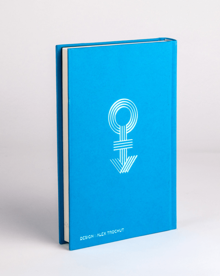
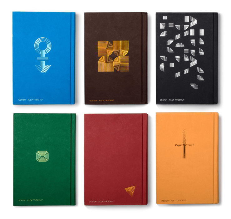
The back cover of the novel features a stylization of an Androgyne symbol. In a reflection of the sliding-scale nature of gender and sexuality, there is no one definitive symbol that represents androgyny, and this is therefore a designer’s interpretation, merging the traditional Mars and Venus symbols in a style in keeping with the overall typography of the cover. (It may also remind you of Prince’s reinvention as the Love Symbol in 1992, for which a custom typeface had to be created and mailed to the world’s music press.)
The Left Hand of Darkness is one of six designs created by Trochut for a 2016 Penguin Galaxy sci-fi miniseries. Other designs include some glitched-up type for William Gibson’s cyberpunk Neuromancer, and a hyper-chopped 2001: A Space Odyssey for Arthur C. Clarke’s novelization, with the added complication of a 90-degree rotation to further challenge readability. (The rear of this book cuts the name even deeper, reducing it to a mere geometric puzzle.)
Trochut’s rear cover for Dune is even more stylized, adapting a single geometric pattern to form the letters D, U, N, and E via the simple act of rotation. (Its relegation to the back cover suggests that this was perhaps a stylization too far for bookstore recognizability, even for this adventurous series.)
Isaac Asimov, Foundation trilogy (Panther Books, 1979)
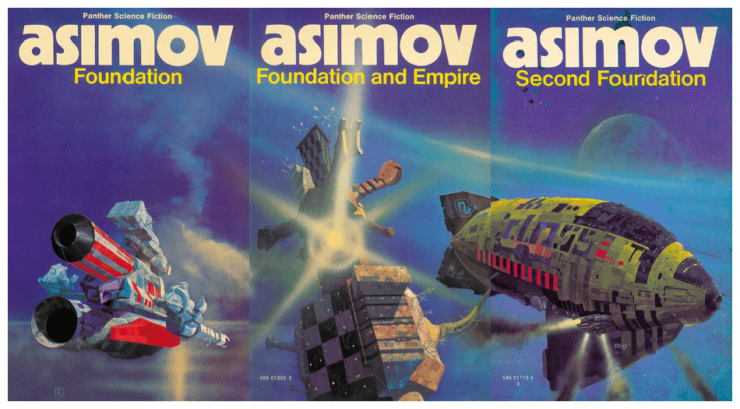
Isaac Asimov’s Foundation has been reissued countless times since it began as a short story series in Astounding Magazine in 1942. For me, its most striking covers are those from the 1979 Panther Books UK paperback edition of the original Foundation trilogy, featuring a spacecraft triptych by British sci-fi artist Chris Foss.
There’s a lot to love here. The lowercase “asimov” is wonderfully stark, set in super-chunky Kabel Black (a geometric sans-serif in the Bauhaus style, designed by Rudolf Koch in 1927). There can be no greater proof of Isaac Asimov’s sci-fi fame that the books don’t even bother to tell us that he’s called “Isaac.” (There are few authors for whom dropping their first name entirely would do no harm to recognizability—you could probably get away with “TOLKIEN”, but the “J.R.R.” would be missed, because its idiosyncrasy is part of the author’s brand. And you definitely couldn’t run “MARTIN” without the “GEORGE R.R.”.)
It does no harm to these cover designs that Asimov’s surname has an innately alien, otherworldly feel for Western readers, with its unusual spelling deriving from Isaac’s Russian father scribing their family name (Азимов) with an “S” rather than the more common “Z” when arriving in the US. Shrewdly, Isaac recognized the value his surname’s recognizability could have for his career, and kept his father’s unusual spelling, ultimately leading to the distinctive cover design seen here.
Buy the Book
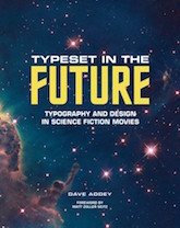

Typeset in the Future
(As an aside: his father’s unusual spelling also provided the inspiration for a little-known Asimov short story, Spell My Name with an S, in which a Polish-American nuclear physicist is persuaded to change his name from Zebatinsky to Sebatinsky. In an early example of what we now know as the butterfly effect, this small change sets off a chain of events that ultimately leads to Earth avoiding an all-out nuclear war.)
After the fantastic Kabel typography, it’s probably best if we skip the disappointing choice of yellow Helvetica for the titles of the books, and move on to those ship designs. Artist Chris Foss paints spacecraft like no other, and his Foundation triptych—really one painting, not three—is just one entry in a series of Asimov commissions for Panther Books. This particular painting was inspired in part by Foss’s fascination with sea creatures—as he states in an interview for his 2011 anthology Hardware, “My spaceships quite deliberately evoke certain animals. It’s not an accident that there’s a big spaceship that looks like a guppy in the Asimov Foundation Trilogy.”
Despite its striking beauty, the primary issue with Foss’s Foundation painting is that not much of Foundation is actually set onboard a spaceship. This mismatch may be due to the fact that at the time Foss was painting upwards of three book covers a week—a process that did not leave time for actually reading the books to which the covers belonged. In another Hardware quote, Foss notes that at the time, “One of my art directors would phone me up with a job and say, ‘Chris, we need another Asimov,’ so I’d ask, ‘What do you need?’ He’d say, ‘The last one was blue, so give me a green one.’”
Foundation’s covers may be a slight extrapolation of the trilogy’s space-based navy battles, but that doesn’t stop them from capturing the grandeur of an empire at war with itself. It’s a testament to the series’ enduring popularity that a disk containing Asimov’s Foundation series is now in orbit around Earth, onboard Elon Musk’s recently-launched Tesla Roadster. (It is sadly unclear as to whether Foss’s artwork also made it into orbit.)
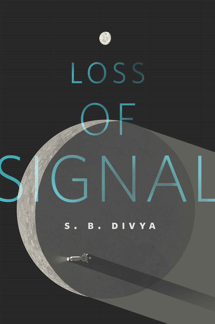
“Loss of Signal” by S. B. Divya (A Tor.com Original, 2018)
Yes, that’s correct—cover #3 is from a Tor.com short story. (I swear they’re not paying me to include it in the list.) I discovered this cover entirely by chance while researching this article, and immediately fell in love with its design. Our vantage point is from the far side of the moon, with the Earth a small near-white disc in the distance—a neat inversion of the expected relationship between these two celestial bodies, and one that is not without sci-fi precedent.
The cover’s inverted planetary relationship evokes “Earthrise”, a famous NASA photograph taken onboard Apollo 8 by astronaut Bill Anders.

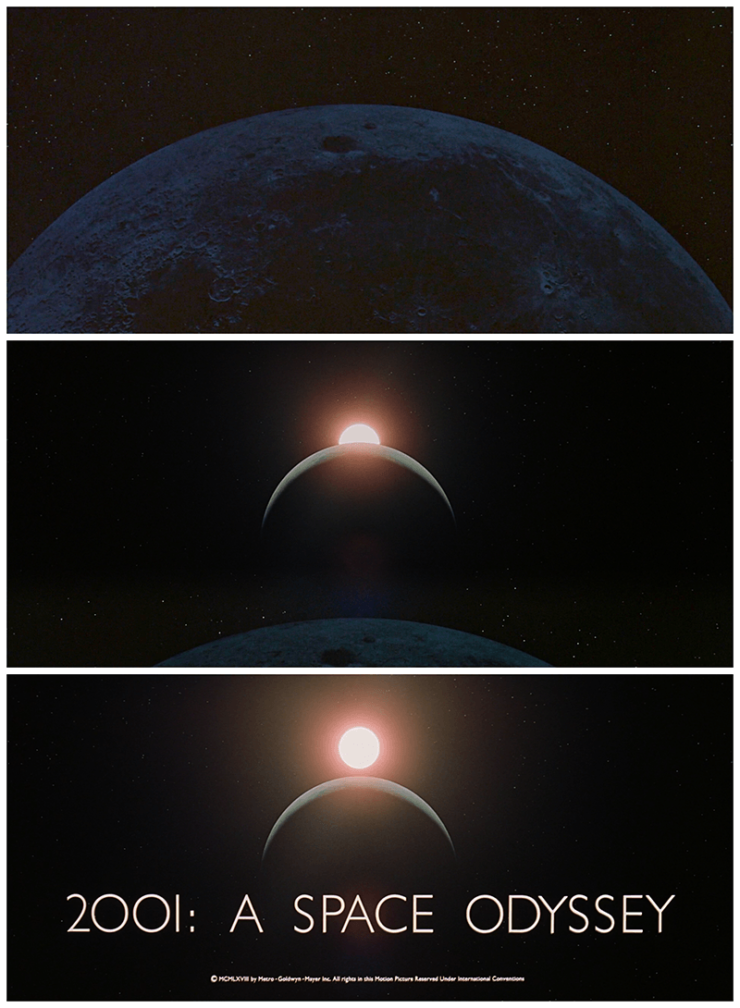
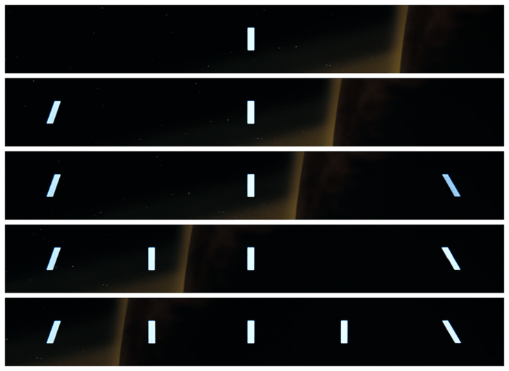
“Earthrise” itself was pre-empted by the opening sequence of 2001: A Space Odyssey, released some nine months before Apollo 8 became the first manned flight to orbit the Moon. 2001’s credits take a similar far-side-of-the-moon vantage point, to remind us just how tiny we are in the universe.
Like “Earthrise” and Loss of Signal, 2001’s intro shows our home planet far in the distance, small and insignificant when compared to the moon’s barren surface in the foreground. Both images require viewers to consider their place in the universe from an entirely alien vantage point, far from the comforts of home. It’s an entirely appropriate feeling for S. B. Divya’s story of the first human mind to circle the moon without a body in tow.
A Clockwork Orange by Anthony Burgess (Penguin Books, 1972)
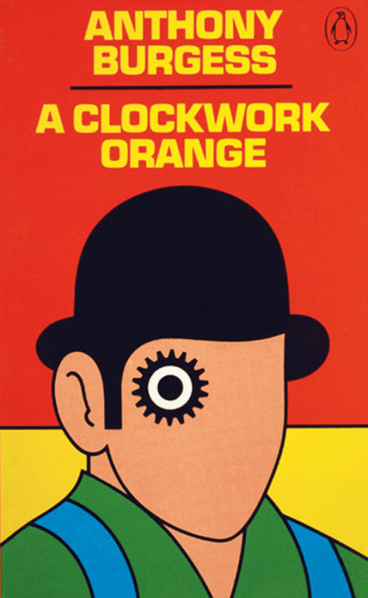
David Pelham’s artwork for A Clockwork Orange, created in 1972 for Penguin Books, has become one of the best-known (and longest-lasting) sci-fi book covers of all time. Originally created overnight, after Pelham (then Penguin’s fiction art director) was let down by a cover artist, it remained in use as a Penguin cover until as late as 1996.
Pelham is no stranger to science fiction—he’s also the artist behind Penguin’s equally recognizable J.G. Ballard covers, which I imagine can be found in more than one tor.com reader’s collection.
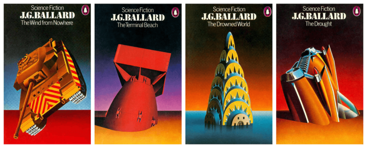
For A Clockwork Orange, Pelham’s cog-eyed droog captures both the clockwork of the title and the open-eyed mascara of Stanley Kubrick’s just-released 1971 movie, paired with some mechanistic yellow Eurostile Bold to match the illustration’s emotionless style.
Eurostile is the all-time classic sci-fi movie typeface, with its Bold Extended variant in particular acting as a short-hand for The Future ever since 2001: A Space Odyssey plastered it across HAL 9000’s interfaces. (Indeed, Eurostile’s recurrence in sci-fi was what first led me to write Typeset in the Future, as a study how typography’s unique combination of aesthetics and communication make it such an effective design shortcut.)
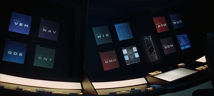
Despite its movie omnipresence, Eurostile is unusual on book covers, even those contemporaneous to A Space Odyssey. Perhaps this is form dictating function—a widescreen movie set in the vastness of space suits a widescreen typeface such as Eurostile Bold Extended, whereas the portrait cover of a novel does not. Nonetheless, Eurostile’s mechanical nature—inspired by synthetic, man-made architectural shapes of the 60s, and based on the mathematical concept of a super-ellipse—makes it an ideal pairing for Pelham’s stark design.
Stranger Things (Netflix, 2016)
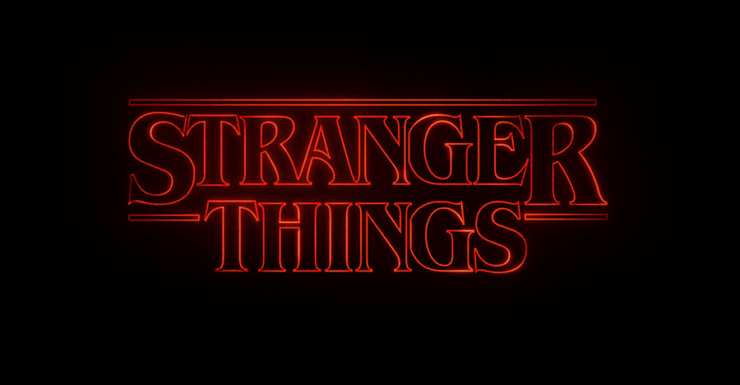
For #5, I’m going to cheat a bit—okay, actually, a lot—and avoid picking a single novel. Instead, we’ll look at how fantasy horror TV show Stranger Things plays on our affinity for classic genre covers as a shortcut for evoking its own particular mood.
The opening credits for Stranger Things are entirely typographic, with plain white ITC Avant Garde overshadowed by dramatic red ITC Benguiat, accompanied a bassy synth-audio moodscape.
It’s no surprise to discover that the title’s designers took Richard Greenberg’s iconic Alien credits as an inspiration. Stranger Things’s outlined glyphs are as unrecognizable as Alien’s floaty text blocks at first, only forming themselves into actual letters once the viewer’s comfort level has been suitably eroded.
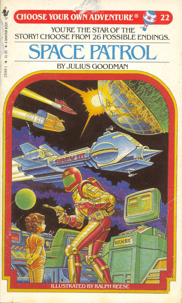
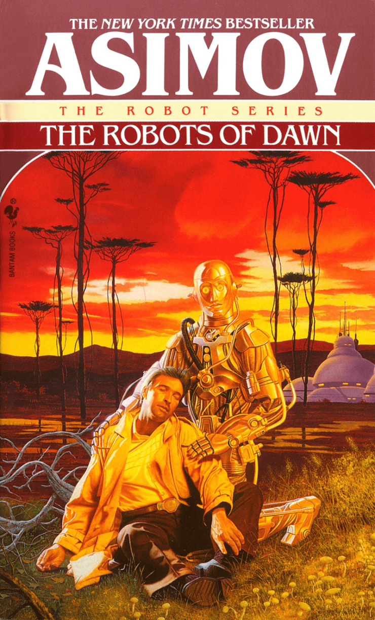
If the choice of Benguiat feels familiar, it’s entirely deliberate on the part of the designers. In addition to appearing on the covers of classic Choose Your Own Adventure books and 90’s editions of Isaac Asimov novels, Benguiat was used on Stephen King movie posters and book covers throughout the era in which Stranger Things is set.
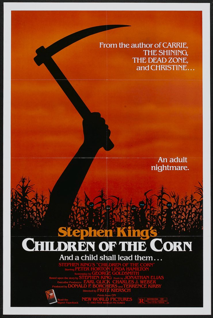
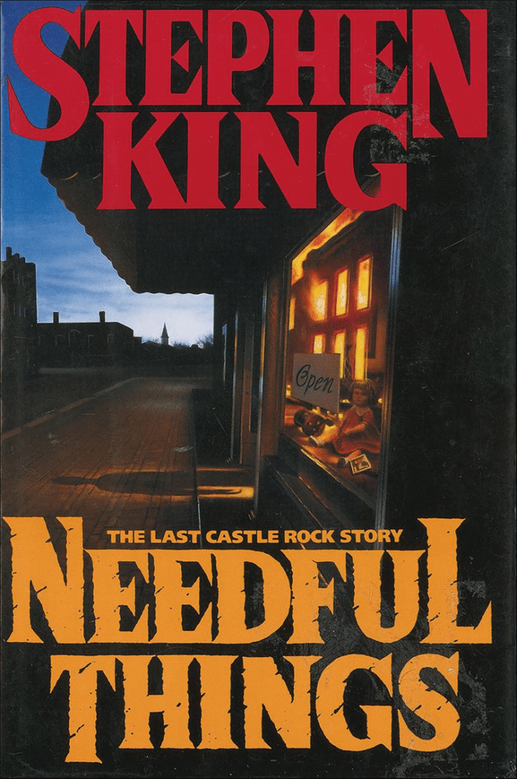
In a subtle yet genius move, Stranger Things takes this association beyond the typographic, borrowing from the layout of books such as (appropriately enough) Needful Things, on which the baselines of the S and N in STEPHEN are dropped below the rest of the word. Combined with a conveniently placed “ING” in “THINGS”, the Stranger Things typography subliminally evokes the memory of every Stephen King horror fantasy you read as a child, giving its directors a ton of emotional association completely free of charge.

As we’ve seen above, a sci-fi cover must both grab the imagination across a crowded store, and communicate its contained world in a single iconic image. Movies may be impressive, but they have hours to transport their viewers into the future; books have mere seconds to achieve marketing, storytelling, and world-building in a single passing glance. Get it right, however, and a cover transforms into more than just a binding—it becomes a memory of the pages within, indelibly remembered as a favorite book, distilled.
If you’ve enjoyed exploring the typography and design of these books, and you’re a fan of sci-fi in all genres, be sure to check out Typeset in the Future: Typography and Design in Science Fiction Movies, available today from Abrams Books.
Dave Addey is the creator of the website Typeset in the Future, a detailed, geeky, and humorous study of the design and typography of classic science fiction movies. He is a designer, writer, and software developer based in Santa Cruz, California.


