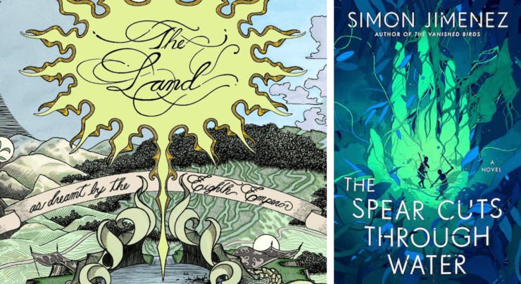
In my new book, The Spear Cuts Through Water, there will be a map of what is known by the characters as The Old Country, rendered gorgeously by the talented artist and writer Chris Panatier. Printed on the book’s endpapers (essentially the reverse side of the hardcover), the map is a heavily stylized representation of the land in which much of the story takes place. Credit where credit’s due, the germinating idea for this approach was my brother’s, and I thought it was a good one. After working with the artist and my publisher, I was pleased with what we came up with.
The Land, as Dreamt by the Eighth Emperor. The image is concepted to be detailed to the point of distraction. To burst with the natural wealth of the country. Tea leaves grow as tall as mountains. Fertile foothills are ribboned with rice paddies. Fat carp are birthed prodigiously from the many rivers. Even forged weaponry grows from the earth like impossibly tall beanstalks. The heightened wording on the floating banner and the surrounding heraldry suggests this image hangs on the wall of a palace, commissioned by the emperor himself as an ode to his visionary outlook on the land; a land, as dreamt by a man with a very selective view of his domain.
There are no villages, no sign of human life; there’s only the natural world, begging to be harvested. Positioned in each of the four corners of this dream map are the symbols of the throne, repurposed from the national myths of the land and made into the icons of empire: the Red Peacock, the Purple Elk, the Silver Monkey, and the Moon. The usual ornamentation that traditionally comes along with fantasy maps are missing. There is no compass rose for orientation, no place names, no handy scale for distance ratios so that a reader might be able to tell how far one location is from another. There are barely even locations. Even the perspective is different—not a bird’s eye view, but something closer and more intimate, for a better view of the imagery that leans away from literalism and more towards the metaphorical, and the eerie.
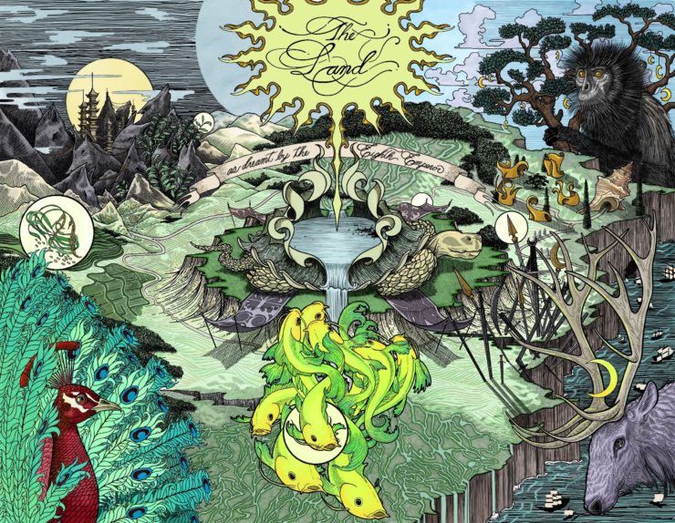
Because of all of these choices, it is not a particularly useful map. One would be hard-pressed to use it as a reference tool as they journeyed with the characters through the book. This is by intention.
Here’s what I was thinking.
An Imperial Imagination
Every map is made with a purpose, and by extension, a point of view. There are maps that provide proper context for themselves—say, a map of the migratory patterns of the American Kestrel from the years 1971-1979, as commissioned by such and such wildlife foundation. Other maps are more insidious, as they present a view of the world as if it were natural law. New names papering over the old names; countries carved out of mountains; voting districts carved out of neighborhoods. Maps have the power to shape the world in their own image. Through maps, empires tell the stories of themselves, over and over, until their fictions replace reality entirely.
Not all maps are the tools of empire, but all maps are tools, and their primary function is as a lens through which one can re-see the world. Which brings us to my map. Surfacing the notion of point-of-view, making it explicit in style that this map is drawn by a royal cartographer of the throne helps address what is often left unspoken when it comes to the presentation of maps: that they are steeped in the culture that produced them. Considering the fact that much of my book is about the damages wrought by a royal family and their supporters, it seemed only appropriate that I make even a token effort to avoid these unconscious replications of power. The map becomes less of an objective tool of reference, and more what it is intended to be: a fun visual supplement to whet the appetite and set a tone for the proceeding narrative.
Perhaps this is a very “post-colonialism 101” point, theoretical to the point of pretension, but still, I think the results are sound. Leaning into the subjective perspective, to the point of absurdity, we get an unusual and interesting image that I think helps establish a singular identity for the book.
The Concession of Translation
A map by necessity flattens and simplifies the world — a three-dimensional space, in constant transformation over time, is pancaked onto a two-dimensional-plane, and frozen in a single state, turning what was once a sensual and breathing world into something cold and dead, almost trivial. There is a risk when composing a map that the reader’s imagining of the fictional world will lean on this abstracted, non-sensual space. That no matter what description, what metaphor the story offers them later on, the world will in the end be reduced to icons and fixed x y coordinates and spatial relationships that are without history or context. The once mysterious, unknowable spaces between locations in prose is, when made visual, a literal blank spot.
Negative space in prose can stoke the imagination. Whole worlds can live in the break between paragraphs. But with visuals, when taken at face value, that negative space can read less like an invitation and more like a declaration.
There is nothing here, the map says; nothing worth imagining.
Move on.
Leaning into the subjective, and the aesthetic of dreaming, hopefully alleviates some of this risk. The map seen above is but a warped pinhole through which to see the world, so there is an implicit understanding that the boundaries presented here are artificial; that this is but one interpretation of the world—one, hopefully, of many. And the danger of flatness, and stasis, is combated by the artist’s aesthetic, his sense of depth and movement. Reality and unreality make an uneasy and inspiring mixture here—minutely detailed animals of strange colors overlooking the land like giants—Chris going above and beyond the prompt, even inserting little easter eggs throughout the image that one can return to and find once finishing the book.
When supplementing prose with visuals, I think it is important to do everything in your power to make sure those visuals do not overshadow the prose, at least when writing a traditional novel (obviously this doesn’t apply to more experimental, mixed media work). Much of the juice of a novel comes from the reader’s personal interaction with the text—the processing of the words on the page through their own ecosystem. Their associations and biases and triggers and desires. The way they are sitting. The quality of light from the window. Even the minutes they have left before they must leave for work. All of this, and more, act as the acids that digest a work of fiction. The product of that process is an organic, undefinable shape within that individual, personal, and untranslatable. A map risks getting in the way of this process by providing the reader with visual answers to the questions posed by prose. In this instance, I felt it a good idea to lean into the artifice, and artfulness. Nothing about the image is believable or real. It is more mural than map. It is hopefully compelling in other ways, but the only truth of the world the image tells is of the man who “dreamt” it. The world itself remains out of reach. Not even the ruler can pin down its mysteries.
Past vs. Present
With my seeming aversion against visual supplements to a written work of fiction, one might wonder why I bothered to include a map at all. The truth of the matter is that I wanted to indulge in a very old childhood fantasy.
Let’s start with a cliché: Ever since I was a kid, I wanted to write a book that felt big in all ways, and which had all the signifiers of “bigness”: a lavish cover, a table of contents, a map. I liked the feeling that the world inside the book was so big it couldn’t be contained in the text but had to spill out to the fringe edges of the physical object, all the way to the endpapers. Family trees and instructions of naming conventions and “historical” timelines that tell of grand events that lead up to the story to come.
As a kid, I had a hard time imagining a fictional world without visual help. Metaphors often confused me, and I had difficulty making sense of lavish descriptions of setting. A map helped get me to where I needed to be. It was a finger pointing to a world beyond my own. It charted the way to an escape from a life that was often pedestrian, and sometimes very painful. It didn’t matter to me what the map looked like; any map was a good map. But as I grew older, my preferences began to lean away from the stock traditional style of map, and more towards the idiosyncratic. I liked when you could tell the author drew the map themselves. Though I didn’t have the words at the time, when done well (as in, with effort, and care), the result can feel almost achingly personal, as if ripped out directly from their notebook.
I think it was also helpful for younger me that maps establish boundaries for the tale to come. In the same way that beginning a story with a defined timeline (say, two hours before the bomb goes off, or one month before the big dance) can offer the reader structure and expectation, a map communicates to the reader where the story might go spatially, and where it probably won’t. It offers the reader an immediate foundation for setting, a foundational sense of style that they can prop the rest of their dreaming upon. Even if the work twists on itself and veers into unexpected directions, the reader will likely remain moored by the safety net that the map has established.
In developing this map, and this book, I had to contend with the wants of my past self and my present. The seed of The Spear Cuts Through Water began as me wanting to write an epic fantasy of the sort I loved growing up, and wished I had growing up. This seems to be a common motivation among my peers, as writers who have traditionally not been represented in the media they loved as a kid now take center stage. But the kid I was is no longer the only voice in my head. Countless such little tensions, between who I was, and who I now am, populate the book. I think they make the work more interesting. My hope is that the reader agrees.
All of which is to say that I like maps, and I don’t, and when my editor asked me if I wanted to include a map with the book, I hesitated, and knew that I had a lot of thinking to do, to reconcile my contradictory desires. I like the sense of grandeur maps lend to the work, I dislike how easy it is, to coast on that borrowed grandeur. I like that fantasy maps attempt the impossible: to make the imagined real, to make order out of what might otherwise be fractured and ephemeral, and I dislike that in doing so, they present a canon visual representation of the world that risks overriding the reader’s own work. I like the production value. I dislike the pretension. I am shot through with nostalgia for those old fantasy tomes that sit heavy on your lap like a tired cat. The thick, embossed cover giving way to the ornately drawn map within, and the endless list of chapters in a filigreed table of contents. All the signifiers that tell you that this is not a book, but a portal—and sometimes there is nothing more important to a child, or an adult, than a way out.
In the end, I could not resist it.
This book—this portal—begins with a dream of a theater. There is an illogic to dreams that resist cartography, but we tried anyway, and what came out as a result is something both concrete and elusive, slippery in a way that I was drawn to. I am very proud to have worked with Chris on this map, to capture that slipperiness; his skill is formidable, and his temperament generous. It was a pleasure to talk through ideas with him and David Stevenson of Del Rey, and to watch the image come to life. The beauty of the work is all thanks to the artist’s hand, and I’m thrilled to share the result with you. It is decorative and hyper-detailed, but the composition is also simple, the locations few in number, the paper unburdened by proper nouns. It has a fable-like quality, I think. It suggests the kind of tale one might tell over a fire, your eyes watering from the smoke as you listen and look out at the world blurring and shifting shape before you. The canopy of branches now looking to you like antlers; the mountain in the distance, a howling wolf.
***
You can find the artist, Chris Panatier, on Twitter and Instagram. For info on his new sci-fi space opera, Stringers, which has been getting rave reviews, check out his website.
There’s also a lovely series of essays on fantasy mapmaking by Jonathan Crowe, found here on Tor.com, which I discovered while writing this essay.
Buy the Book
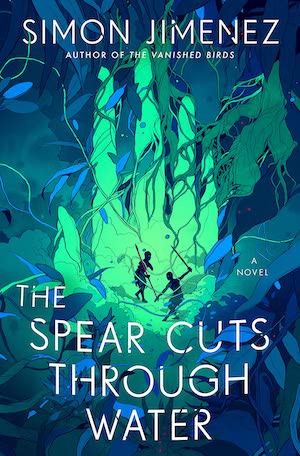

The Spear Cuts Through Water
Simon Jimenez is the author of The Vanished Birds. The Spear Cuts Through Water is his second book.




This essay is incredibly beautiful. Thank you, Simon. As an avid fan of your stunning debut, The Vanished Birds, I am more excited than I dare contain to read your epic fantasy.