Sure, vampires are the classic undead archetype. They’re rich in history and cemented in pop-culture, celebrated and parodied endlessly over the years. I won’t argue, they’ve got great PR backing them.
But I ask you, consider the zombie. They’re not so articulate or glamorous, but they’ve got numbers on their side. They don’t discriminate either. Regardless of age, race, or religion, they take all kinds. If you ask me, the vampires have dominated the spotlight for too long. With their growing presence in popular media, it’s time to give zombies some love, too. I’ve gathered together a few of my favorite pieces of contemporary zombie art and asked the creators to share a little bit of their inspirations. Feel free to post your own or link up your favorite zombie arts!
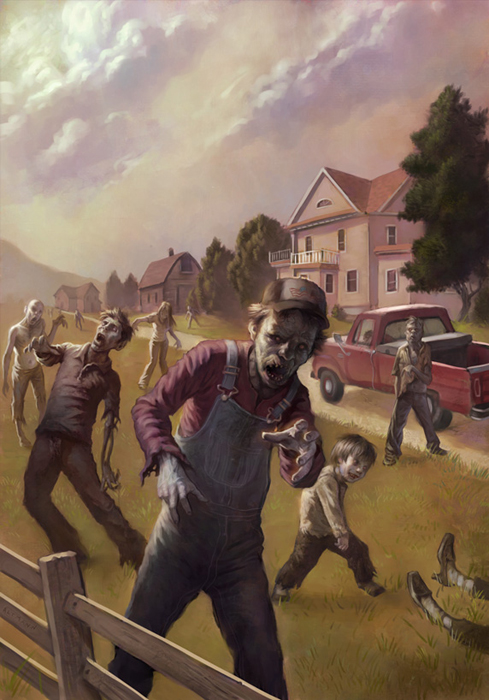
Scott Altmann
This cover was to play off of the famous Garrison Keillor book Lake Wobegon Days, with a strong Rockwell-esque, Americana feel… except with zombies. The art director and I both felt that to get that feeling across, that the setting should be warm, and inviting which would help this book stand out from the common setting of dark, eerie zombie books. At first it was a bit unsettling to use the warm palette with creepy, decomposing bodies around, but then I really enjoyed playing up the juxtaposition. Probably the most fun was getting my son to pose for the zombie kid, which only proved to me that even as a zombie I still find my son adorable. I also hinted at a likeness of Garrison Keillor—in zombie mode—for the zombie close to the red pickup truck.
![]()
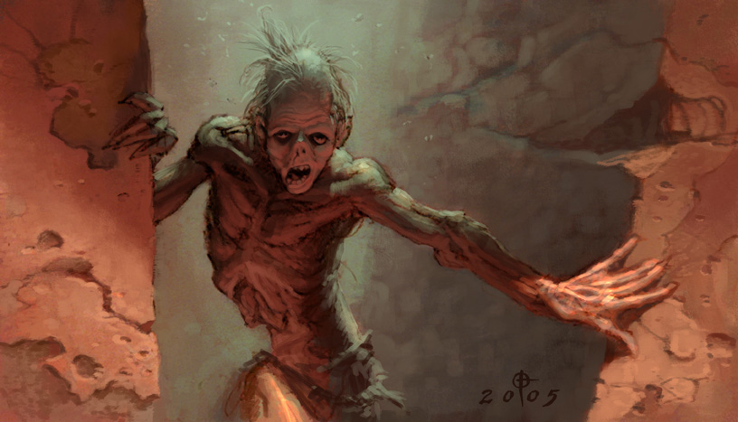
Daren Bader
This digital painting was originally done for a now-defunct trading card game for Wizards of the Coast. The description called for the zombie to be a mime, but I wanted to have a more “traditional” version of a zombie, so I kept the face-paint on a separate layer. However, I did enjoy the humorous angle they were asking for so I threw in the screwed up hairdo and flies to give him that “fresh” look. Also, I particularly enjoyed working out the pose of this guy because I like the way zombies always seem to be just on the verge of falling over.
![]()
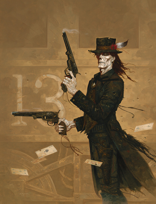
Brom
The Gunslinger was commissioned for Shane Hensley’s Deadlands. Undead mixed with Americana is always a favorite theme and this is one of my personal favorites. It was one of those rare paintings that just fell in place for me.
![]()
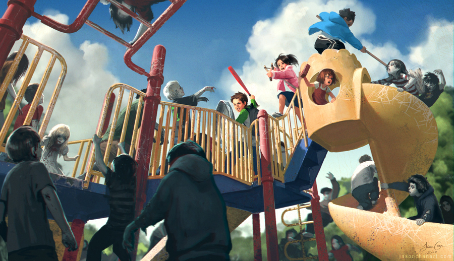
Jason Chan
This piece was inspired by two of my favorite things—playing with my friends as a kid and zombies! Whether this is a kids-eye-view of a playground zombie game or actually a group of doomed children trying to fend off their undead classmates is really up to you.
![]()
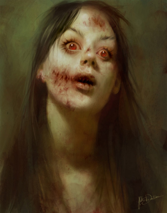
Katie De Sousa
My zombie-self-portrait was painted for a daily sketch challenge. The challenge was to paint your evil twin, and at the time I wanted to have a go at painting some living dead. I didn’t anticipate having so much fun while painting it, I’m squeamish and looking up rotting flesh on google for reference is a little harrowing, but after that I had a blast. I think monsters can be very beautiful in their own unconventional way, and I enjoyed trying to capture that. This is one of my favorite pieces, though it still makes my friends uncomfortable to look at.
![]()
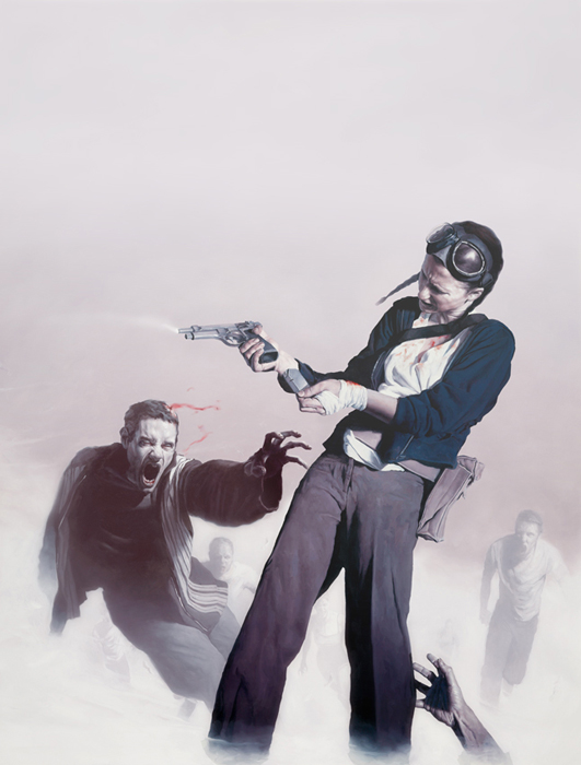
Jeremy Geddes
“This was my first comic cover. I didn’t have much of a brief, just that the comic was called “Doomed” and was a tribute/homage to the old horror comics of the ’70s like Creepy and Eerie.
I wanted to give the cover a slightly ’70s feel, (although I guess if you want to be pedantic, the “fast zombies” thing is a pretty recent addition to the genre) and give an image that somehow gelled with the title, you couldn’t really have the girl winning with “Doomed” plastered above the pic.
I went with zombies because, honestly, this was the first excuse I had had to paint them! The genre is getting a little crowded these days, but I wasn’t going to let it go past without throwing my hat in the ring at least a few times.
![]()
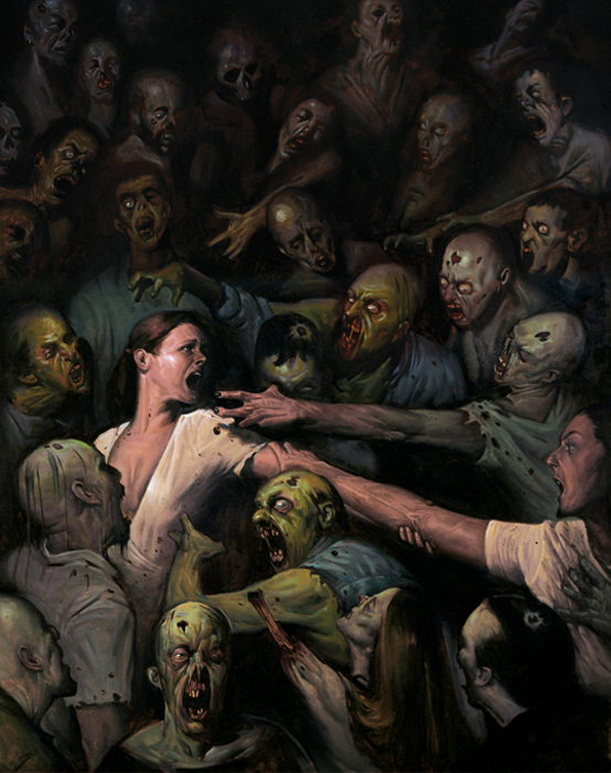
E.M. Gist
My inspiration for this piece was twofold. First, I wanted to represent the primary threat of zombies, which is their sheer numbers. Second, at the time I was enamored with pattern compositions, attempting to treat a narrative illustration almost like an abstract or even non-objective image. Essentially I was trying to create the illusion of the two main characters being swept away in an unstoppable current rather than being threatened by a tradition moustache-twirling villain.
![]()
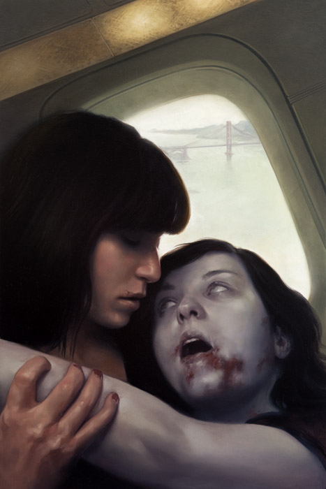
David Palumbo
The living girl in this painting spends most of the book fighting not only with zombies, but also with strong sexual feelings and questions. I wanted to show a moment which kind of walked halfway between: a struggle with a zombie where it could either lean towards a bite or a kiss. Unlike vampires and werewolves, zombies aren’t easily or often depicted as very sexy monsters in any conventional sense, so it was a fun problem to work at.
![]()
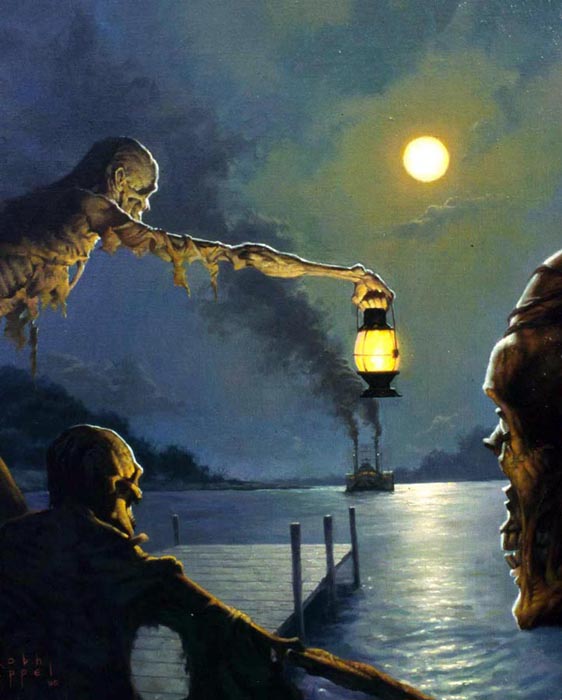
Robh Ruppel
“Visually i was inspired by John Stobart, a marine artist. I was living in Wisconsin at the time and not too far from a lake. I would walk down at night after work and really look at how the moon interacted with the water and trees and then tried to imagine these rotting guys luring the boat in. The shock being too late for by the time the crew docked they’d be on board. I think anything we can experience in reality and bring to our art makes it much, much stronger.
![]()
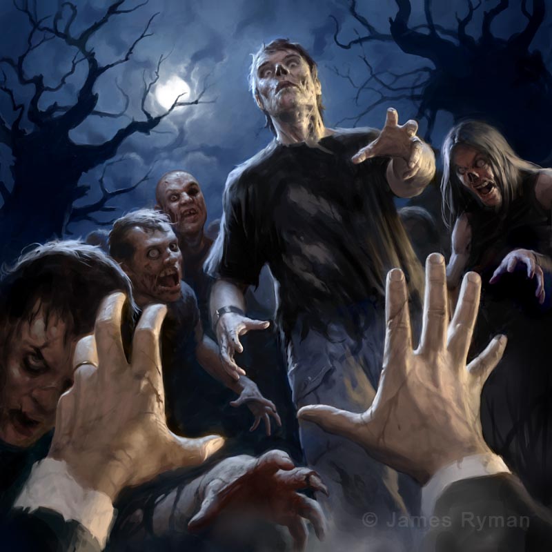
James Ryman
I love painting zombies. There seems to be an endless supply of situations to put them in and they can be terrifying or funny (or even both at the same time) depending on how they are handled. For this particular illustration I wanted the viewer to actually feel like they are in the scene, like it’s their hands being held up and their last breath being exhaled. I don’t suppose this illustration falls into the ‘funny’ category, although I posed for all of the figures which was fun, so when I look at it now it does make me chuckle :)
Out of interest, I have a zombie calendar coming out next month… Seems to be a lot of interest in the undead at the moment!
![]()
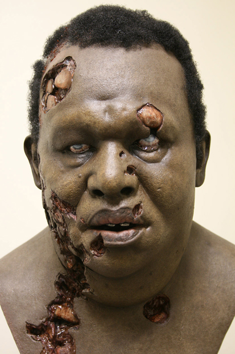
Jordu Schell
To me, what can make a zombie-like character disturbing is the sense of individuality the artist can bring to the figure. If it’s just a generic, taut-skinned skull, it will most likely lack impact; it is when you can make the design a recognizable person that things change—this could be your neighbor, your wife, your best friend—someone you knew and cared for, transformed into a monster.
![]()
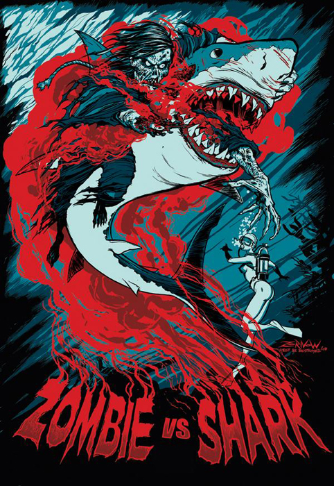
Jeffrey Zornow
This idea came from requests from the Rue-Morgue message board. We have a lot of our earliest Fright-Rags fans there. Ben and I were shocked when we realized NO ONE had EVER made that into a shirt before. So we quickly went into production on it. TO SET THE RECORD STRAIGHT YES THE ZOMBIE ACTUALLY HAS 2 LEFT HANDS! This was a strange slip up on my part while inking the piece. HOWEVER, Ben didnt notice it either. Eric Rot from ROT GRAFIX, pointed it out to me and I was horrified I had made one of those dumb mistakes. I offered to fix the hand as the shirt had not gone into production yet, and there was still time. BUT BEN DID NOT WANT ME TO FIX THE MISTAKE! “Haha,” he said. “Fulci wouldn’t have fixed it, he would have just moved on.” So I did as the boss wanted and left my mistake for the world to see… if they noticed. And since its release two years later it remains one of the top selling Fright-Rags T-shirts. Which means it’s probably my best known piece of art. And hey… a zombie with TWO LEFT HANDS IS DOUBLE EVIL! ROT ON!
Dave Palumbo has been a fan of comic books and science fiction ever since he can remember. Growing up, he loved to draw monsters and superheroes and was fortunate enough to have parents who supported and encouraged him. Since 2005, science fiction and fantasy illustration has become the primary focus of Dave’s career, though he still makes time when he can for side projects and gallery shows. Visit him online and view his gallery on Tor.com.


