I was never really interested in architecture until Batman became involved. And I feel kind of weird about that.
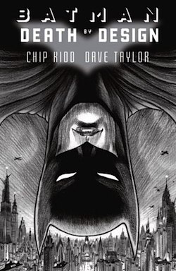
New graphic novel Batman: Death by Design is to blame for this. The stand-alone story by designer and art director Chip Kidd and artist Dave Taylor imagines a Batman caper set in an era of gumshoes, art deco, and pulp heroes with decidedly futuristic tech. At first it’s difficult to see where Batman and architecture cross. Gotham City has been depicted in movies and comics as a grand nightmare of form, shadowed alleys and exposed scaffolding tucked under magnificent colossi and towering, stylized edifices. (When it’s not just Chicago, that is.) It’s a perfect backdrop for the Batman, but how do you build a story around it? Does Batman… fight architecture? Can one imagine Christian Bale shaking an architect while intoning, “STOP BUILDING THESE THINGS. IT’S CONFUSING ME”?
By the end of Death by Design, this is no longer a question. If anything, you want the story to keep going.
The story begins during a golden age in Gotham as Bruce Wayne announces the demolition of Wayne Central Station, the city’s aging transit hub. What was once a towering multi-level station that announced the grandeur of Gotham City to incoming travelers is now a degraded, empty vault of little activity. Bruce is championing a new design with Wayne Enterprises—one that is futuristic, green, and progressive.
This design has two key opponents: a shadowy one that tries to collapse a crane onto Bruce during the press conference where he announces the new station, and Cyndia, a tireless, sincere, somewhat Ayn Randian “urban preservationist” who champions the restoration of the original Wayne Central Station to Bruce. These two opponents may or may not be the same person.
Cyndia’s genuine tenacity charms Bruce and through the course of their work they visit a brand new nightclub called The Ceiling, which is little more than a thick glass platform (“a triumph of maxi-minimalism”) suspended above several skyscrapers.
Once there, the guests fall prey to an attack by a very dapper Joker, who looks more human than normal and somehow all the more frightening. Batman saves the day, of course, no thanks to Exacto, a new superpowered figure in Gotham who seems like a hero at first but definitely has his own agenda. (One that involves giving stern lectures on architecture and design flaws. He’s an odd duck.)
Through these events, Batman uncovers a tangle of forces both legitimate and underground who all have legacies tied to Wayne Central Station. Some benefit from its destruction, others from its restoration. The more that Batman finds out, the more he realizes how intimately his father’s legacy is tied to this fight, and how much that defines Bruce himself. Should he champion those who would restore and put right what his father attempted? Or should he champion the direction that he himself has imposed on Gotham?
To find such an emotional resonance for Batman through the lens of architecture is a fantastic storytelling achievement in itself, and so those who know of Chip Kidd and his art design background are forced to again wonder if there’s anything he can’t do.
Kidd finds an amazing storytelling partner in artist Dave Taylor, who delivers extremely potent moments all throughout the book, whether it’s through architectural vista (like the above depiction of The Ceiling) or through simple character interaction. There is a page further on in the book featuring the Joker that is exceedingly frightening, and the kicker is that the Joker isn’t doing anything in it.
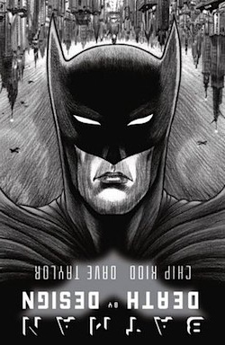 I have to admit personal artistic bias towards Taylor, as well, in that I am a total sucker for pencil-only comic illustration. To be sure, there are inks and colors, but the pages look as if they sprang straight from Taylor’s desk, giving the tale a rough vibrancy that matches perfectly with the nebulous pulp-y, roaring 20s-ish period the story is set in.
Kidd & Taylor also sneak in some clever artistic tricks if you’re paying attention. For example, flipping the cover of the book suddenly turns Batman hovering over skyscrapers into Batman amongst the people of Gotham.
Batman: Death by Design, out today from DC Comics, starts off as a pretty by-the-numbers story, but it turns into a fun and surprisingly resonant tale by the end. The real coup here is that Kidd and Taylor manage to instill in the reader the same fascination with architecture and the minds behind it that brought them to craft this comic in the first place. Reading this makes me want to explore the artistry behind the architecture in my own life.
And it’s all thanks to Batman.
Chris Lough is the production manager at Tor.com and should start looking into the very building he works in, for starters.


