


I was ten years old, holding a golden Nintendo cartridge in my hands. The first time I’d lost myself in fantasy maps was when I discovered Dad’s old Lord of the Rings paperbacks. But everything was about to change for me.
I didn’t play The Legend of Zelda to win. I played it to explore. With colored pencils and an old piece of graph paper, I mapped the 8-bit world of Hyrule. When I ran out of paper, I taped on new segments. I kept it in my back pocket and took it to school with me, unfolding it at every chance to plan my next adventure. I dreamed of filling out those blank spaces and wondered what I would find there.
Oh boy, I had no idea where that little folded up map would lead me. I guess I could’ve found myself mapping Antarctica or outer space or the bottom of the ocean. But I dislike the snow, am extremely claustrophobic, and am terrified of being out to sea. So I explore fantasy novels.
Exploration
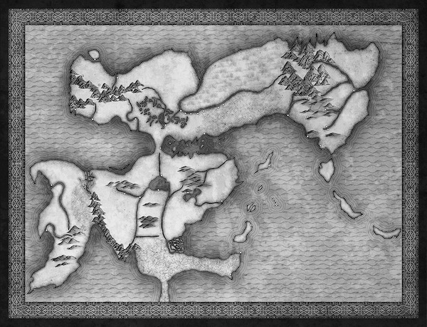
For Brian Staveley’s excellent fantasy debut, The Emperor’s Blades, Heather Saunders at Tor wanted a two-page map that would match the feel of the book. When drawing a map, often all I have is the text of the book itself. This time I had both the book and the author’s sketch of his world.
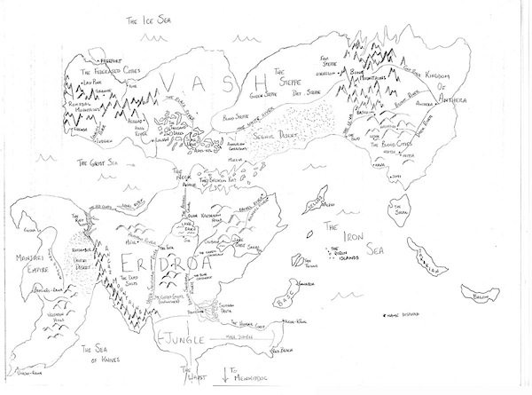
Brian’s attention to detail was amazing! I immediately wanted to dive into reading the book. I wasn’t disappointed. The same care with which he built the map is also found in the novel.
Buy the Book
The Emperor’s Blades
Before I jumped in headfirst, I needed to make sure of my destination. I wanted the final map to:
- Match the design of the book.
- Match the feel of the book.
- Feel like an artifact from the world of The Emperor’s Blades.
I asked Heather for samples of the book’s interior design. I studied the book’s cover. I tried to distill the feeling I had while reading the novel and decided that a somewhat far Eastern looking map would work well.
As much as possible, I try to design my maps as if they were artifacts of the world they depict. This is probably influenced by my time creating ephemera for Brandon Sanderson’s worlds. There are plenty of well-designed fantasy maps that don’t follow this paradigm, but it’s my preference. Because of that, I always try to find real-world examples on which to base my maps.
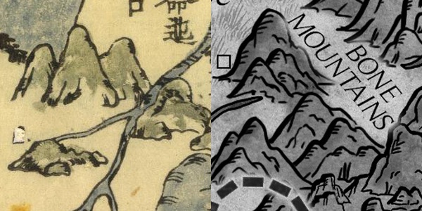
After some serious web surfing (and an unfortunate delay in the Straits of Social Media), I discovered a map on a website I hadn’t come across before (David Rumsey Map Collection), but which has quickly become my go-to place for map reference.

This was exactly what I was looking for and made it my style target.
The Problem of Real World Maps
I almost always run into the same problem each time I try to adapt a real-world cartographic style to a map meant for a novel.
Real world maps are huge and detailed.
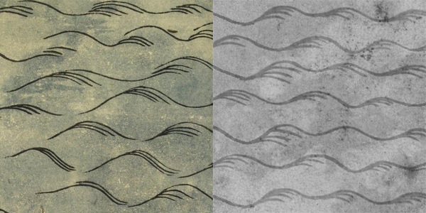
A map meant to fit in a hardcover book (and subsequently a paperback) can’t be as detailed as a real-world map and still be legible. Even though I treat the map as a product of its fantasy world, it has to be understandable to modern audiences. Usually this means I can’t copy the exact style of my reference, but I can use it for inspiration. I decided to borrow the style of the mountains, rivers, and ocean.
Borders
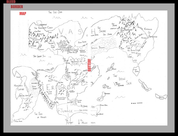
I start with the project specs to create a Photoshop file with all the guides I need to keep the image and text from getting too close to the book’s trim line. With a two-page spread like this map, I also add in safety guidelines around the gutter between the two pages.
Using the interior chapter designs as inspiration, I created a border, then went about fitting Brian’s sketched map into the space available, resizing and moving it until it fit right. I also cut the reference map in half and pulled it to either side of the gutter line. This makes the final map slightly wider than the sketch, but it also gives me space in the middle with no labels or important features. This keeps readers from having to pull the book apart to find words that are hidden in the binding.
Map Creation
Painters have their preferred way of working, whether dark to light, light to dark, background to foreground, etc. With maps, it’s a bit more like Genesis (the book, not the band). I decided, for the sake of contrast and legibility, what parts of the map will be light and what will be dark. Then I separate the land from the water.
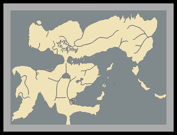
I add the coastline and different biomes: mountains, deserts, forests, etc.
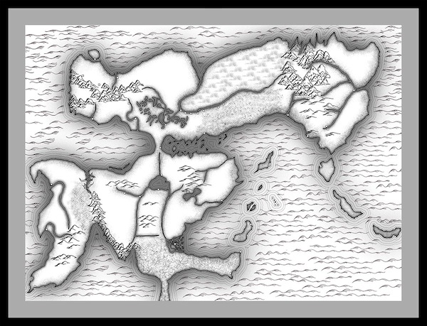
Final border and texture for that antique feel. (Okay, so this step has nothing to do with Genesis.)
Then I draw national borders and label everything.
I would’ve loved to have found a font with an Eastern flair to match the reference image, but I’ve found that most faux Eastern fonts often aren’t very legible, especially at small sizes. My first rule of fantasy cartography is clarity. For that reason, I opted to go with a nice Roman font that matched the book’s interior design.
Finally, I make a few layer adjustments to make sure the map would print out clearly in the final book.
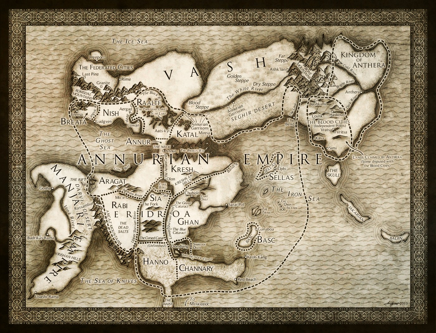
There you have it. A map that would’ve made my ten-year old self proud, except I doubt I could’ve used it to find another piece of the Triforce.
Originally published in December 2013.
How is that intricate, flawless, border design generated; does the computer do all the work?
Just had to throw my voice in. The maps you create are just gorgeous! Wonderful art :)
I love your maps! While reading the story I always pause and check the map to see where the characters are!
I love making fantasy maps too, I just wish I knew enough about geology, weather patterns, and ocean currents to make them even vaguely realistic. I mean, for example, if you put a land bridge running from just above The Humber Estuary in England to just under the Kiel Canal in Germany, would that make the tides in what used to be the English channel and southern North Sea more extreme like the Bay of Fundy, or less like the Baltic? I mean, serious question, anyone know?
Like Mr. Bilbo Baggins I dearly love a map.
Why is it fantasy novels get maps, but SF novels–even ones set on other worlds–almost never do?
What an excellent resource for writing fantasy. Thanks.
I was always delighted to find maps in books when I was young. It made the stories feel more real to me. And to this day, I delight in books that start with a map or diagram of some sort.
Thanks for sharing what goes into creating a good literary map.
deleted by author
Another question: as the artist, suppose you notice something that’s geologically impossible in the map’s design; I guess you have to just shrug and bear it because it’s not your place to comment? Or, can you sometimes nerf the map design a bit to save the day?
Love this! The maps are always my favorite part of (most) fantasy novels. And thank you, especially, for paying attention to the gutter!
If you’re drawing an in-world artifact, don’t you have to consider what the people in the world would use it for? A sea chart looks not very much like the map a caravan leader would use, for instance, and a rutter is yet a third thing. I don’t recall ever seeing a sea chart in a fantasy novel, now that I think about it.