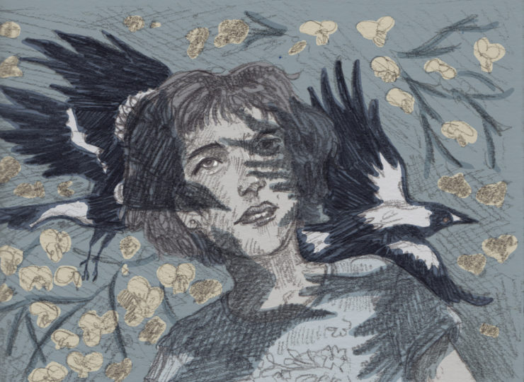
Until recently, I’ve been known more as an illustrator than as a writer (although I’ve always done both). But I rarely do both together.
Although writing and art draw from the same storytelling aquifer, they come up through different wells. Ideas sometimes shift fluidly between the two in the early stages of a project, but usually one—art or words—will quickly take over. In fact, it becomes a challenge to strip an idea entirely of words, or to create a painterly impression using only text, and a challenge for my editors to bring me back to the purpose of a comic.
I’ve been trying to bring writing and images together more often (for example, in short stories for some patrons on Patreon). And when I began a practice-led MPhil at the University of Queensland, researching “The Visual Evocation of the Beautiful Sublime in Australian Gothic Literature”, it was with the grand plan of doing just this with the creative component, which became Flyaway.
Uses of sketching
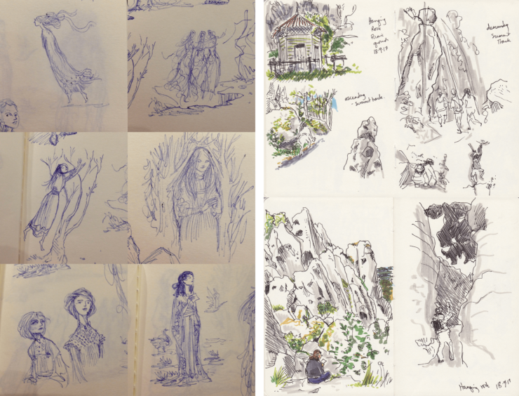
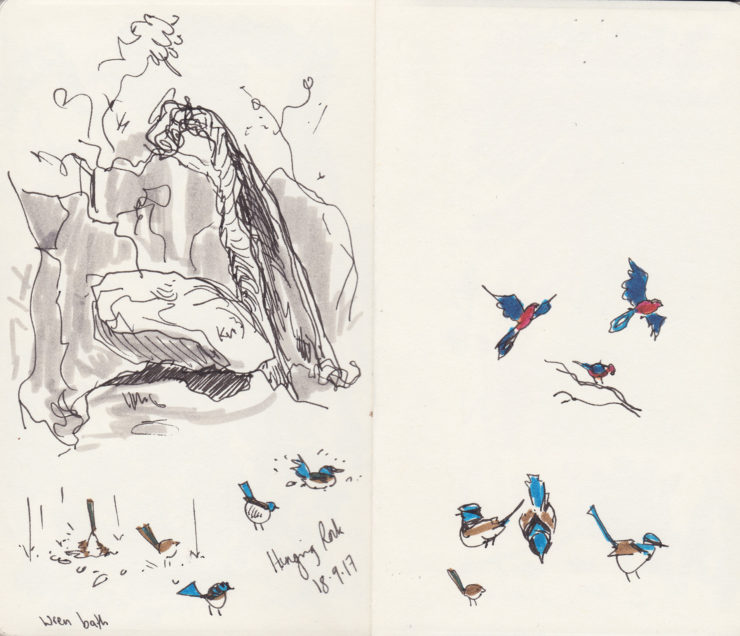
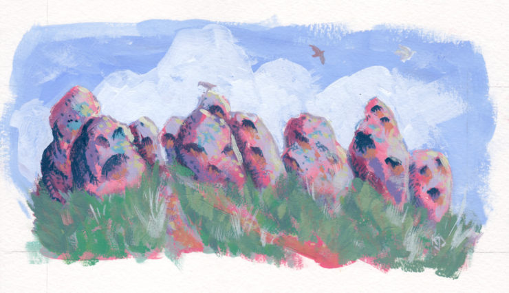
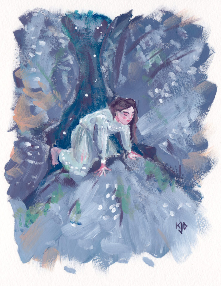
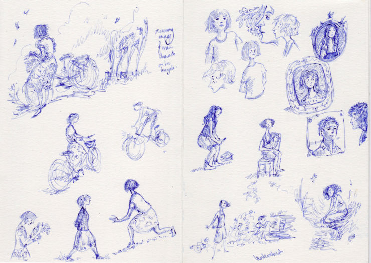
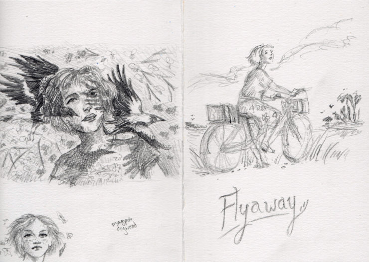
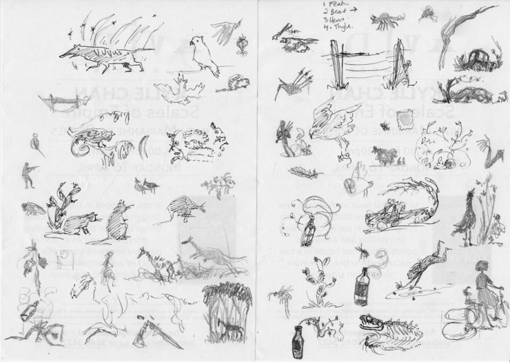
It was very interesting consciously watching myself do this. I found that when I was developing the story, I was using sketches as a way of reading other books, as a method for examining other authors’ locations (such as the Hanging Rock of Joan Lindsay’s Picnic at Hanging Rock) and textures (the dresses of Rosalie Ham’s The Dressmaker, as well as classics of Australian art history referenced by author-illustrators such as Shaun Tan in his Tales from Outer Suburbia, among other works), as a process of collating favourite genre tropes and touchstones, and as a way of working out the images that did and didn’t spring comfortably to my style, and what to do with that knowledge.
Purposes of illustration
I also found I was working out the roles not just of sketching, but of illustration. In my own work, I had always prioritised illustrations full of movement and commentary over more purely decorative ornament. But that separation wasn’t working for Flyaway.
The playing-in-other-people’s-worlds, and the thinking-about-things roles of drawing had been taken over by the academic essay component of the project. The writing of Flyaway itself was busily dealing with most of the movement and impetus inherent in the story. I took a trip back to the region that inspired the story (thanks are due to the Cecilie Anne Sloane Postgraduate English Creative Writing Research Scholarship for making this and the Victorian research trip possible). The audio notes I took, however, are full of word-sketches, colour and texture and light that kept getting into the sentences instead of the drawings. And the feeling of my drawn style was different from what I felt when I wrote the story (a problem that doesn’t exist to the same extent when illustrating someone else’s stories).
This forced me to reconsider the role of decorative illustration.
While my dissertation was on the visual evocation of the beautiful sublime, most of what I was considering in Joan Lindsay and Rosalie Ham’s books (to a lesser extent, of course, in Shaun Tan’s Tales from Outer Suburbia) was how that visual evocation was done in prose.
But aside from how beauty was described, I also looked at what those descriptions were doing. In Australian Gothic literature, not uniquely, beauty (if it exists at all) is very untrustworthy. It is a literature of doubling and mirrors and rotten facades. But Picnic at Hanging Rock, The Dressmaker, and Tales from Outer Suburbia all contain intense (and unwavering) beauty, for all their terrors. And each book created robust frameworks and foundations to support that.
“Everything if only you could see it clearly enough, is beautiful and complete…”—Joan Lindsay, Picnic at Hanging Rock
This made me think differently about ornament. Like written flourishes, decorative illustration can frame and found a book, positioning it in a particular genre and aesthetic, underscoring that people care enough about this particular book-as-object to decorate it.
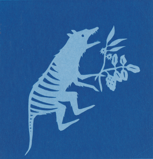
Of course, this was also a convenient justification for me to turn to my other beloved style of silhouettes and shadows, with their enforced stylisations, their fairy-tale and Gothic implications.
(Incidentally, these illustrations led to my covers for a set of rediscovered Australian Gothic and mystery novels for the University of Queensland’s teaching press, Corella Press. Although each of those covers has a flourish specific to the republished novel, the books themselves hadn’t been chosen when the base art was due, so I had to lean heavily on the lessons of Flyaway. And one or two of the early sketches for cover ideas slid into some compositions for Tremontaine.
Process
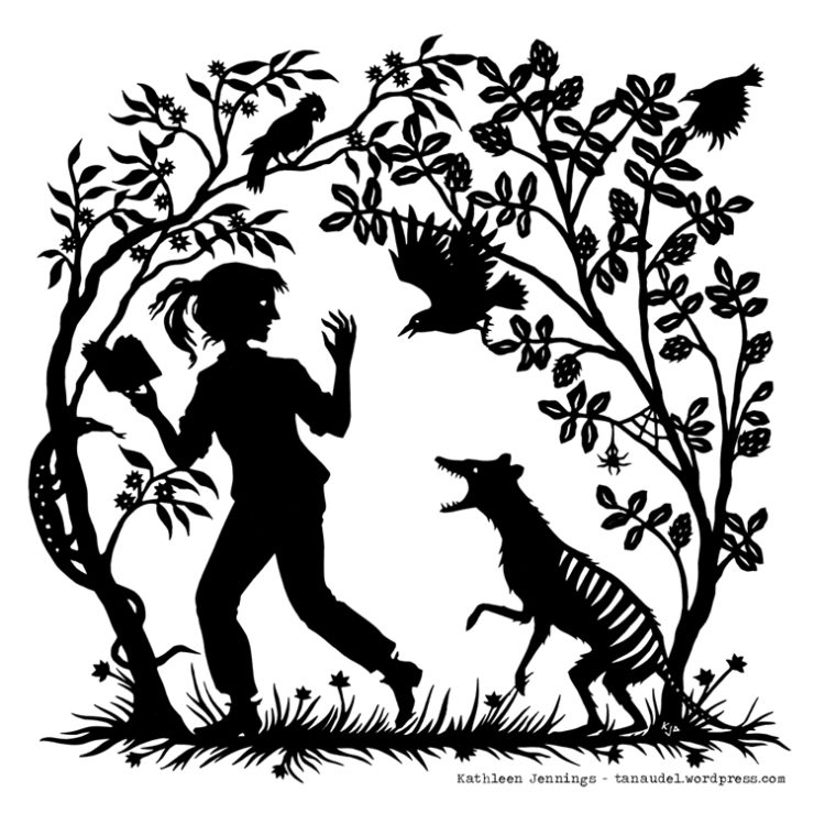
Most of my silhouette illustrations, however, had been for more northern and purely fairy-tale-inflected stories. I had to sound out what Australian settings would do to that style (a theme, as it happens, of Flyaway). One of the early products of this was my “Into the Woods” illustration for a Light Grey Art Labs exhibition.
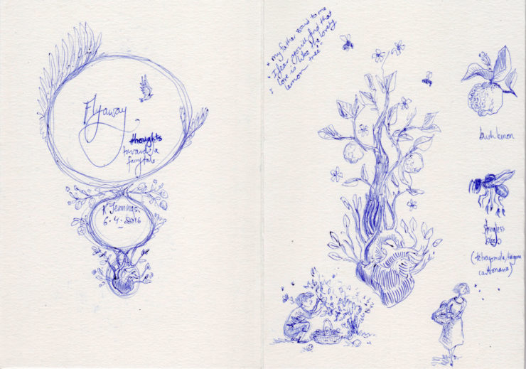
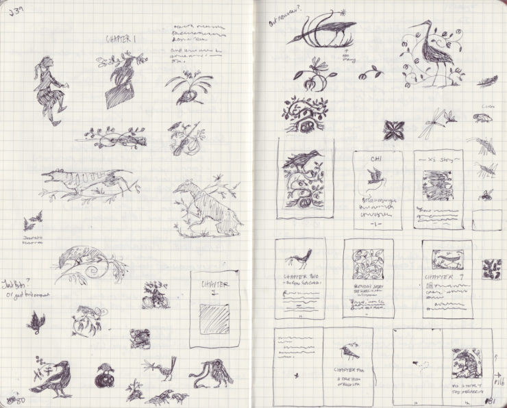
Then I began a list of key images and elements, jotting quick sketches in my notebook.
The decorative emphasis helped me lean towards the very evocative rather than the heavily representational. (I also found that, in the absence of an art director, rigid restrictions helped me make uniform decisions more easily, in much the way another mind would have.)
From the sketches, I selected spot illustrations for one category of chapters, and slightly larger square illustrations for another, according to the structure of the book. The challenge of fitting the composition to that shape gave me something to worry about instead of deadlines, and forced a further decorative approach. I played with this in a few other illustrations around that time, until I started to be more comfortable with it. (There’s a video here of a square unicorn design.) I also did a few “test patches”—not only in the form of those secondary projects but also with miniature treatments of concepts and outright finished illustrations.
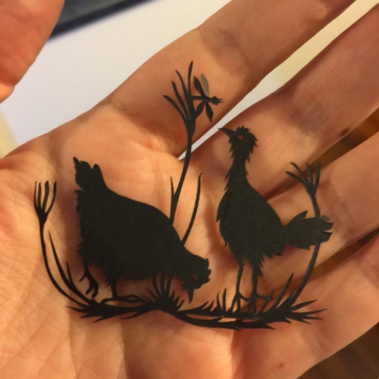
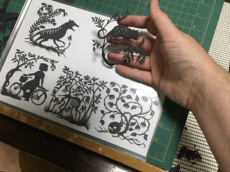
After that, the final process was relatively simple. For simple pieces, I would sketch them directly onto the back of black paper. For complicated ones, I would do a detailed pencil drawing and use white transfer paper to copy it down. Then I cut it out, scan it in and do a quick digital tidy up. This gives a clean, easily resizable file for printing, but I rarely do more than repair the occasional obvious mistake—piercings that haven’t quite been cut through, etc. I like the odd textures and wobbles of the hand-cut line.
Designers
At that point, the internals were finished. I completed the art before I submitted the manuscript, so there was none of the usual back and forth or approval process on it—a strangely unsupervised feeling.
The cover, however, had a few more steps to go through. Initially, I asked a graphic designer friend, Shayna Naran, to mock up a layout for me to attach in the appendix to my dissertation.
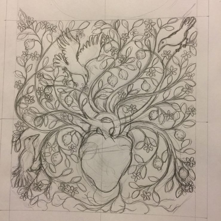
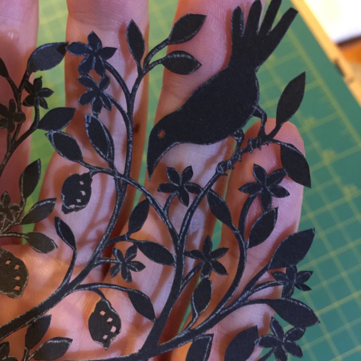
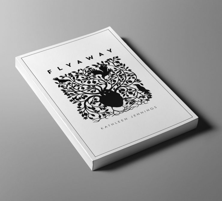
After the book was accepted by Tor.com, however, Christine Foltzer, as art director, had Jaya Miceli put together the cover treatment. Suddenly the image went from cold black and white to that beautiful layered mystery of anatomical charts and mid-century lettering. I adore it.
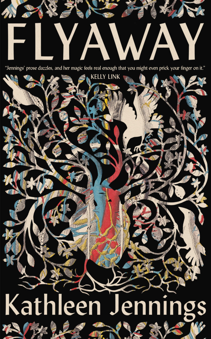
And then—and then!—Tor.com sold Australian rights to Picador Australia, and a new cover had to be designed. This was fascinating for me as an illustrator (as well as a writer)—getting to see two covers developed for different markets from the same silhouette, while being behind a different part of the scenery than I usually am. The cues and meanings all shift and change, and both are in their own way accurate, and beautiful.
Lessons
I’m delighted to have Flyaway be brought out by Tor.com (and Picador). It’s an honour and an education to work with Ellen Datlow, Ruoxi Chen, Irene Gallo, Christine Foltzer and all the team, this time as an author—but also to have them take on this ornamented story, and to watch the design and its reception unfold.
The process of creating and illustrating Flyaway has made me think through the possibilities and strengths of silhouettes and decorative illustration. While I will still be writing my own stories and drawing for others, I plan to continue to play with the ways in which my writing and illustration can work together.
Buy the Book


Flyaway
Kathleen Jennings is a writer and illustrator in Brisbane, Australia. She was raised on fairy tales on a cattle station in Western Queensland, and practiced as a translator and a lawyer (which is all stories, isn’t it?) before returning to undertake a Master of Philosophy in Creative Writing (Australian Gothic Literature) at the University of Queensland. Her short stories have appeared on Tor.com, in Lady Churchill’s Rosebud Wristlet, in anthologies from Candlewick, Ticonderoga and Fablecroft Publishing, and elsewhere. As an illustrator, she has been shortlisted for one Hugo and three World Fantasy Awards, and has won several Ditmars.


