


If you’ve seen any of Netflix’s The Fall of the House of Usher, you know that the limited series from Mike Flanagan takes several of Edgar Allan Poe’s works and weaves them into a family story about corruption and reaping what you sow.
What you may also have noticed, is that each member of the Usher family has their own color.
Incorporating that color into the sets in a way that wasn’t glaring or confusing to the viewer was no small feat. “What we decided was, with the kids and their main sets, the colors would always be apparent in the palette, but we would try to subdue as much as we could,” Laurin Kelsey, the series production designer, told me in an interview.
Kelsey and I talked more about her work on The Fall of the House of Usher, including how they created the entire neighborhood of Roderick and Madeline Usher’s childhood home from scratch (and how they aged its look over the course of shooting), and what it took to create that warehouse sequence.
Read on for our discussion, which includes some minor spoilers (though nothing major) for the show.

This interview has been edited for clarity and brevity.
I know that each of the siblings has a respective color. I would love to hear how that concept came to be and how you approached integrating that into each of the homes of the siblings.
[Showrunner Mike Flanagan] always is so detailed when he comes with the scripts, which makes it so fun to work on because you have such a good base to go from. You’re not starting from scratch—there’s a really solid backstory for everything. And the colors were something that he came up with.
I’m not sure when, but it came to us with the first scripts that, “Hey, I really want each of the Ushers to have their own color. And I want to talk about how we do that, where we do that, and how we utilize it.” The color was an interesting challenge because when there are so many sets, and there are so many time periods, and there’s so much going under stunts, and there are all these gory things, I really try to limit my palettes because there are already so many different layers going on that if I had too much color, it just gets so disjointed.
So for me when he said everyone has their own color I was going like “Oh, no! How do we make that fit within, the ‘50s, the ‘60s, Edgar Allan Poe, modern… everything under the sun that we had in the show?”

I loved where we landed. So Michael Fimognari, who was the director of photography and also directed half the series, and I spent a lot of time together, talking about the colors and experimenting with what kind of palette we can use, and then how the other departments can layer in color, like hair and makeup or wardrobe, and obviously lighting. What we decided was, with the kids and their main sets, the colors would always be apparent in the palette, but we would try to subdue as much as we could.
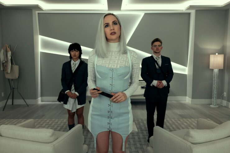
So for example in Leo’s loft [pictured above], his color is yellow but his walls are just very beige, which works when Michael pours lots of gold light onto it. And then you get the intensity of the yellow but it doesn’t hit you in the face and over the head. The second thing that we did was we shifted all the colors a little—they’re more primary when you’re on someone with lighting, but in the sets we went a little bit more jewel-toned, so a little bit more of a scarlet red, a little bit more of a sapphire blue. And that also allowed us to carry those hues through into the period stuff with a little bit more consistency. And then it was about accents in the set and how much to do. For example, in Frederick’s house—his color is blue but the walls are very whitewashed. So is it just blue pillows? Is that too obvious? Where do you bring in the layers of that?

Can you talk a bit more about how you incorporated the flashbacks into the look and feel of modern day?
That’s always a challenge. I love period stuff—it’s definitely one of my favorites because my background is in theater and I have an art history background. But obviously, with this one, the challenge I found was tying it all together, including the color story because Roderick’s color is gold, and Madeline’s color is lilac, and we don’t see as much of their modern homes but we see their childhood home. And in the period stuff, I really wanted to bring in a little bit more of the gothic Edgar Allan Poe feel. So I tried to keep that period stuff as their own world, just a slightly altered feel to the modern. So there’s the same colors—Roderick’s office at Fortunato has a lot of gold and a lot of purple, and wood tones. And that’s all in the Usher house as well—the wallpaper has big purple flowers on a yellow background, and the wood tone is the same wood tone as Fortunato.

It seems like Roderick’s modern home evokes the most what people think of when they think of Poe. How did you come up with that look?
The modern home was really interesting because Roderick has an interest in antiquities and artifacts that he’s collected. So he has that in his office and all the shelves. And then when we went looking for his home, we thought, “Well, he’s extremely wealthy. What kind of home would he have that we can lean a little bit into Poe and still tie into something somewhat updated so he doesn’t feel like a dinosaur. It was a location, one of only a handful that weren’t staged builds, and so we utilized a lot of what was already there, which was such great bones because it also had a very similar wood tone—a little bit warmer, but very much the same as his other home.
Where was the location?
That was in Delta (an area part of the metro Vancouver region). It’s a very interesting house and the exterior you see is the real exterior as well, so it’s a little bit more modern looking on the outside. And then we built his childhood home, which is probably my favorite set of the whole show, because it was a really interesting challenge. In the original story, which is like this very massive mansion in Edgar Allan Poe’s story. And to come up with a suburban version of a gothic home was a really odd challenge.
We had to be on a little suburban street, but we needed to have a gothic flair, but also the family comes from really humble beginnings. So it’s small. So how do you take all of that into consideration and come up with something that’s fitting? And it was really cool because we saw it in 1953, and it had to have a lot of warmth and family to it. And then as things go back to this moment, the ‘60s it had to become cluttered and start to decay a little, and then obviously, you have the present day version, which is completely decayed. The house is a lot like his soul—it’s innocent in the beginning and then it slowly rots and he just lets it fall into disrepair.

For those different stages of the childhood home—did you age up the same set as you went along?
Yeah, it was really fun. We had the exterior of the house on one stage and we built the whole street. We built the other houses and we paved—we had a paver come into the studio and pave a road and then on the neighboring stage, we had the backyard and the exterior back porch, and then the front entry and then the whole interior of the house. And then on another separate stage was the upstairs bedrooms. So it was broken into three parts.
We did it in proper order. We blockshot it, so all the 1950s stuff first, then we had time to change it over. Then we did all the 1960s stuff. And then we had a week or maybe two weeks to do the decays with paint and construction. We came in and smashed up the walls. [The paint crew] went to town, degrading it and breaking down the wallpaper and creating all the layers of decay, and then [the set crew] came in and did their thing with broken furniture and newspapers.

A very memorable scene is the rave in the abandoned building. How did you approach creating that space given what happens there?
As a collective we struggled for a while with figuring out how we were going to do that. We all wanted to use a location—it seemed so silly to build an empty warehouse. However, there were so many things to take into consideration. First of all, the layout that Mike [Flanagan] and I talked about and wanted was that feeling from “The Masque of the Red Death” where there are hallways off the side, and the rooms, and the individual doors. And so we wanted to have a very linear feel to it. And then, when we were looking for locations, we need to take into consideration being able to run water from the ceiling and control the drainage.
Older warehouses are not often that safe in terms of having that many people inside and you don’t want to pour water into 100-year-old walls. So we knew for a long time we were probably going to have to build it. I did love the feeling of the big windows at the back, which also comes from the original “Masque of the Red Death” imagery, and the brick and all the old pipes and everything. [Set decoration] did a really good job of taking what was essentially a large rectangular brick room and decking it out in a way that made it something that felt a little bit more realistic. And then we had fun things—like the bar was made all of individual speakers and we sprayed it all gold and did things that we thought Perry would do to make it a party and to make it fun.
The Fall of the House of Usher is now streaming on Netflix.