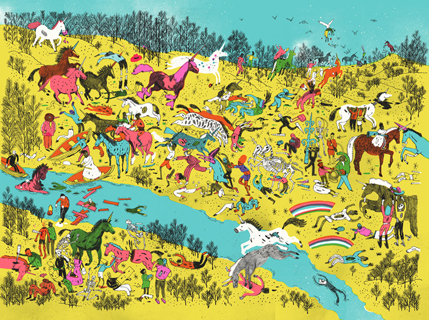
Holly Black and Justine Larbalestier challenged a number of young adult writers to the ultimate throwdown, Zombies vs Unicorns—a collection of short stories deciding once and for all, which rulz.
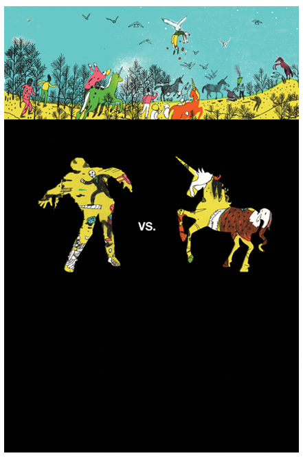 The title is an art director’s dream. So many possibilities, how can you go wrong? And yet, so many choices can be paralyzing. Simon and Schuster decided to go with Josh Cochran—a bold and unexpected choice. His zombiepocalypse perfectly pays tribute to the uncountable hours young teens spend engaged in drawing their own epic landscapes and battles without being patronizing to them or overly coy.
The art is printed on the boards of the book with a black jacket wrapping around two-thirds of the book—it does everything it can to make itself an object, short of literally begging to be picked up and played with.
I asked Josh to share his process with us.
Josh Cochran: I referenced Hieronymus Bosc’s “Garden of Earthly Delights” and used that as a starting point.
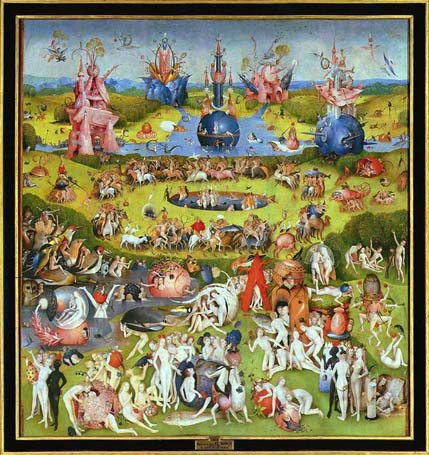
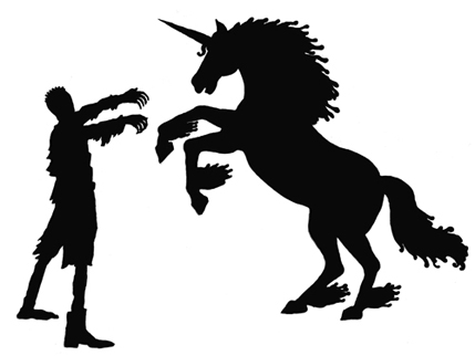
I even included a Bosch character in my drawing. Since this was a Young Adult cover I wasn’t too sure how far I could take the imagery. The art director, Lauren Rille wanted me to do a sample of what it could look like so she could sell it to the editor and her creative director:
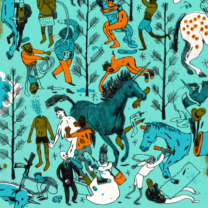
After seeing this they basically let me go wild with it, I just couldn’t show any nudity or sex. I did a super loose rough thumbnail to base a tighter composition off of:
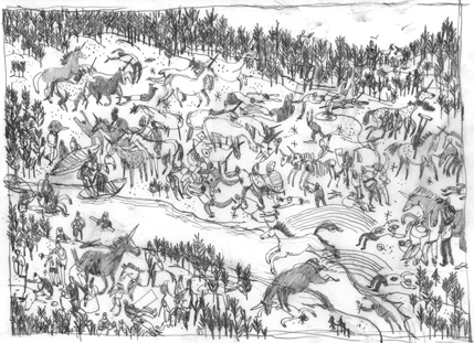
I then sent my sketch in and got some feedback from the Art Director’s:
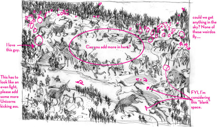
This project was a total dream assignment for me because of my love for both unicorns and zombies. The art directors, Lauren Rille and Sonia Chaghatzbanian, gave me a lot of freedom as well as pushed me creatively and luckily we were all super happy with the results.
To buy a print of Zombies Vs. Unicorns, and other cool stuff, visit Josh Cochran’s store. To have Josh Cochrans’ Zombies versus Unicorns as your desktop wallpaper, check out Simon and Shuster’s website.


