Skip to content

Knife of Dreams ebook cover by Michael Komarck

89
Share

Knife of Dreams ebook cover by Michael Komarck

Home / Wheel of Time Master Index / Knife of Dreams ebook cover by Michael Komarck
Blog Art & Illustration

Knife of Dreams ebook cover by Michael Komarck

By

Published on August 10, 2010

Michael Komarck ebook cover for Knife of Dreams
89
Share
Michael Komarck ebook cover for Knife of Dreams

Knife of Dreams, volume eleven in Robert Jordan’s The Wheel of Time, will be available in ebook form on August 24th. In celebration of Jordan’s work, we have commissioned fourteen artists to interpret one of the Wheel of Time books in their own style. (Previous editions can be seen here. The first seven ebooks can be purchased here.)

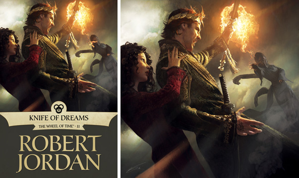
It was time to pump up the action on the covers. I knew early on I wanted to ask Michael Komarck to work on the series but I wasn’t sure which book. After talking to Jason Denzel and reading some of the fan comments, it seemed Komarck’s gritty photorealism would be a perfect fit for this sequence.

At this point in the series Rand’s physical and mental stability is breaking down. Komarck’s tight composition and unconventional angles make the viewer feel that imbalance. Komarck engages you by making you feel slightly uncomfortable, almost wishing you could take a step back to regain your composure.

In an age when a lot of noise is being made about illustration “needing” to become moving images, I would say the beauty of this image is that you are in perpetual conflict—you want Rand to regain balance, but no amount of looking will change his struggle at that moment.

While Rand is being heroic by saving Min’s life, a fan of the series will come to the image knowing the full story is more multifaceted than that. It is a testament to Jordan’s writing that very little is simple or one-sided. While Rand is saving Min, it is an act that helps ground him, too; Rand being the Dragon isolates to the point that it’s hard to interact with people the way that he used to. Protecting them from danger at once expresses his power and reinforces his connection to close friends and loved ones. This scene is emblematic of the tightrope that Rand must walk to get to Tarmon Gai’don.

Michael Komarck ebook cover for Knife of Dreams


To keep up with all of our Wheel of Time posts, including information on the ebook releases, check out our Wheel of Time Index.

To see more of Michael Komarck’s illustrations visit his website.

Dragonmount’s feature on the Knife of Dreams ebook cover, including a larger cover image.

About the Author

Subscribe
Notify of
Avatar


89 Comments
Oldest
Newest Most Voted
Inline Feedbacks
View all comments
Avatar
Megaduck
14 years ago

Nice.

I especially like the use of light and shadow here. With the sun over Min and the Shadow over Saimherige and Rand right between the two illuminated by fire.

Avatar
14 years ago

I wanted a Bud Light!

Sorry- did that when the first Batman w/ Keaton came out in the theaters. Went over a lot better than it did here.

Pikkitur wise, I didn’t imagine the hooded whatisit in the background casting flame- Semi. And I totally did not picture Min that way. But I am much more comfortable with Rand in this depiction than in previous incantations.

Woof™.

Avatar
tamyrlink
14 years ago

i love it! i was wondering which scene would be picked as there are a few good ones in this book

Avatar
14 years ago

Absolutely GORGEOUS! I am so impressed with these ebook covers and this one has, perhaps, topped the lot. A testament to the art direction and talent of the artists involved (as well as Jordans brilliantly imagined world/characters!).

Avatar
14 years ago

Wooah… so awesome.

Edit: only one thing could make this cover any cooler, so I went and got some Sonny Bryan’s barbeque to enjoy with. Aaahhh :)

Avatar
14 years ago

Hello, Semirhage! Bye-bye, hand & Scepter!

Very nice; the three characters pictured are much like I imagined them in this scene (always a plus with me).

Avatar
14 years ago

I wasn’t sure if I liked it at first, until I zoomed in on the picture and could see the detail better. Upon being able to look at it more closely I like how it looks now, especially the fireball and how Rand almost looks like he is moving as he intercepts it. Also, having Semirhage wrapped in the dark and mist works really well with what we have been given about her character. She has been mysterious and deadly up to this point in the series.

If I have one small complaint, it would be that Min looks a little plasticky(?) and a bit like a mannequin for some reason. Maybe it’s just me seeing things, but it certainly doesn’t detract from the excellent cover that this is.

Avatar
14 years ago

Ridiculous. Simply ridiculous.

That amount of talent should be illegal.

From when we first spotted Komarck’s amazing renditions of the Lannisters for Fantasy Flight Games, where the company wouldn’t tell us his name unless we half-jokingly swore to secrecy because they knew other publishers were going to be beating down his door, we’ve been watching him over at Westeros.org with an eagle’s eye. I was bugging Irene about when this would be posted on Twitter, in fact, because I was really eager to see it despite not really following the series any longer.

I would have loved to get more on his work process, as with some of the others (Komarck seems a bit more private, or at least mysterious, which may explain it), but this will do. Oh yes. It will do.

Has Tor given any thought of releasing prints or a calendar or something with all this new, top-notch art on hand… ?

Avatar
trench
14 years ago

Best one yet!

Avatar
14 years ago

Another awesome choice, Irene. Kudos all around.

Avatar
Ghenjei
14 years ago

A+ all around. What it lacks in epic sweep is made up for by the detail and light/dark contrast.

This is the best depiction of a bad guy yet. Semirhage looks terrifying.

As for Aspeo’s comment re: Min, I’d always thought of her as a bit more tomboyish and less china-dollish as well. Bang-up depiction of Rand though.

Avatar
14 years ago

Hi Elio,

I was bugging Irene about when this would be posted on Twitter, in fact, because I was really eager to see it despite not really following the series any longer.

Do you plan to return to the series in the future? The last book (TGS) was outstanding, and I believe the last two books will be just as good, if not better, because of the huge number of awesome events prophesied but not yet fulfilled. The series will be finished in November 2011, and who knows we’ll see an end to the Wheel of Time before GRRM comes out with DoD!

Avatar
14 years ago

Another awesome cover. For me this will rank next to the stunning Dumai’s Wells scene for LoC as the best of the set so far.

Avatar
14 years ago

Alisonwonderland@12

The series will be finished in November 2011

Unfortunately, no. Brandon Sanderson has already stated it will take longer to finish AMoL. November 2012 would be more realistic.

Avatar
14 years ago

Brandon would still like November 2011 but the date he’s been saying is more realistic is in the spring of 2012.

Avatar
mspencer
14 years ago

Wonderful.

Avatar
14 years ago

Alisonwonderland@12,

I probably will. I’ve bought the paperbacks of the post-TPoD books, and have sort of skimmed, but haven’t really brought myself to actually reading them cover to cover.

Weird, eh? I remember the series up through ACoS quite fondly, but the story went directions I didn’t care for after that. Maybe it’s because of that fondness that I keep picking up the copies of the new books (though no longer in hardback).

Some day, perhaps, I’ll give them a proper read.

Avatar
rosetintdworld
14 years ago

WOW. The best by far (and that is saying something.)

I love Rand, I love Min, and I LOVE seeing a villain finally. I especially appreciate the mystery and menace that cloaks Semirhage, while still keeping the action firmly on Rand and Min. Beautiful.

Avatar
14 years ago

:blink: :speechless:

Wow. Well done, Mr. Komarck! Ouch. Action indeed! No epic sweep required for this one. Awesome job. Ming say more when I pick my jaw up off the floor.

Avatar
14 years ago

Stunning artwork once again. Irene, there’s a reason you’ve been acknowledged as the best…!! (Congrats, by the way.) Good scene choice, and masterfully portrayed. I too would like more detail of the process (you’ve spoiled us!) but I love seeing these any way I can get them.

Avatar
14 years ago

How the hell does he have this much talent and then end up putting his sword on the wrong hip?

Rand’s right handed. His sword belongs on his left hip.

Avatar
14 years ago

Once again, a marvelous job.

The use of light here is just stunning, and the sense of movement. Just amazing.

TheDarkOne
14 years ago

Awesome.

You picked just the moment, the right time, the scene I had in mind for this book!

I heart you guys!
And kudos to Mr. Komarck!

Avatar
14 years ago

Pretty impressive. Light, shadow and tilted angles all convey a clear sense of movemement surpassing even the one in the LOC’s ebook cover.
Also, how snakelike the veils on Semi – such hidden menace, and a nice reference to her being a savage monster (Medusa springs to mind).

Well done, Mr. Komarck and Ms. Gallo.

Avatar
14 years ago

Stunning!! What an awesome addition to this series of covers.

Love all the attention to detail. Since Rand could use either hand for sword work before this moment dun.dun.dun does it really matter what side the sword is on? (Actually, I am curious, not being sarcastic.)

tempest™

Avatar
Halibulu
14 years ago

@21 meswan

That jumped out to me as well. Not sure why since it’s a minor detail, but only assumption I can make is that he wanted the sword to be showing to add to the detail of Rand’s appearance. However, the hilt is long enough and the scabbard is obscured enough to where he could’ve just put it on the correct hip and had the hilt sticking out as it is. At least you have to look closely to actually notice the “error.”
Wonderful portrait of a tricky scene. Would have loved to get a fuller glimpse of Min’s coat & breeches garb but that would have ruined the picture.

Avatar
14 years ago

For the first time, a Forsaken is depicted on one of these covers. Oh, BTW, Semirhage, Moridin isn’t going to be pleased.

I like the squint of Rand’s eyes, and how his head is partially ducked, partially turned. He doesn’t want to take his eye off of Semirhage for a moment, but who would not reflexively protect themselves while a fireball aims at their head?

In spite of being shrouded by shadow and her clothing, Semirhage’s imperious stance as she launches the fireball shouts to us of her self-image. No amount of pain or humiliation could possibly break her…

Wonderful work again. Thank you Michael Komarck, and thank you, Irene.

Avatar
14 years ago

Absolutely gorgeous!!!

As soon as I saw it, I blinked in amazement. I felt slightly disoriented and dazed, as I then read was the intention! So well done, indeed!!

And…I don’t think any more words would do it sufficient justice. *raises glass in appreciation*

Avatar
14 years ago

Another amazing cover. Very well done. It really captures the moment and delivers the intensity of the scene. I would have loved to see a little more of Semirhage’s face…just to see how Mr. Komarck would have interpreted her, but the obscurity seems more realistic.

Avatar
MostlyAnthony
14 years ago

Yay! Finally some artwork with my favourite character, Min! And she’s even more gorgeous than I could ever imagine. A fantastic job!

Avatar
14 years ago

this cover is ____________ (wow, amazing, scary, intense, pick one, I can’t decide)

what an delightful addition to the already superb e-book covers!!

Avatar
14 years ago

Have to say, this cover might just be the very epitome of Made of Awesome and would be my favorite thus far if Mat had not helmed The Shadow Rising.

We have an important scene with a great depiction of Rand. That’s how I’ve always imagined the clothing in WoT to look.

Min finally gets a depiction in canon.

It’s nice seeing a Forsaken make an appearance and she looks amazing (even down to the smirk on her face).

And the action is perfect.

All in all, Michael Komarck….simply amazing.

Avatar
14 years ago

Oooh… Pretty! :D Great job, Mr. Komarck!

Bzzz™.

Avatar
Planeswalker
14 years ago

Amazing cover. Great art. I guess we could begin with the ranking of our favorite e-book covers now?
For me, I like:

1) Knife of Dreams
2) Lord of Chaos
3) The Fires of Heaven

Avatar
14 years ago

Michael Komarck is favorite fantasy artist – EVER. First the spectacular ASOIAF stuff (his Cersei Lannister is how I see her) but this….

this?

This is mindblowingly awesome. Everyone is perfect. Semirhage is tall dark and evil, Rand is tall grand and kingly, Min is short girly and with bouncy hair.

Perfect, perfect.

Avatar
14 years ago

This is awesome, and may be one of the best piecea of cover art I’ve seen, on WoT or elsewhere. Can’t wait to get home so I can look on a full size monitor, not just an iphone.

On that note, let me also start the pleas for high res versions to be posted :) No size is too huge for this one!!!

Avatar
14 years ago

That looks like a movie screencap, seriously!

I love the depiction of the Crown of Swords and Rand’s expression is made of win.

Avatar
14 years ago

34 Planeswalker

Ranking? Hmmmmmm…

1. The Shadow Rising
2. Knife of Dreams
3. Winter’s Heart

Avatar
14 years ago

Interesting that this cover didn’t wow me as it has done everyone.

I should note that I very much like the artist’s work in GRRM-verse, which is amazing. Here, I liked the overall dramatic Caravaggio style composition; liked Rand; Min was pretty good but not really what I had in mind for her; was a bit put off by the fireball being out of line to hit Min; but my big issue was I had a WTF reaction to Semirhage. She looked like the Terminator with his skin burned off at the end of the original movie. If she acting as DoNM, she should not have been wearing a veil – as she appears to be doing in the pic. (If she’s not wearing a veil, then I really have problems with how she is presented.) I would have preferred to see her dressed up (as she was) and barefaced, with a stony, focused scary expression. That would have been tres cool.

Am I totally off base here? Please explain what is up with Semi.

Rob

Edit for typos

Avatar
14 years ago

Wow. That is all.

Avatar
rosetintdworld
14 years ago

RobM@39:

Semirhage has charcoal black skin, and wears a veil in this scene. (The narration makes clear that the veil itself was not part of the Illusion.) What makes you think her skin appears burned?

She appears focused, intense, and a little surprised to me. Of course, YMMV.

Avatar
dwndrgn
14 years ago

I think this might be my favorite of them all. No. Maybe. Ok, I like all of them and if Matt looked like he did in my head for his cover, that would tie with this one for my favorite.

Of course I’m already a big fan of the artist. Loved what he did for the last two Nightrunner books.

Do we need to keep repeating that we want a calendar or coffee table book of these or something? Because we will!

Avatar
14 years ago

@41 Not burned, just looking odd to me under the veil. And, from an accuracy standpoint, should not have been wearing the veil. R

Avatar
Fenric25
14 years ago

What a lovely cover, definitely the best one yet, IMO (granted, it covers one of the most memorable scenes from the later books so there’s no way it couldn’t have been awesome, but still…) 11/10 from me-yes, I praise practically everything to the heavens, but oh well…

If I have one criticism it’s that the cover wasn’t something to do with Mat and Tuon. Mat’s only had the one cover so far and his plotline pretty much dominated this book compared to the others. Other potential stuff might have been Nynaeve rousing the Malkieri to follow Lan or Perrin and his bunch taking down the Shaido in Malden and more or less ending the Plot That Wouldn’t Die…I don’t know. No matter what, I still love this cover, still the best of the e-book covers, and that’s saying something, they’ve all been so good.

Can’t wait till the cover for the Gathering Storm, which is sure to be something better than torsoless fake Aviendha watching fake Renaissance Faire Rand shake his fist at the gaudy pink sky…:)

Valan
14 years ago

@@@@@ Free – We actually did get Lanfear on the cover of The Great Hunt (kinda small in the top right corner but still), which I actually think is on par with this cover in shear coolness. Winter’s Heart’s cover is still my fave.

Oh and THANK YOU for the Min cover – she’s my favorite female character.

@@@@@ Ghenjei- she started more tomboyish but started looking like that when she got back to Rand in Lord of Chaos (I think it was that one…)

Avatar
14 years ago

RobM – Yes, Semirhage is wearing a veil, according to the book:

For an instant, she was taller than most men, garbed all in black, surprise on her face, and though she still wore the veil, her head was covered with short-cut wavy black hair. Only an instant before the small woman returned, her step faltering as she let her white skirts fall, but another flicker, and the tall dark woman stood there, her face twisted in fury behind the veil.

Avatar
Tenesmus
14 years ago

Excellent! Details, clothing, personal depictions, all top shelf. Why didn’t his guy just do ALL of the covers. He is not only extremely talented, but gets the WOT. PAY HIM TO DO EACH AND EVERY SINGLE FRAKKING COVER!!!!

Avatar
AmylaineSedai
14 years ago

OMG it’s unbelievable how this covers just keep on getting better and better!
This is the best of them all, aside from the FoH one (but there’s Moiraine in there, so it doesn’t count lol)
I love Rand, this is the best picture of him I’ve seen so far! I really like the details of his coat and the reflections of the fire on in his face. Semirhage is badass and the snake-effect of her clothes makes her even more menacing.
I don’t mind the few imperfections, like left-handed Rand and the lack of swords on his crown, this cover is just so beautiful, I can’t stop admiring it! Besides think of how the perspective of the image would change if Rand held the sword with his right hand; this way it’s so much better!
Thank you thank you thank you Michael Komarck! I wish he could have done all the WoT covers, even if the others are amazing too.

Avatar
14 years ago

He isn’t holding a sword in his left hand, but the “Dragon Scepter”, that portion of a Seanchan spear which got through Aviendha’s gateway as it closed. In “A Plain Wooden Box“, Chapter 27 of Knife of Dreams, Rand is holding the Scepter in his left hand, something a righthanded swordsman would do naturally. When Cadsuane’s ter’angreal dissolves Semirhage’s Illusion, Rand and Lews Therin fight for control of saidin, while Semirhage launches her fireball. It destroys the Scepter and Rand’s left hand. This depiction is precisely accurate on that point.

Edit to add: And for anyone thinking that it’s incorrect for Rand to be wearing his sword on his right side, notice that the hilt is turned upward. When a hand-and-a-half (or bastard) sword is drawn, it is with the off hand first, so that the strong hand ends up against the crossguard, closest to the blade. To begin this draw with his left hand requires it to be worn as shown.

Avatar
14 years ago

Wet – silly wabbit, bringing actual facts into a discussion. Geez. It is funny to me that Semi wore a veil – perhaps she was still High Lady Tuon to the damane and suldam while telling Bashere she was the DoNM. Tricksy Chosen.

Guess my problem is I can’t see Semi well enough to like the picture. I’d probably like it better with a higher quality print. (I’ve looked at Dragonmount’s bigger one and it is still not enough.) Oh well. Perhaps he should have drawn Semi five feet closer….And, as noted above, Min doesn’t look quite right. In sum, not my favorite, can’t help it.

For favorites overall, I’d pick:

LoC – awe inspiring battle scene with bonus sideways scope.
CoT – Perrin is best character study of the group.
PoD – I like the boobies

General observation – Looks like I see the later covers as being better than earlier covers. Irene is definitely getting better as this goes on.

Final points

– next cover for TGS is now definitely positively Egwene in the Tower, either with Vora’s Rod or drinking tea with Verin.

= I was surprised that Mat wasn’t the KoD cover but tricksy Irene is saving him for ToM – and Lan for New Spring.

Avatar
14 years ago

RobMRobM @50-

If Lan is on New Spring, he’d better be badass (taking out Ryne) and not becoming bonded as a Warder.

Avatar
14 years ago

RobM @50:

– next cover for TGS is now definitely positively Egwene in the Tower, either with Vora’s Rod or drinking tea with Verin.

My suggestions for TGS ecover:

– Rand balefiring Semi, Min holding her throat and Elsa just turning to flee

– Egwene high in the blasted part of the Tower, sa’angreal blazing, throwing a fireball at a To’Raken

– Sheriam with her head on the block as the executioner (in full black head cover and mask) raises the axe

Avatar
14 years ago

RobM – go to the Dragonmount picture and zoom in to about 400%. She’ll make you shiver just a little…

Avatar
14 years ago

RobM – Or copy and paste it to a good paint program…or PowerPoint…and blow it up. (Always ways to make pixels bigger without turning them into blobs.)

Also, let us not forget:

November 16, 2010: From Two Rivers
November 16, 2010: To The Blight
November 16, 2010: The Hunt Begins
November 16, 2010: New Threads in the Pattern.

Though one does question how they’re all coming out on the same day. Same artist?

Also, if Egwene gets her cover on one of these books…well…let’s hope not. =)

I’m still hoping for tGS, in the Tower, with Vora’s Rod.

edit: Two things though:

1) Why does Rand’s Dragon look like a tattoo?

2) Why is Semirhage wearing a Great Serpent ring? =)

Avatar
zep243
14 years ago

Love the cover, love Komarck, love Irene!

I still think that Egwene’s tea with Verin should be (and should have been) the cover for TGS. !!SPOILERS AHEAD!!

That was the most mind-blowingly awesome, game changing, & shocking moment in the whole book if not the series. Fantastingly well written and satisfying twist, and I couldn’t find any inconsistencies with it as with most “plot twists” in modern storytelling. Needs to be shown somewhere.

Avatar
14 years ago

Freelancer –

While your description of the sword-drawing may be accurate for some types of straight sword, the heron-marks (like Rand carries) are based on the katana, and the sword form “Unfolding the Fan” is based on a real way of drawing and attacking very smoothly. Unfolding the Fan probably wouldn’t work well if the heron-mark were drawn as you describe. Instead, it’s drawn with the dominant hand placed near the guard, gripping firmest with the thumb and first 1-2 fingers, while the off hand is used just before the draw to loosen the blade in the scabbard. After Unfolding the Fan or a simple draw without an attack, the off hand can grip below the dominant hand for greater precision.

Avatar
14 years ago

Steve.Godecke@56

The draw as you describe it demands that the sword be worn on the off side.
Example
Note that the hilt is turned downward for this method. When worn on the strong side, with the hilt up, a two-handed draw is clearly preferred.

Very few of the sword form names in WoT are actually described as to their movement and action, so nobody but Robert Jordan could speak intelligently regarding them except as supposition, if in fact any but a handful of them had real movements even in his mind. However, on the three occasions throughout the story that Unfolding the Fan is mentioned, the sword is already drawn and in action every time, so it cannot possibly be a draw/attack technique as you claim. Perhaps you made this assumption based on the one time (in The Dragon Reborn) where a sheathing move is called Folding the Fan.

The draw I described is a katana draw/attack, and would be almost useless with a straight blade, whose cutting action depends on brute force, rather than speed and a slash arced to complement the curve of the blade. The power of the katana is in the balance of weight between the hilt and the blade, making the point of the crossguard a natural pivot point, allowing tremendous speed to be generated with a relatively easy pivoting action on the hilt. When performed two-handed, increased blade speed is possible through greater separation between the fulcrum, provided by the strong hand against the crossguard, and the lever of the off hand, guiding the path of the slash from the end of the hilt.

Avatar
Hysteries
14 years ago

Best image of Rand yet, perfect.

Avatar
AmylaineSedai
14 years ago

For New Spring I’d like Moiraine and Siuan with the Tower on the background :P

Avatar
14 years ago

Cover looks awesome. Much more than I could achieve, haha. Min looks a bit off though, doesn’t look scared at all and a bit vapid, haha. Might be just me though. As I said, awesome.

Avatar
14 years ago

Blindillusion@54

edit: Two things though:

1) Why does Rand’s Dragon look like a tattoo?

2) Why is Semirhage wearing a Great Serpent ring? =)

1. I thought it looked a little too much like a regular tattoo also.

2. I don’t think it’s a great serpent ring, it looks more like a regular golden ring when I look at the blown up dragonmount version.

Astus@60
You’re not the only one, I said kind of the same thing up at the beginning of the comments. There just doesn’t seem to be enough emotion coming across from her. But I agree that overall it’s still pretty awesome too!

Avatar
14 years ago

Rob@50

Take another look at the Dragonmount pics. I really doubt you found the full resolution one (you have to click one of the images to get it, your browser will probably auto-shrink the image).

I don’t run at a huge resolution, but the full pic wouldn’t fit on my monitor. Semi looked huge, I could get plenty of her details (eyes, smirk, veil, ring, manicure…)

Avatar
14 years ago

Freelancer:

Rand hastily finished hanging his things from his shoulders, holding them all awkwardly behind him with his left hand so he could reach his sword.
The Eye of the World – Chap 32 “Four Kings in Shadow”

A part of Lan’s instructions came back to him. Left hand on the hilt, he twisted the sword behind him, catching the scabbard in his right, then bowed, arms straight. “By your leave, Mother, may I depart this place?”
The Great Hunt – Chap 8 “The Dragon Reborn”

Also, every draw in your video shows the sword on the left hip. Admit it’s a goof and move on.

Avatar
14 years ago

mcswan@63

I completely agree with you on all points, short of the final phrase. Rand did wear his sword on the left side in every one of those scenes. The video I linked was meant to show the one-handed draw which Steve.Godecke described, and my point was precisely that such a draw demands the sword be worn on the off side. A single-edged bastard sword worn on the belt, on the strong side, indicates a two-handed draw. That is my point.

Avatar
14 years ago

FWIW – I just went and looked at the high-res picture again, and have to disagree regarding Min’s expression. The widened eyes and parted lips, the off-balance posture and hand raised to – but clearly not resting on – Rand’s shoulder, looks about right to me. Remember – Semirhage flickered from “Tuon” to herself for an instant, then back. Another step, and then the illusion dropped completely. (quoted above @46) During this flickering, Min was behind Rand, where she probably didn’t see it all terribly well – I’m pretty sure he makes a better door than a window. Then…

“Semirhage,” he said in shock before he could stop the word, and suddenly everything seemed to happen at once.

He reached for the Source and found Lews Therin clawing for it, too, each of them jostling the other aside from reaching it. Semirhage flicked her hand, and a small ball of fire streaked toward him from her fingertips. She might have shouted something, an order. He could not leap aside; Min stood right behind him. Frantically trying to seize saidin, he flung up the hand holding the Dragon Scepter in desperation. The world seemed to explode in fire.

The time lapse between hearing Rand say “Semirhage” to the point of the fireball being on it’s way, as pictured, might have been a second or two at most. Even if Min were a screamer, which I doubt, she’s not had enough time to sort it out and reach “terrified” or even really scared – she’s had just about enough time to realize that something is seriously wrong.

Avatar
Ghenjei
14 years ago

New Covers (in order of teh awesome)
1) TSR (Matt is the man)
2) KOD (This guy should do all covers)
3) WH (best depiction of channeling, rand too boyish)
4) COT (dark stuff, needed light
5) LOC (the execution is off but the battle intense)
6) TGH (Like DKS… only better)
7) POD (the bowl of the big o… , g-rated)
8) EoTW (Sailing into the great unknown)
9) TFoH (gypsy Moraine’s last dance)
10) TDR (young Rand’s angst over his new toys)
11) COS (the Lifetime movie of the week cover)

Avatar
14 years ago

Wow-this one is great! I rank it in the top three along with Shadow Rising and Crossroads of Twilight.

Avatar
14 years ago

Wow. Epic cover! I love everything about it- The details on the clothing, the use of light, Rand and Min’s expressions and postures. Great job!

Avatar
14 years ago

Aha! So this is where everybody went! I was wondering where people were hanging out since there was not a post yesterday.

Great art! Thanx, Irene and Michael!

So, I’m off to Dragonmount to look at this in greater resolution, but I’ll be back for the Heinlein discussion.

Avatar
AndrewB
14 years ago

I have to agree with RobMRobM. My first reaction was that Min did not look 100% as I would have imagined her. For me, it was her hairstyle. I always imagined Min’s hair with a slight amount of waves. The e-book cover looks almost like she went to a salon and had a perm.

Other than that, I liked the cover. Rand’s body angle was a nice touch. Much more effective than if he were standing straight.

Thanks for reading my musings.
AndrewB

Avatar
Whitestar
14 years ago

I totally agree with Sulin,
this is Wow-fully Beautiful!
I also love Rand’s coat.

My only complaint is Rand’s size. I know he’s not standing straight and that it is a side view, but either He’s too “average” in height and size when he should be “Aiel” size, or Min is too tall. She’s the fourth shortest main female character (the others being Nyaneve/Egwene, Moraine, and then Tuon (she sounds shorter then Mo)) but here she looks as tall as Aviendah.

As for Min’s hair, technically her hair IS unnaturally curly since Suian (and/or) Leanne curled it. And ever since it has been described having ringlets. So, ya, she did have a perm.

Avatar
14 years ago

66 Ghenjei

11) COS (the Lifetime movie of the week cover)

PERFECT description! ROFL :D

Avatar
14 years ago

Whitestar @71 – I can see what you’re saying, but look at it this way. If both were standing straight and barefoot, the top of her head would come a few inches (maybe 6, +/-?) below his chin. In this shot, she’d be standing on her tiptoes (aside from the fact that she always wears heeled boots) to see what’s happening, and Rand is leaning back and ducking his head slightly in an involuntary reaction to the fireball. She might still be a few inches too tall, but you can always pretend she’s standing on a molehill or a rock… :)

ETA: Besides, it would have messed up the proportions of the painting to make her that much shorter. Look at the picture, and visualize it with the top of her head at about his shoulder seam. The balance is all wrong, and the shorter you make her, the more wrong it gets. Just shrug and call it artistic license, if you have to. I’ll happily put up with a little license of that sort, to get this stunning result!

Avatar
14 years ago

64. Freelancer

My misunderstanding then.

Peace.

Avatar
joe heron
14 years ago

@@@@@ McSwan and Freelancer

hasnt it been ascertained that in a sword fight, the sword can be used in any such way the wielder wish to give them the advantage of speed, deceit, brute force, countering, dodging through cunning? so therefore the sword can be worn left or right as there is special draws for both (or no draw at all). the only unlikely position when expecting an adversary is for the sword to be on your back, where unsheathing is awkward and difficult. So i think you both have valid points.

in terms of the cover, i think the artist was just trying to show the sword, cause we all love to see it.

Avatar
Duncan Long
14 years ago

I really appreciate Irene taking the time to give us these behind-the-scenes looks at how covers are created and the “plotting” that goes into them. And another beautiful cover from TOR.

–Duncan
=====================
Freelance illustrator for HarperCollins, PS Publishing, Pocket Books, Solomon Press, Fort Ross, Asimov’s Science Fiction, ILEX, and many other publishers and self-publishing authors. See my cover illustrations at: http://DuncanLong.com/art.html

Avatar
14 years ago

No problem with this cover. It’s mucho awesome-o.

Only disappointed it was not a Mat cover, specifically one of my suggestions in the comments of tFoH cover post. As mentioned above, KoD was the best book for Mat in a while; since CoS in my opinion, though I liked parts of CoT. But anyway, I eagerly await ToM where I know I won’t be disappointed, right?

….

Right.

Avatar
14 years ago

I think the main point about Min’s height here is that she’s taken to wearing heels all the time. (what moderately petite woman wants to deal with well over a foot of difference in height?) That said, I do think she is described as between Nynaeve and Elayne in height.

Has anyone ever bothered to check out Duncan Long’s site? He manages to insert the same vanilla comments here for every WoT eBook cover article, but darn if it doesn’t seem he’s just using it for self-promotion, and while naming other publishing houses to boot. He could at least register here, or perhaps learn to insert proper links. Then again, as one employed by a competitor, perhaps Torie would balefire his comments if he linked.

Avatar
14 years ago

Freelancer @78 – Yeah, I’d been noticing it too. Irritating, that. Not to say… tacky.

Irene
14 years ago

@78 — I know Duncan Long from a few illustration sites. He’s got a real interest in fantasy art of all origins. We try our best to make the illustrations interesting to the fans that know these books on a deep level but, I hope they can be enjoyed by newbies as well.

Avatar
14 years ago

Freelancer – I had to chuckle at your comment on petite women. I am 5.2 and work in the business world. You should see some of the heels on my shoes! (They could be classified as weapons;) As to your other comment, I always thought he wanted in on doing one of these covers.

tempest™

Avatar
14 years ago

Absolutely wonderful. I love the angles, Rand’s expression, the light. The fire is rendered so beautifully. Rand is so “in the moment,” fierce and shocked, his hand gesture is perfect, his clothes, sumptuous.

I didn’t imagine Min being quite so exotic, but she is my fave lady, so why not?! I wish we could see more of her body and clothes too, but it might have detracted from Rand’s face and the central image. I’m glad she made a cover, anyway.

I think this is my favorite one, although I loved Rand channelling and Lan and Nynaeve in the water, too. More Mat please….on ToM?

Bravo. Keep ’em coming, along with a calendar, posters, new covers for the hardbacks, etc.

Avatar
14 years ago

@82. Yeah, I wish I could see more of Min’s body too….

Avatar
14 years ago

thewindrose@81

There is a woman at my workplace who is 4’9″, in a mid-level position. She always gets to conference rooms 10-15 minutes ahead of meeting times so that she’s sitting at the table before others arrive. I understand it, but at the same time I’m sure I don’t. I certainly don’t treat her as though she has any less significance because of her size. It’s what a person does, and how they do it, that determines their authority to me, not anything about their physical presence. I admit that perhaps that’s easy for me to say, having the “luxury” of being taller than most. ::shrug::

Tektonica,

I would have expected subwoofer or another guy to have wanted to see more of Min’s body…

Avatar
jerome248
14 years ago

Great cover, great work Michael Komarck and Irene Gallo!!!… love the feel of the characters shown… love everything about it… one of the best ones indeed…

one comment though… where would Min’s knives fit in those sleeves? … ;o}

no, i’m just picking at it… i love it really… the artist has every right to “license”… to bend reality a little bit…

-Jer

Avatar
FiFo
14 years ago

i loved this cover,to tell you the truth.i loved all the previeus covers as well,but this one is…awesome…Rand looks so mature and hardend,the things he did add years to his face but in this instance,when he saved Min at the cost of his own hand,reminded me of the ol’Rand,the one who grow up protecting women…it’s kinda poetic here

Avatar
ctkierst
14 years ago

Um, wasn’t this supposed to be released by now? Also, the links on the main WoT site (under eBooks) are all linking to the previous book, not this one.

Avatar
Pike747
14 years ago

I really like all of these E-covers. If asked to choose a favorite, Dumai’s Wells.
This is a great action shot! Min equals awesome (Admit to wanting to see more of her particularly the swaying walk away. I would be humming and tugging on my ear like Lews Therin.) She is quite different from my mental picture. Her eyes are, dare I say, tilted?
Excellent depiction of Rand!
Semhirage looks like a Forsaken should look, terrifying!

@21. mcswan
“How the hell does he have this much talent and then end up putting his sword on the wrong hip?
Rand’s right handed. His sword belongs on his left hip.”

My first thoughts after reading your comment were; “I hadn’t noticed that!” “Is Rand’s dominant hand ever mentioned?” “Even if he is right-handed, one of his first comments is that he will need to re-learn the sword and therefore his left hand is important in his two-handed method and it is possible that he is either ambidextrous or left-hand dominant. I am pretty sure that he is pretty capable with either hand or foot.” Then I read this very cogent explanation by Free.

@49. Freelancer
“Edit to add: And for anyone thinking that it’s incorrect for Rand to be wearing his sword on his right side, notice that the hilt is turned upward. When a hand-and-a-half (or bastard) sword is drawn, it is with the off hand first, so that the strong hand ends up against the crossguard, closest to the blade. To begin this draw with his left hand requires it to be worn as shown.”

RobMRobM @50-
“= I was surprised that Mat wasn’t the KoD cover but tricksy Irene is saving him for ToM – and Lan for New Spring.”
@51. sps49

If Lan is on New Spring, he’d better be badass (taking out Ryne) and not becoming bonded as a Warder.

It would be a great scene ie Lan’s battle with Ryne! Show Lan with a useless arm, Ryne’s cocky over-assurrance of an easy victory. He was a superior swordsman but we all know who had the most heart!

Avatar
14 years ago

Just wanted to mention that I have this picture as my current blackberry wallpaper. It’s a pretty epic wallpaper. :)