Skip to content

Look at What They’ve Wrapped Around My Baby!

20
Share

Look at What They’ve Wrapped Around My Baby!

Home / Look at What They’ve Wrapped Around My Baby!
Blog Art & Illustration

Look at What They’ve Wrapped Around My Baby!

By

Published on December 1, 2008

20
Share

Readers are always surprised to learn that authors have little or no input regarding the cover art for their books. There may be good reasons for keeping the author out of the loop regarding the cover art. One publisher I’ve talked to about this subject said that is his (very extensive) experience that what the author thinks would make a good cover would actually make a good frontispiece. (That is an interior illustration often included at the front of a novel in days of yore, a custom that sadly seems to have gone the way of the dodo in adult fiction).

This publisher may be right. Certainly, I rarely hear three people agree as to how good a cover is or is not. I’ve actually made something of a study of this. My friend Julie the Librarian (yes, the same one I mention in my entry on YA fiction) and I have made an informal annual study of cover art pretty much every year for the past five or so years.

Julie and I try to look at the covers from various perspectives: personal, professional, in comparison to other covers, and in view of various trends of the moment. Some years we’ve incorporated another person into our quest. One year it was a long-time editor, another time an award-winning artist, another time a book collector. We all rarely agree on what works.

So, what I’m going to do here is not meant to be an authoritative examination of Book Covers in General, but merely one author’s chatty look at a few of the covers that have appeared on my books, with comments about how I felt about them.

My discussion is also not meant as a criticism of artists or art directors. I’ve never met any artist who illustrated one of my books, although I’ve corresponded briefly with one. I have always been impressed by the technical expertise involved in the covers, even if sometimes puzzled by the subject matter.

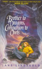
I’m going to start with my first novel, Brother to Dragons, Companion to Owls, cover art by Rowena. This book came out as a mass market original paperback from Avon in late 1994. The cover depicts a blond young woman wearing jeans and a baggy harvest gold sweater. She is curled asleep amid stark rocks. She is cuddling a green stuffy toy that just might be a two-headed dragon. To the sides, wispy smoke forms of a dragon and an owl are shown. The lettering is white and very cursive.

Although the art is lovely, I had some real problems with this cover. For one, the story is completely urban. No rocky landscapes. For another, the dragon is rubber and blue. For a third, the book deals with street gangs, hackers, and genetic experimentation. No way would the people who might like this book choose it based upon this cover. I hope those who did weren’t too horribly disappointed.

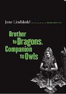
Brother to Dragons, Companion to Owls was re-released by Tor in 2006 as a trade paperback. The front cover is matte black with the title in poison green lettering in erratic sizes. The art, by Patrick Arrasmith, is black and white. It shows a fair haired woman of uncertain age (not old, but not a kid, either) seated on spread newspapers next to an overflowing trash can. She wears jeans and a tee shirt. Resting on her knees is a toy two-headed dragon. Her attitude is one of depression, but not of surrender.

The back cover is an expansion of the front cover art. Most striking is a brick wall that has been painted with a very cool wolf’s head. (I’d love to have the full wolf’s head on a tee-shirt). The grit and grime are almost palpable.

I loved this cover. Not only did it seem as if it could be a moment from my book (although it does not in fact illustrate a specific scene), but I felt that it was right on the mood of the novel. A reader picking this up would have some idea of what to expect.

Side trivia. When the re-print was in production, I got a call from my then-editor.

“Jane,” she said. “Am I remembering right that you have the dragon who’s in the book? Can we have a picture?”

I did, and the picture was duly sent, and the artist did a fine job translating it into his style. Those dragons were hard to live with before. Now that they’re on a book cover.

Just kidding.

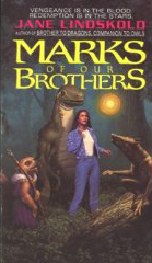
Okay. I’ve room for one more cover. Let’s do Marks of Our Brothers, the book that came out next from Avon. Another mass market paperback. Another source of frustration for me, although the artist, Mark Stawicki, certainly could do realistic art.

The cover depicts a woman with dark hair wearing jeans, a white tee shirt, and a denim jacket. She is looking with wonder and awe at a glowing globe floating in the air. A sort of dinosaur stands behind and towers over her. A cute rodent in robes, holding what seems to be a wizard’s staff, is off to one side. Crouched on a fallen tree is a naked, brownish, vaguely canine critter with hands. From how the light from the floaty thing falls on this canine, you have the impression it has something to do with it.

My reaction when I saw this cover was, “Great. I write a story about planetary scale genocide and get Disney.” I was particularly unhappy that the canine—who must have been intended to be Onyx, the main alien character in the book—was depicted with hands. The whole point of the novel is that Onyx’s race Doesn’t Have Hands, is quadrupedal, and is in grave danger of being dismissed as merely intelligent animals because of this.

Big sigh. Again, a cover that does neither the book nor the reader justice. And, no, this scene never occurs in the novel.

Needless to say, I can’t touch on all of my covers here, but if there is interest, I’ll do this again, somewhere down the road. Let me know if you are interested, and let me know if there are any specific covers you want to me to talk about.

About the Author

Jane Lindskold

Author

Learn More About Jane
Subscribe
Notify of
Avatar


20 Comments
Oldest
Newest Most Voted
Inline Feedbacks
View all comments
Avatar
16 years ago

I’m often frustrated by covers that seem to have nothing to do with the contents of that book. I can understand a character’s face not matching my imagination, but when it gets down to ignoring even simple details from the book, such as making someone black-haired into a blonde, it gets on my nerves.

I’m inclined to think the artist isn’t provided with enough descriptive clips, in most scenarios. I think most artists try to be true to the book, with what information they’re given.

Avatar
Chris Palmer
16 years ago

I remember hearing Michael Whelan talk at a convention many years ago. He was saying that, at that time at least, he never painted a cover without reading the entire book and making sketches as he went along.

One glaring mistake that he admitted to was the cover to Heinlein’s The Cat Who Walks Through Walls. Whelan says he read the book, but missed the one line that said the main character was black (some line like “You skin is just as black as mine” or something like that), so he painted him as Caucasian. By the time Heinlein pointed that out to him, it was too late to repaint, so they darkened his skin on the artwork master making him look like a Caucasian guy with a really dark tan.

You can see the cover here:
http://www.amazon.com/Cat-Who-Walks-Through-Walls/dp/0441094996

What I find most interesting about book covers is the lengths that publishers go to in order to market books to target markets based on current best sellers. Like when The DaVinci Code was the rage, all techno/conspiracy/adventure books had covers that looked like The DaVinci Code’s cover. SF and fantasy books do it often as well – it’s almost a visual clue to “If you like xxx, you should try yyy” recommendations.

Avatar
16 years ago

I’d love to hear your thoughts on the covers for Changer and Legends Walking. Those two were my introduction to your writing, and the cover art to Changer was why I finally grabbed the book after passing it three or four times in the store. IMO, the cover art did a good job of reflecting the content of the book – mystical, southwestern – just what I was looking for at the time. The art caught my attention, the back cover blurb convinced me to buy, the content made me a fan.

Avatar
zaphire
16 years ago

fascinating. please do more. this is great info. very interesting. (funny covers too!)

Avatar
16 years ago

I really enjoy hearing your perspective on the covers of your books. I’m curious–have you ever had an adverse reaction to the interior design? (Font? Type size?)

Avatar
16 years ago

This is very fascinating, please post more when you have it. =)

As an illustrator just starting to get into the cover market this is very interesting. I have done a lot of interior art and card art for licensed material and I am always pleased when I can make the client, author, fans, and myself happy.

I find when a product has a lot of back history to read its really easy to miss things.

Avatar
Tim W.
16 years ago

There may be good reasons for keeping the author out of the loop regarding the cover art.

Musicians have much more input into their album covers, and yet album covers are generally much better than book covers* (although of course there are bad album covers and good book covers). Do writers really have worse visual taste than musicians?

*Someday I’m going to write a long, tedious essay about this (as long as it doesn’t involve actual research), but the short version is that I think album covers are treated as part of the artwork, whereas book covers are treated as packaging. Thus albums are re-released in the original covers rather than being redesigned for every edition, they’re not covered with tacky blurbs, they’re less concerned (although not entirely unconcerned) with making sure you can tell the genre from twenty feet away, they’re less tied to literal illustration concepts, they become iconic in a way book covers generally don’t (when was the last time you saw a book cover quiz?), etc., etc.

Avatar
16 years ago

Have you seen this:

http://www.amazon.com/Beedle-Collectors-Offered-Exclusively-Amazon/dp/0956010903/ref=pd_bbs_sr_2?ie=UTF8&s=books&qid=1228156767&sr=8-2

Its a nice fake leather and gem set up for the book – The Tales of Beedle the Bard, Collector’s Edition.

Several of the authors own sketches have been included. Such a different take from the very happy mass market cover (perhaps how the author would have wanted it?)
J.
(sorry I dont know how to put images in)

Avatar
16 years ago

I have Brother to Dragons, Companion to Owls with the first cover. I picked it up because of the title, not the picture, and bought it either because of the back copy or from flipping through the book, I don’t remember which. The picture didn’t influence me either way. Maybe you’ll find that reassuring. :-)

Avatar
16 years ago

This entry was very interesting. Would love to read more.
Oh, and related:
Favorite Book Covers of 2008 according to NY Times Books

Avatar
16 years ago

I’d definitely read more as well (and am fascinated by W’s brief discussion about the differences between book and album covers. Hmmmmm).

J Dalziel
16 years ago

I have the original cover version of Brother to Dragons, Companion to Owls and have loved it each time I’ve read it. I’ll agree the cover, although well done, isn’t at all right for the contents, but that hasn’t hurt it any for me.

Having seen that little teaser pic of the re-issue, though: *want!*

I’ll definitely have to see if I can get hold of a copy of Marks of Our Brothers and give it a read.

Given I just finished (and really enjoying,) Child of a Rainless Year yesterday, I’d be especially interested in hearing your opinions on that cover, specifically, as well as any and all thoughts you feel like sharing about covers to your other books.

Avatar
arthurW
16 years ago

It could be worse. You could be Charlie Stross.

Avatar
16 years ago

We are constantly fighting the fight between “type too small to read” and “book too big to shelve.” It drives us all crazy in various ways at various times.

Sometimes we get the type bigger but then it runs too far into the gutter so the right edge of the left page and the left edge of the right page are unreadable (unless you break the spine of the mass market).

Sometimes we get the size of the type and the leading and the margins right and then the book winds up projected at 1000 pages in mass market and we have to think about charging more than $7.99 for it, which makes us unhappy, and many stores won’t take a lot of copies of a book that thick (because you can only fit a couple on a shelf/in a rack face out).

Sometimes a book looks great and is perfectly readable in hardcover but when we shrink it down for mass, it becomes teeny-weeny and gives us headaches. To combat this, on any group-size hardcover, our designers now also provide photo-reduced pages that show us what the design will look like at mass market size.

Until a few years ago, I could look at designs with the naked eye and get a good sense of whether the average person would be able to read the book. Now I wear reading glasses, and because of that, it’s harder for me to assess type.

The switch to electronic files rather than hardcopy of designs also contributes to this–by the time I make the file big enough to see on my laptop screen, of course the type is readable . . . but it’s no longer at its true size. So I mostly still look at actual pieces of paper.

Another part of the problem is that when we look at an interior design, we are looking at only a few sample pages, not an entire book. Almost anything is readable if you’re looking at a few sheets, so you have to imagine that you’re going to look at several hundred pages of that type and layout. And the design sample uses only a small part of the text of the book, and repeats that text over and over. Or uses a few bits of the book at the beginnings of chapters and for extracts, but the bulk of the sample is made up of blocks of text in the chosen type from some other source entirely.

So we’re having to use our imaginations quite a bit when we look at a design. Which means we mess up from time to time.

Avatar
16 years ago

Great post, and very informative. I’d love to read more about this topic.

Avatar
16 years ago

Well, at least Jane didn’t have to worry about the readers being disappointed that there were no Octopi in the book.

/wish I’d seen this topic earlier. I have lots to say about it.

Avatar
16 years ago

Wow, a very informative discussion. This may be the only area in which small-run nonfiction publishing with a university press is actually better for the author. For my first book, the press actually solicited possible images I might want, and I actually got to (congenially) argue at length over the phone with the art director over the precise form that the chosen image would take. I made almost no money off that book, but I sometimes think that the dust jacket is actually my favorite part of it.

Avatar
Michelle of CrowsFeet
16 years ago

I suppose I have the unusual viewpoint of having started my life as a reader, worked in a library while free-lancing as an illustrator and recently become a published author.

As a reader I always had the gut feeling a bad cover was the publisher’s or artist’s fault, never the author. I simply couldn’t imagine any author putting up with a cover that had nothing to do with his/her story. When I worked at a library it often irritated me (sometimes angered) how utterly wrong some covers were.

The books I illustrate were non-fiction. I never was given a cover, even though one author openly asked her publishers. As an illustrator I can see no excuse for an artist producing a cover that does not match the story. When I worked on illustrations (only two authors) I met with both of them and asked that they not only describe what they wanted, but also asked for short pertinent quotes from their books to use as reference.

Surely the publishers could at least give the cover artists a precise version of the book they’re doing the art for?

Now, as an author FINALLY, I’m up against the other side of this problem. In my case I have a publisher willing to accept my cover design as long as it fits their printing requirements, which is far more “high tech” than what I’m used to working with. So far my resolution and pixel-whatsits have been all wrong, but at least (once I figure this computer graphic stuff out) whatever goes on the cover will be my own success or failure, not a random act of artistic nonsense!

I wonder what would happen if they did a survey and asked readers which covers they were attracted to… or hated?