Tor’s Creative Director, Irene Gallo, commissioned me to create the atwork for Pyria Sharma’s “Rag & Bone”, a story with a steampunk feel with a little Charles Dickens thrown in for good measure. She cautioned me not to give away the surprise ending of the story, so you’ll have to read it here. Below is an account of how this image came together.
I set about creating some quick sketches. I prefer to keep them rough. This allows for additional creative exploration when working on the final art. Having the added opportunity for creative discovery when working on the final painting is another catalyst that fuels my inspiration and staves off boredom. If I would have an overly finished drawing at this stage I think it would be like doing the art a 2nd time. Almost like a paint by number painting or a kids coloring book with no mystery. I think of these sketches as a launch point.
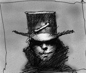
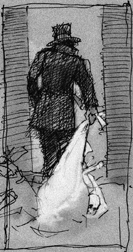
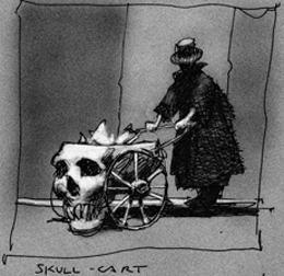
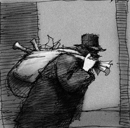
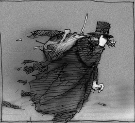
Irene Gallo and I have done many covers together so we can work in this visual shorthand method for concept sketches. Irene chose sketch number five. At this stage I go directly to the final drawing on a plate finish board. I had my son pose for a few quick reference photos and set about working on the final art. I do have to say that having a secret internal image of the final painting does help. I always work toward this internal image. Sometimes I get close and other times I miss the mark. I do like the elusive nature of working this way.
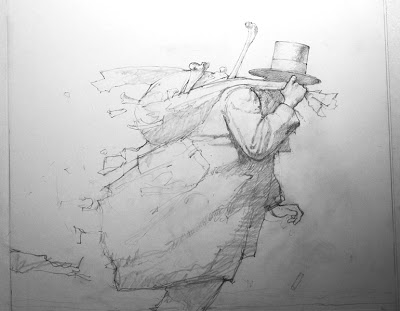
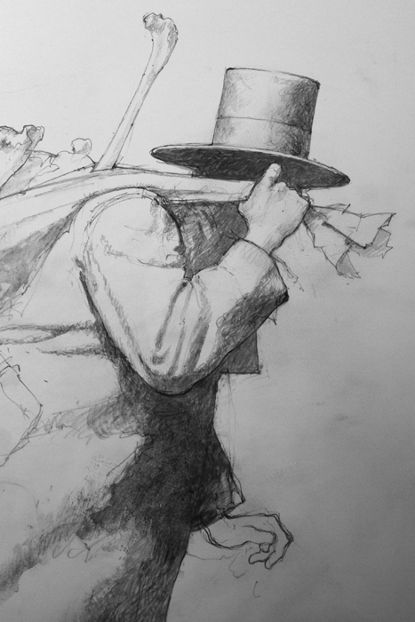
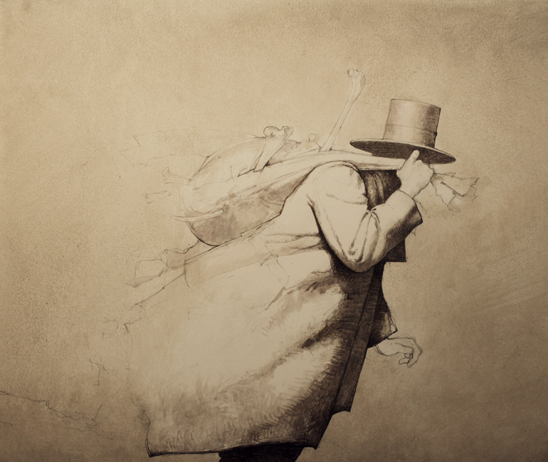
Pencil drawing first with subtle shading. Just enough to indicate general shapes. I do however render some areas to function as a guide when establishing the image in paint. I also keep the rendering fairly light at this stage because I do work with transparent washes at the beginning.
Since I’m working in acrylic in a watercolor fashion the initial washes are laid down—wet into dry and wet into wet. Over the course of developing the image, many layers and subtle colors are then woven together. This is where I begin to introduce opaque and semi opaque washes. Veils of color and value for lack of a better description.
These veils are also intermingled with transparent glazed colors. This back and forth method begins to build the form. Using washes and lots of small strokes the subject starts to almost paint itself. Each layer is contributing to the layer underneath. Each color, value, and layer shines through the previous layer to create some unexpected textural effects. Working in this manner borrows technical approaches from oil, watercolor and egg tempera mediums. It’s not for everyone and can be tedious. For variety I will sometimes have areas of larger simple washes.
I work on a variety of surfaces. I typically prefer a surface with a plate or smooth finish. If I’m working on a wood panel the gesso is always sanded to a smooth finish. In some cases I will build up a physical texture to enhance a particular area.
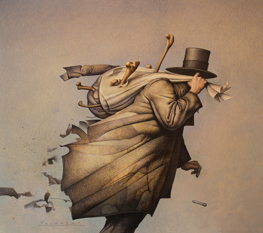
I do have to apologize for not taking more photographs of the progression but when your rolling along it’s hard to interrupt the creative flow.
This post originally appeared on Muddy Colors.
John Jude Palencar’s art has appeared on hundreds of book covers and has received many honors for artistic excellence, most recently being recognized for “Artistic Achievement” by the ASFA.


