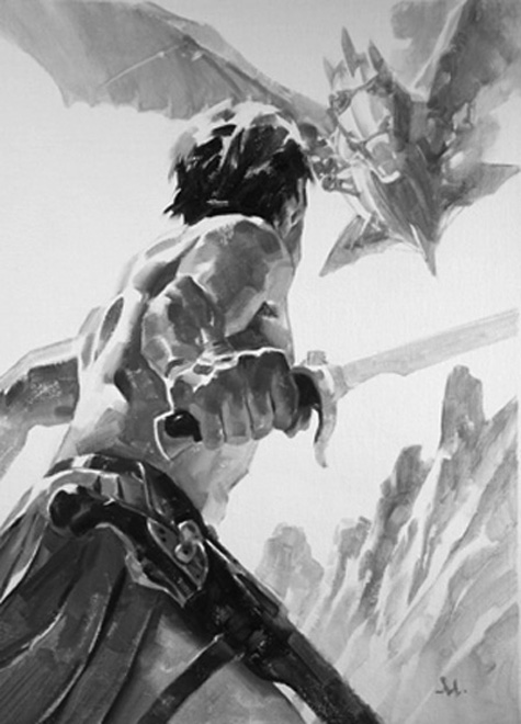
The 100th anniversary of A Princess of Mars, by Edgar Rice Burroughs is here, and to celebrate, John Joseph Adams has edited an anthology of all new adventures of John Carter, set on that seminal planet. Under the Moons of Mars: New Adventures on Barsoom will be released early February, full of great writers and specially commissioned contemporary illustrations. This is my contribution to the story entitled, “The Metal Men of Mars,” by Joe R. Lansdale. Other artists include Charles Vess, Molly Crabapple, John Picacio, Mike Kaluta and others.
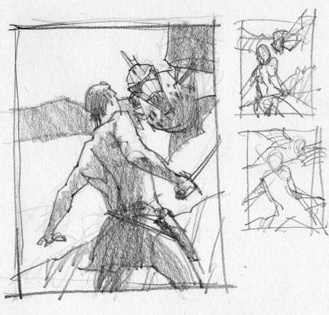
Sometimes I tire of the typical, average human height POV used by so many artists when describing tales. It’s a very tired narrative angle, so I constantly search for more intriguing places to structure my compositions.
This story has John Carter attacked from above by a steaming metal dragon air-machine. I wanted the viewer to be right there, looking past Carter toward the airship. Fairly straightforward, but it offered a nice way to foreshorten the figure and add a desirable way to lead the eye.
This is Ivory Black oil paint, mixed with Titanium White, on pre-primed linen. I used the white of the linen to break up the blacks and greys, allowing the brain to fill in the holes. I love this sort of thing as it keeps the mind engaged. It’s also fun to paint and stare at.
Here’s a time-lapse video of me working on the finish:
This post originally appeared on Muddy Colors
Gregory Manchess is an artist and writer working in New York and Portland.
Are you aware that this is extremely stylistically similar to Michael Komarck’s depiction of Raest and Silanah from the book Gardens of the Moon?
I am in no way accusing you of copying. Just pointing out that Komarck worked with a similar angle with similar characters and you can probably pick out things to improve upon or work into your own take upon the poses.
I can see you’ve composed it to where the dragon, aesthetically, doesn’t have to be as detailed as the main figure, as there isn’t a photo reference.
While the human height POV was more common, seeing the monster as an oncoming threat viewed from over the protagonist’s shoulder was sometimes seen in pulp illustrations from folks like J. Allen St. John, back in the days when John Carter was first published. This is not a criticism, Mr. Manchess–I think you have evoked the spirit of the pulp adventurer perfectly! And that time lapse clip was fascinating.
Sorry, amphibian, your Mr. Komarck was far from the first artist to frame an illustration that way.
Ah, I wasn’t trying to say Komarck came up with it. Just that the way Komarch used the dragon really brought home the perilious situation for the protagonist in the foreground, while this one seems a bit more… leisurely.
Although, Raest is decidedly not a protagonist in GotM…
I actually prefer one of Mr Manchess’s other John Carter illustrations, which shows Carter and Dejah Thoris attacked by (or attacking) a thark. It has a similar viewpoint (behind and below the figures), and the postures of the three characters (Dejah appears to be reacting to an unseen threat coming from another direction) make it very dynamic. Moreover, the thark – who looks authentically terrifying and gigantic – and the protagonists seem to be very faithful to Burroughs’ descriptions.
My immediate reaction was “Wow, that’s a great composition, I must
steal that for one of my imagesacknowledge the artist’s creativity and skill.”I’m not sure if there’s an official URL for that image, but searching Google images for “manchess john carter” will turn up several copies of the image in question. It’s definitely one of my favorite JC images now, not just for the composition but also for its faithfulness to Burroughs.
This was done a personal piece — a class demo, really. The painting in the article was a commission for a newly written story set in the world of John Carter.
That is one fine drawing.
Reminds me of Latro and Myt-ser’eu confronting a god in Soldier of Sidon.