As the heroes of Madeleine L’Engle’s 1962 scifi novel A Wrinkle in Time prepare to face off against the evil being called IT and rescue their missing father, their angelic mentor Mrs. Whatsit presents them each with a helpful talisman. To budding psychic Calvin O’Keefe, she gives increased communication abilities; to five-year-old super-genius Charles Wallace Murry, she gives the “resilience of childhood.” But to his older sister, our awkward teen protagonist Meg Murry, Mrs. Whatsit declares, “I give you your faults.”
Moments like these, when L’Engle eschews familiar hero’s journey beats, are part of why A Wrinkle In Time has become one of our most beloved young adult novels; but these bits are also why it’s taken 56 years for a proper film adaptation. The novel may have everything we like to see in a modern adventure movie — including a misfit protagonist who topples an authoritarian regime while growing secure in her identity — but it makes for a far stranger story than your standard Marvel or Star Wars franchise entry. The example above just hints at the story’s peculiarity, and that’s before mentioning the book’s mix of Christian mysticism, theoretical science, 60s psychedelia, and Cold War-era resistance to conformity.
Of course, a filmmaker could easily streamline the narrative into a standard adventure story about a kid coming into her own to fight the bad guy, but to smooth out A Wrinkle’s wrinkles would be to miss its point. Unlike most protagonists, Meg does not transform into a triumphant warrior, shedding her oddities to conform to our idea of a standard-issue hero. Rather, she learns that the quirks that distance her from her peers — her short temper, her inability to focus, her protectiveness toward Charles Wallace — are exactly what she needs to defeat IT. The story arc traces a change in self-regard, not a change in behavior.
Were the big-budget Disney version helmed by a director any less sensitive or insightful than Ava DuVernay, we might have reason to worry that movie Meg will be too likable, too normal. But even if the film turns out to have missed the mark, this decade already saw an adaption of L’Engle’s novel that retained the original’s community of misfits: Hope Larson’s 2012 graphic novel.
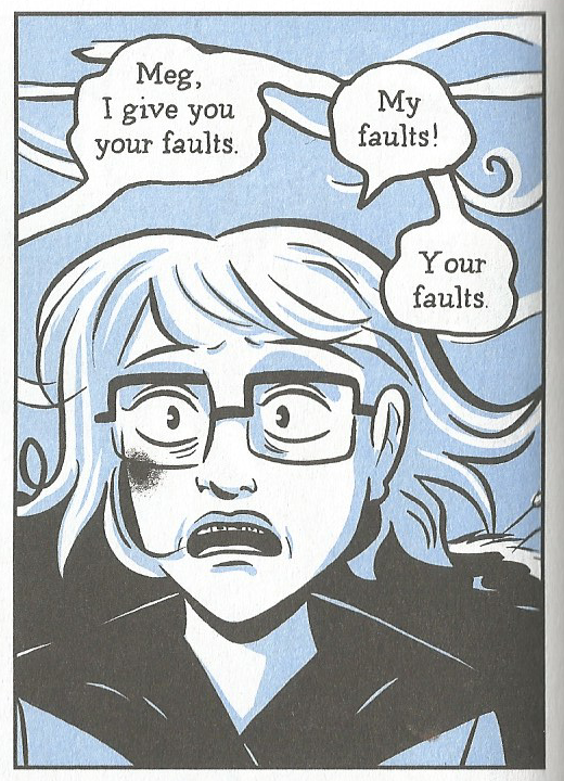
While comic books are known for their ability to visually convey bombast and complex action (dating back long before filmmakers had the technology to do so convincingly), Larson’s cartooning slows the narrative and grounds it firmly in Meg’s experience. She does not excise the story’s surreal elements, but subordinates them to the arc of Meg’s shifting perspective. Doing so allows Larson to keep Meg’s faults front and center, filling the book with weirdos whose mere presence undoes IT’s uniform utopia.
We see this devotion to peculiarity in the way Larson renders the characters, conveying paragraphs’ worth of development in a few lines. Her Meg alternates between sloping when sad and tightly angled when angry, glasses forever sliding around and occasional unruly curly-q’s atop her mop of hair. Larson retains Calvin’s ebullience with a smile beaming from between two too-big ears and crowning a too-long body, his knees bent outward and his ankles protruding from his pant legs. Charles Wallace has the wide eyes and small stature befitting his age, but Larson’s skill at facial expressions reveals a mind sharper than any ordinary child’s. Larson follows L’Engle’s basic descriptions for Mrs. Whatsit and her compatriots Mrs. Who and Mrs. Which, making the first two little old ladies and the last either a traditional witch or a floating blob of light, but her use of tight curved lines indicate an ethereal lightness. Even when the figures recall familiar types, Larson gives them an odd distinguishing touch.
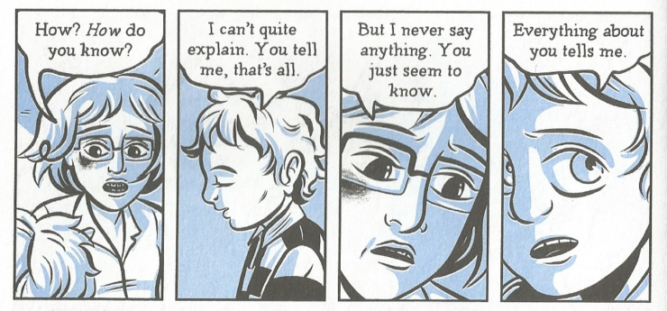
She achieves this effect by using thick and rounded lines, which imbue the world with disheveled whimsy. Larson forgoes straight lines and jagged edges for softer arcs, finding curves in every surface and making even static structures seem to sway.
One might think this approach would fail to suit the story’s third act, when the heroes enter Camazotz, IT’s rigidly controlled nightmare of 1950s suburbia. L’Engle describes the world as one of perfect order, in which every house looks the same and children bounce rubber balls in immutable rhythm.
But Larson’s wispy lines accentuate a point implied by L’Engle: IT does not have complete control over Camazotz, despite contrary appearances. The “CENTRAL Central Intelligence” building, a skyscraper housing IT’s henchman The Man with Red Eyes and holding Meg’s captive father, may have been intended to stand at a 90 degree angle, but Larson draws it with wavy lines, and the walls of Dr. Murry’s cell feature not a pattern of bars but of interlocking circles.
These rolls and wobbles create a motif that better aligns with Meg than it does IT’s organizing force. They render IT’s plans invasive and unnatural, thus emphasizing both the novel’s valorization of misfits and its Christian cosmology. The untidy universe is as God designed it, as is fault-filled Meg; when she undoes IT’s plans for harmony through hegemony, she restores the world to its intended mess.
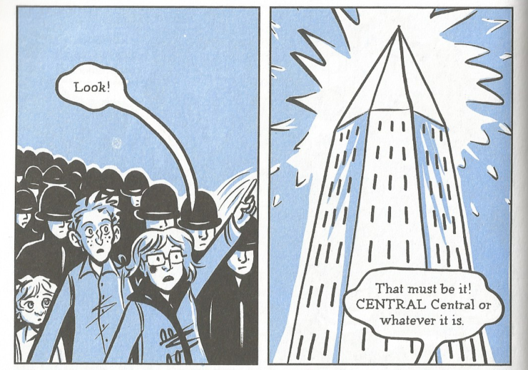
While her line work clearly advances L’Engle’s vision, Larson makes a bolder and more unconventional choice by accentuating her black and white drawings only with light blue washes (by colorist Jenn Manley Lee). The decision makes perfect sense for the dark and stormy night on which the novel opens. The first third of the story finds Meg lonely and sad, missing her father and shunned by her classmates. She wears a bruise from a fight with an older boy, and hears townspeople gossiping about her mom. But as the story grows more psychedelic, the single color might feel restricting, if not outright inappropriate. After all, L’Engle associates IT’s power with the color red, as in the red rubber balls bounced in Camazotz or the red eyes of those IT possesses.
But by sticking with light blue, Larson keeps the focus on Meg’s perspective, even when things get weird. Blue indicates Meg’s melancholy, as indicated by flashbacks of people insulting her or her family, which Larson displays in monochrome. This hurt cannot be erased by their adventure, nor should it be — it’s a key to the faults that Meg must summon when standing against IT. Like the wiggly lines, the pervasive blue reminds us that perfection is an aberration and that difference, even when it takes the form of hurt, is natural. The signs of outsider status help Meg retain the stubbornness she needs to resist IT and the compassion she shows her family. More importantly, by keeping the blue throughout the story, Larson underscores the crucial point that Meg does not need to change, that the story is not about her losing her faults, but about making connections with equally odd and broken people.
Nowhere is this communal theme more prevalent than in Larson’s page layouts. Most illustrators would convey the vastness of the cosmos with big splash pages and unusually-shaped panels, and Larson does employ a few of those. But the vast majority of her pages feature 4-6 small panels, often displaying a single character or action. This approach not only slows down the action, but also directs the reader’s attention to smaller, more intimate moments.
For instance, in the middle of the story, the characters visit the Happy Medium, whose crystal ball exposes physical abuse in Calvin’s home. Larson unfolds the scene over three pages, devoting an entire panel to instances such as Calvin’s forlorn look, or his and Meg’s hands joining together. Likewise, Larson slowly reveals the despair of Mrs. Murry, including six panels of her sitting sadly in her kitchen. Accentuating small character beats over big plot points further reinforces the stakes of the story, keeping it centered on Meg and her desire for connection.
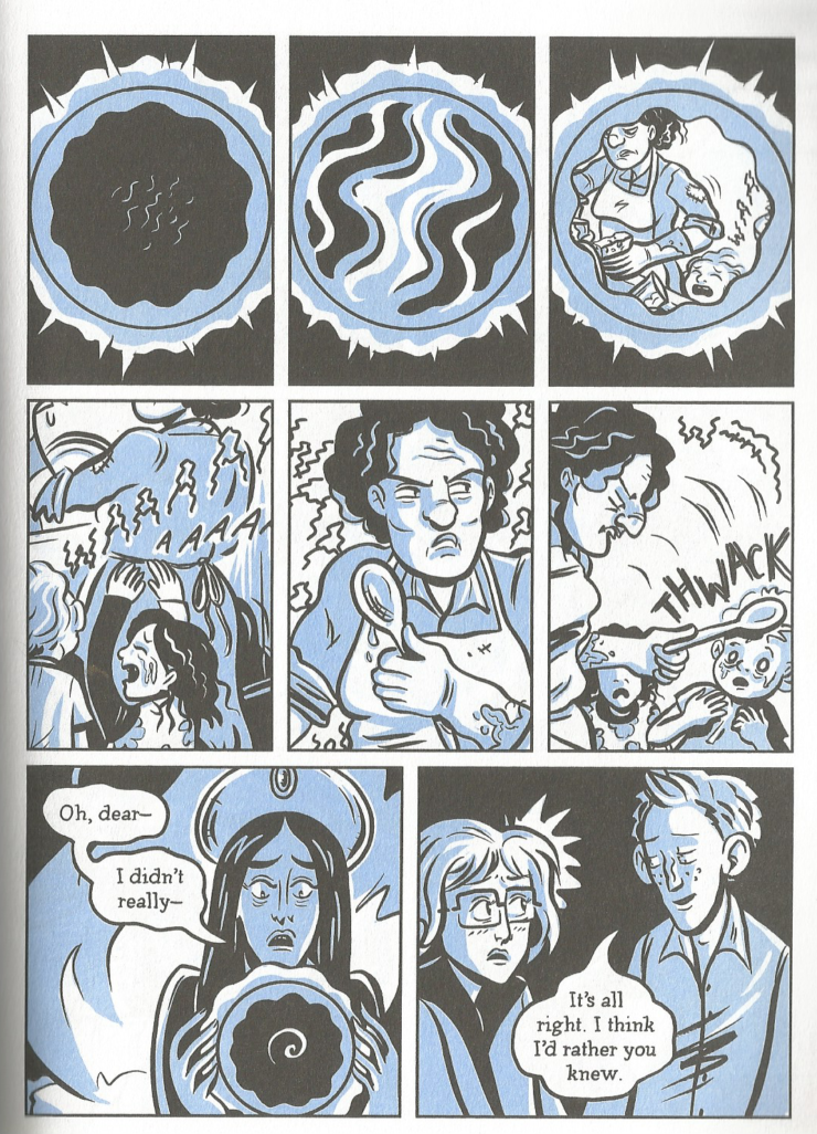
In fact, the small panels may be Larson’s most effective tool in telling the story of this connection. The size of the panels leave little room for multiple characters within the same space, and so many consist only of one character at a time. This approach presents the characters in isolation, even when they speak or react to one another. As with the blue hues, this sense of isolation matches the plot of the novel’s first third, where Meg is the most disconnected.
But when the adventure begins, she feels closer to Charles Wallace and Calvin. At these points, Larson often groups the trio into the same panel, but she does not expand its size. Rather, she keeps it small to show us how tight the three of them have grown. Where we once saw just Meg suffering alone, we now see her alongside her brother and her friend.
This renewed attention does not suggest that the three are a single-minded team; that would just replicate IT’s unity. Rather, Larson takes care to accentuate the distinctions between the three, even as they share the same space. Take the scene in which they resist the Man with the Red Eyes’s mind control. In a single panel, we see Meg defeated with slumped shoulders, Charles Wallace tiny but determined to fight, and Calvin waving his gangly limbs in protest. The three people remain separate and distinct even from other oddballs like themselves, but connected because of their difference.
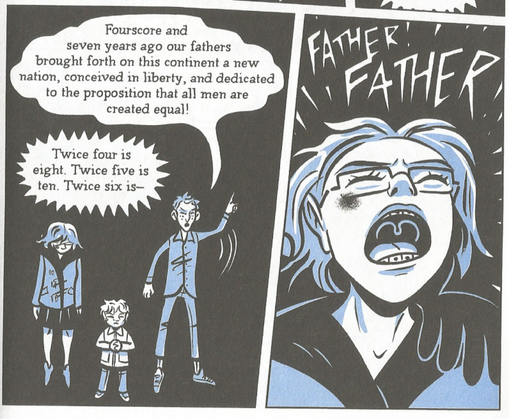
This vision of community has inspired eccentrics and outsiders for over half a century. Larson’s adaptation has been uniquely faithful to that vision, reshaping it in delightful images to be shared with a whole new set of readers. Let’s hope the big-budget mainstream movie version can do the same.
Joe George‘s writing has appeared at Think Christian, FilmInquiry, and is collected at joewriteswords.com. He hosts the web series Renewed Mind Movie Talk and tweets nonsense from @jageorgeii.


