Hi, everyone! Irene kindly asked me if I would like writing about some of the older fantasy-based art out there, an offer I’ve gratefully accepted. So I’ll be focusing on some of the great illustration that has inspired and shaped modern artists we admire.
Irene’s recent trip to the Waterhouse exhibition in Montreal sparked some interesting thoughts for me. Waterhouse’s work is undeniably beautiful—and evocative—but, despite the obvious love of women in his paintings, you can’t help wondering if they’re the subjects of his pictures, or perhaps in fact the objects. The femininity we see in his images is draped with Victorian concerns, and those concerns can be quite sexist.
Waterhouse (and his spiritual brethren in the pre-Raphaelite movement) has been tremendously influential in illustrating the fantastic, but what I’m going to do is look at some of the other artists working around this time. We’ll see how the same stylistic tics and influences emerge, but there’s a sense of interplay—of experimentation and even perhaps levity—that I think makes for more ambiguous, interesting images. Images that have, in my opinion, ultimately shaped just as much contemporary illustration.
You can check out some pictures by our man J. Wizzle in Irene’s post, but let’s have a look at one more to illustrate.
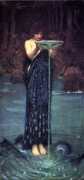 This is one of Waterhouse’s more iconic pictures. It’s called Circe Invidioso, aka, jealous Circe. This is from an Ovid story about how Circe (the Mediterranean witch who got jiggy with Odysseus at one point) turned a girl into a hideous monster (Scylla).
This is a quite a typical image, for both Waterhouse, and some of the other pre-Raphaelites. The first thing that leaps out at us is the sexuality. Circe is nearly naked, and her diaphanous dress of peacock feathers (the trollop!), leaves little to the imagination. Compare this with what women were actually wearing at the time: a chemise, a corset, a corset cover, an under-petticoat, a hoop petticoat, an over-petticoat, then a dress, bonnet and gloves. Quite the laundry list.
But Waterhouse is strangely coy with what—in context—is quite outre nudity. Circe’s attention is wholly fixated on her evil brew. She’s not trying to be sexy; she’s just drawn that way. In some ways, it’s strangely hypocritical: short of lounging her naked on a chaise, Waterhouse is doing everything he can to make her hawt.
And yet, look at the framing. It’s very traditional. The water looks just as inviting as her alabaster flesh. Her legs and lips are clamped together and her hips are resolutely straight. The pose itself—were she clothed—is quite chaste. Ironically for the goals of the pre-Raphaelites, it looks staged; despite the intensity on her face, it feels quite formal. And there’s something else, something tweaking our cultural memory and making us feel a bit unsexy.
I personally think ‘something else’ is religion. Look at the Waterhouse picture, then look at the images below. Circe Invidiosa looks and feels a bit like a freaking religious icon! The framing; the focus; the tilting head and posture; the intense, vivid coloring. Even the freakishly long legs (scroll back up and look where Circe’s hips start and feet finish: creepy!).
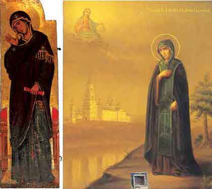
By rejecting the western artistic tradition that embraced renaissance painters like Raphael, artists like Waterhouse inadvertently hearken back to an earlier (and eastern) religious tradition. This makes sense thematically, also. The emphasis on symbolism that the pre-Raphaelites used in their art gels very well with iconography.
Ultimately, though, it leaves me feeling a little cheated. Like Waterhouse wants his sexy, earthy, vivid symbolic cake, but he also wants to eat his staid, Victorian, ‘naturalistic’ and kinda chauvinist cake, too. And everyone knows those two cakes don’t mix. But there were other artists using similar aesthetics in much more subversive ways. Paradoxically, Aubrey Beardsley appears to have loved both icons and iconoclasm.
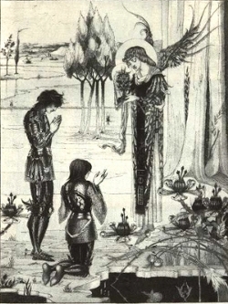 Beardsley managed to get homosexuality, transsexuality, and basically a metric tonne of naughtiness into popular and mainstream art, and few batted an eyelid. I think part of his envelope-pushing sprung from the fact he was dying of consumption for the few years he worked (dead at twenty-six), and he had a private income, so he basically just didn’t give a shit.
The picture on the right really highlights the iconographic qualities of Beardsley’s work, right down to lankiness, strict framing and even a halo, but you’re probably wondering where the sex is. Well there’s a few more pics below. And if you want the really out there stuff, go here (my esteemed hosts may be reticent about four foot penii on the web site…).
Beardsley worked in black and white, but nonetheless visual commonalities with Waterhouse are clear. In some respects, I feel this is distilled Waterhouse. The frippery, the luxury, has evaporated, leaving behind the barest aspects of what’s common to both. Also, when his subjects are clothed, they’re really clothed. There’s no did-we-didn’t-we nipple action with these billowing drapes; they’re more like curtains than the veils we see in Waterhouse. And the images just don’t feel very sexy—even the sexy ones.
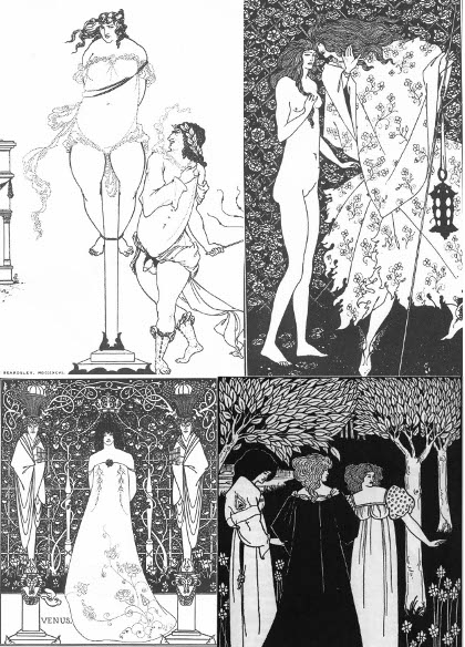
Why is this? I think there’s a few reasons. Symbolically speaking, Beardsley is in a very different place to Waterhouse. This pictures are lighthearted, playful; penises and bums are funny, Beardsley says, and we’ve all got them. The lack of color tone renders his images more cartoon-like, but also I think helps dispel some of the naturalistic elements that linger in Waterhouse—especially in his luscious backgrounds. These elements of naturalism play into a more voyeuristic atmosphere to Waterhouse, whereas I feel like Beardsley’s images acknowledge us. For all their staging, Waterhouse’s pictures imply we have stumbled across rich and arcane moments. The viewer is unacknowledged, and we’re invited to drink in these statuesque beauties, their unbound hair and bare feet.
This ties into another factor. There’s a strong aspect of the sacred and the profane to Waterhouse. Unnatural and uncontrollable desires, unfettered and indulged. His work feels filled with notions of sacred and profane. The pictures—semi-naked women (and it’s always women), dark arts and melancholy—reveal a pretty standard Victorian preoccupation with Madonnas and whores: the titillating and terrible price of breaking taboos. Beardsley, by contrast, makes breaking taboos look kind of fun, something to fit in between morning tea and lunch.
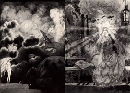
There was another artist working a little bit later than Waterhouse and Beardsley, who in my opinion had a far greater range than these two. But there’s still some visual similarities to be found. Sidney Sime couldn’t be more different to Beardsley in some respects: born into abject poverty, lived to his seventies, and never really courted controversy. But some of the pictures he did for Lord Dunsay’s books resonate for me in a similar kind of way.
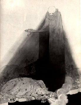 I mean, look at these images. Wow. The contrast of light and dark is incredible. Rather than the simple foreground/ background dichotomy prevalent in both Waterhouse and Beardsley, there’s multiple levels going on here. Again, we see that draping, robe-like quality to the costume, the tall forms and heavy symbolism. There’s even some nudity but it’s not sexy; it’s way too otherworldly for that.
The backgrounds possess the same level of detail as Waterhouse’s, but any pretense to naturalism has been jettisoned. They are rich—even fecund—dreamscapes: fish through the air, billowing clouds and black woods. Despite the clear allegorical and symbolic nature of these pictures, we’re not seeing hasty signs and co-signs like Beardsley. Sime is doing the heavy lifting for us: leaving nothing to our imagination except feverish conjecture of what may be happening outside this tiny glimpse we have seen: the picture. These drawings just scream out Jungian archetypes and tarot images. We’ve looked at how iconography shares a mystical flavor with Waterhouse and Beardsley, tapping into a western discourse about sacredness, but this work makes it look like finger-painting.
Sime has taken similar thematic preoccupations and—using enormous talent and technique— really created something equal parts wonderment and disquiet. But the disquiet here isn’t coming from repressed sexuality or chauvinism, it’s coming from a much more primal, dare I say pure, place.
In this respect, I think he has been both far more successful, and influential in real terms than Waterhouse (and even Beardsley, though I’m really on my own with that one) . There are echoes of Sime’s work in some pretty interesting places.
So you can see with these fantastic artists how similar thematic concerns can produce wildly different responses, but also a few threads that bring them together as well. Don’t get me wrong: I’m not trying to make a direct connection from iconography to Waterhouse, to Sime, to a host of modern art. Straight lines are for architects, not illustrators. But, by comparing and contrasting, I think you can get a richer understanding of some aspects to illustration that are both powerful, and long-lived—and also an insight into your own reactions, too.
Patrick Garson lives in Sydney. He occasionally writes about fantasy on Australian political blog, Larvatus Prodeo.


