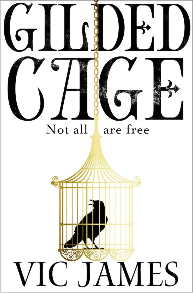
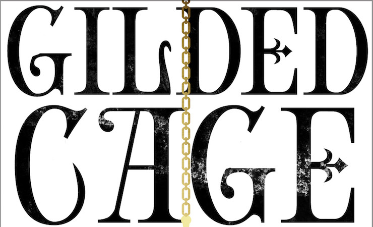
Gilded Cage is a firecracker of a novel, which deserves the most GLORIOUS cover to match! With its charismatic characters, Orwellian British setting and a dash of magic, Vic James has penned a rollercoaster of a read. My brief to our Design department included the words beautiful, sinister and brutal and I think designer Jo Thomson has absolutely nailed it with a stand-out cover (see below). I’ll tell you more about that process, and give you some ideas and covers that didn’t make it. But first, some plot…
The first book in the Dark Gifts trilogy, Gilded Cage is available January 2017 from Tor Books UK and February 2016 from Del Rey (US). From the catalog copy:
In a modern Britain, everyone must endure ten years of slavery for a magically-skilled aristocracy. On England’s grandest estate Abi finds love, and will demand justice. In a brutal slavetown, her brother Luke will dream of rebellion.
And as the country moves from anger to defiance, will one young aristocrat remake the world with his dark gifts?
As we follow characters you’ll love and hate, Vic leads us into a world of compulsive personal, political and dynastic power struggles. You’ll find divided nation in an alternative present, families at war and a parliament in meltdown. And if you see reflections of our own society, look to the author’s career as a high-profile documentary maker. I found it thrilling and here’s an extract.
THE PROCESS
I presented three ideas to Design at our weekly covers meeting, where you have to pitch the book to a packed room full of people. And why do those afternoon meetings have to be so WARM?! But my melting brain braved the heat for my precious book…
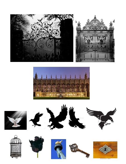
I’d also created a mood board of images and comparison covers, in tune with how I saw the book. Type was always going to be really important, especially if we went for a simpler cover, to give the book personality and hint at mood. I shared all ideas with Vic too and she had some great feedback. We had a lot of fun bouncing ideas around—but there is SO much going on in this book. It was hard to narrow things down so I didn’t just throw a massive bucket of thoughts over Design and run. And even if an editor does have a fairly specific idea in mind, we absolutely have to give the designer room to create something of their own. That’s their area of expertise—but it does mean that you have no idea what the final cover will be. The suspense … well. It’s one of the most nerve-wracking parts of the job. I’ll give you my three ideas, share some of the ‘also ran’ covers and then the big reveal at the end—still gives me the shivers.
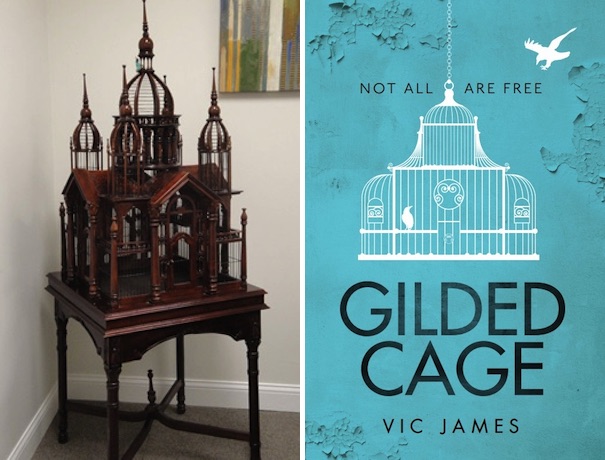
I suggested an ornate Victorian type bird cage—in the shape of a stately home. I thought a bird of prey could swoop down on it, to suggest the rule of oppression. We’ve gone for something like this in our early marketing proof cover.
I thought we could have variations of ornate railings and gates on each book, running along the bottom of the cover (gate closed, gate half open, gate broken?). Or we could use other architectural elements such Kyneston, Stately home of the main dreaded aristocrats (book 1), a Scottish castle/fortress (book2) and a version of Kings College Chapel (book 3).
There are also so many symbols that could work wonderfully with the themes of freedom, liberty and oppression in this book. Ornate keys, elaborate keyholes, chains. Also, birds—hawks, doves, a phoenix …
COVERS THAT DIDN’T MAKE IT
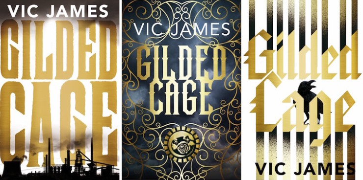
Here are just a few of the wonderful options we saw. But for various reasons we didn’t go for them. All beautiful but some were harder to read or the message wasn’t as clear.
THE FINAL COVER
The cover itself takes elements of these ideas and is simple, beautiful and iconic. I love the type too, which has tons of character. Finishes will be lashings of foil, a spot varnish on the text and maybe textured paper… In these online days, it will stand out beautifully tiny online or across a crowded bookstore. It does indeed suggest lost liberty and oppression and I’m delighted with it. But what do you think? And here’s the US cover if you want to go compare.
