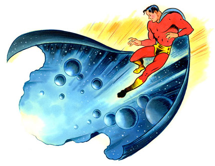
Ross MacDonald is an illustrator, designer, letterpress artist, prop maker, and every art director’s dream to work with. Whenever we have worked together, Ross has attacked the assignment with excitement, often sending sketches along with all kinds of interesting and amusing backstories about the historical context of the type and images he is playing with.
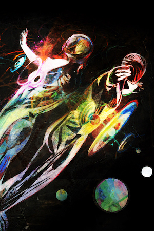
When Greg van Eekhout’s Tor.com story “Last Son of Tomorrow” came in, it was a bit of a mixed blessing for me. I loved the story. It is easily among my favorites on the site. While every story is an opportunity to create a great image, I can’t help to feel doubly pressured to “get it right” when I feel close to the source material. After thinking about various artists, I kept going back to Ross. I’m glad I did. The image is simple and perfect. It works well before you’ve read the story and gains more depth afterward, as a good collaboration between pictures and words should.
I asked Ross a few questions about the unusually varied career.
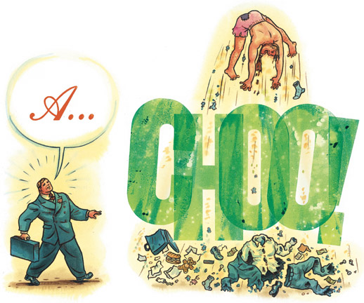
You work in letterpress, illustration, and movie props. Which came first and how did one lead to another?
Since there was always a little overlap, I can’t really figure out a simple way to answer this one without telling practically my whole tedious life story, so here goes:
As a kid I did a lot of drawing and was interested in illustration of all kinds—comics, book and magazine illustrations, pretty much anything. I was like a visual sponge. But when I left home (I was a 16-year-old dropout/runaway), I quickly stumbled into the small press world. I worked first at Coach House Press in Toronto. After a year there, I started a small letterpress printing/publishing house called Dreadnaught Press with my brother and a couple of other hippies. My brother was the designer, and I set type and ran the presses. I really loved the mechanics of it all, and the hand craft—the type, design, and poetry side of things pretty much bored me to hell. But I was surrounded by artists and writers and designers and I guess some of it was rubbing off.
I used to do little woodcut initials and dingbats and decorative pieces for books and broadsides. A couple of working illustrators fell by the press one day and encouraged me. I took out my ragged ink-stained portfolio and actually started to get some little magazine illustration jobs, and did some books and slowly moved away from printing into doing that.
 When I left Dreadnaught it was pretty tough making a living as an illustrator—I did a lot of house painting, construction, landscaping, drawing in malls for loose change—anything to make a buck. One of the odd jobs I picked up was building and painting low-rent television sets and props for cheesy commercials and cable shows. I also did some work in an animation studio in Winnipeg on Sesame Street shorts, and started a kids performance group called the Boinks with a couple of friends. Like I said—anything for a buck.
In the meantime, I had been badgering art directors, and finally landed a big high-profile magazine illustration job, and the mag work quickly snowballed from there. A few months later I traded apartments with a friend in New York and took my portfolio around and got a lot of work. A few months after that I did the same thing in Paris. I moved to New York permanently in ’86 or ’87 and work poured in—magazine work mostly, but some book stuff, ads, on-air graphics, a comic, stamps, cards, etc. Literally hundreds of illustrations a year.
In the early 90s I started writing and self-publishing things, some for fun, some for promo. I was working with designers and hiring printers, and I just decided to fall back on my letterpress experience to take on more of that aspect myself. I bought a small press and a few fonts of type, thinking I’d just do little letterheads and things, but something snapped. I suddenly became rabidly interested in type and design and amassed a huge pile of letterpress stuff and started doing more and more of that, and using it in my illustration work.
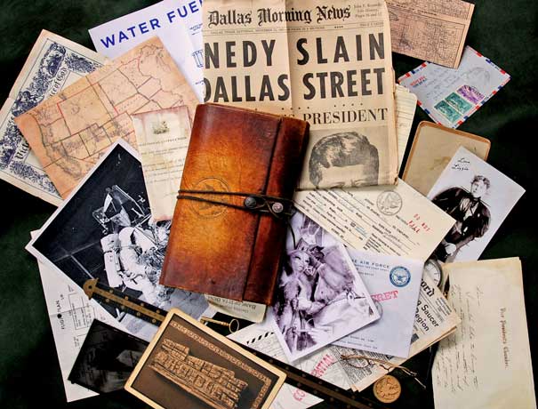
Meanwhile in 1993, I had been tracked down by a movie production company. They had seen some of my magazine illustrations that referenced old Dick and Jane books. They hired me to do a faux 1930s children’s book for the movie Baby’s Day Out. Because the book was tightly tied to the plot and scenes, I had to work on set for 5 or 6 months and met a lot of people and learned a lot. I thought I’d never do anything like that again, but a few years later, I got a call from one of the friends I made on that movie, and started getting more and more movie work again. I’d always been interested in and collected old paper and ephemera, and it ended up being something I use a lot in my movie work.
You had the potentially problematic task o
f illustrating one of my very favorite tor.com stories (so far). The image you came up with was so simple and perfect. Did you play around with other images or did you come to this pretty quickly?
It wasn’t the first thing I thought of, actually. I started off convinced that the perfect way to illustrate this story was to do some kind of comic—5 or 6 wordless panels showing different scenes from his life. But something kept nagging at me—somehow it felt flat or pat. I learned the hard way that you have to listen to that feeling.
The deadline loomed, and part of me started to panic, wanting to take the easy way out, and just go with my first idea. But I couldn’t get rid of the feeling that somehow it didn’t feel right—ironic where the story wasn’t. Every time I sat down and tried to sketch it, my pencil would freeze on the page. Maybe the problem I was having was that the story references a comic—Superman, but it’s almost anti-comic. My take on the story is that it’s a more real-world version of that character. And more interesting, frankly. But of course, the comic reference is there, so you can’t ignore it. I felt like I had to try to think the same way as the author had. I couldn’t get the end of the story out of my head—I love that pause before everything starts collapsing back in on itself. I had this image of the guy floating on a white ground, hanging in space in that pause. I originally imagined him without the cape—we saw his head and shoulders and then he gradually cross-dissolved into this silhouette of blue-black space with stars and planets. But I felt I wanted to come up with something that showed that the universe was around him as well as in him, and that’s when the image with the cape kinda floated up in front of me.
You are a working anachronism—stylistically nostalogic but with modern ideas. In school they often say, “you don’t find a style, it finds you.” Can you talk a bit about how you came to your style?
I’ve always felt like style was not something that defined me, but rather just another paintbox, full of colors. I also feel like I never wanted to always interpret everything through one style. I gave a lecture at an art college and when I talked about this, half of the teaching staff walked out—I guess they must have some kind of strong investment in the whole idea of encouraging students to find one style and stick with it for life. And I get it—I’ve heard all the reasons why you should do that. But I’ve never done that, and I’ve been able to make it work for me. But you’re right—one common thread that runs through all my different styles is that they’re based on lots of different period influences, and that is my style. I love looking at old stuff, and when I work on something, I tend to see it through that filter. In the last couple of weeks, I did a faux 19th-century wanted poster with wood type and a woodcut illustration, a piece for the Times that looked vaguely like an old Catholic holy card, A Wall Street Journal cover that kinda looked like a cross between a ukiyo-e Japanese print and a German Expressionist poster, and a book cover that looked like a 40s Superman cover.
Can you name some of your influences, historical and/or contemporary?
I love 30s and 40s adventure comics, 15th century woodcut illustrations, old labels, Shuster’s Superman, Saturday Evening Post covers, Japanese woodblock prints, Moon Mullins, Tex Avery, early Popeye cartoons, religious kitsch, Dick and Jane, early 20th century magazine illustration, and almost anything from the 19th century—newspaper cartoons, circus posters, wood engravings, children’s books, ephemera, Nast, Cruikshank…. I could go on. As for contemporary influences, I guess a big one is R. Crumb. I also love what a lot of my fellow editorial illustrators are doing. Yuko Shimizu, Brian Cronin, Barry Blitt, Alex Nabaum, Edel Rodriguez, Robert Saunders—I’m probably leaving a lot out.
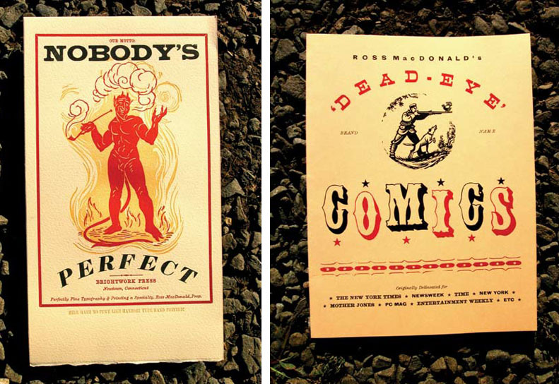
How do you go about finding your wooden type? I imagine that’s gotten harder as the years go by? (And, for that matter, can you tell us about when wooden type faded out of everyday use?)
Believe it or not, it hasn’t completely faded out yet. Wood type was still being manufactured till about 6 years ago by American Printing Supply in Long Island City. In my town right now, the fairs and carnivals are all starting up, and most of them get their posters printed at a place called Pyramid Printing, which prints from woodblocks and wood type on a Kelly press. There used to be hundreds of those poster shops all over the country, but there’s still a few left. These places aren’t museums or boutiques—they’re real working-class printers.
Wood type is very durable and easy to work with. For straightforward display type you can’t beat it. You can set up display copy for a poster and have it ready to print in far less time than it would take to design it with a computer, get film made, burn plates and set up an offset press. With wood type, you are designing right on the bed of the press. Once you have your type arranged, you just start printing. You can’t get more direct than that. Yes, if you want, you can spend hours fussing over details with letterpress, but you can in InDesign too.
To answer your first questions last, wood type has gotten harder to find in the last few years, but it still pops up fairly frequently. There were so many print shops in this country that it was pretty thick on the ground at one time. You can find it on ebay, and occasionally wood type collectors or boutique letterpress printers will sell or trade a font or two, but I have gotten very little type from those sources. They’re really only good if you are rich, in a hurry, or only want to buy one or two fonts and don’t mind paying top dollar. I used to spend a lot of time tracking down type. Scouring newspaper ads, driving around, going into small shops and asking around, etc. Lots of legwork and time on the phone. I like it—it’s kind of like detective work. Lots of false leads, lots of fruitless digging around in dusty shops, basements or sheds, but you occasionally hit paydirt. I also have a long-term relationship with several used equipment dealers and other letterpress guys like me. After years of doing this, I now get calls or emails from people who’ve gotten my name from someone. Probably half of my type has come from people who are clearing out a dead relatives’ basement or garage. Probably the weirdest one was when I got a call to appraise a collection of type that had been found in the basement of the Lizzy Borden house when they tore down the building next door. There were several cabinets of lead type and an enormous rotten wooden cabinet full of wood type. Most of it was made by a company that only existed for 2 years circa 1885. Lots of it was missing, but I got a ton of great type out of that place. Years ago I bought most of the wood type out of the old newspaper/print shop in Peru, Indiana, which is a circus town. The paper was founded in 1845. Some of their wood type dated to 1830. On the back of one of the large letters, someone had engraved an illustration of a burning oil derrick, probably as an illustration for the newspaper. They used to do that kind of thing a lot. I have lots of fonts that have extra letters engraved on the bottoms of other letters. I’ve even done it in a pinch.
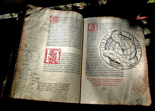
When creating movie props, how much of it is done by use of period methods versus contemporary improvisation?
It’s a real mix. There are plenty of times where I’m making stuff by hand, but also lots of times where I’m creating something on the computer and printing it out on an inkjet printer. A lot of movie props are custom designed and built in small numbers, so in my case, when I’m making a book, I’m hand–stitching the signatures and hand-binding it. If I’m doing a wine label or a wanted poster or a flyer for a period movie, I usually set it and print it by hand. Partly because it’s more fun that way, but it also looks better and frankly I find it quicker and easier than doing it digitally. But if it’s something like a newspaper or something with a lot of text, there’s no way I could possibly hand set all that running text—not on movie deadlines. When I’m doing handwritten documents, I use quill pens or steel pens, and lots of times I use period inks. It’s no harder, it looks better, and it’s fun. I make my own ink from pokeweed berries. It’s what they used for the declaration of independence. It’s deadly poison, which adds to the fun.
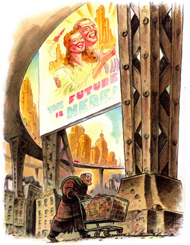 Do you prefer one media over anther, or is that a “which child is your favorite” kind of question?
I like jumping around. That’s one of the fun things about props—I get to do all kinds of different things—oil paintings, pen and ink drawings, woodcuts, calligraphy, designing, printing, carving, metalwork, leatherwork, bookbinding, research, photo retouching, etc. When I’m not working on props, I write, I design, I do lettering, and I illustrate in different styles and media. I think if I had to do any one of those things all the time I’d go mental. If I work on a movie for a few months, I usually swear I’ll never do it again, I get so sick of all the long hours and pressure. But then after a few months of magazine work, I start getting antsy for something new.
Have you found working in so many disciplines has made it harder or easier to market yourself to art directors?
I never found it to be a problem, but I wouldn’t necessarily recommend it as a wise career direction for illustrators starting out, either. When I first got to know a lot of art directors, I was only working in one or two styles. It was only after I had established relationships with a lot of clients that I started to branch out in other directions.
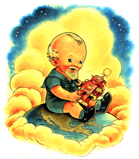
The economy is tough on everyone, not least of all illustrators. What have you done to keep yourself in the eye of art directors? Do you specifically target ADs f
rom your various disciplines (design, illustration, move props) or do you approach all ADs pretty much the same?
I try not to blanket everyone with the same thing. I’ve never done huge mass promotions. I’m not saying they’re bad, but I’ve always found that sending out smaller targeted promos worked for me, especially since I do a lot of different things. Also, there was a time when you could count on the fact that if you did an illustration in a big magazine, that everyone saw it, so it worked as promo. I’ve only recently realized that that’s no longer necessarily true. So now, if I do a piece that I like, I’ll send out an email to a few people saying “Hey, did you see this in the recent issue of whatever…”
I do email some of my illustration work to some movie prop clients, but many of them don’t really grok magazine illustration. It’s a pretty insular business. On the other hand, my editorial clients seem really receptive to and interested in the prop stuff.
 In general, my motto is, that if you find a good client, you do everything you can to keep them. In other words, I spend most of my promotion efforts on people that I know and like and like working with. I send them personal emails with recent work, send out copies of books I’ve worked on or letterpress pieces, whatever. But you always have to seek out new clients and new markets. I keep a short list of people I really want to work with, and send them stuff occasionally. I also do research—I look at magazines and books and industry websites, and write down names and send out promos. I think it helps to keep it organized—I write out a dopesheet of what I’ve sent to whom and when so I don’t repeat myself or leave anyone out.
When work is slow, I take advantage of the extra time and spend it scoping out new clients, strategizing, updating my website, and producing promo pieces. In edition to getting back into printing some letterpress pieces to send out, I’m considering doing a couple of things through MagCloud.com. They produce on-demand magazines, but some artists and photographers are using them to print portfolios of their work. I think it’s important to send out things that people can hold in their hands. I also signed on to Adbase. I’ve used it a lot for researching clients and it’s great—it can really give you hope, because you can see that, despite all the gloom in the publishing industry, there are still hundreds of great magazines and book publishers out there. I haven’t really taken advantage of their emailing service, but I hear good things. I think they give a free trial, so you can check it out.
To see more of Ross MacDonald’s work check out his website and Tor.com gallery, and for a fascinating look into the creation of his cover for Brain Franics Slattery’s Liberation, check out this past Tor.com post.
Irene Gallo: Catsitter, dogwalker, fish feeder. Also, art director for Tor, Forge, and Starscape Books and Tor.com.

