


This is the fourth (and I think final, unless someone comes up with something related they want me to discuss) piece in a short series where one author gives her reactions to some of the covers that have been put on her books.
In my last piece, “Series Doesn’t Equal Set,” I referred to an earlier comment by “Midwinter” in which was said: “the cover art to Changer was why I finally grabbed the book after passing it three or four times in the store.”
“Midwinter” clearly meant this as a compliment. However, I think this comment highlights a serious challenge book covers have always faced, and will face even more as book selling takes place more and more on-line. That is, how to make sure the book cover grabs the reader’s attention right away—even when it has been reduced to an icon the size of a postage stamp.
Throughout my career, I have had my share of what I have called “second look” covers. By this, I mean, covers that, while eye-catching in some fashion, demand that the reader pause long enough to take a second look or even to read the jacket copy for the true nature of the novel to emerge.
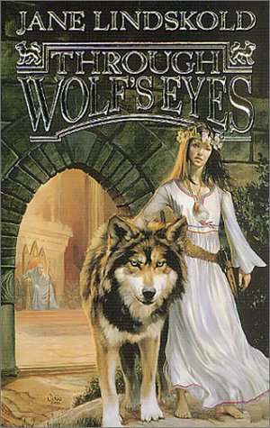
The cover to The Pipes of Orpheus, which I discussed in “When Right is Completely Wrong,” was one such cover. Another, oddly enough, graced the first of my books to become a bestseller: Through Wolf’s Eyes.
At first glance, this lovely painting by Julie Bell shows a pretty girl in a white gown standing next to a big dog or wolf. Her silky brown hair flows past her shoulders. She is crowned in flowers. Nice. Pretty. Girl and her animal book…
A second glance shows that something is wrong with that initial reaction. The girl is barefoot. The gown is belted with a battered leather knife-belt. Her only jewelry is a leather pouch hanging awkwardly around her neck. The expression on her face is twisted, even a bit demented. In the background, an old man leans forward from a throne, studying girl and wolf intently.
But you need that second look to see this. Otherwise, as “Eratosthenes” commented elsewhere on Tor.com, this book can be dismissed as girly. To quote in full: “There is no chance that I would have bought Through Wolf’s Eyes at the bookstore because it looks like a book written for young women and I am neither. I read the e-book and was hooked.”
Needless to say, haunted by the “fluffy bunny” covers of my early career—see “Look at What They’ve Wrapped Around My Baby” for more on this—I was deeply concerned.
Thank goodness, the strength of Julie Bell’s art seems to have meant that many readers did give the book that second look. Mileage on tone of later covers did vary widely, however, with scarred, battered 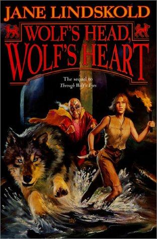 Firekeeper often depicted as a well-scrubbed girl-next-door.
Perhaps the worst was the art on the hard cover of Wolf’s Head, Wolf’s Heart. A friend actually phoned me and said, “What’s Laura Mixon [mutual friend and N.M. author] and a Mexican wrestler doing on the cover of your new book?” I admit, seeing my dark, gritty sewer transformed into clean splashes was disheartening, and poor Grateful Peace!!
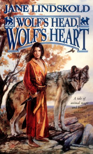 I think it’s indicative that I wasn’t the only one to have a negative reaction to this cover. Tor commissioned an entirely different cover for the mass market paperback release. The scene is a bit tranquil, and I wonder where Firekeeper got that bathrobe, but I think it does more good than harm.
As a side note, I was particularly delighted that, in later covers for the series, Ms. Bell’s wolves just got better and better. They lost the broad-chested “dog” look of that first cover, and became unmistakably wolves.
Another “second look” cover to grace one of my books was the beautiful, even elegant, painting by Eric Bowman for The Buried Pyramid. The colors are soft—pink sandstone and pale blue dominating. 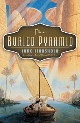 The scene is of a small sailing craft gliding up a river that (from the misty pyramids glimpsed in the background) can only be the Nile.
A second look is needed to note the one incongruity in this calm scene. The young woman in the boat wears a gun belt around her neatly-skirted waist. That’s it. Otherwise, this book might be a dry, dull memoir, perhaps entitled, My Visit to the Monuments of Ancient Egypt.
I’ve got to admit, I would have put something completely different on the cover. My choice would have been Jenny Benet astride a camel, her rifle held with loose competence in one hand. Perhaps, if it could have been done without falling into “fluffy bunny” territory, I would have also included the kitten, Mozelle, who ends up playing such an interesting role in the novel.
This approach would have reached not only the fans of authors such as Elizabeth Peters, but also those who like novels with strong female characters. As matters stood, it took a second look, and maybe even a third or fourth, for readers to realize that this was a novel by the same person who wrote Through Wolf’s Eyes. (The information was on the cover, but in teeny-tiny type).
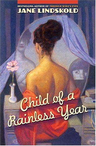 The same lack of continuity in approach colored my reaction to the cover for Child of a Rainless Year. Although the art (by Gary Kelley) accurately evokes the opening scene of the novel, I don’t think the old-fashioned, cover-for-a-Raymond-Chandler-mystery approach best presented the novel. Moreover, the flat, even dull, hues that dominate the cover hardly reflect the content of a book for which “Color is the great magic” is the first line. Since this cover looks nothing like those for the Wolf Series or The Buried Pyramid, it’s also unlikely that readers who enjoyed those books would have picked up this one.
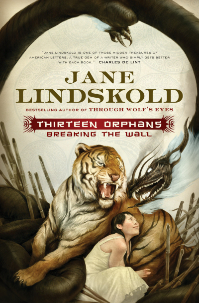 I’m not saying all books by the same author need to have the same cover artist, but there should be some continuity in theme. I dearly hope that Tor has reached this balance with the amazing cover, by Sam Weber, for my newest novel, Thirteen Orphans. The lifelike depiction of the tiger will hopefully reach those who think of me as the “animal” writer, while the gorgeous Chinese dragon may speak to those who have enjoyed my ventures into myth and legend.
In sum, I have no illusions that people will remember my name. Readers rely on book covers to hint that this is a book they will like. That’s why I have such strong opinions on the subject, and why I’ve taken the time to share them with you.