Skip to content

SF/F Book Cover Review, Hugo Edition: The Last Colony

7
Share

SF/F Book Cover Review, Hugo Edition: The Last Colony

Home / SF/F Book Cover Review, Hugo Edition: The Last Colony
Blog

SF/F Book Cover Review, Hugo Edition: The Last Colony

By

Published on August 7, 2008

7
Share

The fifth and final review of the covers for the 2008 Hugo nominees, in which we continue to shut our yaps and let you guys do your thing. Part one of this week-long series is here, part two is there, part three is yonder, and part four esta aquí.

The Last Colony by John Scalzi (Tor)
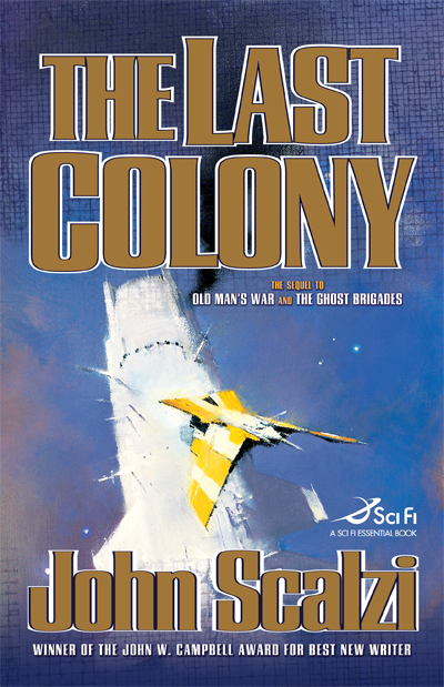
Design by Peter Lutjen, illustration by John Harris

Once again, synopsis from the Tor-Forge website: Retired from his fighting days, John Perry is now village ombudsman for a human colony on distant Huckleberry. With his wife, former Special Forces warrior Jane Sagan, he farms several acres, adjudicates local disputes, and enjoys watching his adopted daughter grow up.

That is, until his and Jane’s past reaches out to bring them back into the game—as leaders of a new human colony, to be peopled by settlers from all the major human worlds, for a deep political purpose that will put Perry and Sagan back in the thick of interstellar politics, betrayal, and war.

All I’m going to say here are two things:
(1) I heart both John Harris and John Scalzi. Scalzi was love at first read; Harris was an acquired taste, and I dig his work all the more for it.
(2) This book features embossing and gold foil for the title and author.

And so, with that: Good luck to all the nominees!

That is all.

The Last Colony HC


About the Author

Pablo Defendini

Author

Learn More About
Subscribe
Notify of
Avatar


7 Comments
Oldest
Newest Most Voted
Inline Feedbacks
View all comments
orchard
16 years ago

For me, this one wins. The cover really lets the awesome composition show, great palette, very cool space ship. This is the only one out of the five that gets me really excited to read the book. Interesting choice on the lettering, I don’t know why but it brings to mind old Heinlein books. It feels classical SF but is still original. strange and familiar.

Avatar
16 years ago

Yes, the cover art looks really nice, but it exemplifies a major pet peeve for me as concerns the covers of SF books: it has absolutely nothing to do with the content of the story. This really ticks me off; I may not judge books by their cover (well, any more than ordinary people are wont to do) but I do want the cover to tell me something about what’s in the book: a particularly exciting scene, or at the least what one or two of the characters might look like.

But all the books in the Old Man’s War series have these generic, starships-flying-around covers that tell me nothing other than that it’s science fiction. The cover of A Fire Upon the Deep is another offender in that regard. I guess Tor just commissions a bunch of random science-fictiony paintings, then slaps them on whatever book needs a cover. Perhaps it’s cheaper than paying someone to paint something that is actually from the book. That might mean they’d have to read it, God forbid.

Your cover art is your big chance to say something about your book. You should say more than “it’s SF.” We can already tell that from where it says “Sci Fi” on the cover.

Avatar
16 years ago

Purely as a cover, this one is my favorite. Ironically, since I’m pretty sure this is the book I’d be least likely to vote for (not having read all of the entrants, I can’t say for sure). But, yeah: very pretty spaceships, lovely composition, excellent style. This is the sort of cover that would make me notice the book at the bookstore.

Avatar
16 years ago

Actually, I like this “school” of illustration — what would you call it: “impressionistic spaceships looking cool”? So, color and image are cool and eyecatching in a bookstore. It reminds me so so many books I’ve enjoyed (John Barnes, Scott Card, Sean McMullen…) that I don’t care about whether or not it illustrates something in the book.

* On that note, it strikes me that I only care about whether or not the cover depicts a scene in the book for fantasy novels, whose covers tend to contain much more narrative (for want of a better word). It upsets my world if I’m reading a fantasy and get to the end only to realize that the moment shown on the cover has nothing to do with the actual story. I really enjoy the ‘aha’ moment when I come across the scene on the cover.

Not mad on the typography, though. It’s too big, clunky and old-fashioned — it screams “overblown Nelson de Mille thriller.”

Pet peeve #1: “Sequel” I just think that word stops a lot of potential buyers from picking the book up to find out more. “Oh, it’s a sequel to 2 books I haven’t read. I think I’ll look at ________ [fill in the blank] instead.” By all means, explain that it’s a sequel on the inside flap or back cover, but don’t put something on the cover that gives readers an early opportunity to reject the book. Look at Pratchett, they are Discworld novels, not sequels to a list of 24 books.
— of course, this may simply be truth in advertising and the reader who hasn’t read OMW and GB might be completely lost, but usually you can read a sequel without too much distress.

Pet Peeve #2: Sci-Fi Essential Book”
This just looks wrong. It might as well be “A Coca-Cola Essentials Book.” It smells of sponsorship and corporate branding, and the only brands I’m interested are the author and publisher. The ultimate annoyance for me is that the SCI-FI logo is on the spine also, so I can’t even escape it when the book is shelved at home. (Which of course illustrates that this is just a minor peeve and hasn’t stopped me purchasing Haydon or Doctorow or someone I’ve really wanted to read.) However, for books I’m marginally interested in, the logo may have tipped the scales away from buying (but wouldn’t have been the only reason).

Since I’m on the subject. Attn: nice Tor people. Please don’t put this logo on A Memory of Light or I’ll cringe every time I look at my Robert Jordan shelf…

On balance, I like the cover. Its positives outweigh the negatives for me.

Avatar
16 years ago

It’s a nice cover, but… it’s a cover. By that I mean that, at least at mass paperback scale, all I look for is something that isn’t offensively amateurish. I’m actually having a hard time with Stross’ Saturn’s Children since the cover annoys the heck out of me. Middle-aged guy walks up with SF book with bimbo on cover… yeah, thanks.

I like the large type – makes it easy to see from a distance (Yes, not relevant if I’m in the S section in SF, but if it’s on the New Paperbacks table…

On the sequel label… I like that when it’s a sequel. Book N of the X Series works too. But you’re right here – this is a book in the same universe with some characters we’ve seen before. You could read it as a standalone vs, say, the second book in LotR or Dune.

Avatar
16 years ago

I just want TOR to release this as a Kindle edition. Where is the follow-up for all the freebies?

Avatar
daniela
16 years ago

is the last colony reall.