For the first official installment of the Science Fiction and Fantasy Book Cover Review, we’re going to take a look at some of the covers for the current Hugo Award nominees. (The winner of the Hugo for Best Novel will be announced this Saturday, August 9, at the World Science Fiction Convention in Denver.)
Since a quick look at the first post in this series (which includes the rules of the game) will remind readers that I’ve said that I won’t personally be reviewing Tor books in this space due to conflict of interest, I’ve decided to concentrate on the non-Tor books, and limit myself to very brief mentions of the two Tor nominees. Since I’m reviewing multiple books on this first outing, I figured I’d split the post into five segments, to be published one at a time over the course of the week leading up to Worldcon (five books, five days in the week–I love it when a plan comes together!). The last two posts will be the Tor books, and these will be mostly a space for people to chime in via the comments–unless someone outside Tor wants to use the previous posts as a model and submit a detailed critique of these two books. I’d need those by Wednesday night, kthx!
The Yiddish Policemen’s Union by Michael Chabon
(U.S.: HarperCollins; U.K.: Fourth Estate)
U.S. Edition Design & illustration by Will Staehle
U.K. Edition Designer unknown.
A Chandleresque murder-mystery/alternate-history set in the present day of a world in which a temporary settlement for European Jewish refugees was established in Alaska in 1941, and the postwar state of Israel failed to survive its struggle for independence in 1948.
Overall, Staehle does a fantastic job of imbuing the Pacific Northwest/Inuit totemic iconography used on the cover with a distinctly Jewish flavor, without going overboard. It would have been very easy to overuse the Star of David as a design element. As it is, it’s there, and it communicates what it needs to communicate, but it doesn’t take over the layout, as very recognizable icons tend to do if given too much prominence. Additionally, it’s not the star of David that we normally associate with a Jewish state (eg: the flag of Israel), so it creates a little bit of ambiguity in that respect. The gun, the bullets, the skull, and the cityscape all clue the prospective buyer into the fact that this is a crime novel, again without overtaking the entire design, which in turn helps to communicate the fact that the book is a mash-up of ideas, as alternate histories usually are. Although the cover is packed with graphic ornaments, it doesn’t feel too “busy,” mainly due to the large field of black in the center of the layout (which also implies the long nights of Alaska), and the lack of heavy type.
The most prominent typographic element, the author’s name, stands out due to its being knocked out to white, more so than due to its size. The title is set in an outlined face, which helps settle it into a very defined position within the typographical hierarchy. Had the title been a solid color, it probably would have competed too much with the author’s name for prominence, despite its smaller size. As designed, the first typographical element to catch your eye is the author’s name (surely a requirement of the sales department, and not a bad one at that), which then leads you directly to the white “the” in the title. While the words “Sitka” and “Alaska” feel a bit unnecessary and incidental at first glance, they do help to give a reason for including the bright band in which they’re placed, which does serve a very necessary function: it provides a bit of balance to the composition, which would otherwise be too red-heavy on the bottom.
Limiting the color palette to two colors along with black gives the entire thing a very graphic, very crime-novel look, but making those two colors bright and day-glo firmly grounds the book in these (post) modern times, not to mention making it positively pop off the shelves when face-out.
 Speaking of shelf placement, the spine on this book deserves a serious tip of the hat. The typesetting is beautiful, and–as Joseph Sullivan mentions on his post about this spine in his Book Design Review blog– the fact that the text reads as a complete sentence is a novel (no pun intended) and welcome surprise.
 As an added bonus, Harper has issued a limited edition hardcover, complete with silkscreened, wooden slipcase featuring a faux-wood finish. The design of the slipcase complements the book very nicely, and the choice of material further reinforces the craft-ish nature of the Inuit iconography.
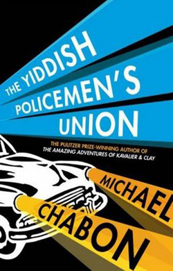 The U.K. version of this book sports a very different approach, concentrating mainly on the noir-ish aspects of the book. While competent, it positively pales in comparison to the U.S. edition, and garners a big ol’ “meh” in my book.
Special thanks to Jamie Stafford-Hill for links and commentary.
Tomorrow, we’ll tackle Halting State by Charles Stross.


