Sometimes an image speaks for itself.

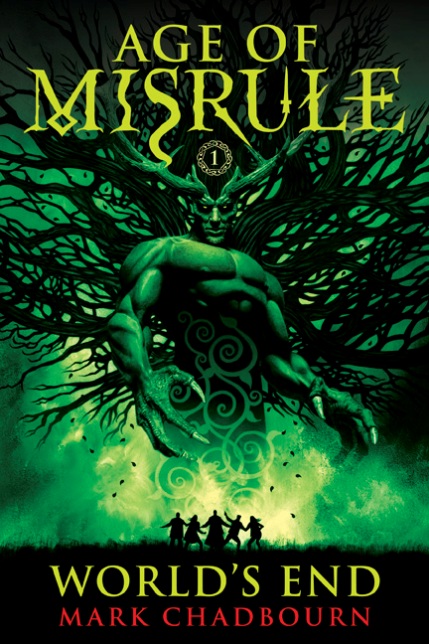
This is John Picacio’s cover for World’s End, the first book in Mark Chadbourn’s Age of Misrule trilogy. The Age of Misrule is something special—long overdue for a US publication—and I knew it demanded nothing less than the type of attention and deep reading that five-time Hugo-nominated artist John Picacio would bring to it. John and I have worked together on quite a few covers now, and while he’s the artistic genius and I’m just the guy who knows what he likes, the back and forth dialogs that we engage in are always very much part and parcel of how the book covers evolve. Being especially pleased with the results, I want to talk a bit about the process of creating this cover, and the two that follow (the third of which, below the fold, has never been seen before in its final form.)
A bit of background: Mark’s series, which is actually the first trilogy in a “trilogy of trilogies,” is at one time the classic fantasy quest mapped onto a modern world, while also being a “secret history” novel, or a book that peels back the curtain on all the ancient places and sacred sites of pre-Christian Britain and explains their significance, doing so in the context of both Celtic myth and Arthurian romance. Age of Misrule is set in a Britain that has been invaded by the dark gods and demons of Celtic mythology, the golden Tuatha Dé Danann and the vile Formorii, who fought a war and left our realm centuries ago, and have now decided the time is right to return. I described it initially as, “One part Lord of the Rings, one part Illuminatus!, one part Arthurian romance, one part Harry Potter—100 % original!” and I don’t think I was exaggerating. The Lord of the Rings connection, obviously, is due to its band of individuals on a quest to stop a dark god from conquering the earth. I invoke The Illuminatus! for the way it lifts the lid on hermetic magical knowledge and hidden spiritual secrets. Arthurian romance, because it looks beyond the myths of Arthur to the buried truths they contain, and Harry Potter because it concerns a group of adults who have to put aside the preconceptions of the mundane world and learn the new rules of magic while coming together as a team. The series has a bit of Terry Brooks in it, in the way we get to see our world slowly overcome by a new magical reality, and a bit of Stephen King in it, in the way that sometimes, the human heart can reveal itself to be as dark as any monster. For the covers, we wanted something that could speak to all these elements (no easy task!), that wouldn’t hide its fantasy tropes, but which would also proclaim that this was a “big series” of broad appeal. Early on, I made the decision that we wouldn’t say “World’s End: Book One of the Age of Misrule” with all that “book one” stuff rendered like a typical subtitle. I told John that “Age of Misrule” had to be at the top of every book, with the title taking the position the subtitle generally would hold. One of the reasons for this was that, for the first time for us, we were experimenting with the strategy of releasing all three books in a trilogy in three consecutive months, and I wanted this clear, strong through-line to show and catch the eye as they began to appear one after the other. Against these constraints—which when you think about it involved having to work with an awful lot of text—and urged to always keep the phrase “Big Book” foremost in his mind, John did an absolute magnificent job. He talks about his process:
From my first conversation with Lou about the Misrule trilogy, we knew we wanted them to feel like a cohesive set. At the same time, each book had to have its own shelf identity. In the early stages of any cover job art-directed by Lou, he and I play mental tennis, volleying short phrases and visual cues back and forth at each other. After we did a bit of that, he handed me the gigantic manuscript for all three books and left me alone to read, discover and brainstorm.
I’m not sure which of us first verbalized World’s End would focus on a Green Man image, but we were both sky-high excited and in agreement from the very beginning. By the second book, it was clear Chadbourn’s epic was focusing on an evolution of his protagonists as they’re confronted with a catastrophic collision of their world (our world) with the apocalyptic return of Celtic myth. So as an illustrator, that’s a crossroads decision. Do I show the protagonists in full representative glory on the covers or let the readers imagine them? The answer was yes and no, and that was one of the keys to discovering my cover solutions. Yes, the protagonists should be on the covers, but they should be at the mercy of myth in full bloom—nightmares and wonders massive, spectacular, and terrifying.
In many ways, these Misrule books are an illustrator’s dream because of the lush imagery, the vile monsters, and the epic scale. The toughest thing was to restrain myself from drawing and painting too much. These cover illustrations needed to be iconic and simple, and finding those simple touchstones is not as easy as it sounds, when there’s so much incredible imagery from chapter to chapter. Big props to Lou for some solid volley work in that department. My initial ideas for these covers turned out be very similar to my final illustrations, but they refined and honed as I finalized them. If not for Lou, I probably would have been tempted to draw and paint more stuff and introduce more visual complexity. He felt like my initial simple ideas were winners from the beginning, so I stayed true to those initial schemes. I’m glad I did. It’s been an honor and a pleasure to illustrate these covers. I envy anyone who reads these books for the first time. Wow— you’re in for a helluva ride!
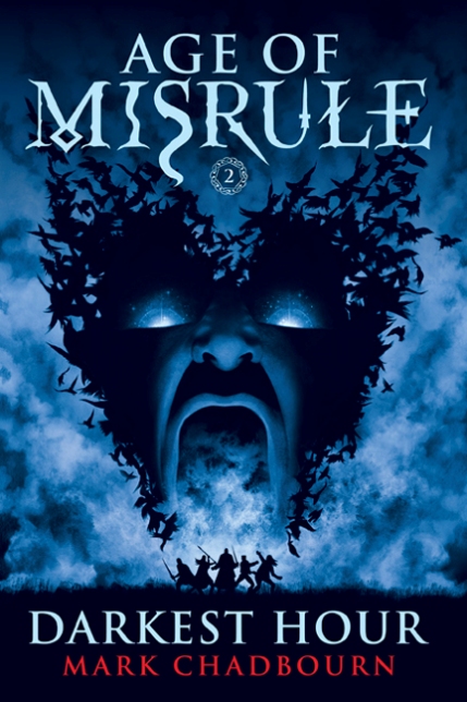
And on that note, here is the artwork for the second book, Darkest Hour:
Now, if it sounds like a lot of work and thought and research went into these covers, it’s only because we were challenged to be equal to the material. Mark Chadbourn did an incredible amount of research for this series, both in books and on the road. I asked him to tell us a little bit about its genesis and the work involved:
The idea for the Age of Misrule came to me around the millennium, which had become something of a focus for people asking big questions about their place in the world. I’d always been fascinated by the ancient sites of Britain—the stone circles, the cairns, and menhirs, as well as the Medieval cathedrals and castles—and at that time all those places were seeing a massive up-tick in attendance from those people trying to connect with the past to understand the present.
They were on a quest, not for a magic ring, or a sword, but a quest for some kind of meaning in a secular world. And I decided to use that as the theme for the Age of Misrule.
A lot of fantasy at the time seemed, to me, to be building on the work of Tolkien. I wanted to go back to first principles, the old myths that Tolkien himself had drawn on, tie them in to ancient history, and see if they still resonated with the modern mind-set in the same way that they had deeply affected the old Celtic tribes.
It was a massive undertaking, with a back-story that wound through five thousand years of history, from when the great stone circles at Stonehenge and Avebury were erected, to the present day. And the research was phenomenal. For the three books that make up the Age of Misrule, I traveled the length and breadth of England, Scotland and Wales, visiting prehistoric sites, castles, churches, cathedrals, sacred springs and lonely moors, as well as all the modern sites that feature in the story. If you are so minded, you can follow the route from the book. The entire trip took about six months.
I spoke to scores of people—folklore experts, academics, people who lived in the areas I referenced. I studied primary, secondary and tertiary texts on all the ancient sites, the history, on the Celts and their society, their myths and legends.
When I saw John Picacio’s art, I was absolutely blown away. It captured the raw power and the wonder of those old Celtic myths, but also got that sense of spirituality I was trying to fuse into the text. The story is epic—Misrule is the first of a trilogy of trilogies covering five thousand years of human history, that great world mythologies and three worlds, this world, the Celtic Otherworld, and the world after death—and John totally captured that sense of scale.
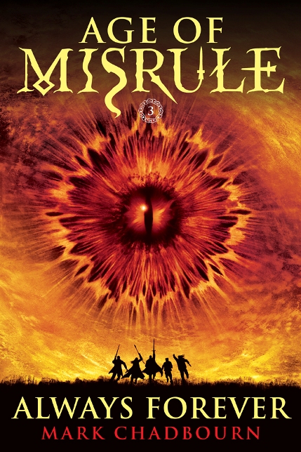
Without giving away too much, each of the looming supernatural entities on the cover is very much central to their respective books. When it came time for book three, we knew absolutely what it had to be. Balor, the Celtic one-eyed god of death, was the specter haunting every page of this final narrative. Balor has always been represented by an evil eye—in fact, some people think the entire notion of an “evil eye” is inspired by his legend. But, of course, a great big eye is going to draw some inevitable Tolkien comparisons, particularly after the Peter Jackson films. It can’t be helped. I’m told Moebius has had to endure years of being told his stuff looks like Star Wars, and it’s a similar situation here. Because before Sauron, there was Balor. As Mark explains:
It was interesting to see where Tolkien got some of his stuff—Sauron is really the Celtic one-eyed god of death, Balor, who appears in Misrule. But by going back to the original template, I could then attempt to reinvent what had become familiar fantasy tropes, from dragons to vampires to gods and magical items.
Which brings me to the artwork for book three, Always Forever, which, as I said above, is appearing here (in its final form) for the first time anywhere:
Mark’s reaction:
I really like the cover. I always expected an eye to crop up because, as you say, how could it not? There’s no point steering clear of the Tolkien connections—he doesn’t get to own the old myths anyway.
So if people tell you, “Hey, that’s the Eye of Sauron!” you can tell them, “No, that’s the Eye of Balor, and he can kick Sauran’s ass!” Okay, probably not. But it underscores the way this series gets to the heart that lies beneath so much of British fantasy and mythology. Either way, it’s a strikingly beautiful cover and a fitting cap to the trilogy. Notice too how John has evolved the tiny figures across the three books. Aspects of the cover like that will mean more to the reader as the narrative unfolds for them as well.
 Finally, for the spines, we tried something new as well. I’d been frustrated with the way books in a series were shelved in the store alphabetically by title rather than in chronological order, and had been struck by the way Marvel comics started numbering the spines of their graphic novels. I talked to John about doing something similar and he came up with the Celtic knot design, which not only served our purposes but helped reinforce the tone of the books. World’s End is already on shelves, and Darkest Hour and Always Forever arrive in May and June respectively. I think when all three are out, it will be a really eye-catching display, even if they aren’t faced out. Again here, the series title takes precedence over the individual titles.
Now, for anyone wanting to know more about John Picacio’s art, here is his website and his blog. And as for the book’s themselves, here are the first three chapters of World’s End. And here is Mark Chadbourn’s website and blog. And:
More information about World’s End.
More information about Darkest Hour.
More information about Always Forever.
And finally, if you like the look of this series, you’ll be happy to know that John Picacio is at work right now on the second series in this “trilogy of trilogies,” The Dark Age trilogy. I, for one, can’t wait to see what he comes up with. The challenge, of course, will be to do something equally compelling, that is close enough to this in appearance to suggest the continuity between Age of Misrule and The Dark Age, without being so close as to be repetitive or boring. I think that he’s got his work cut out with him. But I’m not the least bit worried. How could I be?


