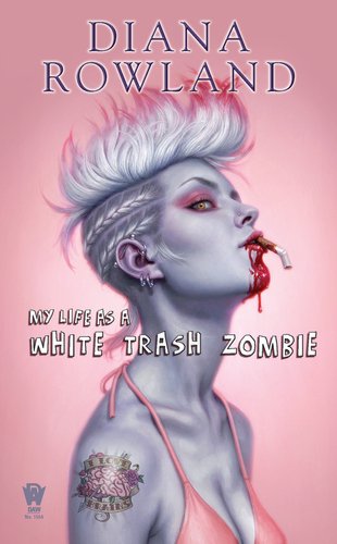
DAW Books, for whom I’ve been doing a lot of covers for this past year, contacted me about this job. Unfortunately, my schedule was booked totally solid (mostly with their titles), so I had to decline. Fortunately, the Art Director being wiser than I, decided to try again anyways and called to see if I would change my mind. When the words “zombie romance” came out of her mouth, I knew I had to take it.
Because the deadline was so tight, I had to come up with a particularly simple piece. I also would likely only have time to come up with a single sketch, two at the most. I explained this to the AD, and she agreed.
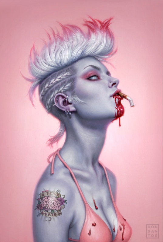
The AD was very particular that I make the heroine an obvious zombie, but still attractive. Apparently, someone had tried something similar not too long prior, and sales were disastrous. Making the cover more sexy than scary was essential. I sat down, and quickly drew my way through every trailer park and pink flamingo cliche I could think of. Nothing worked. But something about the pink stuck with me. I sometimes sketch in color (one of the great benefits of sketching digitally), and the moment I saw the way the dead grey skin would play off the bright feminine pink, I knew I had my cover.
To me, everything about the sketch seemed so perfect for the story… just the right combo of sexy, quirky and trashy. Yet, I was utterly convinced that they would NOT approve it. A pink book in the Fantasy section?! A cigarette in her mouth?! There was no way in hell the sales team was going to let me get away with this! I sent the sketch along with a short email that said: “Please, please, PLEEEAASE let me do this cover.”
Their response… “We love it!”
As is usually the case with really simple design, I ended up spending way longer than expected on it. Because there is so little to look at, you have to make sure that what is there, is stellar. Knowing that I was going to paint every little eyelash, I shot a bunch of reference. I composed it all in Photoshop, mixing several different photos of 2 different models. From there I re-established my drawing, and transfered it to my board.
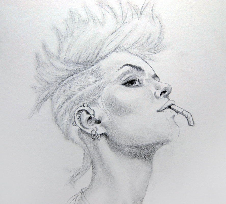
It may seem silly to spend time drawing in subtleties like the eyebrows, since they are going to get painted over anyways. But, it actually speeds up the process a lot. That pencil ends up showing through in the end, and gives me a very fine level of detail that is a bit harder to achieve in paint. To ensure that they showed through all the paint, I drew those elements much darker than the rest. The AD had questioned the amount of blood on her chin, so I kept that part of the drawing super light in case I needed to revise it.
Applying a color transparently over a white surface results in a much brighter color than mixing it with white (which tends to make most colors chalky). Since I wanted a sickeningly sweet pink background, I started with a vibrant wash of oils. This also let me see the color relationships almost immediately so that every decision afterwards would be easier to judge. You can already see how much work that pencil is doing for me at this stage.
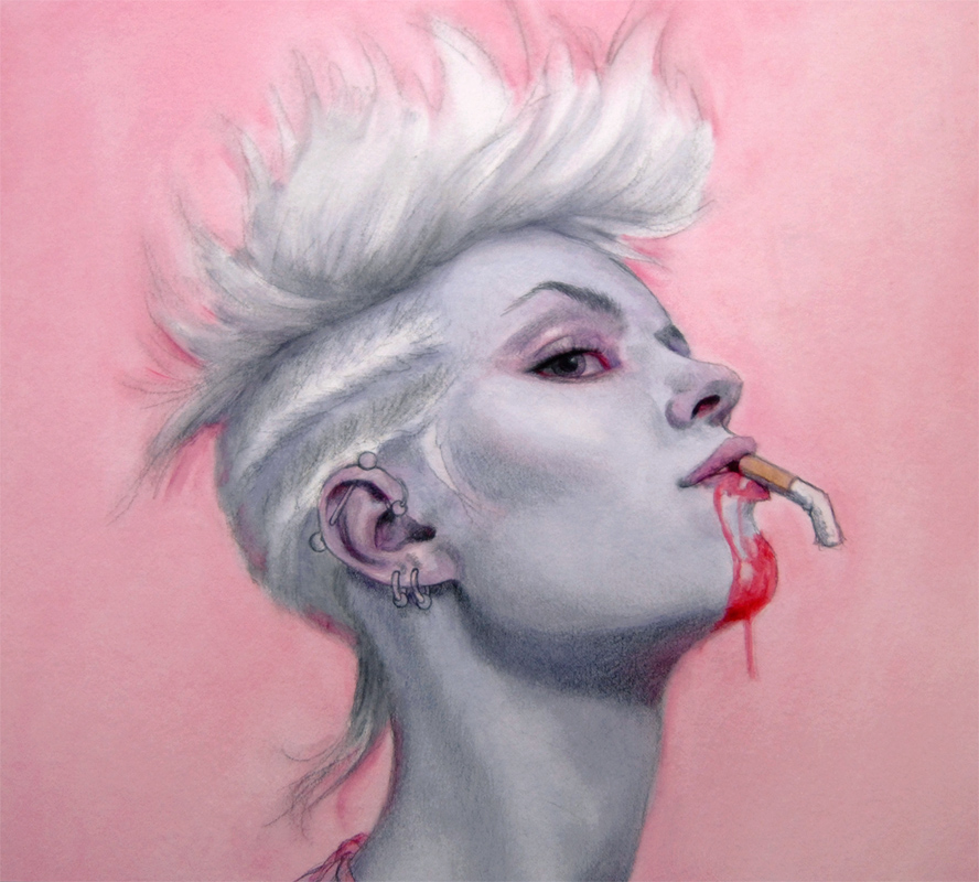
All that’s left is to just do it. In the image below, the painting is near completion. I typically paint the flesh tones beneath the hair, and then paint the hair on top of it once they are dry. This makes it easy to wipe out brushstrokes if I mess up some of the overlapping strands. Here, I am one coat away from finished, so a few elements as still missing, like the tuft of hair near her ear, as well as the nose stud. I also decided to make the eye a milky blue to add to the zombie theme.
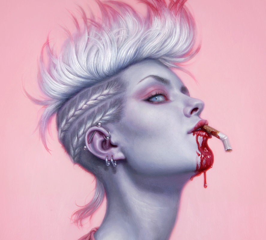
That’s about it! I sent it off to the AD, who happily approved of it with the exception of a few changes. She wanted to have no blood on her chest, and also asked that I make the eye look human again, feeling that the dead looking eye made her less attractive. Both totally valid decisions. (The pre-change version is below.) The completed image with type treatment is at the beginning of this post. The book, which is getting some great reviews already, is due out in July.
This post originally appeared on Muddy Colors. You can read an excerpt from White Trash Zombie right here on Tor.com!
Dan Dos Santos’ work spans a variety of genres, including novels, comics and film. He has been the recipient of many awards, including a 2010 Silver Medal from Spectrum, the 2007 Jack Gaughan Award for Best Emerging Artist, and the Chesley Award winner for Best Paperback Cover of 2007. His illustrations have graced the #1 spot on the New York Times Best Seller list numerous times. Aside from freelance illustration, Dan also co-hosts a series of instructional demonstrations called ’Art Out Loud’. You can view a gallery of his work here on Tor.com.


