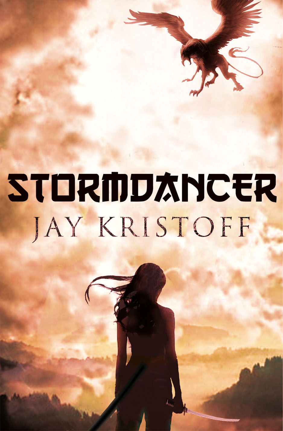
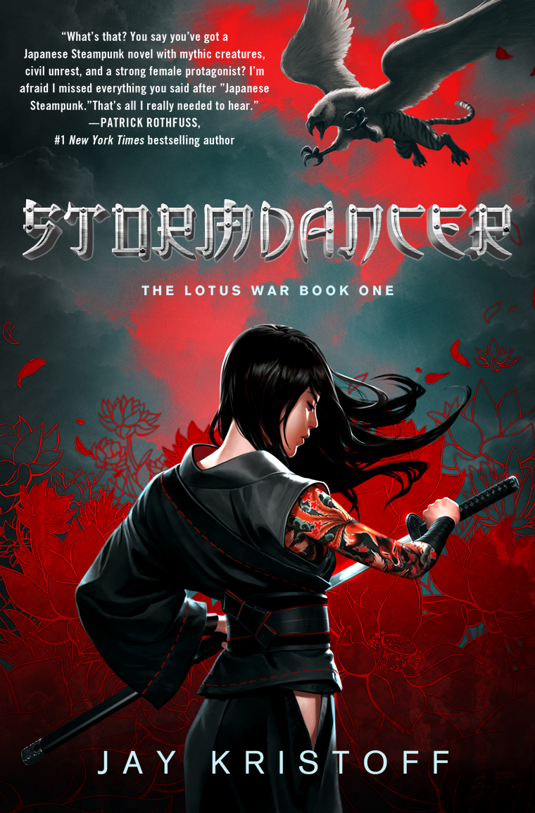
This is the cover for my debut novel Stormdancer. I love it like Westley loved Buttercup. Like Han loved Leia. Like Jaime loved Cersei. No… wait, ewwww….
As far as I know, the secret behind a good cover seems to be “hire a good illustrator and get the frak out of the way,” but I’m not sure I can pad that out to 800 words, so I’ve asked the stonkingly talented illustrator behind Stormdancer’s cover, Mr. Jason Chan, to help out.
Jason: To begin, I was given a rough comp of what the cover should be,
I thought focusing on making the cover graphic as opposed to an actual scene would work well, so I decided to use the thunder tiger (white) and the blood lotus (red) as very strong graphical elements. This left me with a white and red background, which not only describes two important subjects of the story, but also alludes to the Japanese flag as well as blood and the corruption of purity. I also zoomed in on Yukiko and made sure to hint at her face.
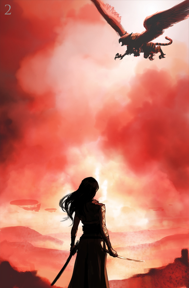
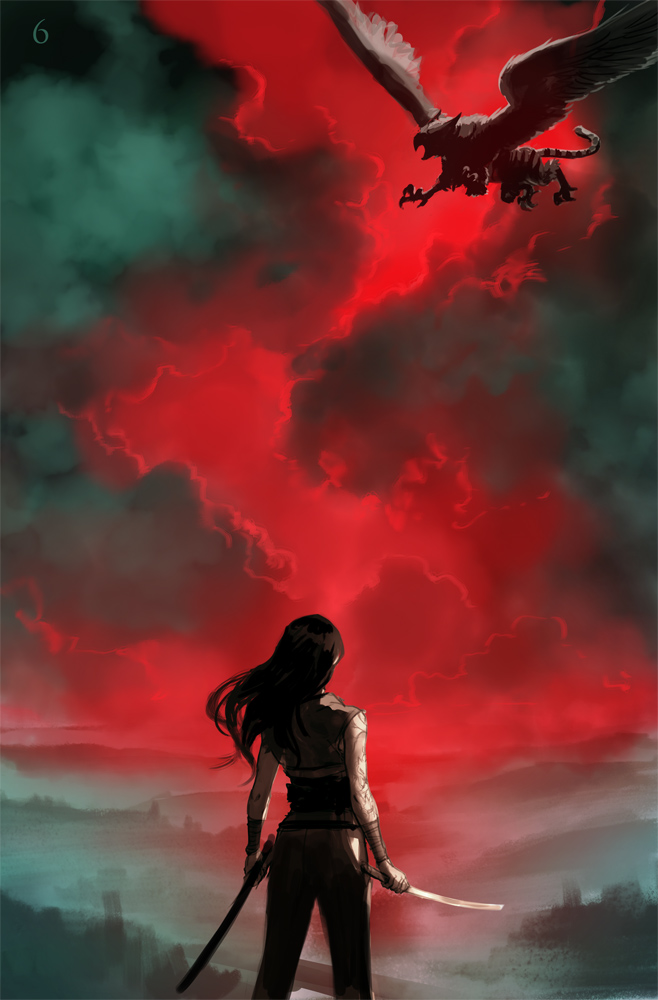
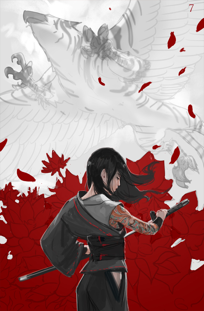
Jay Kristoff: At this point, I got sent comps of where Jason was at, both the design we were expecting, and the design he’d come up with under his own steam. This was the first I heard Jason was doing my cover (I was huge fan of his MTG stuff), and I think my air guitar solo lasted around 17 minutes.
I loved the new design he’d done. My only concern was… now, you’re going to think I’m a freak when you read this, but my concern was the griffin’s…accoutrements.
Seriously, we’re looking right up at him! Am I the only one who thinks like this? Where is his gear? Not that I’d spent an enormous amount of time pondering the physiology of griffin love, but I’m pretty sure they’re, as Commander Data would say, fully functional.
I suggested we change angles. I could feel my editor’s withering glare through my monitor, but he passed the request on and Jason seemed to agree.
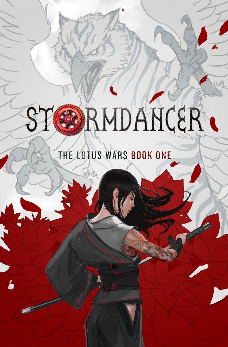
Jason: With the second direction approved, we tried a couple of versions with different griffin poses, but in the end Yukiko and griffin were competing too much and lacked some of the mood from the stormy sky—
Kristoff: Wait… so you’re saying it wasn’t the wiener thing?
Jason: …No.
Kristoff: Oh.
Jason: …In the end, we settled on something between the two original versions, with Yukiko and the flat graphic blood lotus, plus the dramatic sky and distant griffin in the background from the previous comp.
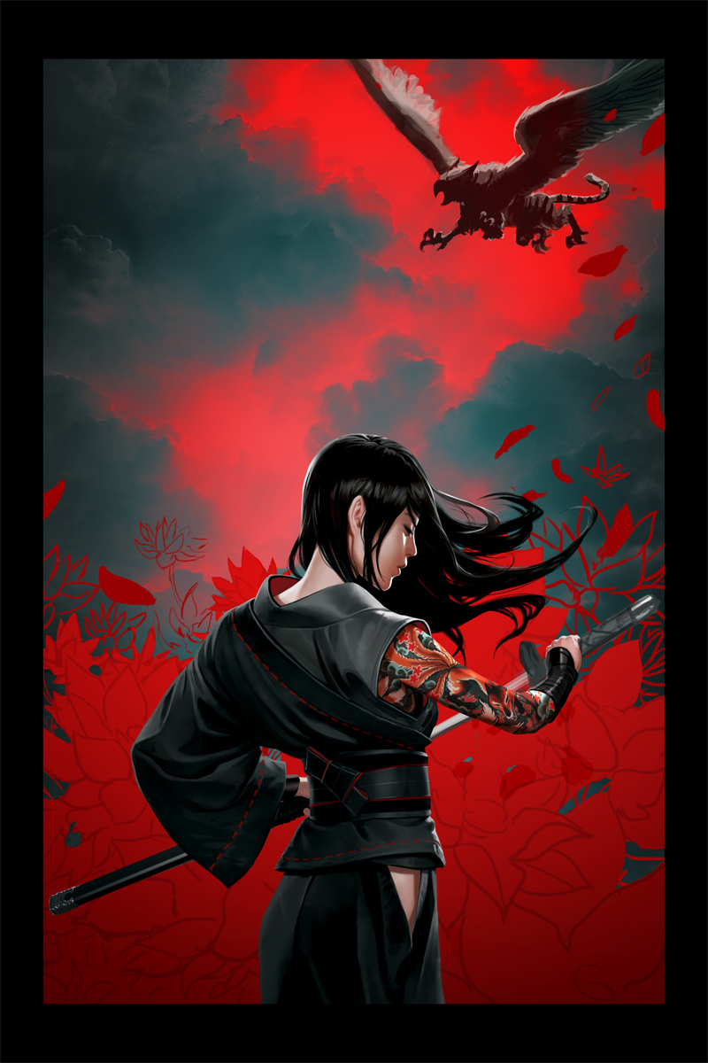
Kristoff: After the illustration was done, we focused on typography. Stormdancer’s setting is Japanese-inspired, but it’s also heavily influenced by steampunk, and I thought steampunk was the one element we hadn’t yet fully portrayed in the illustration. I sent in my ideas for font treatments and we went back and forth until we found something everyone was happy with.
Jason: I think came together very nicely.
Kristoff: …are you sure it wasn’t the—
Jason: YES!
Kristoff: …fine.
Jay Kristoff has managed to trick the world into thinking he’s an author. His debut novel, Stormdancer, billed as a dystopian Japanese-inspired steampunk fantasy, will be released Spring 2012 through Thomas Dunne/Tor UK.
Jason Chan is a full-time concept artist with Massive Black Inc., working for clients in the video game and entertainment industries. A number of the notable clients Jason has worked with through Massive Black include Sega, Sony Entertainment, Microsoft, BioWare, Electronic Arts, and many more.


