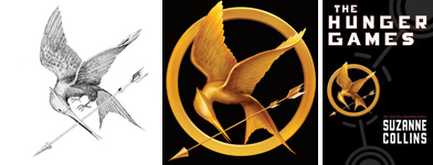
The awesome Charlie Jane Anders at Io9.com posted a rave review of The Hunger Games. It reminded me that the cover artist, Tim O’Brien, had an interesting post on packaging the book. He and his wife Elizabeth Parisi, the Scholastic art director, talk about the challenges of getting a cover completed when everyone in the company loves a book but no one is on the same page as to what it should look like. I’ve been there and it isn’t fun.
Tim: “This seems to be an important book for Scholastic and they and she spent quite a bit of effort trying to get it right. Great illustrators were hired to do covers for this book and the versions they came up with were inspired. Still, not everyone was on board yet…”
Elizabeth: “In the end, Tim’s bird was the perfect solution. Ironically, it was my first concept upon reading the manuscript. But I comped up an idea for it using a gold dove pendant as a placeholder, and everyone said it looked too religious.
Even if I had asked Tim to work up that bird at that early stage, I don’t think it would have been approved. It’s as if we had to go through every possible idea before everyone would be happy.”


