Welcome to Wednesday Comics Pull-List, here on Tor.com! Every week we post reviews of a select handful of this week’s comic releases. From those reviews, we let you know what we would pull for keeps.
This week’s batch includes:
- Batman #704
- Batman: The Return
- Batman Incorporated #1
- Deadpool MAX #2
- George R.R. Martin’s Doorways #1 (of 4)
- Hellboy: Double Feature of Evil
- Nightmaster: Monsters of Rock
- Osborn #1 (of 5)
- Phoenix Without Ashes #4 (of 4)
- Spider-Girl #1
- Superior #2 (of 6)
DC Comics has gone nutty with Batman titles this week so we’re taking the opportunity, as Bat-fans, to also go nutty. Is the Batman relaunch working? Are you excited about the character again? Is it being done well? We have our opinion, but let us know…
 Batman #704
Written by Tony Daniel
Art by Tony Daniel
(DC Comics)
Pull: You have to; it totally helps in making sense of the other two.
Annie says: There are so many Batmen now; I’m not really sure where to begin…
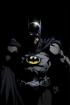
Tony Daniel does a great job of working this story in a way that compliments Grant Morrison. But before we can get to the Grant Morrison comics we have to talk about Batman #704 because it really sets up the premise to Batman Incorporated and Batman: The Return.
Bruce Wayne has just returned from being lost in time travel and has a lot of crazy ideas as to where to take the Batman Empire next. This story starts out with a major conflict between a man on the outskirts of Gotham and a man in Chinatown. We’re not told what the secret they share is or why either of them are willing to die to protect it, but it must be a good one since someone ends up beheaded before Batman ever gets there. There are a lot of twists and characters thrown into this issue. It’s basically the pretense to Bruce Wayne getting a good grip on everything that is happening in Gotham and making sure everything is lined up to set Batman Incorporated into motion. We’re introduced to Peacock, who might be a philanthropist that offered Wayne Enterprises over 10 million dollars for apartment building in an area referred to as “Crime Alley.” We’re not sure of her motives yet but Dick Grayson is going to do his best to find out.
There is a lot of awkward dialogue in this comic because of the power struggle between Dick and Bruce. Dick wants to do the right thing now that Bruce has returned and acknowledges him as THE Batman but Bruce is adamant in making Dick understand that he’s in control of all the things that happen in Gotham.
Here’s my issue, Tony Daniel shouldn’t be writing pre-issues for Grant Morrison. The crossing of an older series with brand new series is a little jarring. I’m excited to see where this story goes and how Peacock evolves and whether or not they ever get Selina to rope in Kitrina Falcone but there has to be some sort of divide. I’m not a dumb girl but I had to reread this comic in order to really get what was going on. It’s a fully packed issue, and definitely necessary if you’re going to move forward in the Batman Incorporated series but, it takes a bit to absorb.
 Batman: The Return
Written by Grant Morrison
Art by David Finch & Scott Williams
(DC Comics)
Pull: YES!
Annie says: It has to be said that Grant Morrison absolutely knows how to draw in an audience. The beginning of this comic is beautifully done. He likens the lifespan of an actual bat to the rough voyage that Bruce Wayne has been through and identifies them, almost, as one in the same. The imagery is seamless, the artwork is absolutely gorgeous and I found myself really feeling sorry for a combination of the actual bat and Batman. I totally got sucked into this comic very early on.
During his time away, Bruce Wayne saw what the future was meant to bring and it scared him. It scared him to the point where now he’s trying to totally reorganize the very idea of Batman. He gathers his entire team of trusted “crimefighting associates,” talks about his plans to revamp Waynetech and the changes that will be made internally. The panels cut to Wayne Enterprises where we get to see Bruce giving Lucius specific instructions as to what technology needs to be updated and what new weapons should be rolled out. It should be pointed out and that is that Bruce gives Lucius instructions to modify a thousand GI Robots. I don’t know what role they’re going to play in Batman Incorporated but I’m really hoping they’re not turned into an easily produced massive Batman Army. You hear me, Morrison? I’ve accepted your idea of a global team of Batmen but please, please, please don’t turn Batman into a Droid. I just couldn’t handle it.
We’re given a great look into how these changes are going to effect the internal workings of Batman’s team; there is definitely going to be some drama between Damian and Bruce, perhaps more than the casual father/son butting of heads—though, when your dad is Batman, shouldn’t you expect that? Lots of new characters are being introduced and best of all, Bruce is in the new suit with the yellow bat symbol. It’s really cool to have read about all the changes that were going to be made to these issues and then actually see them come to life. Morrison, Finch & Williams did a spectacular job of integrating a lot of information into a one-shot issue. Game on.
 Batman Incorporated #1
Written by Grant Morrison
Art by Yanick Paquette
(DC Comics)
Pull: I mean, you basically have to.
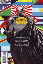
Annie says: I picked this up this morning and was immediately disappointed with the cover art. It’s like Batman is standing in front of the U.N. with all of the international flags. I get it, he’s global, can we please move on now?
This story takes place in China which, if you had been paying attention in Tony Daniel’s Batman #704, you’d see that it was alluded to that China was going to be the first country to get an international Batman. We’re introduced to a Mr. Unknown, who we later find out is the Chinese equivalent to Batman. He’s being held hostage by a man in a skeleton costume that enthusiastically refers to himself as MIGHTY LORD DEATH MAN. Lord Death Man is a sick dude. He’s melted off Mr. Unknown’s hands with nitro-hydrochloric acid and just as Unknown is coming to, Death Man announces that the last thing Unknown will see is Death’s face, and then throws more acid onto his face. At that precise moment, a young man (Jiro) opens up the doors where Mr. Unknown is being held and, somehow, manages to escape Lord Death Man & his henchmen. We’re not told who the young boy is but we know he’ll be back. All while this is happening, Batman and Catwoman are trying to steal a very expensive piece of weaponry (alluded to in Batman: The Return). It’s nice to see both Selina and Bruce working together again. Selina has to be one of my favorite characters because she’s absolutely outrageous in her presentation and speech. Grant Morrison does a great job of narrating her while managing to keep her tone consistent. Yanick Paquette has her drawn as the exact thing she is; a total sexpot.
After successfully removing the weaponry, Bruce explains that he’s headed to meet with Mr. Unknown to begin training him as the Chinese Batman. But what Bruce doesn’t know about Mr. Unknown is that homeboy hasn’t had a face for the last 24 hours, so when they get to the toy store that serves as Mr. Unknown’s lair, he’s in for a surprise. Not only does he discover Mr. Unknown (does anyone else see the irony in melting the face off a guy who’s known as Mr. Unknown?) but he’s greeted by the same henchman that tried to kill the young boy earlier on. All the while, Jiro is being lured into a trap set by Lord Death Man.
SO MUCH INFORMATION. This comic was obscene. It was obscene in every single sense of the word. It’s violent and graphic and absolutely delicious. I can’t believe I’m even saying this but if the stories continue to take the same shape that this one has, you can consider me a fan of Batman Incorporated. Because of the constant changes in location, the stories have less of a chance to go stale. I’m really excited about this prospect and hope Morrison continues the good work.
 Deadpool MAX #2
Written by David Lapham
Art by Kyle Baker
(Marvel Comics)
Pull: Yes! It’s an insane ride, and you’ll be glad you took it.
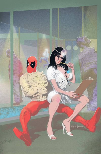
Matt says: Kyle Baker is of course no stranger to superhero comics—he got his start at Marvel, after all, and more recently was the artist on the fantastic Hawkman series for DC’s too-brief-lived Wednesday Comics series—but it’s also safe to say that he’s better known as a cartoonist. Now, before you get all Scott McCloud on me, let’s all admit that any distinction between “comic book artists” and “cartoonists” is making a de jure distinction where de facto there is none. But—Kyle Baker, drawing a Deadpool comic? If the idea strikes you as strange, you’re not alone. But I tell you this so that you will believe me when I also say: it’s a perfect fit. Baker takes up a style on Deadpool that is somewhere between Frank Miller and Tex Avery—one part capes-and-tights, one part Saturday morning cartoons, and one part fine art. The overall effect is something like a filthy Warner Brothers cartoon; it’s a fresh and interesting take on Deadpool that yet manages to stay true to the character.
Credit where it’s due, Baker hasn’t done this alone. David Lapham’s script really sets the “Saturday morning cartoons for grown-ups” tone, and it’s a hard call to say which half of the creative team is doing the better job. Lapham’s writing walks a razor-fine tightrope of entertaining hijinks between the vast pits of “campy” and “offensive,” somehow managing to pull humor from both camps without falling into either. For the first few pages, it’s a little disorienting—“It’s a MAX-line comic book,” you’ll say; “Shouldn’t I be taking this seriously?”—but the genius of Lapham’s tone here is that he can get away with things that in a more serious comic book would read as either tired clichés or moments when the suspension of disbelief cannot be sustained. Deadpool has long been a character ripe for this sort of out-of-the-box storytelling; a postmodern hero if ever there was one. For too long, MAX titles have been the terrain of solely grim-and-gritty storytelling. At their best—Ennis’s Punisher or Bendis’s Alias—they have been the site of some genuinely fresh, outside-the-box comics, and the new Deadpool series has that fresh feel about it. Time will have to tell whether it can stand with the likes of the aforementioned MAX titles; in the meantime, though, you should crack out your bowl of Fruit Loops and enjoy the ride.
 George R.R. Martin’s Doorways #1 (of 4)
Written by George R.R. Martin
Art by Stefano Martino
(IDW)
Pull: For fans of George R.R. Martin, yes. Otherwise, I’m on the fence about it.
Chris says: Today I learned that the ”R.R.“ in fantasy author George R.R. Martin’s name sometimes stands for ”railroad“ and now it’s hard to think of him any other way. ”Railroad“ Martin is, of course, also known for the heightened bloodiness, sex, and dark humor in his A Song of Ice and Fire series. That style translates over in full in Doorways.
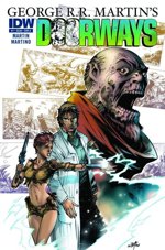
The story here is—as Martin explains in his essay in the back of the book—”He’s an emergency room doc. She’s a feral slave girl fleeing her alien masters. They travel to parallel worlds.”
The immediate trouble with Doorways is that the simple three-sentence pitch isn’t fully conveyed in the first issue of this series. Here’s how much of it you find out here: He’s an emergency room doc. She’s a feral slave girl fleeing her alien masters. They travel to parallel worlds. The girl’s alien masters do indeed show up, but you’re not sure what they are, exactly, and you get no inkling that parallel worlds are in play. She could be from the future, from a crazy sci-fi/fantasy realm, or equally from a parallel Earth.
That lack of basic detail does hinder the story, which is a shame because Martin does a great job of bringing the reader in on the ground floor of this odd phenomenon. The pacing of this book is lightning-fast but you don’t feel cheated out of the mundane details of Dr. Mason’s life. What is missing, however, is a wow moment that encapsulates the pitch above while showing us something amazing, something that we haven’t seen in other parallel-world stories on television or in written fiction. Doorways is good, but isn’t as strong as it could have been.
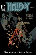 Hellboy: Double Feature of Evil
Written by Mike Mignola
Art by Richard Corben
(Dark Horse)
Pull: Yes, please!
Annie says: There are many reasons to love Hellboy and in this issue the most predominant reason is the fact that you can get a double feature issue for less than four dollars and it’s still worth every penny. It’s hard to be disappointed when you’re getting such value. Hands down, my favorite part of Hellboy stories is how Mignola’s story telling is partnered perfectly with Corben’s artwork. Together they share the duty of getting the story out together instead of competing for the attention of the reader. The lack of words, at times, from Mignola brings the artwork into focus and allows the story to be told that way.
I definitely dug the gimmicky nature of this issue. The first story reminds me a lot of a movie I saw once but can’t put my finger on. Basically this guy, only identified as Mr. Sullivan had been down on his luck. A drunk, he lost his family and friends until one day a “man” appeared with a wad of cash, some legal papers and the keys to a house that Sullivan was to “inherit.” But get this, the house he inherited is “making him kill” and that’s why he got in touch with Hellboy. His conscious wouldn’t let him sacrifice anymore homeless people or prostitutes so he brought Hellboy in to try and solve his problem. Does anyone see that train coming? The one coming a million miles an hour with the words, “IT’S A TRICK” written down the side? No? Okay… I’ll keep going then.
Every time Mr. Sullivan sacrifices someone to the house, it gives him three golden coins which allows Mr. Sullivan to satiate his need for alcohol. So much for kicking the habit, huh? Anyway, Hellboy comes in, gets lock in the room and Sullivan thinks he’s struck it rich. “Master, you paid me for all those others—shambling drunks, prostitutes… But what will you give me for him?” Well, the joke’s on you Sullivan, cause whomever is sending you those gold coins thinks he’s about annoying as I do and does away with him in the most symbolic way imaginable. His greed most certainly got the best of him.
In the second story, we’re taken to an Egyptian museum exhibit where the one guy you would totally expect to go crazy, has. He’s in complete Egyptian garb, shouting things at gods and trying to get this one specific God, Horus, to smite a woman who’s turned him down on several offers for a date. It’s always those women, stirring up trouble, not accepting dates from people who probably shouldn’t be working with other people in the first place. Horus, an alligator, comes alive and takes care of the little creep before Hellboy even has a chance. This story was shorter and definitely the perfect encore piece to the first feature.
It was definitely a campy issue but well worth it, sometimes there’s nothing wrong with a new spin on a couple of old stories.
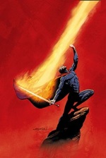 Nightmaster: Monsters of Rock
Written by Adam Beechen
Art by Kieron Dwyer
(DC Comics)
Pull: I’m feeling pretty (Lord) MEH about this… Don’t.
Annie says: Naïvely, I jumped at the opportunity to review this issue. It’s called Nightmaster: Monsters of Rock—I think it’s pretty clear as to why I was so excited to read it. At the checkout this morning, my cashier said the words, “This is the most METAL COVER EVER” and I left the comic book store feeling pretty good about my selection. Then I opened the comic and pretty much everything went downhill from there.
The basic premise of this one-shot is about a normal human turned superhero who has to deal with the duality of his identities and hasn’t quite figured out how to do that yet. Jim Rook is a former rock star. He used to be the frontman for a band called The Electrics and in the 70s he was the hottest thing going. Except then he took a break from the music industry to fight “otherdimensional menaces.” He eventually came back to Earth, finding a portal he could use to teleport back into another dimension so he could save his friends, who are part of the “Shadowpact” superhero team. While he’s searching for the portal, someone who can only be described as a classic take on a “hippie” recognizes him and yammers on and on about the good old days. And that’s the plot, ladies and gentlemen. This comic is basically 30 pages of watching Jim Rook awkwardly fight poorly named villains (LORD MEH?!?!) while this hippie just goes on and on. This situation has happened to all of us; you’re sitting there, focused on a task you’re supposed to complete before your boss gets back and the one person who has absolutely nothing better to do is hovering over you, yammering about absolutely nothing.
I will say that the writer, Adam Beechen, did a great job of annoying me. The entire time I’m trying to absorb who this character is, what he’s about, and all these little speech bubbles with this whack dude going on and on about whether or not song lines were written about Richard Nixon or ideas for songs that Jim Rook should write. I get it, Beechen; point made. This was supposed to be a playful issue, as a one-shot, and not supposed to tell a story that’s going to carry on anywhere but even trying to read this was too much. The illustrations want you to pay attention to whatever Rook is doing but the incessant speech bubbles totally take away from that. I kept hoping Rook would turn around and put the hippie out of my misery, but he didn’t. Superhero code of ethics or something like that.
This comic was fine, I’m sure I’m being a little too harsh but the truth of the matter is, I don’t particularly like to have my time wasted and that’s what this issue felt like.
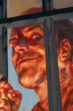 Osborn #1 (of 5)
Written by Kelly Sue DeConnick & Warren Ellis
Art by Emma Rios & Jamie McKelvie
(Marvel Comics)
Pull: Oh hell yes.
Chris says: Did any of you read Siege? No? That’s fine. You don’t have to have done so to get the full impact of Marvel’s Osborn limited series, the first issue of which hit today. So don’t worry about that when you pick this up because you are going to pick this up. The power of good storytelling compels you!
Norman Osborn, super crazy goblin man and recent overlord of the Marvel Universe, is now rotting in prison after finally pushing his insanity too far. We pick up with Marvel’s alternative paper “Front Line” trying to nail down a feature about him and end up cycling through closed door government meetings, a black prison full of villainous freaks, and the hints of a Cult of Osborn ready to spring the man himself.
Writer Kelly Sue DeConnick works these elements masterfully, infusing each with its own personality and context. The closed door government meeting regarding Osborn is not depicted as a shadowy room filled with generals but rather as a flourescent-lit and weary bureaucracy of assorted senators, clerks, and figureheads who know they’re just going through the motions. The Osborn cultist integrates his personality with his cult work so well that even after he stands revealed, you don’t consider anything he’s done prior to that to be false. Norah, the Front Line writer, is hyper-kinetic and selfish, but you never get the impression that she doesn’t know what she’s doing. My favorite line in the whole book comes from her storming into a budget meeting:
There’s nothing to budget. Ad revenue is zilch, print journalism is dying and taking ethics with it. We’re all doomed. And fired. Meeting adjourned!
Osborn himself interacts with the cast for only a couple pages, but even in that brief span of time you know that he hasn’t been cowed in the slightest. Putting him away has diminished none of his danger.
I can’t overstate enough how well-crafted this book is. Even though the reader is informed of the big reveal at the end, it’s still chilling to watch everyone else learn of it. The only criticism I have is regarding Emma Rios’s art, as the first couple pages are warbly and off-putting. However, after that the style melds perfectly with the story and reaches a fantastic peak when we visit the prison full of freaky villains.
This book also contains a back-up story from Warren Ellis regarding one of the villains featured in the main story, a genetic researcher by the name of June Covington who experimented on thousands of low-income and homeless people. It’s a nice touch, but if you’ve read any of Ellis’s work then you’ve read this kind of story before, and this one is particularly one-note. So…nice, but not entirely necessary.
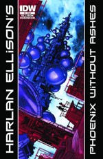 Phoenix Without Ashes #4 (of 4)
Story by Harlan Ellison
Art by Alan Robinson
(IDW)
Pull: If you like dystopian sci-fi, then do it! This is everything that Shyamalan’s The Village should have been.
Matt says: Harlan Ellison seems to be one of those guys you either love or you hate—though personally, I’ve never really much understood why this debate has to get in the way of the stories. And maybe when people say, “I hate Harlan Ellison,” they mean the stories and not just the man who writes ‘em; but if that’s the case, then I really don’t understand. Because if Harlan Ellison as a man is sometimes tough to take (don’t know, haven’t met him), it has always seemed obvious to me that the stories told by Harlan Ellison are fantastic. And I mean that in every sense of the word: Ellison tells tales that stretch the imagination, and he does so with a consistently high standard of quality.
I’ll admit that I have the occasional moment of worry or pause—the first issue of Phoenix Without Ashes was chock-full of bad Early Modern English, and the first three panels (I thought) rather obviously telegraphed the secret that we weren’t supposed to discover until issue #2. But like every momentary, fleeting doubt I’ve had about Ellison over the years, these turned out to be intentionally-chosen devices that ultimately made the story stronger. By issue #4, it has now become apparent that we’re dealing with a fresh take on some rather standard science fiction tropes; it’s been entertaining to read, and Ellison has me coming back each month for more. Meanwhile, Alan Robinson’s art on the series has been fantastic so far. It’s clean but interesting, the storytelling has been sharp, and the style itself—modern, but with obvious inspiration from old woodblock prints and engravings—is perfect for the “Puritans In Space” story being told.
What I’m still waiting to see on this series—and again, I’ve learned to trust Ellison—is how some of the basic themes in place are going to be made fresh. The old-school-religious-community-as-dystopian-future-colony thing has been done a million times. The debate between love and genetics is well-trodden ground. The space-colony-headed-for-disaster plot (complete with Cassandra-like prophet warning of doom) can only be retold so many ways. And while so far the writing has managed to stay fresh, the characters compelling, and the story elements tightly knit, Ellison hasn’t quite done anything with the central themes that hasn’t been done before. I’d like to take the central message of Ellison’s story to heart, here, and not just have to keep blindly putting my faith in The Creator!
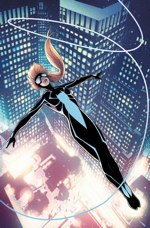 Spider-Girl #1
Written by Paul Tobin
Art by Clayton Henry & Dean Haspiel
(Marvel Comics)
Pull: This is a great first comic if you want to introduce someone to the medium, but skip it if you’re a longtime comics reader. – Chris
Yes. And if you don’t like it, then give it to a young, non-comics reader that you know. They may end up thanking you for it down the line! – Matt
Chris says: I was intrigued by the new Spider-Girl comic after Jezebel posted a first-look last week, citing that the comic treats its female teenage main character with the same respect that Marvel does to Spider-Man himself. That is, that the book doesn’t focus on (or get on a soapbox about) the character’s race or gender but also doesn’t forget who its main character is in relation to these classifications.
Writer Paul Tobin pulls this off really well, delivering a straightforward story that shines on its own merits. Jezebel’s assertion that Spider-Girl isn’t needlessly sexed up also rings true thanks to Clayton Henry’s clean and realistic pencils. Henry packs some power into Spider-Girl’s fights while maintaining realistic proportions throughout. He also remembers that his main character is a kid, thankfully, so cheesecake is nonexistent.
That said, the straightforward story has a hard time matching up against its shelfmates in Marvel’s Spider franchise. Spider-Girl’s world is a small one and although her dialogue is nerdy and generally great, there’s not a lot of drama to spur the story onward. This is a great comic to point someone towards if you’re trying to introduce them to comics, but for those who are already neck-deep in the medium, I would skip it and see how it develops after a few months.
Matt says: I’ve always been cautious about “-girl” superheroes. As if some misguided sense of gender equity kept leading comics creators to say, “Okay, you want more female superheroes? Well here are female versions of our best[-selling] male superheroes.” And the difference between “woman” and “girl” means that we tend to get, not one female knockoff, but two. And so we have Superwoman and Supergirl; Batwoman and Batgirl; Spider-Woman and Spider-Girl. And in each case, the more condescending “girl” version seems to be the more popular. (Where is “Power Woman,” by the way? A panel full of cleavage, and she’s still got to be Power Girl?) In other words, the “[Insert popular male superhero here]-Girl” heroes always smacked of tokenism and false feminism; a fig leaf to cover the elephant in the room that is misogyny in mainstream comics. (Yeah, how’s that for mixing my metaphors?)
It is for this reason that I’m impressed by Spider-Girl #1. Here we have a superhero comic that does something rare: it passes the Bechdel Test. Does this make it an instantly pro-feminist book? Not at all—you’ll notice, simply for starters, that there still isn’t a single woman credited in the creation of this book—but this is the rare superhero book that isn’t obviously written for “boys, and girls who like comics for boys.” Anya Corazon doesn’t feel like a token girl, or a token ethnic character, or a cheap Spider-Man knockoff; she’s an interesting (if thusfar two-dimensional and underdeveloped) hero. Furthermore, this is a very “21st-century” comic; like most of her peers, Anya can’t stop texting and Twittering long enough to star in her own comic. In short, Spider-Girl reads like a book about—and for—real people, and not like a halfhearted political gesture.
I tell you all of this because ultimately Spider-Girl #1 fails to live up to the promise it makes on the cover: this is not “the most synapse-shattering super hero debut of the decade.” My synapses were rarely stressed reading this comic, let alone shattered (or even cracked). Clayton Henry’s storytelling ability is strong, and his art is simple but thoroughly enjoyable—but he’s certainly put to shame by Barry Kitson’s cover image, which may at least make your synapses “tingle” a little bit. We can say the same of Paul Tobin’s script; a strong debut issue, Tobin manages to reclaim the long-lost Marvel art of making superheroes real people with real problems. But will this issue have you on the edge of your seat? No. The dialogue is real without being sharp, and the pacing is solid without being tight.
To return to my earlier point, Spider-Girl #1 is really impressive because it’s a comic book that non-comics fans (and especially in that much-needed pre-teen demographic) can easily pick up and enjoy. It is a perfect jump-on point for young readers of any gender, and it’s an easy, enjoyable read. This is not the sort of comic book that is going to single-handedly change the face of comics. But if it can start to change the faces of comics heroes and readers, then that will be a start.
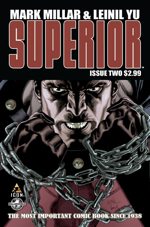 Superior #2 (of 6)
Written by Mark Millar
Art by Leinil Francis Yu
(Marvel Comics)
Pull: If you’re a died-in-the-wool Millar and Yu fan, like I am, then you’ll do it no matter what I say! Those of you on the fence, though, might sit this one out, and see if the story’s picked up at all by the time the first trade hits shelves. Still, if you’re looking for a superhero book that’s kid-friendly, Superior might just be your pick!
Matt says: Superior continues to be the dullest (albeit sweetest) book of the Millarworld set. Issue #2 finds Simon Pooni (now transformed into Shazam-like hero Superior) testing out his powers, while the narrator freely cops to the similarities between this story and Big. It continues to be an enjoyable, relaxing read—well scripted and well paced, despite the fact that basically nothing happens. Millar has pulled out all the stops, even eschewing most of his trademark off-color humor for “aw shucks” moments of an MS-infected kid enjoying the chance to fly like Superman. By the end of the issue, it’s all starting to feel a little too saccharine sweet, and a little too recycled. How many times have we seen the new hero testing out his powers (accidental forest fires included)? How much teen-coming-of-age-buddy-comedy can we take? Fortunately, Millar ends the issue by dropping the International Space Station on our hero’s head—so we might still hold out hope that, yes, this is all eventually going somewhere.
Meanwhile, Leinil Francis Yu got a slow start last issue, turning in art that was mediocre by his own standards (even if better than most of his peers)—but in issue #2 he’s back up to classic form. It helps make the book feel fresh and interesting, even as we’re watching yet another newly-minted hero test his strength by pulling on train cars. Gerry Alanguilan’s inks and Sunny Gho’s colors really add to the mix, here—for my money, Superior #2 sets a new standard for the way Millarworld books should look, even if it seems to be trailing the rest in terms of content.
All complaining about plot simplicity aside, however, Superior has the chance to do something really interesting, and that is to explore the “reconstructionist” side of post-Watchmen superheroes. Millar is one of the handful of writers who really understand the implications of the 1980s “deconstruction” of superheroes, and the rest of his books (from Wanted, to Kick-Ass, to Nemesis) have done a great job of exploring the question of what it means to be a post-1985 superhero. But writers have tended to fall on one side or the other—while writers like Millar, Ennis, and Bendis have chosen to pick up the torch from Watchmen and The Dark Knight Returns, others like Darwin Cooke, Mark Waid, and Alex Ross have been equally determined to try to “put the genie back in the bottle,” and write superheroes as if it were still the Golden Age. It’s rare to see a book like Superior, then, in which we have to all appearances a Golden Age take on a superhero, written by a writer who obviously really understands what the 80s deconstruction of superheroes was all about. It’s for this reason above all that I’m interested to stick around and see where this goes. In the meantime, I’m just glad that Yu is making everything look so good—because I’m not sure how many more breathless bits of awkward, teenaged wonder I could take otherwise.
When Matt Lampert isn’t writing about comics, he’s a philosophy professor in New York City.
Chris Greenland is glad he didn’t have to read Nightmaster but wow is that cover some kinda epic.
Annie Gala is at critical Batmass.


