

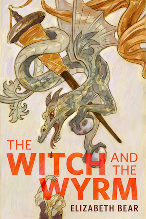


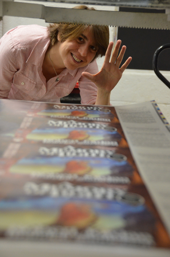
Last week I visited Coral Graphics to do a press-check for the A Memory of Light jacket sales-proof. A sales-proof is not the final jacket but it’s pretty darn close. On bigger books, like AMoL, we will go through the entire printing process to create an early version of the jacket for two reasons: 1) To give our sales force a shiny cover to show off to the various bookstores we’d like to carry stacks and stacks of the book, and 2) So that we can get a good look at how all the pieces fit togther before we print a small forest’s worth paper. To that end, these are printed with all the same processes and materials that the final will be created with.
Some of the things that may change between now and the final jackets (to be printed this winter) are the spine size, the foil color, the copy on the inside flaps, and any number of other little adjustments. We’ll make a few hundred proofs now and when the time comes to print the final jackets for the book, it’ll take three shifts working around the clock for five or six days to print all the jackets needed.
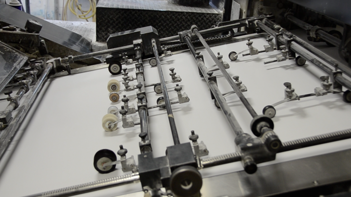
Photos of the process are below. Click any image to see a larger version.
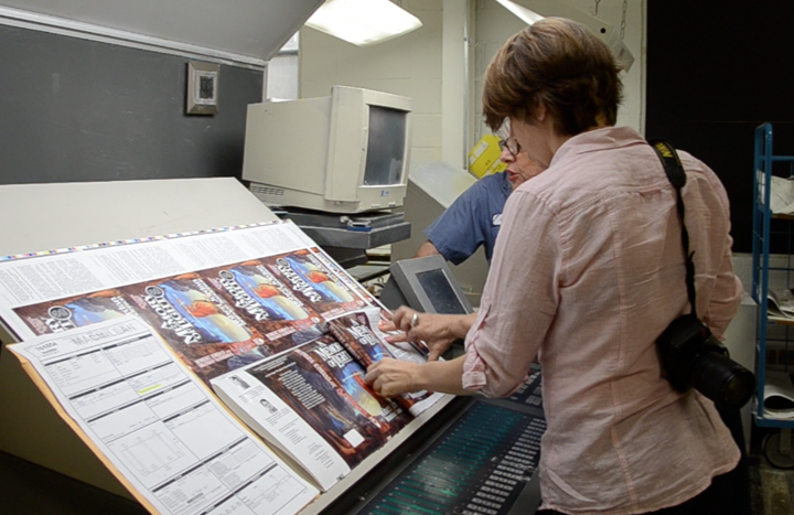
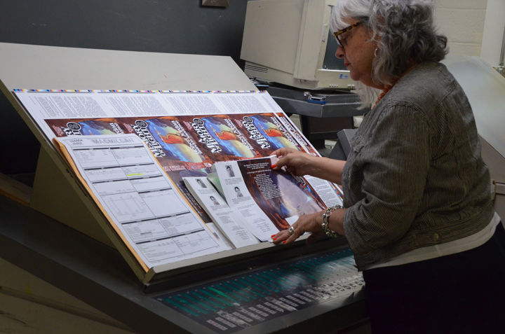
Here we are looking at the first few proofs under color balanced lights, seeing if there are any adjusments to make.
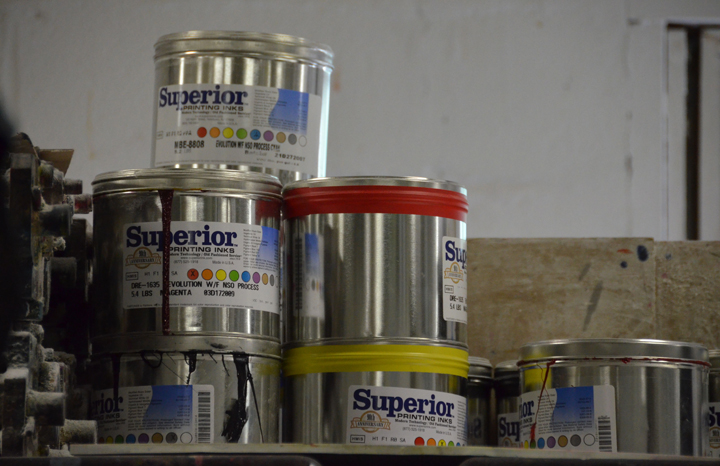
The ink room.
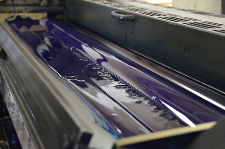
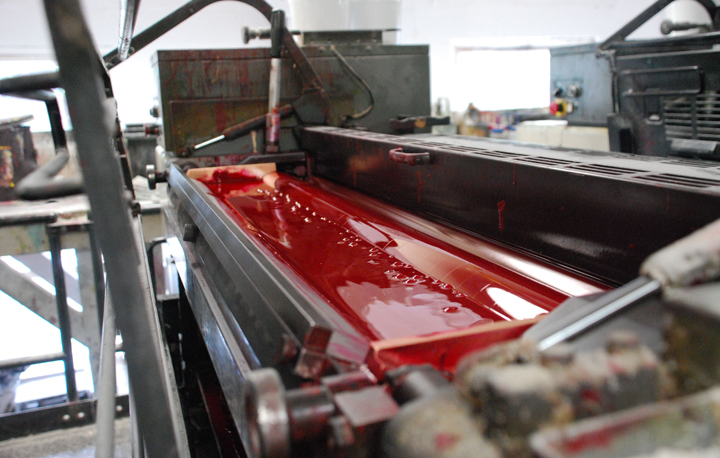
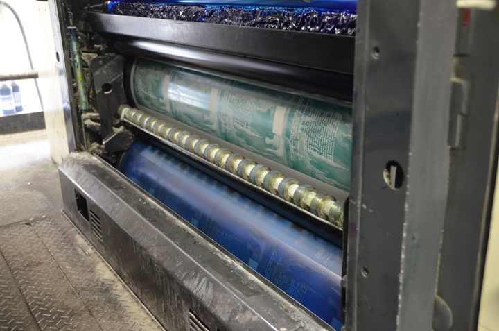
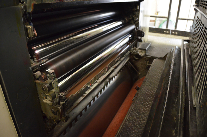
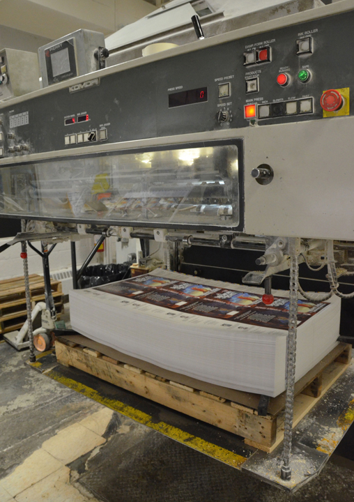
Ink in the press.
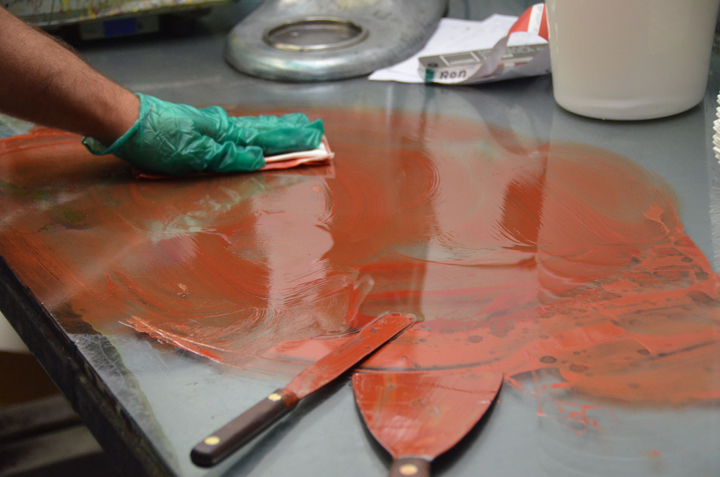
Ink on the plates.
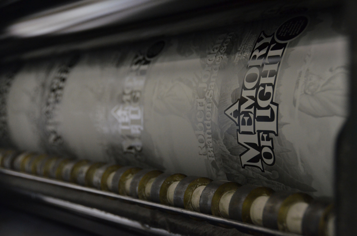
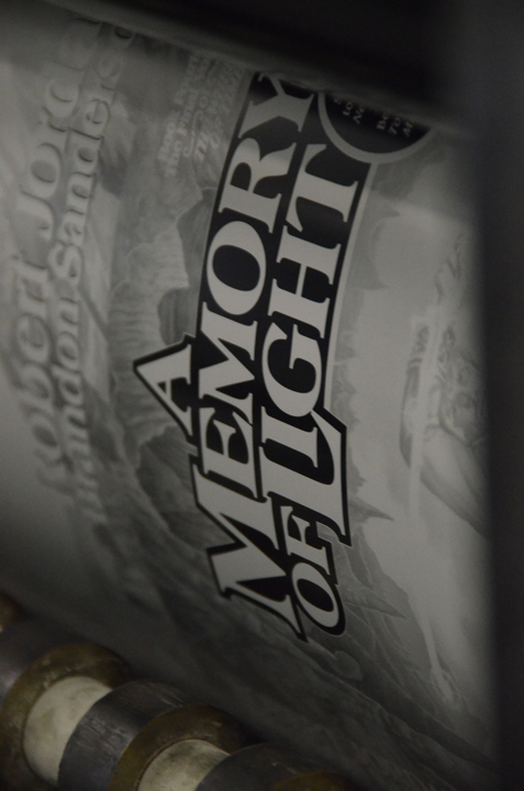
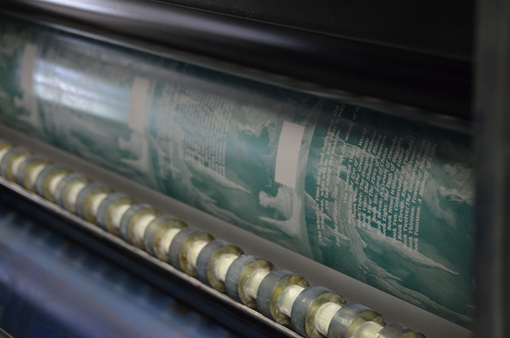
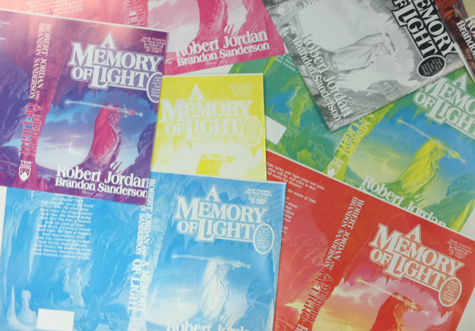
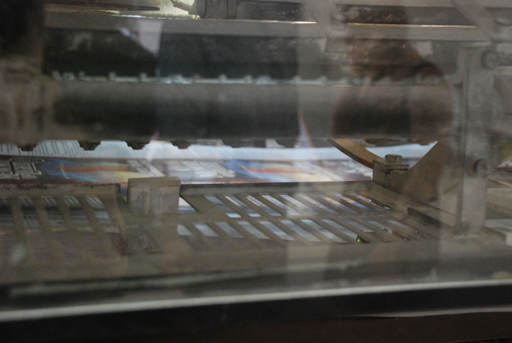
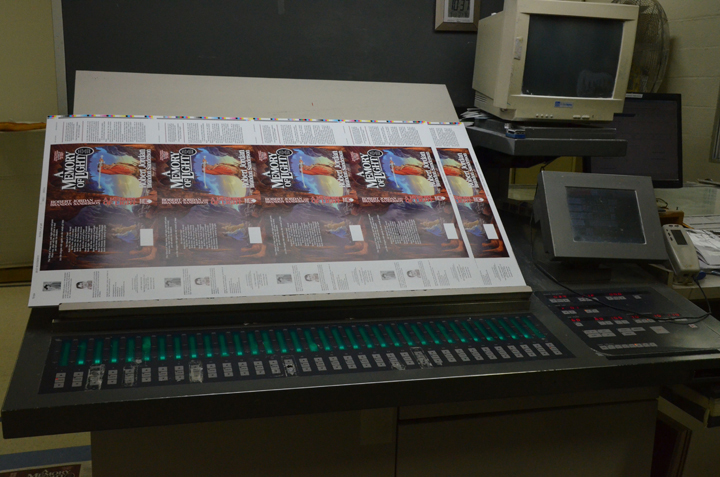
“The Progs”—checking how each color plate is working individually and progressively.
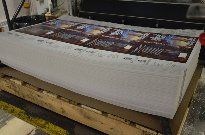
Stacks of clean white paper.
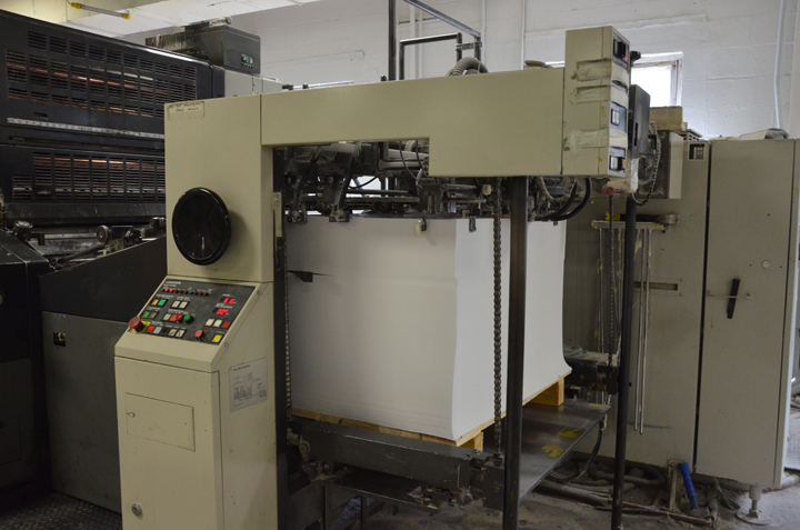
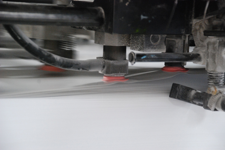
Paper on the move.
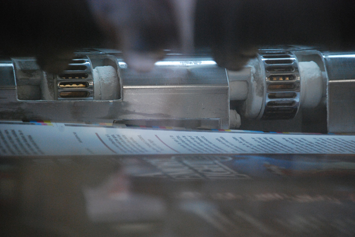
Stacks of paper, a little less white than it was a few seconds ago.
From here, the proofs will be laminated, trimmed, and then sent off to get foil stamped and embossed.
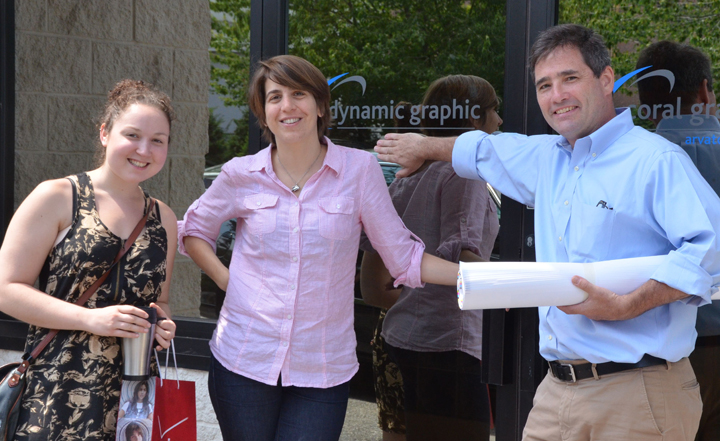
Tor Books folks, Emily Yolleck, me, and Jim Kapp, outside the printing plant. Thank-you to Claire, Raffy, Richard, Glenn, and Stephen at Coral Graphics for letting us poke around with our cameras—we’ll see you again this winter when we print the final jackets!
Irene Gallo is the Art Director for Tor Books.
really really really cool, thanks for sharing! i love getting “behind the scenes” looks like this!
Thanks for this. I think we SF nerds tend to forget that even very old technologies like printing are complicated and “technical,” and this really illustrates (pardon the pun) the process beautifully.
The back of this book is actually going to contain the titles of EVERY BOOK IN THE SERIES for the first time. Small little ditals like that get me giddy. I’ve been fantasizing about them for over 12 years. God I can’t wait.
Thanks for the peek at your press check! As a designer and a #WOT freak, I’m loving this. Reminds me of the old days when I did ePro at an agency… using a loupe looking for “hoodoos and voodoos” (spots and glitches in the proofs up close) and learning color correction. Nowadays, I just draw pictures all day. ;)
I am so excited!! Just looking at the pictures is making me giddy for the book!!
Oh I saw that the spine is going to be vertically written again. So NS, EotW, KoD, TGS, ToM, and AMoL are all vertical, and the rest of the series TGH, TDR, TSR, TFoH, LoC, ACoS, TPoD, WH, and CoT are all horizontially written. Hahahaha. Oh well.
It’s torture, I tell ya, torture!
Oh, I want one of the black and white “rejects”!!!!
@@@@@ 6, yeah, it does mess with the flow of the whole series on a shelf together. I wish they would all go one way.
Man, I would LOVE it if I could get one of the black and whites. Those would look really freaking cool on my bookshelf.
This takes me back to my old book design days. *sigh*
I always loved Press Day! Very exciting! Thanks, Tor!
Very cool. Thanks for sharing, Irene!
I love this behind the scenes look. Thank you for sharing with all of us fans!
Oh man, this book is becoming more and more real. Thanks, Irene!
I wouldn’t mind having one of the monochromatic covers. They look pretty sweet.
I fourth comments 8, 9, and 14.
*coughgiveawaycough*
Very cool post! The stack of covers on the pallet briefly made me chuckle because it looked like AMoL would have about 20,000 pages. I know, I know, it’s dustjackets all the way down.
It would be so cool to get one for my hs school library!
Wow thanks for sharing…once again I am struck by what a great cover to finish the series. Fun to see it being printed. After so many years of reading, It is hard to believe that this series is going to have an ending. Seeing the final cover printed is sad and awesome at the same time. Cant wait for release date.
Hmmm….We are going to be running a sweepstakes this week — with the large untrimmed proofs. I hadn’t thought about giving away the progs — we might need to hold onto them until the final run but, if I can grab them I will.
This progs are amazing, very trippy colours! I love these behind the scenes looks at the publishing process, it’s really interesting to see how the book is made, from words on a computer screen to a solid thing in itself.
lmelior@15 Heh, good one :)
As an Artworker I am used to seeing this behind the scenes bit. But have to admit it still gives me a thrill to see blank paper go in one end of the machine and the printed come out the other. So cool, I can almost smell the ink.
Along the lines of vertical vs. horizontal on the spines throughout the series, do you know why the switch was made to vertical for the last 4 books, Irene? Like Kadere mentioned that has always puzzled me.
So cool. Love this glimpse into the printing process!! Also, the fact that it’s yet another step closer to the ending of the Wheel of Time. Or should I say, an ending..
Thanks so much for this, Irene!!
Thnx Irene.. Best job ever I presume ;)
This just became my new wallpaper :D
@21 My guess would be that with both authors names they couldn’t fit everything in horizontally, so that would explain the last two. I notice KOD’s font is a lot bigger than 1-10. Not sure if that was intentional, though.
This is so cool! Thanks for sharing this.
Thanks for sharing!
That was really awesome! I worked for three years at a copy shop, but I have never seen anything like that before. I’m sharing this. : p
Nice post.
Back in the day I was an Apprentice Stripper (in a strippers union, no less) at a shop that ran two massive 6-color presses. There’s nothing like standing next to a machine that is 30 long, 8 feet wide, and 12 feet tall, while it is magically transforming blank paper into finished art. The sound alone is difficult to describe. Its a bit like standing next to a steam locomotive, one of those shay ones, with rods and gears whirring and going every which-way.
For those that like the look of the progs you can get the same effect using photoshop and any 4-color (CMYK) art piece. Just open up the “channels” pallette (or window) and make sure the little eyeballs to the left of the channel names are all off, except for the color you want to see. Make sure you check the box labeled “Show Channels in Color” under prefferences.
Thanks Irene for sparking some old memories.
So, that is pretty cool; but, show me how they are going to do the leather bound edtion of the whole series, I would like to see if it would fit in my bookshelf, or I would have to enlarge it. ;)
Brought a tear to my eye to see it this close to reality. I can’t wait for AMOL. Like Brandon has said, these characters are like my family, and I cherish my realtionship with them. Thanks TOR.
Irene – This was really interesting Thanks for the “behind the scenes” look!
I’ll take a proof, preferrably with a binding underneath and the 800+ pages of AMoL attached! :)
Anyone else have the “How it’s Made” theme song running through their head while the read this, cause I totally did.
Thank you for sharing this exciting behind the scenes experience!
I am very excited and filled with trepidation as my connection to a masterful author and his masterfully written story comes to an end. I mourn the talent lost, and for what could have been, and the closing of a story which to me had the potential to be as endless as the wheel of time itself.
I also celebrate his life and the gifts Robert Jordan has bestowed upon his readers, and I am grateful to Brandon Sanderson for carrying the story forward so capably, and to Harriet for ushering and harboring the transition through completion, such that we can all conclude this epic journey together that Robert Jordan started us on so long ago.
Thank you Brandon, and I very much look foward to traversing your works once this journey has come to an end.
This brought back memories of working around those awesome machines. So excited to see that things are progressing nicely. I too think the idea of a givaway on the progs would be really cool.
Thanks Irene, and everyone else at Team Tor!
Progs for the faithful – yes.
Looking great Irene-
Just wondering if you know if they will be proofing/printing/selling (beggin here) a giant sized copy. Maybe a wall-sized finish that i can buy and place in my room? because that would be totally awesome…