


The Tor.com rocket logo, drawn by Greg Manchess, is affectionately called “Stubby” around the office. When we talked about dedicating October to Steampunk, one of the first things we all wanted was a Steam Stubbs, of course.
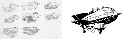
Here is the evolution (perhaps the devolution) of Stubby to the H.M.S. Stubbington.
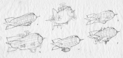
Greg: At this stage of concepting, I find it best to just draw whatever comes to mind, and let the process dictate the direction. It’s better to have more “off” iterations than completely “correct” ones because something might come up from unexpected attempts. Elements can then be combined later, in refinement. Here, I was searching for the right engines…
Irene: All of these first iterations were fun. It was very difficult to have to exclude options that looked great but didn’t quite have the steampunk flavor we needed.
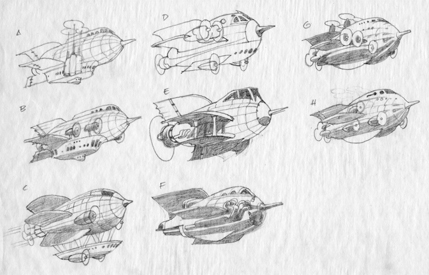
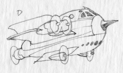
Red Baron Stubbs
Irene: This has a ton of character and I loved the idea of a bi-wing spaceship. But it referenced something too specific.
Greg: This one made me laugh as I pictured some enterprising guy in his backyard trying to make a stick and canvas copy. I knew it wouldn’t fly, so to speak, but it allowed that pusher prop to stay in the final sketch.
DieselPunk Fighter
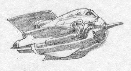
Greg: I’ve designed funky airplanes for decades, and putting pipes on them just seems outrageous. I was thinking of how other countries “hot rod” fighter planes that they purchase from the US. Seems crazy, but it’s real.
Irene: This was slightly too modern for what we wanted. It also looks like a fighter rocket and I’d much rather have our Stubbs be about exploration. Still, I like to think that this is part of our fleet somewhere in the tor.com phantom federation.
Basket Stubbs
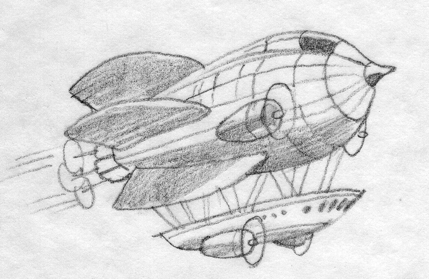
Irene: Many people in the office liked this one since the airship basket is such a strong signifier for steampunk. It also had the advantage of looking a lot like StubbyClassic. But the fact that the hanging basket seemed grafted on to the rocket, which in itself still looked like a fully contained ship, bothered me.
WWII Bomber Stubbs
Irene: I’d love to see a squadron of these piloted by Jimmy Stewart, but it looks more like WWII bombers than steampunk.
The chosen one…ish
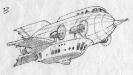
Irene: After sadly saying goodbye to the others, we honed it down to this one.
Greg: This one came from my vague memory of the ship in “Master of the World” starring Vincent Price. (But that one had tons of propellers.) I liked the substantial gondola…more like the Graf Zeppelin.
Which got fined tuned to:
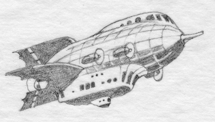
Irene: This was shaping up nicely but I feared that the main cabin was a bit too far removed from our original rocket. We needed to bring the stubbness back into it.
Greg: Irene said we still needed to keep the Stubby profile, as if it was on its way up in engineering toward StubbyClassic. I cut some engines, and made the profile much closer to the logo rocket.
Irene: This was almost approved for final but something was nagging me. It almost seemed too subtle and even too plausible. Those that know anything about engineering can stop laughing—visually speaking, it was missing a bit of fantasy and Steampunky whimsy.
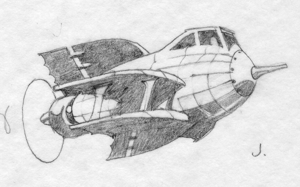
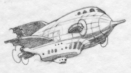
Irene: At this point Greg and I went back to looking at various real airships, reminding ourselves of their scale and about getting back to the “lighter than air” aspect of dirigibles. He made this set after that conversation. This time, we immediately knew it would be the last one. It struck a nice balance between our actual logo, dirigibles, and the fussiness that steampunk loves to imbibe in.
Greg: I looked at more and more constructions, photos. I drew looser and faster, trying to find the shape. I finally, out of frustration, put crap and lines hanging all over it, and stuck the prop in the back. Bingo. ‘Zactly what happened when I designed the first Stubby—that was the last thumbnail, too.
Finalizing the sketch
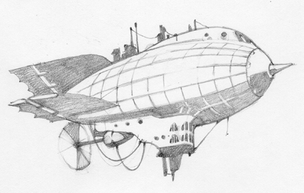
Greg: With an ecstatic “that’s it!” from Irene, I enlarged and refined the thumbnail sketch and drew this one. But it had too many waffle lines indicating the gas bag.
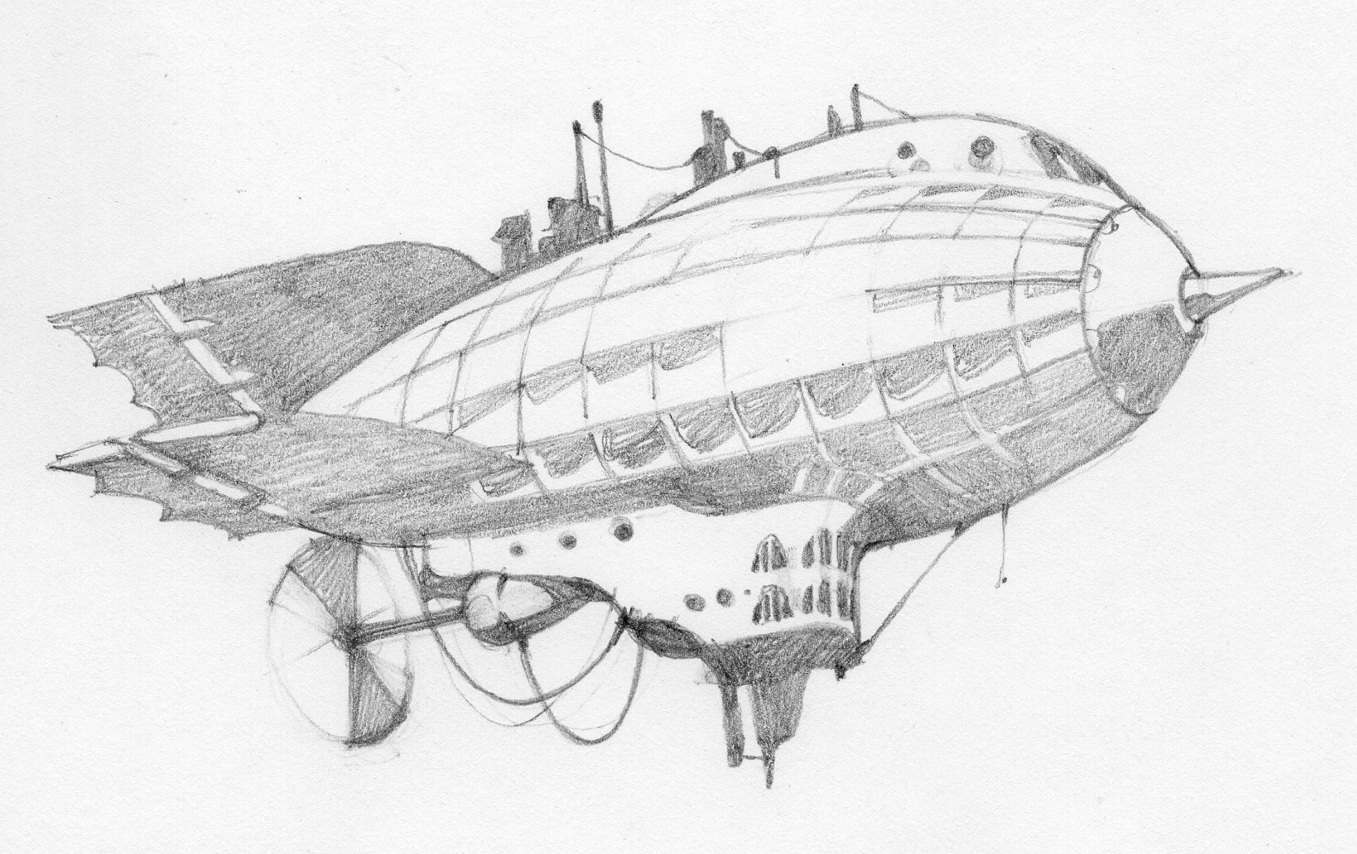
Greg: I decided that as a small logo it needed better darks, so I developed the shading along the bottom lines and up into the middle of the ship. Now I had to decide on how many rib lines.
Irene: At this point I remember comparing it to our usual logo and seeing how the shadow areas could help reference one another. We also talked about the line that separates the gas bag from the cockpit. In ClassicStubby the line comes from the nose. It made this airship version look a little smaller, but it also brought it back to our rocket.
Greg: I wanted it to have a feeling of reflection along the top to middle rib lines, so after simplifying those, I got to this final sketch.
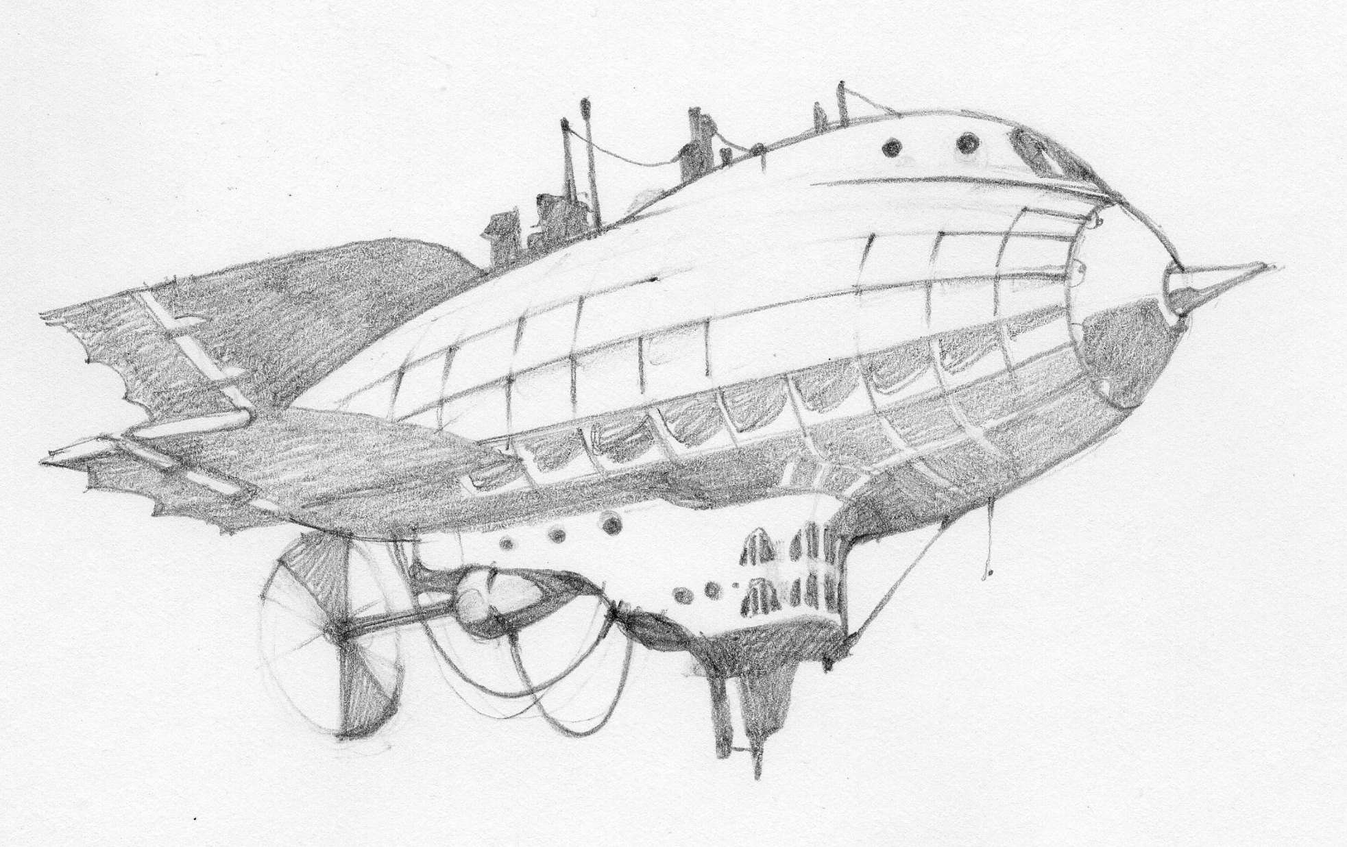
The final drawing
Greg: I did this final version in pencil on a sheet of Denril. Then it was Jamie’s turn to vectorize!
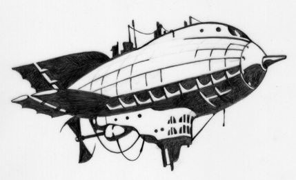
Irene: At this point our designer Jamie Stafford-Hill scanned and vectorized it. With that we were able to look at it in the various sizes needed and make a slew of refinements to get it read at the scale we needed it to. And viola, the H.M.S Stubbington, “SteamStubbs” for short.
Irene Gallo is the art director for Tor, Forge, and Starscape Books, and Tor.com.
Words really cannot even begin to explain the awesomeness of this post. I’m 99% sure that this made my day, thank you for posting this and thank you Greg for drawing it! The finalized version is amazing. It’s making me very, very sad that these kinds of things don’t exist yet. I’m going to write a letter to Obama demanding a new department of the government whose sole purpose should be the production and creation of steampunk airships. We could totally swing the “green” angle on them and convince him how many new jobs it’ll bring for Americans. Who’s with me? ;)
That was fascinating. I think I even prefer it to the original logo, since I always had a soft spot for steampunk, and airships in general. When’s the model kit coming out?
I love everything about this post, and I’d already SEEN the sketches! Not that big, though, or with notes from the artist. Thanks for sharing!
Also, I am ashamed I didn’t get the Red Baron reference.
Wonderful! Thank you for this post!
This post may well be the single coolest thing I have ever read on Tor.com.
Thanks guys. I’ve been meaning to do one on ClassicStubbs since we launched. Maybe now I’ll get to it.
It’s very apropo: Google’s recent 10 to 100 philanthropy kick actually has a nomination on airships!
What I’m planning for NaNoWriMo is more dieselpunk than steampunk, but there will be airships. And possibly a return of the Nazi ninja clowns.
Luftschiff voraus!
Wow! I love the airship and thanks for the insights into the design process, very cool
Speaking of steampunk airships, may I draw your attention to William Waldrop’s version of Robur’s Albatross?http://pics.livejournal.com/serge_lj/pic/00082754/g24
(If I had excess money…)
When I saw the new Stubby, I freaked a little. I can’t say why just yet. But, I do LOVE it! I enjoy the classic Stubby logo, too.
As an artist, one of my favorite things are sketches. Quick and loose sketches are my favorite because they don’t allow much time for over-thinking. They’re also usually more beautiful (I think) than the finished product. It just has so much more character.
This great, I think Manchess should do a whole book of steampunk variations… I hope that’s fuel for thought! I love how each airship has it’s own individual character- I can almost picture what some of the ships crews are like for some of them!
Wow, these are really amazing. Thanks for the really cool post. Maybe you could put some higher res ones up as another giveaway :) I know as soon as I saw the new logo the other day it immediately became the new wallpaper for my netbook.
So, practically speaking, this is the Never Landed model?
The ships remind me of the rocketships from the original Flash Gordon serial. Nice work.
Nice information.Thanks for sharing.(http://www.herveleger-french.com). Your website is amazing,Ilove it.