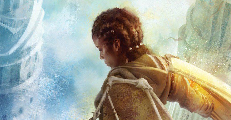
As I gleefully watched my Bone Universe come to life through Tommy Arnold’s stunning art over the past three years, I’ve noticed both small details and bigger themes—from wing architecture to landscape to color choices.
With the series’ conclusion this fall (September 26th—and, hey! you can preorder your copy of Horizon now!), one of the things I wanted most to do was to talk with Tommy and Tor’s Creative Director, Irene Gallo, about their processes and how they went about making this series resonate visually.
Luckily, they were happy to oblige.
Tommy, your work for the Bone Universe series—from Updraft and Cloudbound through Horizon—is so distinctive and evocative. When you started the project, what initially caught your eye?
Tommy Arnold: What starts any good project is an email from Irene. Working with her is always a blast and as you’ll see from many of my answers, her hand in the work in unmistakable and hugely influential to how the images turn out. She gives me a set of parameters and says “go,” and after than my work begins. From there we bounce things back and forth until everyone is happy. Here, initially, she really wanted a different take on the world: something more organic and alive, something that moved.
So Irene, when you started the project what was it about Tommy’s work that drew your imagination?
Irene Gallo: First of all, he’s great with figure work and that’s so important for many of our jobs, this one included. We knew we wanted to focus on the central character. After that, his use of light and lost edges gives an ethereal look to his pieces (when he wants it to) and that seemed appropriate for a series set largely in the sky.
Following up on that a little. Irene, what kind of instructions do you normally give a Tor artist? How did this work with Updraft, Cloudbound, and Horizon?
IG: It really depends on both the project and the artist in question. Sometimes we are really specific about a scene, other times we give a brief synopsis and a few settings. In this case we had a pretty clear idea what we wanted for each book. But Tommy is a big reader,* as well. So he read the books to give himself a more nuanced understanding of the project.
(*Not all artists are, and to be honest, it’s not their job to be… But it certainly helps when they read the books. Of course, we don’t always have the manuscripts when we are starting the cover process.)
Tommy, who are your influences in general? For the series?
TA: I’m pretty stingy about the art I really like but a few artists who’ve changed my work with their own would include Brian Stelfreeze (my first real mentor and the man who laid the foundation for the house that my art rests on today), Sam Weber, Benjamin Bjorklund, Greg Manchess, Robert Heindel, John Singer Sargent (of course), Richard Anderson, and David Downton.
Perhaps my greatest influence generally and for this series, however, is David Grove, an illustrator who got his start in the ’60s and did incredible work in gouache lift and acrylic. His best compositions contain both the gravity of stillness and the beauty of subtle motions. His body of work is a well of inspiration I return to again and again.
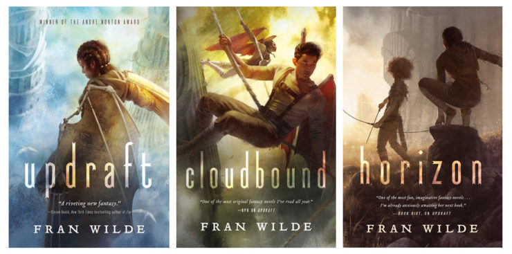
Thinking about colors—each cover has its own distinct palette, how did both of you choose?
TA: For this series I wanted to convey a real sense of sweeping beauty throughout the covers, so I opened up the ranges of colors that I would normally use. Full color ranges tend to carry the beauty of harmonious color palettes while staying dynamic.
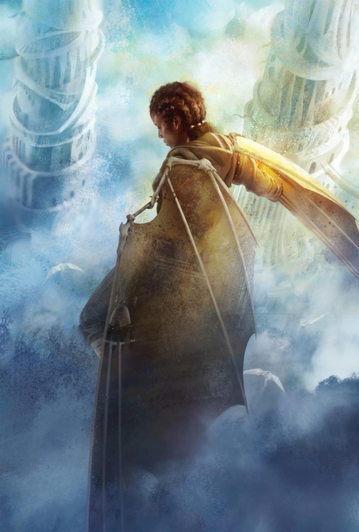
That said, individual groupings of color carry specific connotations, so I couldn’t just splash color around willy-nilly. The first cover is the full allowable gamut of colors complementing the sky blue that relates to the original hardback cover color; though I went a touch lighter with the blue to describe the hopefulness that always accompanies beginnings. Darker blues tend to feel more mysterious to me.
The cover for Book 2 is a more unsettling color palette of greens and yellows that would convey the tension of the scene and thereby, the story. The palette is punctuated by a bright red that drives home the idea of conflict. I used some neutral greys to imitate cool blues in the scene, to continue the use of more open color ranges. Despite the tension, there is still a hint of beauty to be found. Normally I might have left out one of these 4 color families, but not here.
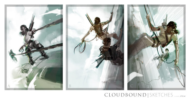
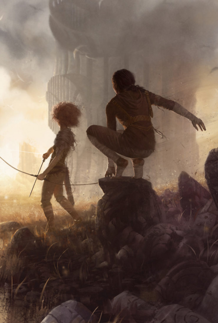
Book 3 was a struggle; I remember emailing you to get an idea specifically of the tone the cover should carry. You mentioned hope, specifically, which was great because it helped relate back around to Book 1 where some subtle purples had crept into the clouds. The fuller purples and yellows of Book 3 sound triumph and and the dawning of new hope after conflict. I remember also submitting a very different light red color comp for this as well, which conveyed hopefulness by keeping the red quite light in certain places, but still alluded more strongly to conflict than to hope. Both you and Irene favored hopefulness for this cover, which seems right.
I should mention, for each of these covers multiple sketches are submitted. That means I have to find a couple ways to say what I mean with color. I try to orbit similar ideas with slight variation in each sketch and let Irene’s judgment do the rest. When I’m really not sure, I’ll do some that are sort of opposite colors and, again, leave it in Irene’s hands.
IG: I’ll be honest, that is largely a marketing issue. Not which color a book is, but when you are working on a series, people like to be able to quickly identify each installment. Having an overall color scheme per book is one way to aid that. It works editorially as well. The first volume is set highest up, so of course the blue sky and white clouds made the most sense. And then progressing through sunset colors, descending into ground colors.
The figures featured in the series are dynamic and posed in ways that lead into the story This is a two-part question…First, how did you select which figures in which scenes to use for each cover?
TA: This is another one where all the credit goes to Irene and the team at Tor. Before I get the brief, the scene (more or less) and who will be in it is already decided. They do a pretty good job it seems :) After that my job is to make it look as cool as possible within the constraints I’ve been given.
IG: Updraft’s editor, Miriam Weinberg, helped us a lot by picking really good scenes. It made this job relatively easy and let us get right to the work of making it look good. I think the structure of the books creates a natural order to the whole set, but she did a great job of choosing dynamic scenes and a range of chapters to engage readers with.
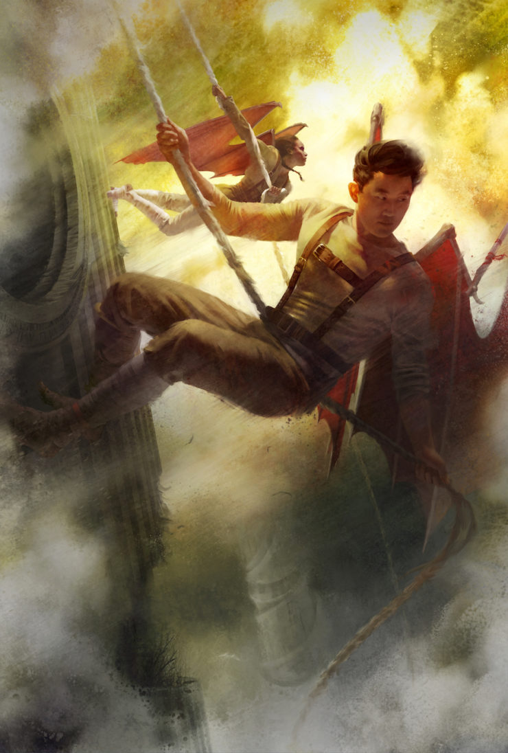
Second, Kirit’s pose in the Updraft cover (right wing extended), is mimicked by her pose in the Horizon cover (right arm extended)—it’s a subtle thing, but one that really drives home the unity of the series, as well as Kirit’s missing wings. How did you come up with that?
IG: Tommy is a really smart illustrator. Many people can render well, but bringing a voice to the work, and making nuanced editorial notes like that, are the reasons an Art Director loves working with a particular illustrator.
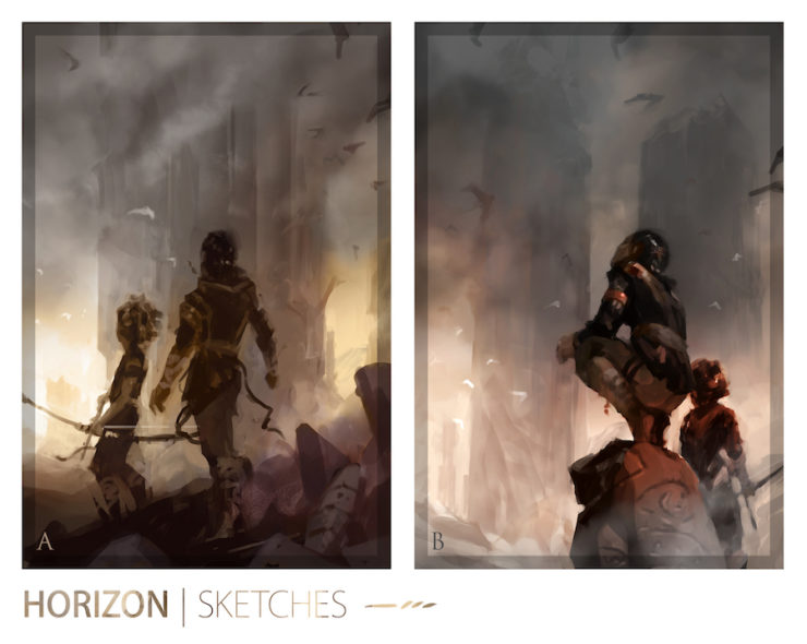
TA: As with the colors, the needs of the brief brought home some happy accidents like this one that, you’re right, really did bring the trilogy together. On the last cover I submitted two sketches: one where Kirit was crouched on a rock in front of a red sunrise, and one where she was striding down a hill in front of a more uplifting yellow/purple sunrise. Irene basically said: “Do the crouching pose, but in the yellow one,” and as I adjusted the pose the compositional needs of the piece necessitated that arm placement to be used again. I’d love to say it was more intelligent than that but as an artist I generally use my gut and let the images tell me where they need to go, instead of trying to get too smart.
Irene, since Tommy’s cited your influence and guidance as a major factor in his work with the series—what’s it like working on a project like this with an artist like Tommy?
IG: It’s been a blast watching Tommy’s career explode over the past few years. It wasn’t that long ago that I first met him. He was clearly serious about building a career, but his portfolio, while technically good, lacked a unique voice. Next I saw him at the Illustration Master Class and he came in with a sketch that was clearly the basis of what his voice was going to be. It was really exciting to see the beginnings of him branching off from technical ability to artistic expression. Then all he needed to do was harness that expression and be able to do it consistently on cue. It really didn’t take long for him to get there. I’ve been working with him ever since.
Perspective is a major element in each composition, and across the trio—in Updraft, the view is above Kirit, looking down; we’re looking dead on at Nat and Kirit in Cloudbound; in Horizon, we’re just a little below ground level, looking up at Kirit and Ciel. Can both of you talk a bit about the choices made?
TA: Irene told me from the start that over the course of the three covers, the characters would visually descend the towers, until they were at the bottom. Because I got the briefs for Book 1 and Book 2 at the same time, it was easier to plot things out for the trilogy as a whole, rather than dealing with each cover on a case-by-case basis as I’m forced to do with most series. Once Irene went with the downshot sketch for Book 1, the idea just sort of presented itself as obvious and something really cool that would give more and more power to the characters, even as they descended. I was trained by a comic book artist (Brian Stelfreeze), so I jump at little chances for enhanced storytelling, even in a collection of single images.
IG: That again came from the settings of the books. The trilogy seemed tailor-made to create that kind of continuum—high point of view, middle point of view, low point of view.
I will say, though, that it’s another testament to Tommy’s abilities that he looks for various angles in all his pieces. Too many artists default to an eye level point of view for all their work. It can get dull, fast.
What was it like to draw the towers?
TA: Difficult! Finding the right mixture of organic and structural elements was a matter of research and practice. On the first cover I repainted the towers a couple of times, each time refining and trying to remember what worked and what didn’t. After that I sort of had a formula I could lean on but still…
To be honest I’m never sure how much I succeed or fail in these sorts of things. If I had to do it again there’s things I’d change, but I’m sure I’d also ruin some of the good things about them—that just seems to be how it goes.
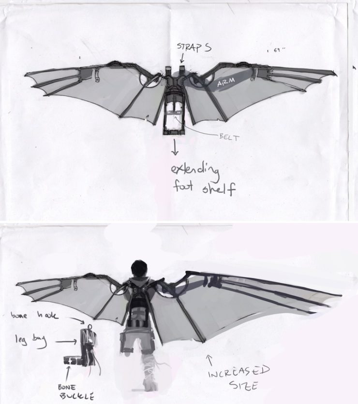
Tommy, how did you work with the text to get the wing design so amazing?
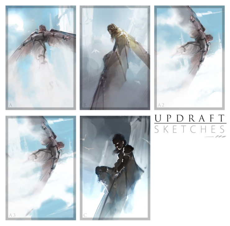
TA: I think you have some of the chicken scratch sketches we used to lay out the design…and I guess I can’t stop you from including them here if you so choose…
The wings were tricky primarily because what looks good and what matches the text were, in this case, not totally the same, so we had to find a design that could work visually and still be semi-authentic to the wings in the story. I was really glad we were able to be in touch about it. I’ll happily go off-book with details if it suits my needs or the needs of the brief, but I do feel a bit guilty about it sometimes.
Again, as with the towers, reference was key. I looked at how different sorts of modern and historical gliders worked, as well as animal wings (bats especially), and tried to synthesize those references with your own descriptions to find something pleasing. And when I talk about design I almost always mean visual design—as a cover artist my main concern has to be how it looks. I won’t sacrifice cool for functional.
The background of each piece is as filled with detail and—dare I say it—plot Easter eggs, as the foreground. How did you come up with such a rich layering technique?
TA: A little luck and a lot of practice. One of my mentors, Greg Manchess, is a master of depth and he was always pushing me to go deeper and deeper with my paintings. Typically these days I prefer arrangements that hint at depth but are visually sort of flat and put together so as to almost be graphic, but in this case depth was called for by the needs of the briefs. Multiple characters in complex settings just demands a lot of depth, and it also happened to be a perfect fit for this world!
Can we talk about how well Tommy’s work invokes wind? I don’t really have a question here, I just want to say it breathes, it gusts, it whooshes. It’s amazing how he does that (in The Jewel & Her Lapidary, too)…
IG: He’s great at paying attention to edges. We share some favorite artists so I feel confident in saying that he’s spent a lot of time thinking about edges. He knows when to carefully define an item and when to lose the edges and let items blend into each other. It gives elements (including people) a great sense of movement and life.
TA: In my answer about influences I mentioned David Grove. Many of the painters of his day put down gesso on their boards (and their paint as well) in vertical motions, so that everything had a sort of vertical striping. Dave tried out putting the gesso base down side-to-side instead, and found that he really liked it. What I think worked so well about it was that it evoked a left-to-right sense of motion that so fit with the subtle movement in his pieces. Ever since seeing his work, I’ll sometimes emulate this technique digitally to get that same feeling of motion. It was perfect for these covers; so really you have Dave to thank!
Tommy, what are you working on now?
TA: Most of my work right now is covers and I’m doing a fair bit of work on Magic: The Gathering, as well. Covers are so much fun because their needs typically best fit the sort of art I want to be making anyways.
Thanks to everyone for participating in this conversation!
Tommy Arnold is an award-winning illustrator of science fiction and fantasy, working for clients such as Tor Books, Orbit Books, Subterranean Press, and Wizards of the Coast. His work has been featured on the cover of ImagineFX magazine and in the pages of illustration annuals Illustrators, American Illustration, Communication Arts, and Spectrum.
Irene Gallo is the Associate Publisher of Tor.com and Creative Director for Tor Books.
Fran Wilde is the author of the Bone Universe series. Her novels and short stories have been nominated for two Nebula awards and a Hugo, and include her Andre Norton-winning debut novel, Updraft (Tor 2015), its sequels, Cloudbound (2016) and Horizon (2017), and the novelette “The Jewel and Her Lapidary” (Tor.com Publishing 2016). Her short stories appear in Asimov’s, Tor.com, Beneath Ceaseless Skies, Shimmer, Nature, and the 2017 Year’s Best Dark Fantasy and Horror. She writes for publications including The Washington Post, Tor.com, Clarkesworld, iO9.com, and GeekMom.com. You can find her on Twitter, Facebook, and at franwilde.net.


