In recent years, The Folio Society has made some impressive forays into the world of science fiction, putting out a wonderful edition of Frank Herbert’s Dune back in 2015, and has added new, high-end volumes from authors such as Isaac Asimov (I, Robot), Margaret Atwood (The Handmaid’s Tale) Pierre Boulle (Planet of the Apes), Neil Gaiman (American Gods and Anansi Boys), Robert Heinlein (Starship Troopers), Ursula K. Le Guin (A Wizard of Earthsea, The Dispossessed, and The Left Hand of Darkness), and many others.
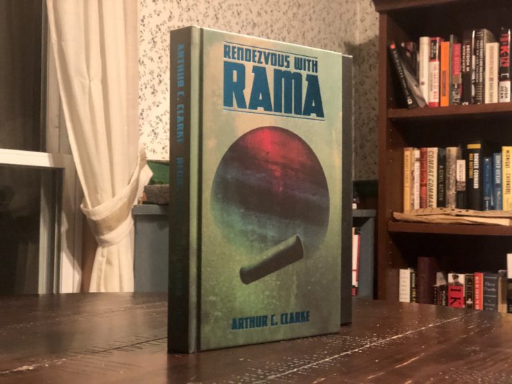
Recently, the publisher released its latest offering as part of its spring collection: Arthur C. Clarke’s Rendezvous With Rama. In addition to original illustrations, the book comes with an introduction by John Clute.
I spoke with illustrator Matt Griffin about how he went about illustrating this latest volume.
Andrew Liptak: What was your first introduction to Rendezvous with Rama? What about it stuck with you after you finished reading it?
Matt Griffin: Actually, I’m ashamed to say it was this project! Being a fan of sci-fi, particularly of the philosophical variety (and with 2001 being a top-3 film), I should have read Clarke a long time ago. But he had remained on the ‘to-read’ list until I got this opportunity with The Folio Society. I am now hooked, so I’ll be reading more. Childhood’s End is next, I think.
I love anything that questions our place in the cosmos, and stories that reminds us of how little we know about what’s out there—that make us realize how small we are in comparison. I really enjoyed how, in Rama, humanity is obviously incredibly advanced—it’s long-since populated the solar system—and yet they are still faced with mysteries beyond their comprehension. Clarke was saying ‘we’ll never know it all, there’s always a bigger fish…’
I also enjoyed how detailed he was about the politics and the various planetary societies—as in, how their hostile environments shaped the type of people they are. The people on Mercury for example—warlike yes, but also representative of a certain view you find here in our own time on a daily basis: a hostility due to mistrust of the unknown. An insular, protect-our-own attitude… ‘Mercury First’….. They have their reasons, which makes it interesting and gives it depth.
And finally, I love how it was not just a ruminating novel. It was an action story too—there is great tension as we attempt to unfurl the secrets of Rama at the same time as Commander Norton and his crew…
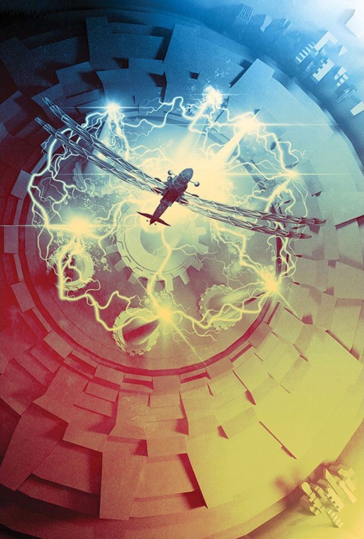
AL: How did you go about selecting the scenes to illustrate? What was it about those scenes that really grabbed your attention?
MG: Well, I read the book with a pencil, a highlighter and lots of post-its! I mark the sentences that grab me visually—and on the first pass there are lots (too many). Then I read again, whittling down the choices. It’s also a case of working with the Art Director and Editor in making the choices—so I present them with my long-list, and we work together to see what images might work best. There are some that got to rough sketch phase that remain on the metaphorical cutting-room floor. Spacing them out throughout the text is also a consideration.
While I read, the image presents itself in my head (like everyone). But I guess I’m also thinking along the lines of composition—which of these images will make an exciting or mysterious illustration? There is also the excitement—which if these descriptions do I just have to draw? Like New York, or the Crab or the Dragonfly attempting to escape the Big Horn lightning storm. Once I get a buzz about drawing it, I know I’m on the right track.
AL: Rendezvous with Rama is an older classic, and while looking at your illustrations for the book, I was struck at how much they reminded me of some of the surreal art that you saw on those classic paperbacks. Where those older books an influence on this project? On your art in general?
MG: They are absolutely a huge influence on how I approached the book, and my work in general. I’m a massive fan of artists like Paul Lehr and John Harris, and how they used impressionist painting to depict science fiction. Space is rarely black in their work. The brushstrokes create texture and atmosphere. They are masters of creating a sense of scale that awes the viewer.
It’s not just about showing a sci-fi scene, it’s about how you feel looking at something so unearthly. I am the first to admit I’m not the best at anatomy or lighting, but what I strive for, and what I hope I achieve occasionally, is atmosphere. I want you to feel something looking at the work…
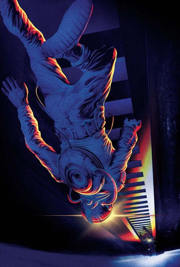
AL: One element in your work for this book is vivid colours: an astronaut is highlighted against the black of space, while in the interior, you use a lot of bright oranges and greens. Why did you go this route?
MG: The astronaut is actually inside Rama at that point! But it’s pitch black, apart from the lights on their helmets, and a spotlight from above (or is it below? we wanted to get the sense of disorientation where there’s no gravity). Really, it’s for the same reasons above.
I’ve always admired bold use of colour—colours you might not necessarily expect. It plays such a huge part in the feeling I mention above—colour affects us. So I always try to be experimental with it—messing about with all kinds of hues before I see the combination that makes me go ‘ahh… nice.’ If it makes me feel like that, the hope it is has a similar effect on the viewer.
AL: What are you working on next that we should look out for?
MG: At present I’m working on several book covers as always (funnily enough, one of them is for Tor!). I’m also doing some concept art for a TV show that is lots of fun—it’s very freeing as they just gave me the pilot script and said ‘do what you want’… I love that freedom (and trust).
I am also starting to do more in the field of licensed collectible prints (alternative movie poster screen prints to be precise) so I’m working on some of those. And on the side, several personal projects including attempting a new book (since my last book in 2017 I’ve had multiple ideas and numerous false starts… But I’ll get there!) I always need to have personal projects on the go. They keep me sane and help me improve technically too.
As you can see from Rama, and the bulk of my portfolio, I do a lot of sci-fi work. I’d like to branch out a bit however and try my hand at some high fantasy. Swap the space suits for elven armour. But stick with the bold colours and atmosphere. :)

