Not everyone knows that I started my career in book design on romance covers. It was the bulk of my work for the eight years that I worked at Grand Central Publishing. While my own reading tastes normally lean elsewhere, working on books with paranormal passion, historical hunks, and luscious costuming during my formative baby designer years—let’s just say it left a mark on my soul. So, when I was told we were working on a queer, enemies to lovers, romantasy that was going to get all the bells and whistles, I was excited!
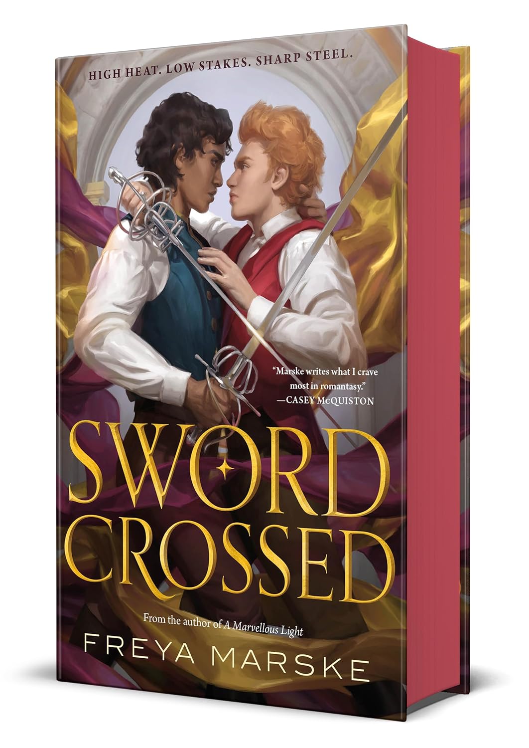
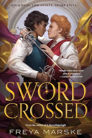
Looking for an artist for Swordcrossed, I wanted to find someone who would not only capture the desire and heat but also the luxurious fabrics, patterns and details this story exudes. Cynthia Shepphard was the right person for this job. Her work is classical in a timeless sort of way, while still clearly being fantasy. She has a way of capturing body language that makes you feel in the moment with the characters. I reached out to her with the project proposal and the first line of her response read “Omg YES this sounds amazing!!”
Buy the Book

Swordcrossed
Thus, the cover assignment began. I gathered up all of the relevant information. This included the amazing amount of visual resources Freya had provided for us, including costuming, patterns, setting, textiles, dueling poses, and character references.
A few weeks later I got the sketches in. *Insert screams of delight and Muppet flailing!* … I mean *ahem professional word of enthusiasm*…
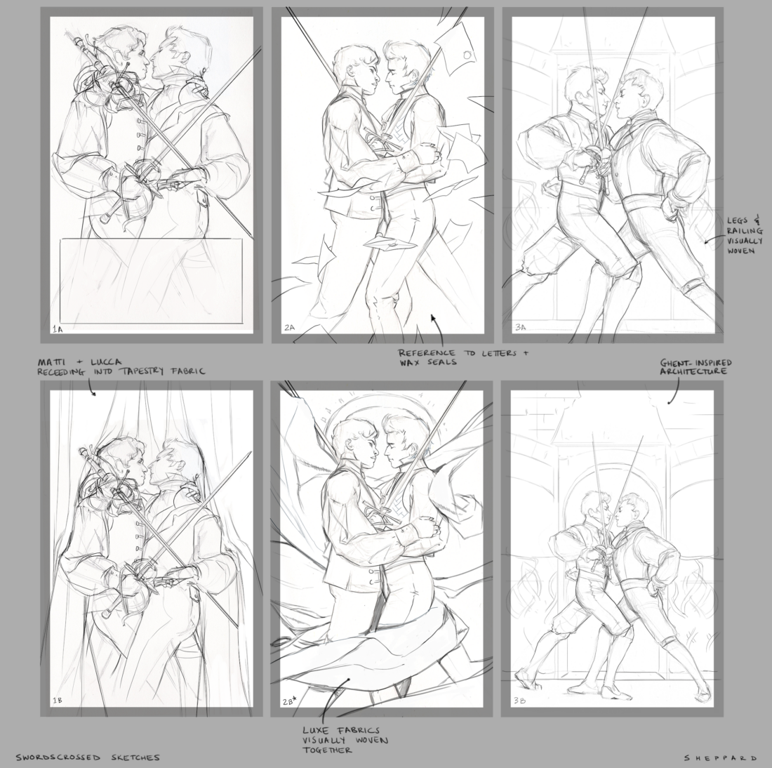
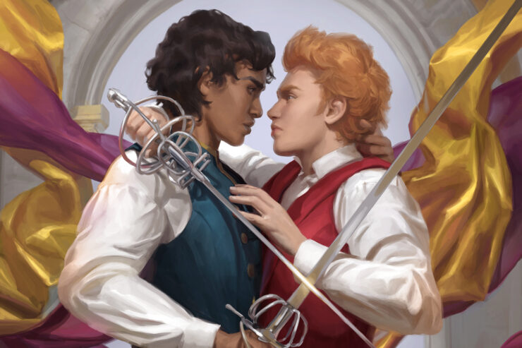
Even from these early line drawings you can feel the sexual tension. We have caught them in the moment that combat turned into passion.
Cynthia on creating these compositions—“One of the more interesting challenges early on was trying to get a balance between the fighting and the romance in the swordplay. If you’re that close to your opponent in an actual rapier fight, someone has lost the fight, or maybe one person has grappled the other, which can look awkward when done correctly—I worked with someone who trains with swords to act out how that might go. Even the way a rapier is supposed to be held, with one finger above the quillon looks kinda “wrong” to the untrained eye, so it ended up feeling more appropriate to make this an intimate moment between their rounds of sparring, rather than pretend they ended up locked together like this somehow during a fight.”
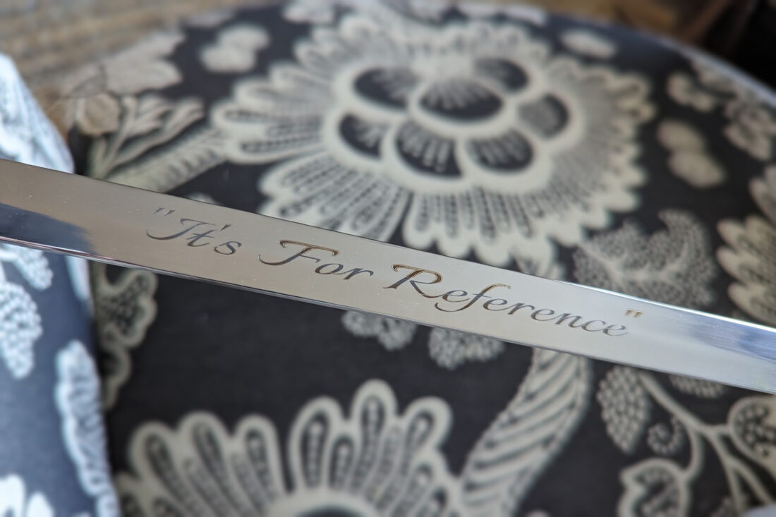
I later found out this project also inspired Cynthia to purchase her own prop sword in order to get posing as accurate as possible. “Because it came with a free engraving, I had the words “It’s for Reference” emblazoned on the blade.”
After we stopped shrieking from how amazing these sketches were, we got down to the difficult business of picking one to go to final. In the end we didn’t just pick one. We decide that we wanted to combine elements from several of them to make the perfect cover. The way the swords intersected from one, the tilt of the head from another, the flowing fabrics, and the hint of architecture from a third. Cynthia took our feedback and then sent us over more refined sketches, with various color options.
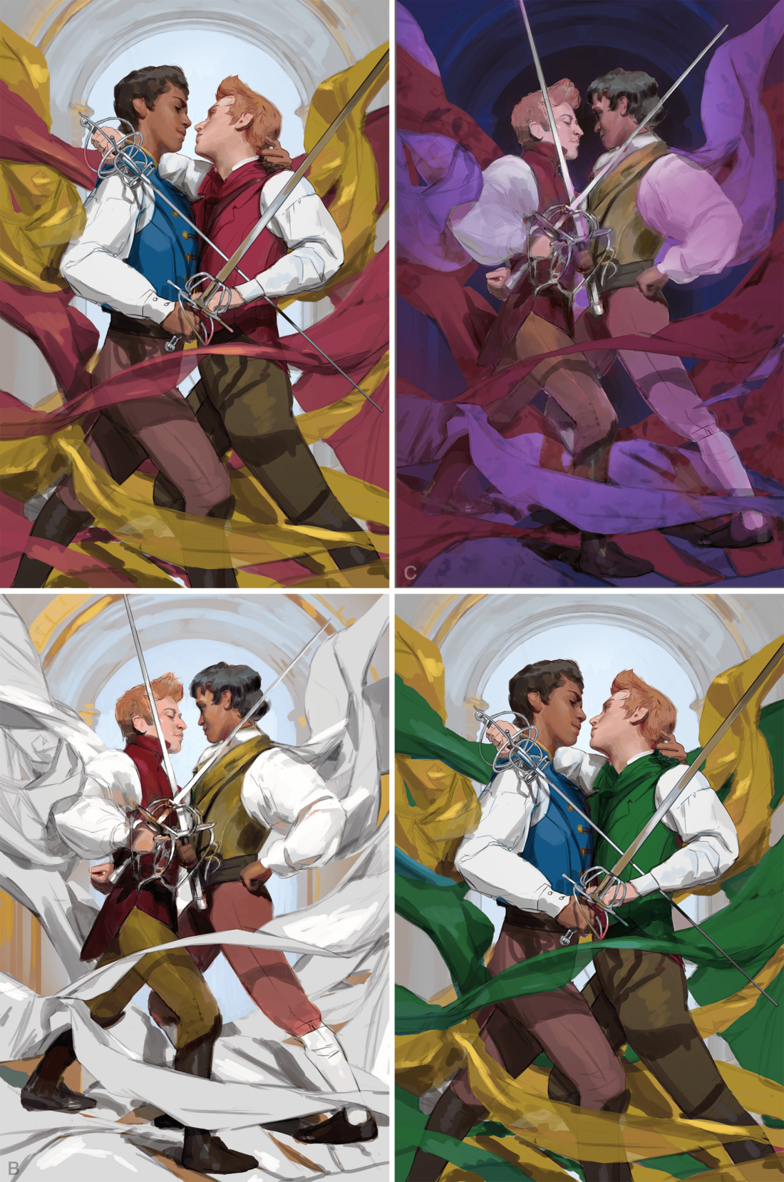
We went through this process of refining and polishing a few more times. We wanted to make sure the steel was sharp, the heat high and the thirst yearning. And Cynthia brought it! This art has us all thirsty!
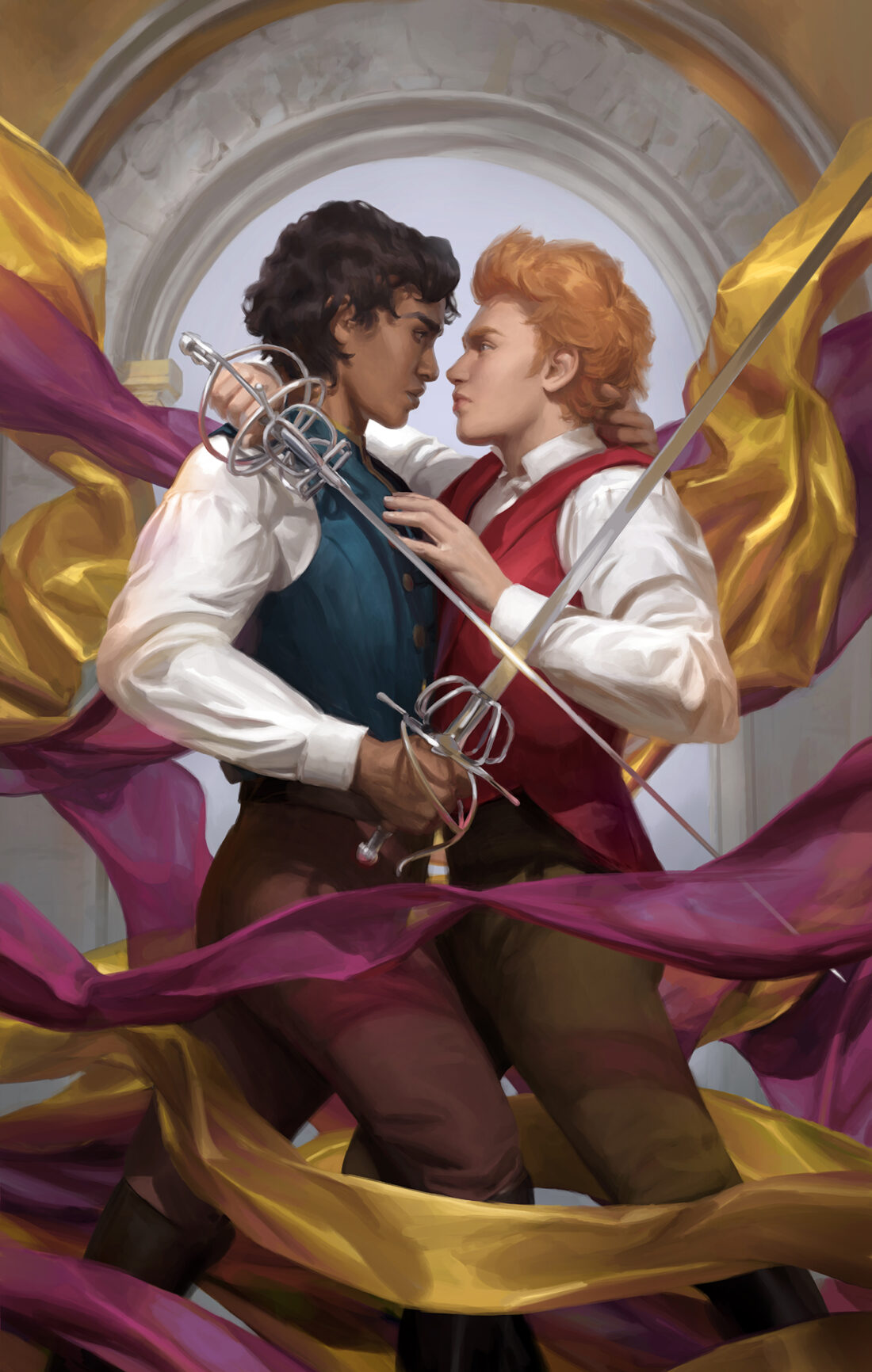
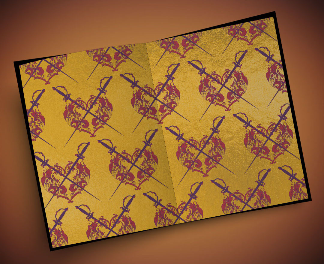
From there I had a the magnificently challenging task of designing typography to match this gorgeous cover art. I tried several different designs, and debated which effects would allow this cover to truly sing. Foil, embossing, spot gloss, stained edges, and patterned end papers; this novel has it all! It was truly an honor to work on this cover. A huge thanks to Cynthia and everyone involved!
