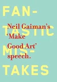
After it was given in 2012, Neil Gaiman’s commencement address to Philadelphia’s University of the Arts lit up the artsy, writerly, creative ends of the internet. It was, all at once, an uplifting speech with emotional content, a professional speech with good advice, and a humorous reflection on a life spent making art. So, it’s not much of a surprise that it was picked up to be published in a unique form: a small hardcover book designed—and the word designed is really important here—by Chip Kidd. It’s a book that is, itself, art. The form is the content, with this piece; the choice to make a physical and visual object out of a public speech is a creative one, and this book is more a product of Chip Kidd’s art than not.
The petite, brightly colored book is titled simply Neil Gaiman’s ‘Make Good Art’ speech. (And yes, the period is included.) There is background “floating” text on the front cover beneath the title that reads, “Fantastic Mistakes.” Kidd, the designer who adapted the speech to this visual form, primarily uses four colors—a pale blue, a soft butter-yellow, a bright red, and white—for backgrounds, designs, and text alike.
Kidd’s design renders this speech into a piece of art similar to a concrete poem, using the layout of a page and the visual dimensions of text to create a sort of montage—a collection of visual items (sometimes printed words, sometimes abstract shapes or colorful lines) that guides the reader through the speech’s semantic content. This book is, certainly, bound up in an idea of text-as-art, as well as the often underappreciated dimensions of how an artist can use text and designs to create emphasis, create pacing, and draw along the eye and the mind while creating distinct rhythms that plain text on a plain background would not have.
In some ways, this removes much of the tonal invention from the reader’s mind and makes it—terminology, hah—concrete on the page. That tendency draws my attention to the thing that struck me most about this book-as-art-object: its use of emphasis, its embodiment of Gaiman’s speech, is distinctly different from Gaiman’s own delivery at the commencement. I also assume that it’s different from the points of emphasis and the rhythm I might have created in my mind, sans speech and sans art-design, reading only a transcript.
For example, on the page that reads “Looking back, I’ve had a remarkable ride” (there are no page numbers, which presents a unique issue in trying to say where in the book I’m talking about), the word “career” is in larger font, colored bright red, for all three of its appearances. However, in the speech, Gaiman only emphasizes the first two instances of “career.” In the last line on the topic, he emphasizes not “career” but “plan;” the textual art, however, only emphasizes the word career throughout. This is useful, and is doing work to create blazing emphasis in the reader’s eye and mind on the word “career,” but is a little different from the speech it’s adapting. (Which is, by the way, why I think of this as an artistic adaptation—a derivative work, where Chip Kidd’s name should really be on the cover and not simply on the interior credits.)
There are several other instances of this; the lines “I didn’t have a career. I just did the next thing on the list.” are presented on a single page together, with the second short line much smaller and in white text on blue background as opposed to the first which appears in red on white. But in the speech, those two sentences feel like one line, and they also seem to have equal weight. That’ interpretation at work, the creation of a unique tone for the reader by way of visual information. When reading the book, that second line seems diminutive, an aside perhaps, clarifying the lack of a career. In the speech, it’s more one-and-the-same with the previous line.
Additionally, the text differs slightly from the speech itself in many places: a word changed here or missing there, etc., to create a more polished and less spoken-word version of events. It’s not just emphasis that’s different and new; the tone is sharper, more polished, and in some ways less auditory now that it has become visual. The rhythm of voice has disappeared from the prose, to some extent, while the rhythm of the visuals takes over and guides the experience; the use of design and abstraction creates associations and patterns for the reader that add to the textual art. On that same page about “career,” there appear several thin arrows at the bottom of the page pointing onward, ever onward—as if they represent the progression of a career, or the progression of the eye to the next page to find out what came after Gaiman’s lack of a “career plan.” At another point, discussing going beyond accepted rules as a new artist, the text flows over and across a light blue box printed in the background. It literally jumps “out of the box.”
Perhaps the cleverest of these abstract designs are the ones that come during the part of the speech where Gaiman discusses the three things freelancers must have and in what combination. On the “people will tolerate how unpleasant you are” lines, the left edge of the page is covered in bright red spikes. On the lines “They’ll forgive the […] lateness of the work,” most of the page where that ellipsis is consists of wavy blue lines that guide the eye off the page rather than down it, a distraction. (The third one, about being punctual and nice even if you’re not the best, worked less for me: it’s a spiky ball of lines behind the text, and I couldn’t quite figure out what that was supposed to visually do for me when placed behind text reading, “And you don’t have to be as good as the other if you’re on time and it’s always a pleasure to hear from you.”)
I also appreciated the big, scary, blank white space of the page where the small bar of color and text at the very bottom reads merely: “The problems of failure are problems of discouragement, of hopelessness, of hunger. You want everything to happen and you want it now, and things go wrong.” These are the things Kidd has done to make visual, effective art out of an auditory speech: he uses the form of the book, the way print appears on a page with a simple color palate, enhanced only by the occasional bit of design-imagery, to create a sort of painting and a sort of music. It has rhythm; it provokes the mind along certain channels and pathways; it creates a version of a speech that is a new thing entirely.
Neil Gaiman’s ’Make Good Art’ speech. is an art object, as I’ve said. And that’s fascinating. It also attempts to show what a book is and does, what the printed page can and will do if the strictures are pushed and the object is considered, itself, art, not merely the vehicle for prose that is art. Of course, it’s not a perfect book. There are points at which the use of color and collage strain the eye, and I suspect someone with difficulty seeing depth-images would have difficulty reading those bits. Some of them also don’t quite succeed at being as emphatic as they’d like. But, overall, I found this experience—reading? viewing?—a pleasure, and a different sort of pleasure than listening to the speech itself. It’s still inspirational, but it’s less immediate, without a person speaking it; instead, it is a visual memory, an impression of color and shape and text that insists on art and the primacy of art in life, in words, in publishing and otherwise.
And that’s, if I do say so, rather neat.
Neil Gaiman’s ‘Make Good Art’ speech. is out now now from William Morrow
Lee Mandelo is a writer, critic, and editor whose primary fields of interest are speculative fiction and queer literature, especially when the two coincide. She can be found on Twitter or her website.


