Forthcoming anthology Interfictions II, a follow-up to the award-nominated Interfictions, is seeking cover art through flickr: photographs of collages and sculptures, digital art, photomanipulations and anything else expressible as a jpg. They set up a pool where anyone can upload up to three images for a chance to be on the cover of the new book; details here. Submissions close this Monday, February 16!
The anthologies are put out by the Interstitial Arts Foundation with the goal of encouraging stories that can’t be classified as any one genre; in the introduction to Interfictions, Heinz Insu Fenkl traces the operative word “interstitial” back to the Latin “inter-” (between) and “sistere” (to stand). The stories in Interfictions are a little bit everything, which makes them not quite anything. Fenkl writes,
if an interstitial novel is determined to be Fantasy by its publisher, a reader, having the parameters of initial engagement with the text predetermined, might experience it as a Fantasy novel exhibiting odd dissonances or interesting novelties in relation to that genre.
In other words, if we come to a work with a prejudice—”There’s a horse on the cover! It’s totally fantasy.”—we read it according to that prejudice and don’t meditate upon the work in its delicious in-betweeny totality.
The cover art for Interfictions II is in a tricky position as a harbinger for the weirdness inside. It has to attract readers without coloring their perceptions in the way that Fenkl n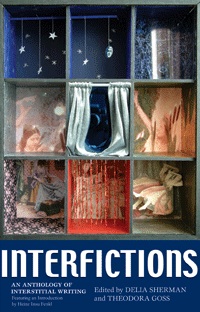 otes; while the cover could be viewed as one more piece of interstitial art in a collection, not speaking for any of the others any more (or less) than the story selections do, it’s not the cover-content relationship that readers are used to. Usually the cover is supposed to tell readers about the book so they can decide if they want to pick it up and read the back for more information. What do you tell readers about a book of stories that are supposed to be read without prejudice? The first volume had a photo of a diorama in warm and cool colors and several textures, so it went in a lot of directions. Curtains are a permeable boundary, the starry sky is dark and whimsical, and overall I got the feeling of a collection that was diverse and a little out there. Since the IAF is probably not going to go with a divided cover again (at least, there are only one or two in the pool at the moment), their choice has to solve the problem of representing the interstitial mindset in a different way. While it might be easier to go abstract, there are some riveting figurative pieces in the pool as well. I don’t envy them the task of choosing one!
[Image
by Foxtongue,
from the Interstitial Arts flickr pool, used under a Creative Commons license.]


