“Doctor Who and the Praying Mantis.” This is the not-so-loving nickname I’ve given one illustration for a story of mine. There are two reasons: first, the guy in the picture looks like William Hartnell. And then there’s the alien. I’d written a tidy and meticulous little paragraph of description, one I quite liked, which outlined all the ways the alien looked like a balloon animal and specifically not a big space bug. What did we have? Yep, giant space bug.
The main reason this particular minor gripe has stuck with me is that I’ve been selling fiction since 1989 and the only time I’ve had story art that felt at all off-target was that once. I’ve been very lucky; almost all of my stories that have had illustrations have had beautiful work, by the likes of John Berkey and Charles Vess, images that in addition to being attractive and intriguing, gave me the opportunity to see what happens to my words once they’ve leaked into someone else’s brain.
And lemme just say: I have no illusions that I could do better. I can’t draw. I can’t paint. My visual memory is poor; I’m better with names than faces, and blank on questions like “What does she look like?” unless the ‘she’ in the question is my wife.
So it’s no surprise, really, that the subtleties of visual design have always eluded me. I’m always super-impressed by good design, because to me it might as well be brain surgery, or particle physics, or magic… it’s an ability that blows my mind. The thing I remember most clearly about Star Wars: The Phantom Menace was that it had a look that matched the original Star Wars trilogy. No doubt this wasn’t even remarkable to someone with a whiff of visual arts ability, but I was all, “Whoa, look at those droids! They’re so, you know, totally droidy.”
This brings me, in a roundabout way, to the utterly gorgeous cover of my first book, Indigo Springs.
People outside of publishing tend to be boggled when they learn that an author usually has no idea what their book’s cover will look like until quite late in the publishing process. Many, many people think we draw or design them ourselves. But no: the writer and editor focus on the text: getting the story itself right, then working on details like copy-edits, and proofing galleys. It’s time-intensive and a good use of energy. Visual design not only happens later but is handled by a team of experts, entirely separate from the editor you’ve been working with. Usually, they’re people the author has never spoken to at all.
Experts are good, because I am not the only author who would otherwise end up with books whose look essentially said “Demented raccoons turned loose with Crayola’s finest!
But because it has that element of OMG, beyond our control! and because a lot of writers are in fact control freaks, cover art is one of those things authors can spend lots of energy angsting about. The worry is increased because new writers do hear horror stories: I wrote a book about a king and a magical fish and they gave me a cover with Satan wrestling a fruit-bat!
And, okay, a few of these tales are true: when Connie Willis’s Doomsday Book came out in paperback, the over-the-top romantic cover (you know what it’s about, right?) prompted one big bookstore—in Chicago, I think—to cover it in a brown paper wrapper. Or check out Lee Moyer’s post-mortem examination of two recent M.K. Hobson covers, wherein he discusses how The Native Star is lovely and intriguing whereas the cover for the follow-up, The Hidden Goddess, isn’t nearly as inviting… even though it has many of the same elements. See, Lee Moyer has the designer-fu that I lack. (By the way, the books are both so very amazing; you should read them the second you’re done with mine.)
Anyway, she said, wrenching herself back on point, it was both a blessing and bit of a fluke that only a couple days after Tor initially agreed to publish Indigo Springs, in 2007, my editor Jim Frenkel, sent me a proposed image for the cover.
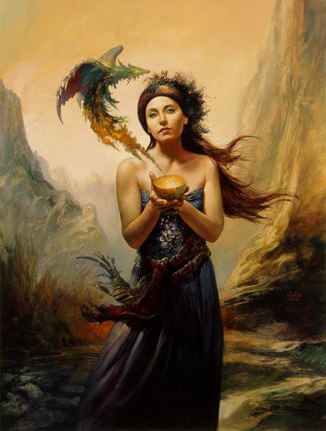
Irene Gallo at Tor had asked if anyone had a book that fit the original Julie Bell painting, you see, and this is a portrait that pretty much screams Astrid Lethewood. She’s holding a bowl. And hey! There’s a magical bowl that’s important in both novels. And though Astrid isn’t usually much of a girly-girl—she’s a gardener, and goes about in clothes suited to digging around in topsoil—an unusual chain of events leaves her wrapped in a pretty dress for the latter half of the book.
Jim asked: Did I like the picture?
Holy cow, yes I do! Can I lick it, please? Mine, mine, mine!
But, you know, I have some dignity, so what I actually said was “Sure!”
The serendipitous thing, from a writer’s point of view, was that having the cover image in 2007 gave me time to tweak a few details within the book. I had time to specify that the bowl was golden, and write in a little description of Astrid’s ill-fated date dress. These are tiny little details, almost beneath notice, but they pleased me enormously.
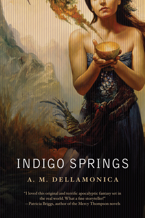
Time passed, the book went into production, and fairly late in the game I got to see what the designer, Jamie Stafford-Hill, had actually done with the image. Since I’m not a designer myself, I was so very blown away. It was like getting the beautiful cover image all over again! Cropping out the top of the woman’s head adds so much mystery, and the lines… okay, honestly, I don’t quite understand why the vertical lines work so well, but they add so much. The font’s terrific, the text looks good, it’s off-beat in the same way that Indigo Springs is off-beat… this was definitely a cover that says “Pick me up!”
Every single person who’s ever seen it has been reduced to going, “Oooh, pretty!”
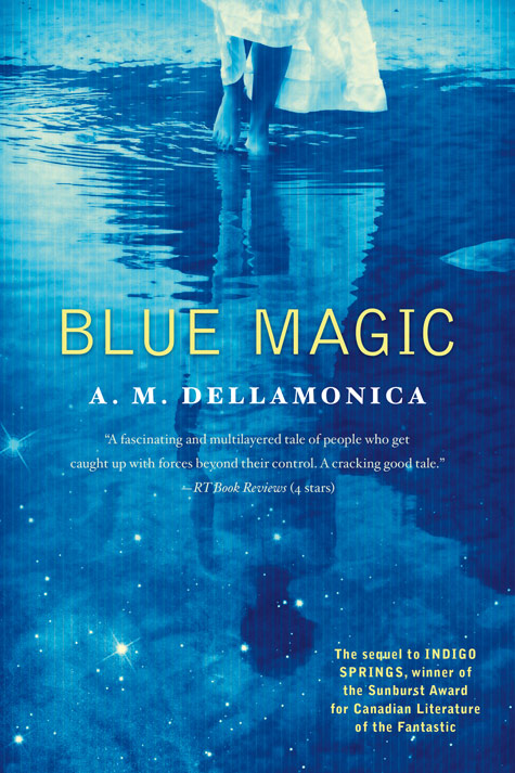
Here’s the finished design:
Getting to hold your first book in your hands is a terribly heady experience, and when the book is gorgeous too… well, you get spoiled. So I was on Blue Magic before I got to have the traditional Cover Suspense experience.
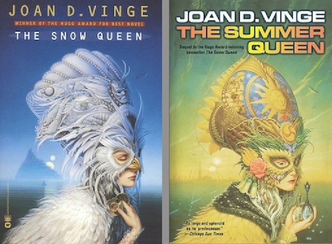
I had a very fixed idea about the second cover: I imagined Julie Bell would do a painting of Sahara Knax. In retrospect, I realize this idea was entirely informed by two Michael Whelan covers: the ones for Joan D. Vinge’s The Snow Queen and The Summer Queen. They’re original paintings, they’re both masks, and they’re obviously of a piece, you know?
So it was a surprise when the work-up (terminology?) arrived and its primary image was a photograph.
But what a photo! The woman could very well be Sahara Knax. It might just as easily be Patience Skye, Astrid Lethewood, or a couple characters who are new to Blue Magic, like the Alchemite high priestess, Passion.
If I’d had this cover in hand a year ago, I’d have been tempted to do the same thing I did with Indigo Springs, and retcon that white slip of a dress onto someone specific. But I love the open question it presents, and the overall sense of mystery this imparts. I want to poll people who’ve read the book: “Who do you think it is?”
So it’s better that I don’t have the opportunity to fiddle.
What is even cooler, though, is that this woman couldn’t have been dropped more directly into a scene from the novel if I’d had that never-happens chance to say: “Use this scene for the cover, okay? Here’s what it’d look like.” Her walking through the pool, with the reflected stars… seriously, I could give you GPS coordinates for where this someone is standing. Even more so than Indigo Springs, even without all that advance warning and time to tweak, the Blue Magic cover looks like a movie still drawn from the latter half of the book.
This is part of the power of going with a photo. It’s downright cinematic.

The two covers (Jamie Stafford-Hill did Blue Magic too, by the way) are united by a number of elements, obviously: those vertical lines, the overall magical sensibility, and the fact that the central portraits are of women and have been cropped in mysterious ways. They look fantastic next to each other.
But for me, the real test comes when I show the image to other people. As with Indigo Springs, the Blue Magic cover pretty much gets one response from all comers: “Ooooh, that’s so pretty!”
Who wouldn’t call that a win?
A.M. Dellamonica has a short story up here on Tor.com—an urban fantasy about a baby werewolf, “The Cage” which made the Locus Recommended Reading List for 2010.


