


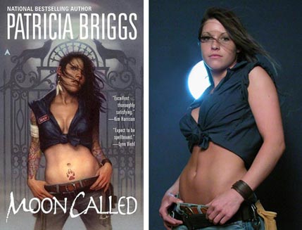
Dan Dos Santos created the quintessential urban fantasy cover when he painted Patricia Brigg’s Moon Called cover. As an art director, seeing the printed proof was one of those professionally jealous moments, “Damn, I wish that was ours!” (Luckily, Dan and I are friends; pride outweighs jealousy.)
Like most artists, Dan utilizes models to create his paintings. I asked him to introduce us to the woman behind “Mercy Thompson” and a bit about the process of taking real-world elements to bring fictional characters to life. Five “Mercy Thompson” books later, and a sixth around the corner, Dan and Jaime, the model, have created a series of paintings defining one of urban fantasy’s most beloved heroines.
Jaime, what do you do when you are not being “Mercy Thompson”?
During the day I am an architectural draftsperson. I have had experience designing and drawing high-end residential homes, commercial buildings, and interior renovations. Architecture has been a passion of mine since a young age.
I am a bartender by night at a tavern where I have been serving the local crowd for seven years.
How does it feel to see your self on the New York Times bestseller list?
It’s very exciting! But that credit is all due to Dan’s awesome work on the cover and the author Patricia Briggs, of course.
Do people ever recognize you on the street?
I wouldn’t say I get recognized on the street, but many friends and family have not known about it and called me up from the bookstore asking if it was really me on the cover. It’s fun!
Dan, how did you find the right woman to play Mercy Thompson?
Jaime is a bartender at a tavern I used to live across the street from. I would go there almost daily to shoot pool with a friend of mine. He and I discussed how I should use her for a model for quite some time, but I never had an appropriate job since I was doing a lot of YA at the time. Eventually I was commissioned to do the cover for Moon Called, which called for a tough, athletically built woman. After reading the brief, I felt Jaime was perfect for the part, and just needed to convince her of the same without sounding like just another drunken customer. Fortunately, she was intrigued by the prospect rather than scared off, as many prospective models often are when approached in public. From there, it was just a matter of setting up a time to do the shoot.
 Artists tend to take many photos of their models…what is it you are looking for in those shoots? Why isn’t as simple as copying a single photo?
If it was as easy as copying a photo, my job would be a lot easier. Unfortunately, some things look fine in photos that just look odd when you paint them. We have been taught to accept photographs as truth, so we don’t question the details. But when you look at a painting, everything is open to scrutiny, and suddenly subtle things like the positioning of a finger can become really awkward. Because of this, I pay very close attention to details when I do a shoot, and often focus more on individual body parts than I do the entire figure, ensuring that every little body part looks the best it can. And yet, despite that attention to detail, even the prettiest of models still needs to be idealized even further. Mixing different photos, stretching limbs into impossible positions, emphasizing features, and changing hair styles is pretty much a given in every piece for me. On this particular series, I have the added challenge of adding tattoos, of which Jaime has none.
You’ve done a number of covers with Jaime at this point. Do you think that both of you are able to inhabit the character to a greater degree than working on a one-off book with a new model?
Absolutely. I was really fortunate that Jaime was a great model right from the start (which is rarer than you’d expect), but even still, there is obviously always room for improvement. With each successive cover Jaime embodies the character more and more, and achieves the desired result faster and faster.
Being an ongoing series also provides an opportunity to really develop the character much further than a single image permits. There are many sides to an individual’s personality, and having multiple images to work with permits me to explore those nuances. Mercy may be tough and proud on one cover, and yet sexy and vulnerable on the next. This goes a long way to making Mercy feel like a real person.
What are the challenges of doing artwork for a series?
There are actually a lot of unique challenges on this series.
Because the covers are printed with a metallic spot coating over the background, I have a lot of compositional restrictions. I can’t use too soft of an edge on the figure, because the Art Director needs to be able to provide the printer with a well defined mask where the spot coating should begin and end. This is particularly challenging when painting hair. The spot coating also means I can not have any foreground elements overlap the figure, since they would have a metallic finish like the rest of the environment, and make the figure’s silhouette look really weird once printed.
There is a fine balance between consistency and redundancy when working on a series. You want the whole series to look good together and have consistent themes that run throughout, yet you also need to ensure that every cover looks distinctly different than the last.
On this particular series, we decided to maintain consistency through the use of the metallic background and the actual composition. You’ll notice that every cover depicts Mercy at the exact same size, from head to knee, centrally positioned. This is no accident. It was actually a request of the Art Director, ensuring that the covers maintained a steady look. Given that restriction, I need to pay close attention to the manner in which I pose the figure, as well as the overall color scheme of the cover in order to make sure each one looks different than the last. Unfortunately, I tend to let a single color dominate most of my compositions, so after six covers, I’ve just about gone through the whole rainbow now!

The image had so much buzz about it, do you think that affected you artistically or professionally?
Prior to the Mercy Thompson series, John Jude Palencar had done some brilliant covers for the Kushiel series, which depicted a woman with a large, prominent tattoo. But aside from that, I can’t recall any other previous covers that depicted a woman with quite that many tattoos, done in a modern rockabilly style. Apparently it struck a chord with people, because I became absolutely inundated with requests for tattoo-centric jobs. I literally could have painted nothing but tattooed people for a full year. I accepted a few of the sweeter ones (some of which remain my personal favorites), but I really did have to make a concerted effort not to accept too many of them for fear of typecasting myself.
Aside from the type of job, the popularity of the series has actually affected the quality of jobs I receive as well. Not only does having a cover in the #1 spot on the New York Times bestseller list really help an artist’s business through notoriety, but it actually helps me produce better quality covers.
So much of creating a striking cover comes down to what the publisher does after the painting is complete. One might argue that it is even more important than the painting itself. When a publisher expects that a book will debut at the top of the bestseller list, they are much more inclined to throw money at the project. This means I can spend more time on the painting, and that the image is going to get extra special treatment when it comes to type design, print quality, advertising, point of purchase displays, etc. It’s a self fulfilling prophecy of sorts, and in the end, everyone ends up looking pretty good.
Irene Gallo is the art director for Tor Books