


In 1938, while working for Columbia Records, Alex Steinweiss came up with the first album cover. Prior to his invention of the 12 inch sleeve records were sold in brown paper, or bound in book like “albums” dressed in leather and gold leaf. What Steinweiss was trying to do was create mini posters to advertise the music, but what he inadvertently came up with was one of the greatest formats for visual storytelling to grace the shelves. Check out Part 2, Part 3, and Part 4.
Since the shift in pop music from classical, to jazz to rock and roll, science fiction and fantasy imagery has been a mainstay in album cover art. From some of the smallest and biggest names in illustration, art and music history. In no particular order over the next four days, I’ll be collecting some of the most notable science fiction and fantasy images ever created.
While researching this post a question comes to mind. Is it an accident that most of these covers are for heavy metal albums? I can’t say for sure, but I do recognize that what both science fiction and fantasy literature and heavy metal music have in common is that they are rarely taken seriously as art forms by critics of their respective mediums. Perhaps the answer lies there.
Thanks to Anthony Buono for all his fantastic suggestions!
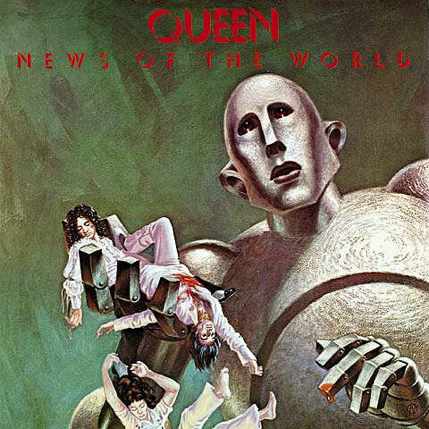
Queen, News of the World by Frank Kelly Freas
10 time Hugo Award winning illustrator Frank Kelly Freas originally created this image in 1953 for Astounding Science Fiction Magazine’s, “The Gulf Between” by Tom Godwin, which shows a sad robot who has accidentally killed someone. Queen co-opted the image and Freas substituted the original solitary figure for the band members.
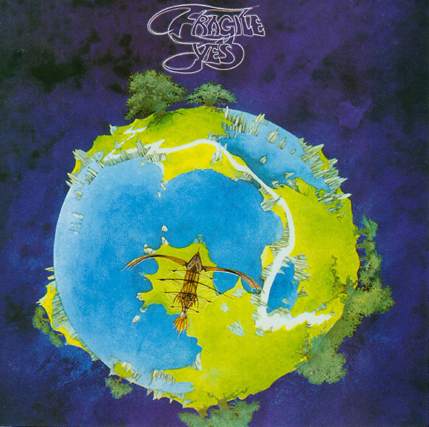
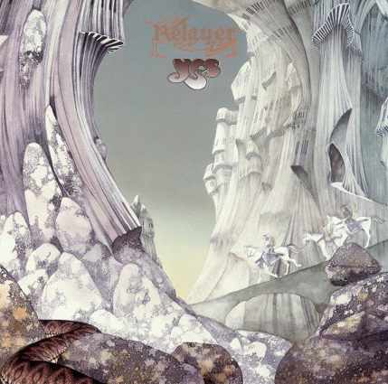
Yes, Fragile by Roger Dean
One of the biggest names in album covers, British illustrator Roger Dean created multiple covers for the progressive rock band Yes of surreal landscapes with little or no gravity. By his own admition he claims he is more of a landscape painter than a science fiction artist, his work inspired the look of Pandora in James Camerson’s Avatar.
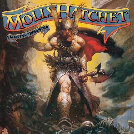
Molly Hatchet, Flirting with Disaster by Frank Frazetta
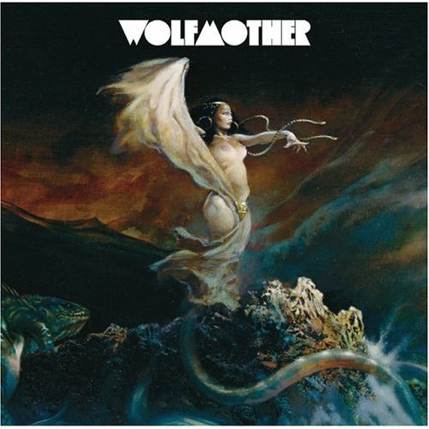
Two of Frazetta’s most identifiable works grace the covers of Molly Hatchet albums. These images had a profound impact on hard rock and heavy metal music and have become a guiding force behind the fashion style and look of the the scene. Frazetta’s work has recently appeared on Wolfmother’s debut album.

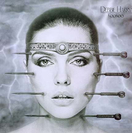
Deborah Harry, Koo Koo by H.R. Giger
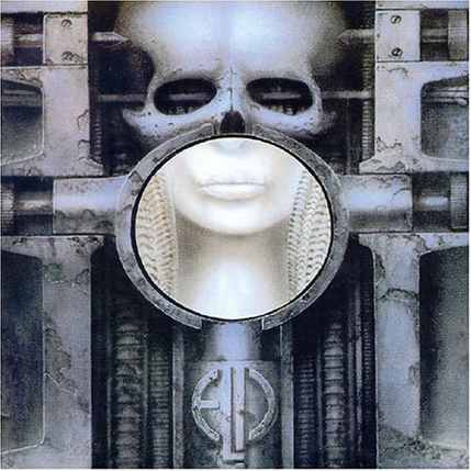
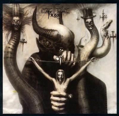
Hot off his groundbreaking work for Alien, Giger created this riveting portrait for Deborah Harry’s album. Giger has created more than a few album covers, from works with Celtic Frost and Mega Therion to Emerson Lake and Palmer’s Brain Salad Surgery.
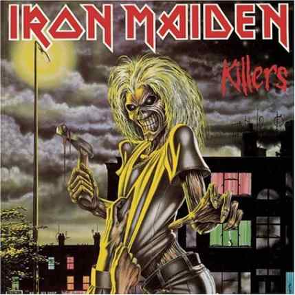
Iron Maiden, Killers by Derek Riggs
Illustrators often create some of the most iconic characters in the public lexicon, like James Montgomer Flagg and Uncle Sam or Haddon Sundbloom and Santa Claus. Derek Riggs arguably created one of the most iconic character/mascots in music when he created “Eddie” for Iron Maiden, displayed on their album Killers.
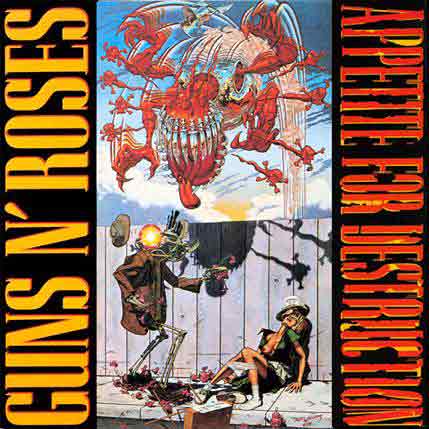
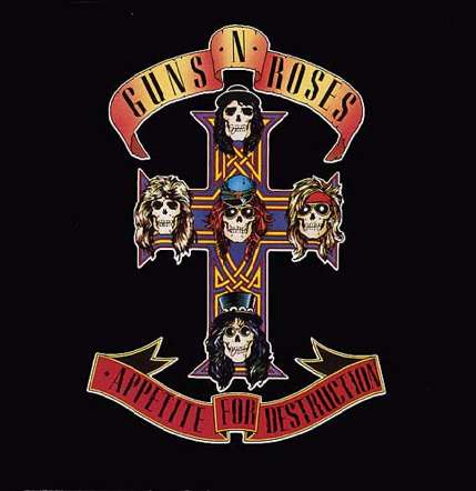
Guns N’ Roses, Appetite For Destruction by Robert Williams
This Juxtapose Magazine founder’s cover for the above albums was origially featured until MTV refused to play any of Guns N’ Roses’ videos. That kiss of death lead the band to move the Williams image to the inside sleeve and the skull and cross image became the publicised cover for the debute album.
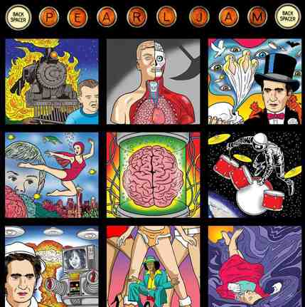
Pearl Jam, Back Spacer by Dan Perkins (Tom Tomorrow)
The cover art was also at the centre of an online teaser campaign, with the label staging an easter egg hunt prior to the album’s release. The nine individual artworks were scattered across sites like Rolling Stone and Wired and fans that clicked on the images from around the web and assembled them on the Backspacer website were rewarded with a demo version of the song “Speed of Sound.”

Erykah Badu, New Ameryka Part Two by Emek
Born in Israel, Emek is one of the few talents keeping poster art alive. Described by Henry Rollins as the “thinking man’s poster artist,” Emek continues many of the traditions of 1960’s psychedelia. His work is always hand-drawn and heavily layered, mashing the political and personal; the organic and technical.
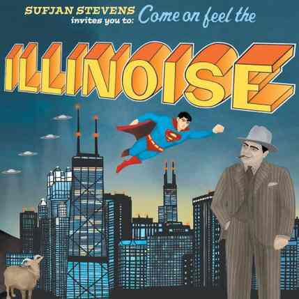
Sufjan Stevens, Illinois
The cover for Illinois got a fair amount of press for all the wrong reasons when its launch was delayed due to legal action from DC Comics regarding the appearance of Superman on the album cover. As rapturous reviews filled newspapers and sites across the country, fans became frustrated to learn that label Asthmatic Kitty Records had been forced to halt all retail sales. A détente was negotiated in a fairly swift fashion, with a balloon sticker employed to cover the copyright infringing superhero. Subsequent copies removed him all together.
Come back tomorrow afternoon for the next part in this week’s four-part feature on science fiction/fantasy album art!
Mark Korsak is an illustrator who’s work can be seen in The Wall Street Journal, New York Magazine, Billboard, and more.
Fascinating post. Thank you.
Some part of my personal history includes a stint in the recording industry (A&R). We spent many hours, days, weeks, discussing and arguing how to transmute a purely aural experience into one that also could be tactile. The cover art and jacket sleeve were integral to that effort.
Many readers here are likely too young to recall the hours fans poured over Cream’s Disreali Gears album cover in the attempt to find its hidden messages. (A terrible rendering is here: http://lpcoverlover.com/2007/09/30/disraeli-gears/ ) Or the Beatle’s Abbey Road. Or, in a related field, the many hidden ‘clues’ on a pack of Camel cigarettes. Alas, today’s CD art does not even come close, leave alone compare.
Thank you for the happy jaunt down memory lane.
Growing-up in the 70’s and 80’s, I became a die-hard rocker around 4th grade when I first heard Kiss’ Detroit Rock City on a juke-box (which btw- Kiss had some great illustrated album covers). As my head-banging tendancies grew, many times what the deciding factor for me between buying the album or the cassette, had to do with whether I had to hide the LP from my parents or not. But sometimes the album cover was so awesome that I just had to risk discovery and some albums I bought without ever hearing a song just because of the cover, like Armoured Saint’s 1st album, March of the Saints. It was like a mini-sci-fi/fantasy story, with Athurian-looking knights standing before a medevel castle on the front and road-warrior looking bikers on the back, with that same castle, now in ruins behind them. http://www.districtlines.com/5730-March-Of-The-Saint-CD/Metal-Blade-Records
Coolest artwork (well, maybe besides the use of Frazetta) had to be the Boston covers. The guitar as spaceship motif on the original Boston album blew me away, although the second was even better:

And thanks for the comment dmg. It’s nice to hear from folks with personal experience in the industry. Now a days there are just so many ways to get visual stimulus about a favorite band (music videos, websites, Facebook, Twitter, etc) that album covers have become a tiny part of the promotional engine.
I like your purely aural comment as well. As a matter of fact, that’s one of the things I really enjoy about illustrating music. Nine times out of ten, my job is to make a picture that goes with words. It’s a truly unique expereince to create a picture for sound.
I’m fascinated by the apparent referencing of Golden-Age illustrators in that second Roger Dean piece – it looks so Kay Nielsen-y to me… Now I almost want to own the album just for the art!
Mark – as someone who makes his living promoting and selling the works of some of the many talented people who’ve applied their craft to music packaging over the past 50 years, I have to tell you that although some have declared that the future of album cover art is a bleak one, it’s really great to see that the subject still fascinates people. While digital music distribution has altered the style and size of the images being created, folks still rely on album cover art to identify the music they have on their PCs and iPods, and most musicians understand that, in many cases, the visual elements associated with them provide another way to strengthen the connection with their fans…
In any case, thanks for helping to keep the works of these talented men and women in front of the eyes of both young folks and old-school rock and rollers like me :-)
Cheers – Mike Goldstein – RockPoP Gallery – Portland, OR