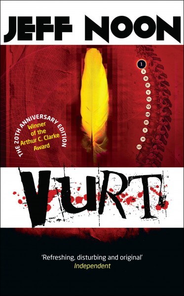
Tor UK’s 20th anniversary edition of Jeff Noon’s Vurt was published last month. And, as Jeff won the Arthur C. Clarke Award for Vurt in 1994, last week’s Arthur C. Clarke Award ceremony was a great time to look back. But as they say you judge a book by its cover, we wanted to take a look at the huge amount of work that went into this new cover look for Vurt, Pollen and Jeff Noon’s entire backlist. Curtis McFee is one of Jeff’s oldest fans and supporters, and has championed his work for years—immersing himself in Jeff’s books, designing his website and even creating a Vurt-based role-playing game.
Curtis McFee also put together a really fabulous new Vurt trailer for us. But here, we want to take a look at the new covers—look at the inspiration behind them, the creative process and various early drafts, plus what messages Curtis was trying to convey. We also wanted to find out how this creative duo met and forged the links that would lead us to this body of work today.
1) What was your inspiration for Jeff Noon’s covers, particularly thinking about Vurt and Pollen? Did you do a lot of picture research? Or is music influential for you?
 I have a very disjointed process when it comes to design in that there is nothing formal or structured. Most of the time just hearing the brief for the first time I will see the final work fully formed, or some aspect of it that I know I want to see, and I will start chasing that down. When it comes to getting something that I could actually show however it goes through a very quick back and forth to narrow it down.
With music I find that it is always a part of the process but not an inspiration. All of the designers I have known have been plugged into music whilst working; I think it helps with the multi-tasking nature of the job. I work with music constantly in my ears, but it is there to lift my thoughts away from the physical nature of the mouse and keyboard. It helps to disassociate from that and just concentrate on the image.
I tend to not have much time to research anything; I just scrabble through the net with a handful of keywords and see what I am left with. The first designs were done within an hour and pretty much pinned the whole template I would use.
I wanted to use the spine motif you see on the covers straight away, as a means to link up the series, and the idea of pixilation. I was trying to keep in the back of my mind an element of punk fanzine. There was a whole scene prior to desktop publishing software that involved cutting up, gluing and low quality photocopying. I thought that punk roots mentality might reflect Jeff’s approach in some way. I originally wanted to use actual cut up techniques and form the work as a collage but time was against me.
2) What attracted you to Jeff’s work and how did you discover him, as a long-term fan who has gone on to work closely with him on his website and other design projects?
I was passed Vurt to read by a friend, even though I had avoided it for some time. A lot of people around me were raving about it and telling me I had to read it but I resisted and resisted. Eventually I had no excuse and I took it with me on a long journey. The first few chapters and I was completely blown away by it. Even as I was reading it I was planning how I would turn it into a script or do something else with it, it was very cinematic. There was so much unsaid that intrigued and I was desperate to fill in the blanks.
The first thing I did after reading it was to try and buy the film rights, which seems ridiculous in hindsight as I had no resources to make a film. I then tried to narrow it down. I played table-top role-playing games for a long time and set out the basics of how the novel could be expanded into a free form story telling setting. Jeff has always been very generous with the ideas of tangents and remixes, so we wrote back and forth about that for a while.
That was the first basis for my discussions with Jeff. I was honoured enough to have the tour of Manchester, with Jeff pointing out the real world inspirations and equivalents, all research for the game. It was also the main reason I became a designer, honing Photoshop and Dreamweaver skills to try and make this insanely creative novel into an interactive storytelling experience. It was to be called Vurt: Role Playing Through the Looking Glass. We took a long time making it and for various reasons it never got off the ground. Whilst we were all waiting for things to get moving we all moved on to other things and I ended up designing websites and creating marketing communications. Years later I was able to use these skills for Jeff as a friend.
3) What were you particularly trying to convey, in the latest range of covers you’ve designed for Jeff?
Punk. I was trying to get a sense of the proto-punk cut-up style flyers and promos that were influencing art during the 70s. Jeff has already spoken about that sense of dynamism in literature so I thought I would try and reflect that. At least that was a consciously inspirational process I was working with. Layers and collage. Juxtaposition and conflict.
With Vurt there is always a sense that you are not seeing a pure image. Jeff doesn’t seem to just describe a scene straight on. The information comes in pieces or through the filters of someone’s experience. I was trying to convey some kind of essential icon for the story but then to have that hidden or obscured by the process. That is why I use so many layers in the covers; each layer adds some texture to the colour or shape that takes the image away from pure.
I thought the use of pixelation would be cool to see when it moves from the thumbnail to the full size. At the small size the image would seem clearer and then as you get the higher quality image you would see how broken that image is.
4) Are there any challenges you recognize in bringing Jeff’s work, or specifically Vurt and Pollen, to life visually?
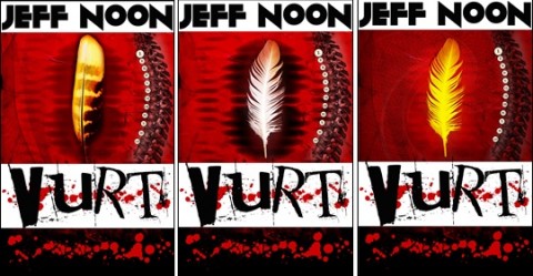
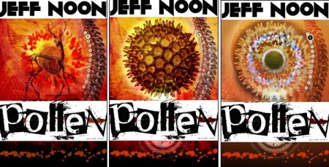
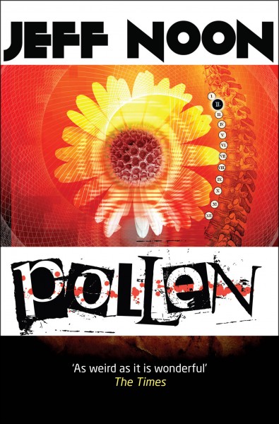 Keeping that very clear and simple primary image proved quite difficult with the others in the series, the hooks for them were much more complex. The image forFalling Out of Carsis one I am most pleased with technically but the Vurt cover needed to reflect the primary nature of the whole Jeff Noon vibe. That one had to be the most direct.There is always some difficulty in creating something for these first novels. They are so important to my history and I know them very well but I was worried that the use of feather and flower was too obvious. I started looking at distorting the feather or using a vastly magnified pollen grain but they were moving away from the feel of the books. In the end it came back to the simple idea; a yellow feather and a flower. With Vurt the more simple and iconic the feather image the better. Pollen also managed to use that pollen grain as the flower centre in the end.
5) Is it possible to see any early drafts or stages that led up to the finished cover for Vurt?
Jeff put the word out to a number of artists asking for their ideas for the covers, starting with Automated Alice and Pixel Juice, to get a feel for what they could do and he asked me to submit something. Naturally I was raring to go.
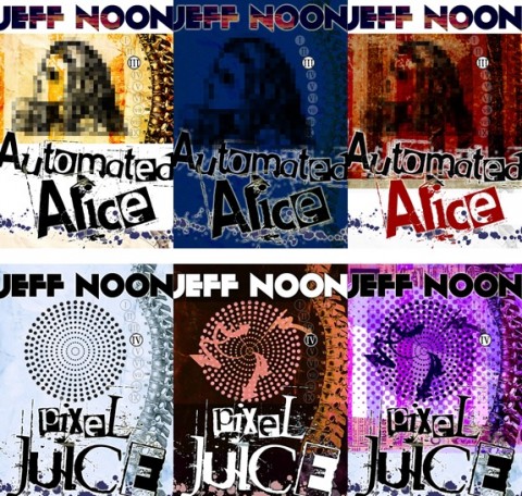
That was an hours’ worth of work whilst eating lunch, so it shows how the whole thing just pours out once you start. It is always best to run with that instinctive thought as far as you can before considering other ideas. It may never be the final work but the core elements of what you want are normally held in there somewhere; a kernel of the pure motivation. If you can get as many of those first ideas down then they will be available later in the process.
It seems interesting to me looking back at these how close they were to the final images but also how raw they were. The spine motif was one of the first ideas to spring into being and it was always with the full series in mind, that it could tie the range of covers together. With these first designs it showed that I was experimenting with just how ugly a colour palette I could get away with. I think that was another original element that I fixed upon, the idea of pixilating and breaking down the image, distorting it.
Jeff showed that around and there was general positive feedback so I tried to expand a bit further.
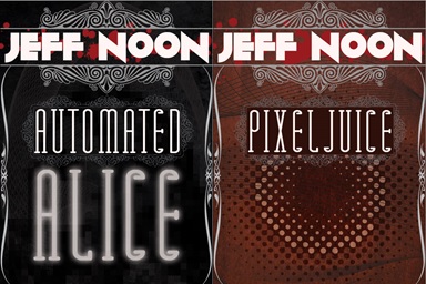
These second ideas came from an attempt to abandon the first thought and provide something in the opposite direction; something a bit more refined, understated and simple. I thought the covers could focus on the wording of the tile rather than leaning on a graphic central idea.
I then wanted to see how those ideas would pan out in other covers, so I went to Channel Sk1n. I had not read the work at that stage, only heard the title, but I tried to capture something for it. This was moving towards a full photographic design idea; a third option.
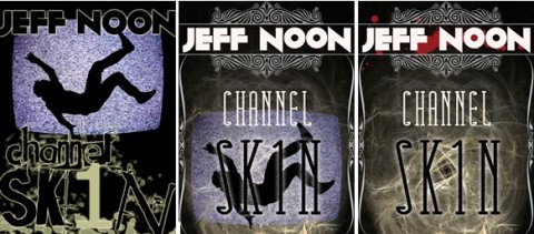
After that initial volley of designs Jeff approved and gave me the go ahead. We met up to talk them through and despite my best efforts to go beyond the first ten minutes work it all came back to the first inspiration.
Now I had to think a bit more carefully about the requirements of this brief. It had to be cohesive and balanced across at least ten covers and it had to scale from tiny thumbnail to possible poster size. I set up a folder structure to start gathering ideas and scoured the net looking for free images, free fonts and anything that would spark interest. We had narrowed down some of the elements of the template I would use in our initial meeting so I knew that I had a visual space to create some kind of icon or primary image that would reflect the mood of the work in question.
Vurt and Pollen were very clear to me, as was Automated Alice and Nymphomation. These were created very quickly. Some of the others were more of a problem and Jeff and I would bandy some key metaphors, or visual cues that would be good to use. The most difficult to complete were Needle in the Groove, and most especially Channel Sk1n. The first designs for the new novel were going in a whole other direction but didn’t resonate with Jeff. I had to rely on his feedback as the work was so new to me and we managed to pin it down eventually.
Some of the variations for Vurt and Pollen, although they stayed within a structured template, tried to bring in different iconic images. At this stage it was just trying to narrow down on the exact image. With Vurt it was a case of mixing the layer interactions and colour mixes. The final part of the process came down to fine tuning the balance of colour. The chromatic steps ranging from deep red through to violet were hopefully going to look nice when the full set were loaded onto your eBook reader. Side by side the full cover set need to look like a single continuation.
One of the hidden aspects for the covers is that splash of drops across the text. It uses a font rather than any kind of brush, so I was able to write out meaningful concepts. In Vurt I wrote “Scribble” across the page, with Pollen it was “Barlycorn.” I like that kind of obfuscation.
This article was originally published on the Tor UK books blog. You can read more articles on and by Jeff on torbooks.co.uk here.
Bella Pagan is the senior commissioning editor for Tor UK.

