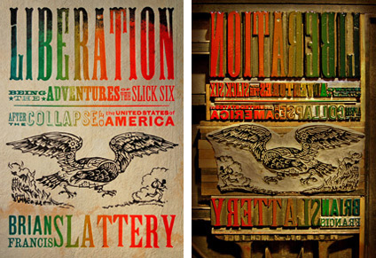
 I met Jed Berry at a dinner party Halloween night. He mentioned he had just read, and very much enjoyed, Brian Francis Slattery’s Liberation. (I also thought he said he was reviewing it, but after drinking a “Corpse Reviver” I wouldn’t swear to it.) I may have been a little paranoid but it seemed to me there was a little trepidation in Jed’s voice when he asked what the cover was going to look like. Slattery’s novels defy easy categorization. I’m a big Slattery fan and I know that the cover could have gone very wrong.
In the end, I think we did alright by the book. I tried to describe the Liberation cover to Jed at the party and mentioned that I might get an opportunity to talk about it here. So…
Liberation was unfortunately prescient. Written over a year ago, it is essentially about America after a sudden and catastrophic economic collapse—from there it gets both scary and trippy.
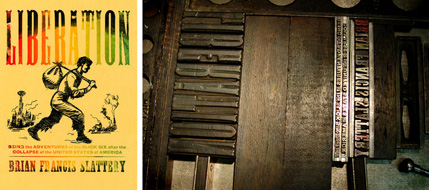
The author had the idea of referencing 19th Century runaway slave posters. Once I heard that, I remembered a great lecture I attended by letterpress artist, Ross MacDonald, years earlier. I’ve always loved his work but knew it would take a long time to find just the right project. After a couple of emails back and forth, I realized that Ross wasn’t just the right aesthetic for the job, he really seemed to get the essence of the book. Below are a series of excerpts of emails from him throughout the process:
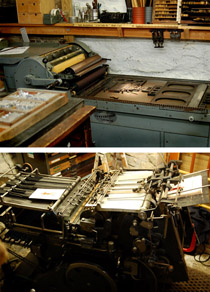
“When I’m giving a talk about letterpress—‘true’ letterpress, with actual wood and metal type—I like to use the phrase ‘ditch typography’. In other words, you could literally do it in a muddy ditch if you needed to. If civilization collapses, letterpress printers would still be able to function, and that’s the back story I had in mind when I was working on this cover—to make it look as if it was printed in the time and setting of the book, by someone working in a burnt-out factory using 19th century technology.”
 And…
And…
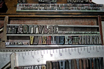
“Although I love a lot of historic periods of printing and design, I’m really inspired by one of the most reviled periods of design—the early 19th century. All of the fonts used on [the Liberation] cover were designed and manufactured before 1854. The two fonts on the bottom (the sans, which was called Gothic, and the slab serif, or Antique) date to before 1820. Although it was not a perfect time (slavery, manifest destiny, votes for white guys only) it is a period when so much innovation was going on in many fields, including printing and type design.
The technology and the typography were really rugged. Americans were building cylinder ‘country’ presses that could survive travel in the backs of wagons. They were brought into frontier towns, where there were no roads, and could be easily run, operated, and repaired. If something broke, the local blacksmith could fix it. He had to, because it might take months to get spare parts. The presses could be run by steam power, water power, mule power, or cranked by hand. Often times the printer would crank the flywheel and his wife would feed the press. I remember seeing an ad from the 1870s that boasted that ‘a small boy could print over 2000 copies an hour’. Ah, the good old days!”
It’s impossible not to enjoy the day at work when others so clearly display their passion for the job.
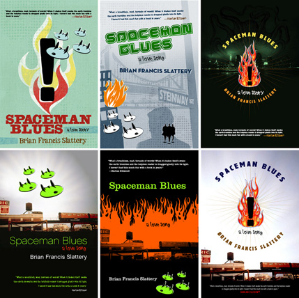
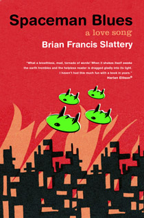
Spaceman Blues is still one of my favorite Tor books. In fact, I loved it way too much to touch it myself so I handed it over to Peter Lutjen—Tor’s amazing senior designer. When Peter first showed me the comps I was still too attached to the book to really see them clearly. I finally understood what I suspect our editors often feel, not to mention the authors. If I remember correctly I think I made Peter do revisions on some of the alternate versions before suddenly realizing that one of the original comps was simple, direct, and perfect for the book.
“I really loved this book, but have had a very difficult time trying to describe it to people, and found it equally challenging to come up with a cover to do it justice. There is an incredible rush of imagery right from the start of the story, and it never really lets up throughout. With so much great material to work with, my initial attempts ended up a bit too cluttered. I hope the final jacket is just suggestive enough of the weirdness and chaos inside.” —Peter Lutjen, designer
