If you could identify a book’s most perfect form, what would it be? What would it feel like?
By form, I don’t mean format—whether ebooks or audiobooks or print. I’m talking about the actual shape of a print book: the height and width, the way it fits in your hands. And beyond that, the way it feels in your hands. Does it have that divisive “soft touch” jacket, the kind that feels ever so slightly like human skin? Is it embossed or dotted with gold foil? Is it hardcover or paperback, large or small, short and thick or tall and narrow?
It wasn’t until I was in college that I encountered what I still think of as the epitome of book form: the Vintage trade paperback.
If you grew up on SFF, you most likely know the experience of small hands gripping the chunky pages of a mass market paperback. These are the books that fit into grocery store spinners, that stack on shelves laid horizontally maybe even better than they do upright. When I was a kid, they were still five bucks a pop, meaning the $25 Waldenbooks gift certificates my grandmother sent for birthdays could keep me in new books for a good while.
This was pretty much all I knew, apart from the handful of hardcover children’s books I had carefully arranged on my shelves, or the middle-grade novels that came in a slightly larger size that somehow suggested they were more serious tomes. And the mass market has a lot going for it. You can put a lot of them in a backpack. You can, if you are spry and careful, walk while reading them. It’s hard to feel precious about a regular old mass market, though as with any book, a specific volume can be special, whether for rarity or sentimental reasons. Or maybe you just have that one book you always buy when you see it on a used shelf, just waiting for the right friend to hand it to. (For me it’s Jo Clayton’s Duel of Sorcery trilogy. Serroi was my first favorite green girl, long before Wicked’s Elphaba.)
At some point in my late teens, I became convinced that I ought to read “real books.” That was—foolishly—how I thought of things that were not SFF. My mom gave me Tess of the D’Urbervilles, into which I ventured only a few chapters. The first “real” book I bought for myself—after a long wander through the Strand—was Milan Kundera’s dazzling and meta Immortality, which came in a weird, tall, awkward shape that made it seem slightly ostentatious. (What a perfectly odd book for a kid who felt she needed to expand her horizons.) I still have that copy, and I still don’t really understand why it’s shaped the way it is. If anything, it ought to be weirder. It is not a normal book.
It wasn’t until I got my first bookstore job, in a long-gone Barnes & Noble, that I began to appreciate the Vintage paperback. They just shelved beautifully. They didn’t waste space. Many of them had a matte texture that felt like the movie adaptation of A Room With a View looked. (I hadn’t yet read the book.) The only books I still have from that job are Martin Amis’ London Fields, in a tattered, highlighter-yellow edition, purchased because the band Blur talked about it in an interview, and Blake Nelson’s Pacific Northwest coming-of-age tale Girl, with its highlighter-pink spine. The ’90s were a different time.
It was years before I learned the term “trade paperback,” which is what those perfectly medium-sized books are. They’re in theory higher quality paperbacks than mass markets, though I suspect many people just think of them as a different (and more expensive) size. I still gravitate toward them, toward their perfect size and shape, their tendency to be neither too thick nor too thin.
Why do we care what form our books come in? Is it just that one size or another is most comfortable for our particular hands and the ways we like to read? I read mass markets rarely enough now that when I picked one up yesterday, to reread Garth Nix’s magnificent Sabriel, I dropped it three times in the first few chapters. I was out of practice.
There’s no reason for me to think trade paperbacks feel “right.” And it doesn’t apply to all of them. I have a pair of Iain (M.) Banks paperbacks of a ridiculously floppy size, like hardbacks that lost their covers, which are simply too tall. They only tower an inch or so over their more average-sized neighbors, but the feel is wrong. (The worst shape is the “premium” mass market, a taller version which feels gangly and awkward, like it will never grow into its body. Somehow these give the impression that one has to open them wider in order to counteract the unnecessary height.)
Hardcovers have a whiff of inevitability about them. If you want to read a new book in its made-of-paper form, you are often doomed to a hardcover, no matter that sometimes they’re so heavy, they give you a backache if you mistakenly try to carry them around with you. (Yes, I am speaking of A Dance with Dragons. Mistakes were made.)
Hardcovers come in their own range of sizes, which I also think of as right and wrong. The smaller size that most YA books come in? Correct. The tall ones that SFF and a lot of nonfiction come in? No. Please, don’t make me hold this. It is too much. I understand that some books are simply so long that if they were forced into a smaller size, they would exist in the dimensions of the bricks we so often joke that they are. I understand this, but I don’t have to accept it.
What I do accept are hardcovers for which designers have had the leeway—and publishers the budget—to do something cool with the form. The original hardcover of Wicked has a window, or die-cut, in the jacket. These die-cuts are the bane of booksellers everywhere: They snag, they tear, they result in new books that look like they’ve been around the block. But Wicked’s jacket hides a book printed with the witch and her animal companions, a secret second cover image that perfectly suits the story inside. Nick Harkaway’s The Gone-Away World was initially, and somewhat inexplicably, published with a fuchsia-and-neon-green jacket on which the fuchsia parts are velvet. (Technically it’s “flocking.”) It’s weird and lush. The only other time I’ve seen this velvety texture is on the advance reader’s copies created for Marlon James’ Black Leopard, Red Wolf. It doesn’t just grab the attention; it grabs the fingers, insisting that you consider the book as an object as well as a story.
Buy the Book
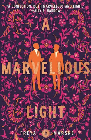

A Marvellous Light
Everyone has their book-object hangups. There’s something compelling about a gorgeous paper-over-boards book, which is industry-speak for “those hardcover books that don’t have jackets.” I love a small-format hardcover like Jenny Offil’s Dept. of Speculation; they feel compactly special, the literary equivalent of a petite but intensely flavorful dessert.
The book as beautiful object is, more often than not, now the province of specialty publishers—of The Folio Society, with its expensive volumes, or Subterranean Press, with its signed and limited editions. Creating books that fancy, books that can be keepsakes as well as stories, does get expensive. (Living with a former production manager will teach you a thing or two about the making of books. I walk into a bookstore and go, “Ooh, this book is out!” He walks in, touches the cover of something new and buzzed about, and says, “They spent money on this.”)
People love hardcovers and they hate hardcovers. My feelings are decidedly mixed. I want lovely things—the outsides as well as the content—to be available to everyone. A beautifully designed paperback has its own kind of value. But there is nowhere to tuck the skull that graced the case (the term for the cardboard covers themselves) of Gideon the Ninth, or the embossed authors’ initials on so many other hardcovers. And there’s a truth about hardcover books that rarely comes up in discussions of format and shape and size: They give a book more than one chance to succeed. A book first published in hardcover gets two promotional cycles: One when it first arrives, a shiny new hardback, eligible to be included on all those best-of-the-month lists and reviewed in all the most literary papers. And another when it lands in paperback, when the media pays less attention but everyone who didn’t buy the expensive hardcover discovers that the book they wanted to read is now somewhat more affordable.
Not all—not even that many—of my paperbacks are actually from Vintage, though I will still smile and pet the spines of those when I see them in a bookstore (when it is safe to go in bookstores). If pressed, I will admit that, yes, of course, I care a lot more about what’s between the covers than what’s on them. But I still have an eBay alert set for the Folio Society’s A Wizard of Earthsea. I still ordered Harrow the Ninth twice because the first copy didn’t have the black-sprayed edges.
Neither of those things exist in quite the same way in paperback. Though I kind of wish they did.
Molly Templeton lives and writes in Oregon, and spends as much time as possible in the woods. Sometimes she talks about books on Twitter.


