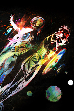
In a chaotic January day last week, I was asked by Rolling Stone to work on a cover. The subject was Ziggy Stardust, and celebrating 40 years since he landed on earth. Music is one of the things in this world that makes life better. It can make you laugh or cry or move or imagine. Bowie holds a very special place in my heart. As an artist, he pushes boundaries. Man or woman, human or alien, rocker, disco, soul, metal, singer/songwriter, Bowie is always ahead of the curve. I suppose the often repeated analogy of a chameleon is not right, though it is true for most artists, as they take the form of what is already there. Bowie went to a new place and people followed.
The creation of Ziggy Stardust asked his fans to meet a new person. You suspended what you thought you knew of Bowie and instead looked at him as a musical visitor. Nothing lasts forever and Bowie moved on. It stands as one of the most bold creations in the history of music and one does not have to look far to see how musicians today are applauded as ‘innovators’ for wearing outrageous clothes. Really?
I’m an illustrator. I wanted to be an illustrator when I was in college and dreamed of being one that did important work for national magazines and publishers. Not all assignments can possibly provide the motivation and lift a cover of Rolling Stone can. There is not even a rotation of the use of illustration on their covers to hope for. I am so lucky to have had the opportunity to do covers for them. Still, I try to imagine the artwork of whatever I’m doing being out there as an advertisement of who I am and how I work. Only on rare occasions does a job of significance combined with a subject matter and art direction come together in a perfect moment. This is one for me.
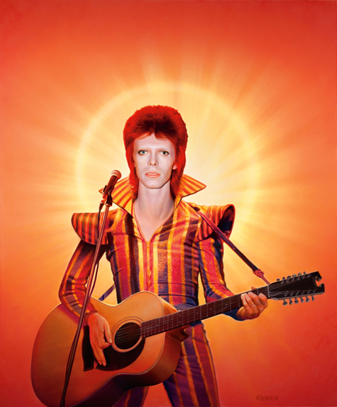
The assignment was to paint Bowie as Ziggy. The specific request was to show body as well as portrait, and for it to be colorful. This was going to put me out of my comfort zone, and probably the more problematic would be how much body to show, and what would the negative space be.
As a realist I was provided reference to work from and the specific request was not to just render any photo, but to build an amalgam image. This is fine, but is challenging.
I was able to craft two approaches and once the direction was chosen, the details had to be worked out.
In the body photo I used a blurry black and white image: Bowie playing an acoustic guitar. Only after I started working out the final did I look back at a video to discover more keys at the head of the guitar. Damn, a 12 string guitar? I thought I was just going to pop an acoustic guitar in his hands, but now I was on a mission to discover the exact model he was holding. Google gave me the answer and I was able to locate a shot of one in the exact position I needed. Amazing luck.
I needed a clear microphone and arms and hands, and once done I was set. There are color choices I made with his outfit that changed things for an overall sense of harmony. I hope I made the right choices. Color-wise, I had hoped for a contrast of high color and a washed out and muted background. I was thinking primarily about how it would look as a painting and felt it was more in my wheelhouse as a muted image. Remember, they wanted color. I was given a green light by Jann Wenner with the final request to have a more colorful background.
We all have chaotic lives and sometimes the stuff we live through effects our work. This painting came at a critical time for me. It was a gift to me and reminded me that I am a fortunate fellow and that I should appreciate it and give the assignment my all. When I was finished, I felt lifted.
As I worked, I listened to Bowie on a loop. He’s really remarkable, and for some reason the song that hit home for me while working on this piece was “Oh, You Pretty Things!” which in some way was the about the birth of Ziggy, at least I think so. One day I was in the car with Cassius and he wanted to hear the song several times. He looked up the lyrics and followed along quietly singing them. So, I was able to do this cover and also introduce Bowie to my boy.
Thanks Joe and Steve and Mr. Jann Wenner for this opportunity.
This was my first sketch. I liked this one if I had to show his whole body. Very cool.
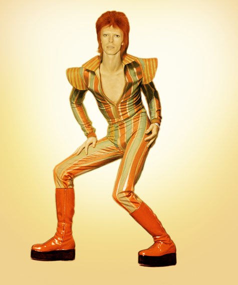
I thought this one looked like the cover of Rolling Stone and I wanted to show that burst behind him. I loved the color shift in his clothes.
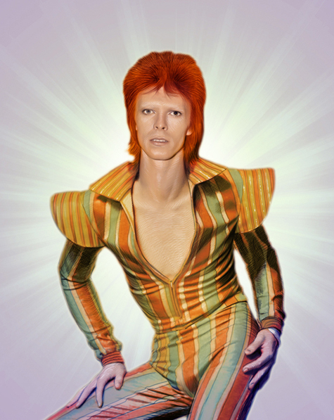
This was my full color attempt and the birth of the ring around him. I loved that and held onto that for the final.
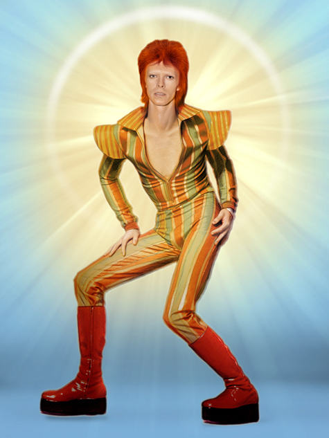
As it usually works out, this alternate sketch was chosen as the direction. One does not know if it was because they wanted to use the source image of the body in the previous sketched in the body of their article (a hunch) or that this looked more rock and roll. No matter, one thing an illustrator must know is to only show sketches that you like and are willing to do. I liked this one, but it was going to be harder to do.
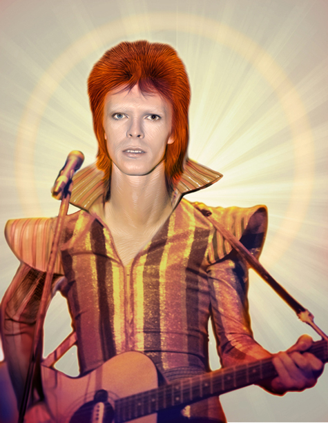
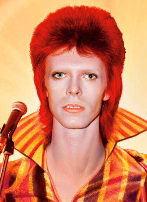
The final art. I love the idea that this image of bowie, albeit put together with the amazing photography provided by RS, never existed before I did it. This is the thing I think about while I’m working on this and many images; I’m adding to the idea of who these people are/were.
Article originally published on Drawger.
Tim O’Brien is an illustrator and portrait painter published by clients such as Time Magazine, Entertainment Weekly, Simon and Schuster, Scholastic, and many other publishers; his work includes the cover art for the highly acclaimed Hungers Games trilogy.


