Soon I Will Be Invincible
by Austin Grossman
Design by Chip Kidd
The story centers around two characters: Doctor Impossible and Fatale. Doctor Impossible—evil genius, diabolical scientist, wannabe world dominator—languishes in a federal detention facility. He’s lost his freedom, his girlfriend, and his hidden island fortress. Fatale is a rookie superhero on her first day with the Champions, the world’s most famous superteam. She’s a patchwork woman of skin and chrome, a gleaming technological marvel built to be the next generation of warfare. (Source)
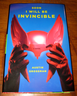
This cover could have been a disaster. Speaking as someone who cringes every time he sees a comics-related headline prefaced by the word ‘holy’ and/or bearing onomatopoeic elements (sorry Irene), the concept of yet another campy superhero send-up is not one of my favorite design tropes. That being said, never underestimate the power of a lame idea executed beautifully. Or by frakkin’ Chip Kidd. Despite my knee-jerk reaction, this cover is a knockout.

The layout is sparse, but complete. Simple typography over a single, centered image. The jacket photography depicts iconic elements of superhero fashion, if you will: big leather gloves and a Thor-esque helmet. The images are duotones1, giving the overall layout a slight pop-art sensibility, which helps ground it in campier times. As a nice contrast, the photography is rich in tone and value, giving the images a preternatural sheen, and offsetting a bit the old-fashioned impression one gets from the vintage-feeling objects depicted. This is best exemplified in the background of the cover photograph, actually, as opposed to on the image of the helmet and gloves. Seen in person, the blue background blends and shifts into darker, purple areas towards the corners (particularly the top left corner, visible in the main picture). It gives an impression of a slightly more organic surface than a straight gradient would (the back cover photograph, for instance, has a solid color background, and doesn’t feel as evocative). This treatment as a whole subtly communicates the intellectual premise of the book quite effectively: it’s a novel that uses the clichés and tropes of a bygone time, but with a modern sensibility.
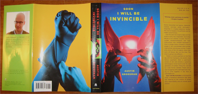
The typeface used on the cover (and throughout the book for running reads, chapter titles, etc.) is Gotham, which when tracked out, colored yellow to complete the four-color aesthetic, and coupled with the imagery, is reminiscent of Wes Anderson’s use of Futura in the titles for The Royal Tenenbaums and The Life Aquatic with Steve Zissou. Seeing as Gotham is a direct descendant of Futura, it makes sense that it serves a similar purpose here: it reinforces the ‘deliberately bland/sophisticated vintage’ feel that the imagery so deftly conveys.
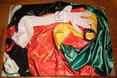
Underneath the jacket, the case is bound in paper, and the photography used is a pleasant surprise. It depicts superhero attire of a silkier, more intimate nature, as if discarded at the end of a day—or in the midst of passion. This reflects the female lead in the novel, whereas the imagery on the jacket depicts more traditionally masculine objects (adding a twist of irony is the fact that in the novel it’s the woman who is the hard-ass cyborg, and the man who is the soft super scientist, although he is super powered). The clothes form a brightly colored texture which is an engaging counterpoint to the straightforward, solid-color palette and layout of the jacket. Almost lost in this cacophony of textures and color on the cover is the title and author, subtly set in a little black cape clasp if some sort.
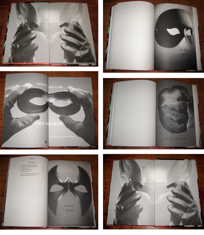
The interior is expressive, but in keeping with the subdued tone set by the cover. The photography throughout the book, on the title page and section title pages, depicts other sartorial elements associated with superheroes, specifically masks and a glove.
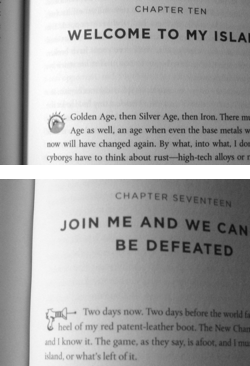 Each chapter begins with a small clip art element, either a ray gun or what looks like a cyborg eye, depending on who is narrating the chapter: Doctor Impossible chapters sport the former, and Fatale chapters, the latter. These little touches help reinforce the tone of the book, as well as inform the reader in subtle ways, without getting in the way of the reading experience.
In all, a very successful design that elegantly communicates the tone of this book. The thought process behind the design has been applied consistently throughout the book, which lends a solid sense of coherence and unity to the whole thing. This might have been lacking had the interior not received the same amount of attention that the cover and jacket did. Despite my general aversion to this kind of aesthetic as a rule, it’s always fantastic to discover new approaches that make you question your assumptions and re-evaluate your own convictions. The design for Soon I Will Be Invincible has certainly done that, in my case.
1 in four-color printing, a duotone is an image that is composed of only two colors, usually black and one of the other three process colors: Cyan, Magenta, or Yellow


